Policy Evaluation with R
Workflow
As a data analyst, it is absolutely essential that you keep detailed documentation of your analysis process. This means saving all of the code that you use for a project somewhere convenient so that you or anyone else can quickly and easily exactly reproduce your original results. In addition to saving your code, you should also provide explanations for your procedures and code so that you will always remember your data sources, what each line of code is doing, and why you analyzed the data the way that you did. Not only will this help you remember the details about your project, but it will also make it easy for others to read through your code and validate your methods. Practically, your code should be saved in a script file, though I strongly recommend using a markdown document since it allows you to create documents with written prose and code at the same time, exactly like this guide!
To create an Rmarkdown document go to file -> New File -> R notebook:

For a good overview of Rmarkdown check out chapter 27 of R for Data Science. For more details, check out R Markdown: The Definitive Guide.
Step 1: Obtain the Policy Data
About the dataset
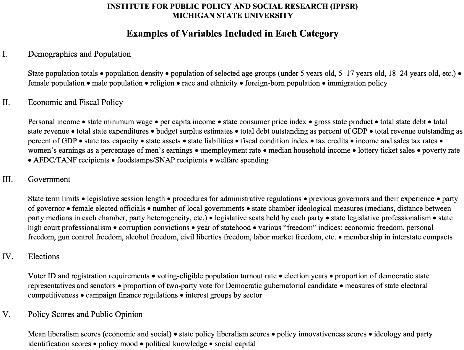
The Correlates of State Policy Project includes more than 900 variables, with observations across the 50 U.S. states and across time (1900–2016, approximately). These variables represent policy outputs or political, social, or economic factors that may influence policy differences. The codebook includes the variable name, a short description of the variable, the variable time frame, a longer description of the variable, and the variable source(s) and notes.
Begin by downloading the Correlates of State Policy Project codebook. After the file is downloaded, open it and review the table of contents. The table of contents simply lists the categories of variables available in the data. Scrolling down to page 3, we see examples of types of data (or variables) that are available under each category:
Unit of Analysis and Data Type
Before you begin thinking about your research question, you first need to identify what type of data the Correlates of State Policy Project are and what the unit of analysis is. Does the data span multiple years or is it just a single year? Do the variables contain data on individuals, ZIP codes, counties, Congressional districts, states, countries, …? This is an essential first step because the answers to these questions will narrow the range of research questions that you can answer.
For example, suppose we were interested in knowing if going to college leads to increases in pay rates. In addition to a research design that would allow us to identify this causal effect, we would need data on individual people; whether or not they have a college degree and what their pay rates are. With this data, the unit of analysis would be the individual-level.
Let’s suppose we have this data. Now we need to decide if we need cross-sectional data, or panel data. Cross-sectional data are data that only contain a single point in time. An example of this would be a survey of a randomly sampled respondents in year, say, 2020. Panel data (also known as longitudinal data) contains data on the same variables and units across multiple years. An example of this would be if we surveyed the same individuals every year for 5 years. Thus, we would have multiple measurements of a variable for the same individual over multiple time points. Note that we don’t need data on individuals to construct a panel dataset. We could also have a panel of, say, the GDP of all 50 states over a 10 year period.
What if we have data for multiple years, but the variables aren’t measuring the same individuals? In this case, we would have a pooled-cross-section. For example, the General Social Survey (GSS) conducts surveys of a random sample of individuals every year, but they don’t survey the same individuals. This means that we cannot compare the values of a variable in one year to the values of the same variable in another year, since each year is measuring a different person.
Getting back to the Correlates of State Policy Project data, we can see in the “About the Correlates of State Policy Project” section that the data measures all 50 states from 1900 to 2018. Thus, the unit of analysis is at the state-level and because it measures states (the same states) over time, it is a panel dataset. This should orient our research question to one about state-level outcomes and programs.
Research Question and Theory
In this guide, I will consider the following research question:
Do policies that ban financial incentives for doctors to preform less costly procedures and prescribe less costly drugs affect per capita state spending on health care expenditures?
In addition to a precise research question, you also need to develop an explanation for why you think these two variables are related. For my research question, my theory might be that incentivising doctors to preform less costly procedures and prescribe less costly drugs will make them more likely to do these things which will ultimately lead to a reduction in, both private and public, health care expenditures.
Selecting Variables
In deciding which variables we need to answer our research question, we need to consider three different categories of variables: the outcome variable, the predictor of interest (usually the policy intervention or treatment), and controls.
The Outcome and Predictor of Interest
For my question, policies banning financial incentives for doctors will be my predictor of interest (or treatment) and state health care expenditures will be my outcome. Here are the descriptions given to each of these variables in the codebook:
| Variable Name | Variable Description | Variable Coding | Dates Available |
|---|---|---|---|
banfaninc |
Did state adopt a ban on financial incentives for doctors to perform less costly procedures/prescribe less costly drugs? | 0 = no, 1 = yes | 1996 - 2001 |
healthspendpc |
Health care expenditures per capita (in dollars), measuring spending for all privately and publicly funded personal health care services and products (hospital care, physician services, nursing home care, prescription drugs, etc.) by state of residence. | in dollars | 1991 - 2009 |
There are a few things to note about this information. First, data are available for both of these variables from 1996 to 2001. If the years of collection for these variables didn’t overlap, then we wouldn’t be able to use them to answer our research question. Second, banfaninc is an indicator variable (also known as a dummy variable) that simply indicates a binary, “yes” “no” status. Conversely, healthspendpc is continuous meaning that it could be any positive number (since it is measured in dollars). Note that when working with money as a variable, it is important to control for inflation!
Controls
Now that we have the outcome and treatment, we need to think about what controls we need. The important criterion for identifying control variables is to pick variables that affect both the treatment and outcome.
For my question I will need to identify variables that affect policies that prohibit financial incentives and affect a state’s health care spending per capita. Here are some examples:
| Variable Name | Variable Description | Variable Coding | Dates Available |
|---|---|---|---|
sen_cont_alt |
Party in control of state senate | 1 = Democrats, 0 = Republicans, .5 = split | 1937 – 2011 |
hs_cont_alt |
Party in control of state house | 1 = Democrats, 0 = Republicans, .5 = split | 1937 – 2011 |
hou_chamber |
State house ideological median | Scale is -1 (liberal) to +1 (conservative) | 1993 - 2016 |
sen_chamber |
State senate ideological median | Scale is -1 (liberal) to +1 (conservative) | 1993 - 2016 |
Perhaps Democrats are more likely to regulate the health care industry including policies about prescription drugs and they are also more likely than Republicans to allocate public funds for health care.
Primary Keys
Finally, in addition to your outcome, predictor of interest, and control variables, you need to keep variables that uniquely identify each row of data. For this dataset, this will be the state and the year. This means that the level of data we have is “state-year” because each row of data contains measures for a given state and a given year. This also means that the state and year variables combine uniquely identify each row of data.
Now that we know what variables we need, we can start working with the data. Download the .csv (linked here) file containing the data and save it to your project’s folder.
Step 2: Prepare the Data for Analysis
Preparing your data for analysis is easily the most time-consuming component of any project and it’s often referred to as “data cleaning,” “data wrangling,” or “data munging.” It is essential that we know the data inside and out: what the unit of analysis is, what the variables we need are measuring, how many missing values we have and where they come from, what the distributions of the variables look like, etc. Without such a detailed understanding, we could easily reach flawed conclusions, build bad statistical models, or otherwise produce errors in our analysis.
Importing Data
Now, let’s get the data loaded into R and start cleaning. To do so, I will be using tidyverse which is a collection of R packages that makes coding easier and more flexible.
# load tidyverse package
library(tidyverse)

# import the data
policy_data_raw <- read_csv("correlatesofstatepolicyprojectv2.csv")
When importing your data for the first time, it’s a good idea to save the original data to an object that denotes an unchanged file. I usually do this by adding the suffix _raw to the data object and and changes that I make to the data to clean it will be saved in a different object. That way I can always get back to the original data if I need to without re-importing it.
Although we are working with a .csv file for this tutorial, that won’t always be the case. Luckily R has you covered. Here is a table of functions available in various R packages to read in other data types:
| File Type | R Package | Function |
|---|---|---|
| CSV | readr | read_csv() |
Excel (.xls & .xlsx) |
readxl | read_excel() |
| SPSS | haven | read_spss() |
| Stata | haven | read_stata() |
| SAS | haven | read_sas() |
| Feather | feather | read_feather() |
There are a lot of variables in this dataset.
# number of columns
ncol(policy_data_raw)
## [1] 2091# number of rows
nrow(policy_data_raw)## [1] 6120There are 2,091 variables (assuming each column is one variable)! Let’s make this more manageable by selecting only the variables we actually care about. We’ll do this by selecting the columns that we want:
policy_data <- select(.data = policy_data_raw,
                      year, state, healthspendpc, banfaninc, sen_cont_alt,
                      hs_cont_alt, hou_chamber, sen_chamber)

head(policy_data)
## # A tibble: 6 × 8
## year state healthspendpc banfaninc sen_cont_alt hs_cont_alt hou_chamber
## <dbl> <chr> <dbl> <dbl> <dbl> <dbl> <dbl>
## 1 1900 Alabama NA NA NA NA NA
## 2 1900 Alaska NA NA NA NA NA
## 3 1900 Arizona NA NA NA NA NA
## 4 1900 Arkansas NA NA NA NA NA
## 5 1900 California NA NA NA NA NA
## 6 1900 Colorado NA NA NA NA NA
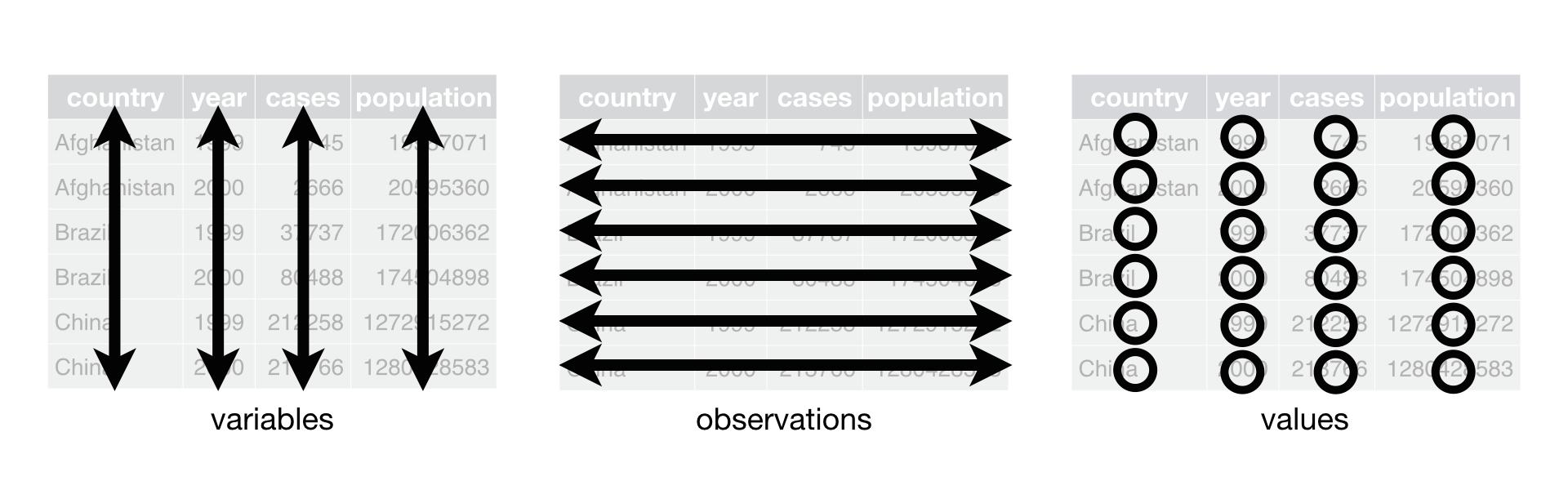
## # … with 1 more variable: sen_chamber <dbl>Now that our data is in a more manageable size, we can start to think more critically about it. One of the first things we want to know is if the data is in a usable format. What is a usable format? Well, we want it to know what is known as “tidy.” The concept of tidy data is a philosophy of data first explained in an article in the Journal of Statistical Software by Hadley Wickham called Tidy Data. The tidy data philosophy has three components:
- Each variable has its own column.
- Each observation has its own row.
- Each value has its own cell.
Visually, these three principles look like this:
Source: R for Data Science Ch. 12
There is a lot more to be said about tidy data and I encourage you to read the article or Chapter 12 of R for Data Science.
Reflect:
Does our data meet the three conditions of tidy data? Take a minute to think about it.
I say yes. This data looks good. If it wasn’t, we might need to think about how to reshape our data.
Missing Data
Missing data present a challenge to data scientists because they can influence analyses. When we import a dataset that has empty cells, R will automatically populate these cells with NA which means missing. These are known as explicit missing values values because we can see them in the data. When you go to create a plot or estimate a regression, or anything else, these values will be dropped from the dataset. That’s not necessarily a bad thing, but it’s important to know that it’s happening.
The more problematic situation is when missing data is represented with a numeric value like -99 instead of simply having an empty cell. In that case, R won’t know that -99 is a missing value - it will just think that it’s a legitimate value. If you were to run your regression with the -99s in the data, it would seriously influence your results. Before making any inferences with our data, we need to make sure we don’t have any values like this in the dataset!
If we knew about values like this ahead of time, we could fix them with the na argument of the read_csv() function. Usually the codebook would tell us how missing values are coded. If there were coded as -99, we could fix them on import with:
policy_data_raw <- read_csv("correlatesofstatepolicyprojectv2.csv",
                            na = "-99")
Looking through the codebook, I don’t see any mention of a missing value coding scheme, so we’ll need to look for unusual values in the data with some descriptive statistics:
summary(policy_data)## year state healthspendpc banfaninc
## Min. :1900 Length:6120 Min. : 75.53 Min. :0.000
## 1st Qu.:1930 Class :character 1st Qu.: 3198.00 1st Qu.:0.000
## Median :1960 Mode :character Median : 4198.00 Median :0.000
## Mean :1960 Mean : 4513.42 Mean :0.079
## 3rd Qu.:1989 3rd Qu.: 5683.00 3rd Qu.:0.000
## Max. :2019 Max. :10349.00 Max. :1.000
## NA's :5151 NA's :1220
## sen_cont_alt hs_cont_alt hou_chamber sen_chamber
## Min. :0.0000 Min. :0.0000 Min. :-1.465 Min. :-1.449
## 1st Qu.:0.0000 1st Qu.:0.0000 1st Qu.:-0.462 1st Qu.:-0.462
## Median :1.0000 Median :1.0000 Median : 0.195 Median : 0.195
## Mean :0.5701 Mean :0.6068 Mean : 0.067 Mean : 0.069
## 3rd Qu.:1.0000 3rd Qu.:1.0000 3rd Qu.: 0.605 3rd Qu.: 0.613
## Max. :1.0000 Max. :1.0000 Max. : 1.228 Max. : 1.242
## NA's :2482 NA's :2481 NA's :5113 NA's :5102The minimums and maximums all look reasonable here so I think we’re ok. It would also be a good idea to create some plots as another way to check for unusual values.
The other type of missing values to be aware of are “implicitly” missing values. To get a sense of what an implicit missing value is, take a look at this example data frame:
df <- tibble(
  state = c("CA", "CA", "AZ", "AZ", "TX"),
  year = c(2000, 2001, 2000, 2001, 2000),
  enrollments = c(1521, 1231, 3200, 2785, 6731)
)
df
## # A tibble: 5 × 3
## state year enrollments
## <chr> <dbl> <dbl>
## 1 CA 2000 1521
## 2 CA 2001 1231
## 3 AZ 2000 3200
## 4 AZ 2001 2785
## 5 TX 2000 6731What do you notice about Texas (TX)? It only has data for 2000. Why don’t we have data for 2001? Well, I don’t know! And that’s the problem. I could be random, but it might not be. Moreover, because the row for Texas in the year 2001 doesn’t exist in the data it’s technically missing even though we don’t see a NA value that represents it. That’s why its implicitly, not explicitly, missing.
We can make implicitly missing values explicit with the complete() function which fills out all possible values for a combination of variables:
complete(data = df, state, year)## # A tibble: 6 × 3
## state year enrollments
## <chr> <dbl> <dbl>
## 1 AZ 2000 3200
## 2 AZ 2001 2785
## 3 CA 2000 1521
## 4 CA 2001 1231
## 5 TX 2000 6731
## 6 TX 2001 NAGetting back to our data, we’ve seen that there aren’t any extreme values, but which columns have missing values?
apply(is.na(policy_data), 2, any)## year state healthspendpc banfaninc sen_cont_alt
## FALSE FALSE TRUE TRUE TRUE
## hs_cont_alt hou_chamber sen_chamber
## TRUE TRUE TRUEHere we used the apply() function which applies an operation over a series of columns. Because we want to know which columns contain missing values, we want to see of there are any missing values in the columns (hence the value of 2).
We would also want to check how many missing values there are in each column. To do that, just change the any to sum in the apply function.
apply(is.na(policy_data), 2, sum)## year state healthspendpc banfaninc sen_cont_alt
## 0 0 5151 1220 2482
## hs_cont_alt hou_chamber sen_chamber
## 2481 5113 5102To check for any implicitly missing values, we can count how many years each state has. If all the missing values are explicit, then there should be the same number of rows for each state. We can check by chaining multiple methods together with the pipe operator (%>%) like this:
policy_data %>%
  group_by(state) %>%
  summarise(n_obs = n())
## # A tibble: 51 × 2
## state n_obs
## <chr> <int>
## 1 Alabama 120
## 2 Alaska 120
## 3 Arizona 120
## 4 Arkansas 120
## 5 California 120
## 6 Colorado 120
## 7 Connecticut 120
## 8 Delaware 120
## 9 District of Columbia 120
## 10 Florida 120
## # … with 41 more rowsIn this calculation, I first grouped the data by state then aggregated it with summarize but counting the number of rows in each group. To connect all those pieces together, I used the pipe operator %>% which allows you to combine multiple steps together. Looks like not every state has the same number of rows, that means we have some implicitly missing values.
What should we do with missing values?
There really isn’t a “right” way to handle missing values, so you just need to think carefully about whatever decision you make. The solution that we’ll use here is just to drop all missing values. Why? Missing values can’t be put in a plot or used in a regression, so we don’t necessarily need them. Theoretically, missing values are important because it could mean something more that just “no data.” For example, data might be systematically missing for a particular group of people. That would definitely affect our analyses and we would want to address it. That’s a very different situation than having a missing value for a random, non-systematic reason.
Let’s assume that we’ve spent time thinking about why our data is missing and we have decided that dropping the missing values from our dataset is the best option. We can do that with the drop_na() function:
policy_data <-
  policy_data %>%
  drop_na()
However, it is a much better idea to only drop rows that are missing the outcome variable. Doing so will ensure that we keep the maximum amount of usable data.
policy_data <-
  policy_data %>%
  drop_na(healthspendpc)
After dropping NA values, it’s a good idea to check that it worked:
apply(is.na(policy_data), 2, any)## year state healthspendpc banfaninc sen_cont_alt
## FALSE FALSE FALSE TRUE TRUE
## hs_cont_alt hou_chamber sen_chamber
## TRUE TRUE TRUENo more missing values for healthspendpc even though missing values remain for other variables.
Renaming Variables
With the missing values out of the way, let’s turn to assigning more informative names to our variables. The variable names in our dataset aren’t too bad, but they could be better. It’s fairly common to run into cryptic variable names like CMP23A__1 when working with data and names like that only make it harder for you, as the data scientist, and anyone else trying to understand the data. In those situations it a good idea to give your variables names that are more easily understood.
There are some rules (more like guidelines) for variable names, however. First, we never want to have spaces. So, Senate Chamber would be a bad name because of the space. Spaces just make it harder to work with. Instead, we use _ instead of a space. Second, variables are easier to work with when they are all lower case. R is a case sensitive language. That means that it sees x as different from X. So, instead of Senate_Chamber, we’ll just use senate_chamber. Finally, we want to try not to have variable names that are too long. Sometimes it’s hard to use short names when the variables are complicated, but do your best. Working with senate_chamber_california_legislative_session_2022 is a bit cumbersome to type out.
Reflect:
What does the
sen_chambervariable measure?
If you had to go look it up, it probably needs a new name! To rename variables in pandas we use the .rename() method where we set the old name equal to the new name like this:
policy_data <- rename(.data = policy_data,
                      health_spend_per_cap = healthspendpc,
                      fin_incentive_ban = banfaninc,
                      senate_prty_control = sen_cont_alt,
                      house_prty_control = hs_cont_alt,
                      house_ideology = hou_chamber,
                      senate_ideology = sen_chamber)

head(policy_data)
## # A tibble: 6 × 8
## year state health_spend_per_cap fin_incentive_ban senate_prty_control
## <dbl> <chr> <dbl> <dbl> <dbl>
## 1 1991 Alabama 2571 0 1
## 2 1991 Alaska 2589 0 0.5
## 3 1991 Arizona 2457 0 1
## 4 1991 Arkansas 2380 0 1
## 5 1991 California 2677 0 1
## 6 1991 Colorado 2511 0 0
## # … with 3 more variables: house_prty_control <dbl>, house_ideology <dbl>,
## # senate_ideology <dbl>Variable Types
R allows for different types of data and it’s important to ensure that our variables have the right types. There are three main types that you will use as a data scientist:
- numeric: standard numeric data with some defined level of precision
- strings: character data like words or sentences
- categorical: data that has discrete categories, can be ordered or unordered
To check what types of variables we have in a data frame, we use the glimpse() function which shows a stacked preview of our data and the data types:
glimpse(policy_data)## Rows: 969
## Columns: 8
## $ year <dbl> 1991, 1991, 1991, 1991, 1991, 1991, 1991, 1991, 1…
## $ state <chr> "Alabama", "Alaska", "Arizona", "Arkansas", "Cali…
## $ health_spend_per_cap <dbl> 2571, 2589, 2457, 2380, 2677, 2511, 3324, 2878, 4…
## $ fin_incentive_ban <dbl> 0, 0, 0, 0, 0, 0, 0, 0, NA, 0, 0, 0, 0, 0, 0, 0, …
## $ senate_prty_control <dbl> 1.0, 0.5, 1.0, 1.0, 1.0, 0.0, 1.0, 1.0, NA, 1.0, …
## $ house_prty_control <dbl> 1, 1, 0, 1, 1, 0, 1, 0, NA, 1, 1, 1, 0, 1, 1, 1, …
## $ house_ideology <dbl> NA, NA, NA, NA, NA, NA, NA, NA, NA, NA, NA, NA, N…
## $ senate_ideology <dbl> NA, NA, NA, NA, NA, NA, NA, NA, NA, NA, NA, NA, N…Let’s see if these data types make sense:
year:dblwhich is a numeric type so that’s goodstate:chrwhich indicates a stringhealth_spend_per_cap:dblwhich is another numeric type
These all seem good. But, fin_incentive_ban, senate_prty_control, and house_prty_control probably shouldn’t be a continuous numeric type like dbl because they are categories. Does the state have a financial incentive ban (fin_incentive_ban)? Yes or no? Who control the senate for a given year (senate_prty_control)? The Democrats or Republicans? So, these should be categorical data. We can change the type with the mutate function which is used to create new variables. Essentially, we are replacing the old fin_incentive_ban with a new categorical version of fin_incentive_ban:
policy_data <- mutate(
  .data = policy_data,
  fin_incentive_ban = factor(fin_incentive_ban,
                             levels = c(0, 1))
)

glimpse(policy_data)
## Rows: 969
## Columns: 8
## $ year <dbl> 1991, 1991, 1991, 1991, 1991, 1991, 1991, 1991, 1…
## $ state <chr> "Alabama", "Alaska", "Arizona", "Arkansas", "Cali…
## $ health_spend_per_cap <dbl> 2571, 2589, 2457, 2380, 2677, 2511, 3324, 2878, 4…
## $ fin_incentive_ban <fct> 0, 0, 0, 0, 0, 0, 0, 0, NA, 0, 0, 0, 0, 0, 0, 0, …
## $ senate_prty_control <dbl> 1.0, 0.5, 1.0, 1.0, 1.0, 0.0, 1.0, 1.0, NA, 1.0, …
## $ house_prty_control <dbl> 1, 1, 0, 1, 1, 0, 1, 0, NA, 1, 1, 1, 0, 1, 1, 1, …
## $ house_ideology <dbl> NA, NA, NA, NA, NA, NA, NA, NA, NA, NA, NA, NA, N…
## $ senate_ideology <dbl> NA, NA, NA, NA, NA, NA, NA, NA, NA, NA, NA, NA, N…Creating and Manupulating Variables
Alright, that looks good but we can make it better. What if instead of saying either 0 or 1, we had it say “Yes” or “No”? That would make the data easier to understand. Essentially, what we want to do is change the names of the categories. Luckily the factor() function has a labels = argument for that! Let’s see how it works.
policy_data <- mutate(
  .data = policy_data,
  fin_incentive_ban = factor(fin_incentive_ban,
                             levels = c(0, 1),
                             labels = c("No", "Yes"))
)

glimpse(policy_data)
## Rows: 969
## Columns: 8
## $ year <dbl> 1991, 1991, 1991, 1991, 1991, 1991, 1991, 1991, 1…
## $ state <chr> "Alabama", "Alaska", "Arizona", "Arkansas", "Cali…
## $ health_spend_per_cap <dbl> 2571, 2589, 2457, 2380, 2677, 2511, 3324, 2878, 4…
## $ fin_incentive_ban <fct> No, No, No, No, No, No, No, No, NA, No, No, No, N…
## $ senate_prty_control <dbl> 1.0, 0.5, 1.0, 1.0, 1.0, 0.0, 1.0, 1.0, NA, 1.0, …
## $ house_prty_control <dbl> 1, 1, 0, 1, 1, 0, 1, 0, NA, 1, 1, 1, 0, 1, 1, 1, …
## $ house_ideology <dbl> NA, NA, NA, NA, NA, NA, NA, NA, NA, NA, NA, NA, N…
## $ senate_ideology <dbl> NA, NA, NA, NA, NA, NA, NA, NA, NA, NA, NA, NA, N…That’s much easier to understand. Still skeptical that labeling the values makes it easier? Pause and think about what a value of 1 means for senate_prty_control? Did you have to look it up? If we had the value labeled, we wouldn’t need to look it up.
Now let’s use these tools to clean up the other categorical variables (senate_prty_control and house_prty_control). Before we do though, we need to check how many categories there are in these variables:
unique(policy_data$senate_prty_control)## [1] 1.0 0.5 0.0 NAunique(policy_data$house_prty_control)## [1] 1.0 0.0 NA 0.5Ok, now let’s look in the codebook to figure out what these values mean and label them appropriately. Note that we can change multiple variables inside of the same mutate() function.
policy_data <- mutate(
  .data = policy_data,
  senate_prty_control = factor(senate_prty_control,
                               levels = c(0, 0.5, 1),
                               labels = c("Republican", "Split", "Democrat")),
  house_prty_control = factor(house_prty_control,
                              levels = c(0, 0.5, 1),
                              labels = c("Republican", "Split", "Democrat"))
)

glimpse(policy_data)
## Rows: 969
## Columns: 8
## $ year <dbl> 1991, 1991, 1991, 1991, 1991, 1991, 1991, 1991, 1…
## $ state <chr> "Alabama", "Alaska", "Arizona", "Arkansas", "Cali…
## $ health_spend_per_cap <dbl> 2571, 2589, 2457, 2380, 2677, 2511, 3324, 2878, 4…
## $ fin_incentive_ban <fct> No, No, No, No, No, No, No, No, NA, No, No, No, N…
## $ senate_prty_control <fct> Democrat, Split, Democrat, Democrat, Democrat, Re…
## $ house_prty_control <fct> Democrat, Democrat, Republican, Democrat, Democra…
## $ house_ideology <dbl> NA, NA, NA, NA, NA, NA, NA, NA, NA, NA, NA, NA, N…
## $ senate_ideology <dbl> NA, NA, NA, NA, NA, NA, NA, NA, NA, NA, NA, NA, N…Perfect.
Sometimes when we have categorical data, we would rather work with a single value of the category instead of every possible category. An easy way to accomplish this is to create an indicator, or dummy, variable. For example, suppose we just wanted to know of the Senate was controlled by the Democrats in a given year. To do this, we could create an indicator variable equal to 1 if senate_prty_control equals “Democrat”. We can accomplish this with the ifelse() function:
policy_data <- mutate(
  .data = policy_data,
  senate_dem_control = ifelse(senate_prty_control == "Democrat",
                              yes = 1, no = 0)
)

glimpse(policy_data)
## Rows: 969
## Columns: 9
## $ year <dbl> 1991, 1991, 1991, 1991, 1991, 1991, 1991, 1991, 1…
## $ state <chr> "Alabama", "Alaska", "Arizona", "Arkansas", "Cali…
## $ health_spend_per_cap <dbl> 2571, 2589, 2457, 2380, 2677, 2511, 3324, 2878, 4…
## $ fin_incentive_ban <fct> No, No, No, No, No, No, No, No, NA, No, No, No, N…
## $ senate_prty_control <fct> Democrat, Split, Democrat, Democrat, Democrat, Re…
## $ house_prty_control <fct> Democrat, Democrat, Republican, Democrat, Democra…
## $ house_ideology <dbl> NA, NA, NA, NA, NA, NA, NA, NA, NA, NA, NA, NA, N…
## $ senate_ideology <dbl> NA, NA, NA, NA, NA, NA, NA, NA, NA, NA, NA, NA, N…
## $ senate_dem_control <dbl> 1, 0, 1, 1, 1, 0, 1, 1, NA, 1, 1, 1, 0, 1, 0, 1, …The dataset is looking really good, but there is one last thing to do. Because we are going to be using spending on health care as a variable in our model, we need to adjust it for inflation. In order to do that we need data from the Consumer Price Index and the formula:
\[
\text{Adjusted Value} = \frac{\text{Actual Value}}{\text{Index Value}}
\] To get the CPI data, we’ll use the blscrapR library. You’ll need to install it with devtools::install_github("keberwein/blscrapeR"). We’ll use the inflation_adjust() function to convert the value of $1 in a base year to the inflation adjusted value in other years:
library(blscrapeR)

inflation_adjust(base_year = 1950)
## # A tibble: 76 × 5
## year avg_cpi adj_value base_year pct_increase
## <chr> <dbl> <dbl> <chr> <dbl>
## 1 1947 22.3 0.93 1950 -7.19
## 2 1948 24.0 1 1950 -0.0727
## 3 1949 23.8 0.99 1950 -1.05
## 4 1950 24.1 1 1950 0
## 5 1951 26.0 1.08 1950 7.94
## 6 1952 26.6 1.1 1950 10.4
## 7 1953 26.8 1.11 1950 11.2
## 8 1954 26.9 1.12 1950 11.6
## 9 1955 26.8 1.11 1950 11.4
## 10 1956 27.2 1.13 1950 13.0
## # … with 66 more rowsSo, $1 in 1950 is worth $11.72 today. To use these values to adjust the dollar values in out data we first need to save the CS data to an object. This time, we’ll use 1996 as the base year because that’s when our treatment started (but this year is arbitrary).
real_values <- inflation_adjust(base_year = 1996)

glimpse(real_values)
## Rows: 76
## Columns: 5
## $ year <chr> "1947", "1948", "1949", "1950", "1951", "1952", "1953", "…
## $ avg_cpi <dbl> 22.33167, 24.04500, 23.80917, 24.06250, 25.97333, 26.5666…
## $ adj_value <dbl> 0.14, 0.15, 0.15, 0.15, 0.17, 0.17, 0.17, 0.17, 0.17, 0.1…
## $ base_year <chr> "1996", "1996", "1996", "1996", "1996", "1996", "1996", "…
## $ pct_increase <dbl> -85.76316, -84.67088, -84.82123, -84.65972, -83.44153, -8…Next, we need to combine this data with the policy data. To do this, we join the tables by matching the variables that are common to both datasets. There are a couple different ways to do this and visually, they look like this:
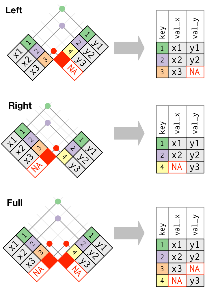
Source: R for Data Science
We’ll use a left_join() with policy_data as the left side (x) and real_values as the right side (y). That means that we’ll keep all observations in policy_data and only the observations in real_values that have a match in policy_data.
How will we match the two datasets? We will match them with the year variable. Let’s get to it:
policy_data <- left_join(
  x = policy_data,
  y = real_values,
  by = "year"
)
## Error in `left_join()`:
## ! Can't join on `x$year` x `y$year` because of incompatible types.
## ℹ `x$year` is of type <double>>.
## ℹ `y$year` is of type <character>>.Shoot! We got an error. Why? At the bottom, it says x$year is of type <double>> and y$year is of type <character>>. That means that left_join() can’t match the year columns together because one is a numeric type and the other is a character. x is the left side of the join (policy_data) and y is the right side (real_values), so we know that year is a character vector in real_values. Let’s check:
class(real_values$year)## [1] "character"Ok, let’s change it to numeric:
real_values <- mutate(
  .data = real_values,
  year = as.numeric(year)
)

class(real_values$year)
## [1] "numeric"Ok, let’s try again.
policy_data <- left_join(
  x = policy_data,
  y = real_values,
  by = "year"
)
With matching columns in real_values added to policy_data we are ready to adjust the spending values for inflation.
policy_data <- mutate(
  .data = policy_data,
  real_health_spend_per_cap = health_spend_per_cap / adj_value
)
Finally, when working with data that is strictly positive and continuous it is a good idea to use a \(\log\) transformation to make the distribution a bit more normal. This helps with the model fit.
policy_data <- mutate(
  .data = policy_data,
  log_real_health_spend_per_cap = log(real_health_spend_per_cap)
)
Going Deeper: Data Cleaning in a Real Workflow
We did a lot to clean this data and we took our time doing. Obviously, we went slow so that you could learn each step and think critically about the code. In a real workflow, however, there’s a better way to write code than taking each step one-at-a-time and it’s referred to as method chaining. Method chaining is a way of writing code where we add multiple steps together, instead of writing each step individually. Here is what my code would like if I were doing these steps for an actual project:
# import packages
library(tidyverse)

# import data
policy_data_raw <- read_csv("correlatesofstatepolicyprojectv2.csv")

# select variables, convert types, drop missing
policy_data <- policy_data_raw %>%
  select(year, state, healthspendpc, banfaninc, sen_cont_alt, hs_cont_alt,
         hou_chamber, sen_chamber) %>%
  rename(health_spend_per_cap = healthspendpc,
         fin_incentive_ban = banfaninc,
         senate_prty_control = sen_cont_alt,
         house_prty_control = hs_cont_alt,
         house_ideology = hou_chamber,
         senate_ideology = sen_chamber) %>%
  mutate(fin_incentive_ban = factor(fin_incentive_ban,
                                    levels = c(0, 1),
                                    labels = c("No", "Yes")),
         senate_prty_control = factor(senate_prty_control,
                                      levels = c(0, 0.5, 1),
                                      labels = c("Republican", "Split",
                                                 "Democrat")),
         house_prty_control = factor(house_prty_control,
                                     levels = c(0, 0.5, 1),
                                     labels = c("Republican", "Split",
                                                "Democrat")))

# examine missing values
summary(policy_data)
## year state health_spend_per_cap fin_incentive_ban
## Min. :1900 Length:6120 Min. : 75.53 No :4513
## 1st Qu.:1930 Class :character 1st Qu.: 3198.00 Yes : 387
## Median :1960 Mode :character Median : 4198.00 NA's:1220
## Mean :1960 Mean : 4513.42
## 3rd Qu.:1989 3rd Qu.: 5683.00
## Max. :2019 Max. :10349.00
## NA's :5151
## senate_prty_control house_prty_control house_ideology senate_ideology
## Republican:1526 Republican:1407 Min. :-1.465 Min. :-1.449
## Split : 76 Split : 48 1st Qu.:-0.462 1st Qu.:-0.462
## Democrat :2036 Democrat :2184 Median : 0.195 Median : 0.195
## NA's :2482 NA's :2481 Mean : 0.067 Mean : 0.069
## 3rd Qu.: 0.605 3rd Qu.: 0.613
## Max. : 1.228 Max. : 1.242
## NA's :5113 NA's :5102# look for implicitly missing values
policy_data %>%
group_by(state) %>%
summarise(n_obs = n())## # A tibble: 51 × 2
## state n_obs
## <chr> <int>
## 1 Alabama 120
## 2 Alaska 120
## 3 Arizona 120
## 4 Arkansas 120
## 5 California 120
## 6 Colorado 120
## 7 Connecticut 120
## 8 Delaware 120
## 9 District of Columbia 120
## 10 Florida 120
## # … with 41 more rows# drop missing values
policy_data <-
policy_data %>%
drop_na(health_spend_per_cap)
# adjust for inflation
library(blscrapeR)
real_values <- inflation_adjust(base_year = 1996) %>%
mutate(year = as.numeric(year))
# combine policy_data with real_values
policy_data <- left_join(
x = policy_data,
y = real_values,
by = "year"
)
# adjust spending for inflation
policy_data <- policy_data %>%
mutate(real_health_spend_per_cap = health_spend_per_cap / adj_value,
log_real_health_spend_per_cap = log(real_health_spend_per_cap))
glimpse(policy_data)## Rows: 969
## Columns: 14
## $ year <dbl> 1991, 1991, 1991, 1991, 1991, 1991, 1991…
## $ state <chr> "Alabama", "Alaska", "Arizona", "Arkansa…
## $ health_spend_per_cap <dbl> 2571, 2589, 2457, 2380, 2677, 2511, 3324…
## $ fin_incentive_ban <fct> No, No, No, No, No, No, No, No, NA, No, …
## $ senate_prty_control <fct> Democrat, Split, Democrat, Democrat, Dem…
## $ house_prty_control <fct> Democrat, Democrat, Republican, Democrat…
## $ house_ideology <dbl> NA, NA, NA, NA, NA, NA, NA, NA, NA, NA, …
## $ senate_ideology <dbl> NA, NA, NA, NA, NA, NA, NA, NA, NA, NA, …
## $ avg_cpi <dbl> 136.1667, 136.1667, 136.1667, 136.1667, …
## $ adj_value <dbl> 0.87, 0.87, 0.87, 0.87, 0.87, 0.87, 0.87…
## $ base_year <chr> "1996", "1996", "1996", "1996", "1996", …
## $ pct_increase <dbl> -13.19131, -13.19131, -13.19131, -13.191…
## $ real_health_spend_per_cap <dbl> 2955.172, 2975.862, 2824.138, 2735.632, …
## $ log_real_health_spend_per_cap <dbl> 7.991312, 7.998289, 7.945958, 7.914118, …For a real project, I would also save the cleaned data to my project’s working directory:
write_csv(policy_data, file = "Policy Project/Data/policy_data.csv")Step 3: Exploratory Data Analysis
Before running any models, it is important that you become an expert on your data. This is easy with a small dataset, but can get harder when you are working with a lot of variables. Here are some examples of questions you should ask about your data:
- What do the distributions of my variables look like?
- What are means and standard deviations?
- What is the relationship between variables?
Answering these questions will help you identify errors in your data - errors that could lead to erroneous regression results, help you understand what your data measures and the types of questions you can as, and also help you generate hypotheses.
There are essentially two ways of conducting EDA: descriptive methods and visual methods. We’ll explore both here.
Descriptive Methods
When exploring data descriptively, we are mainly interested in calculating various statistics over the data and possibly within groups. In general, to conduct descriptive EDA we need to know how to:
- Summarize and aggregate data
- Filter data
- Arrange data
Let’s see some examples of these.
Summarizing and Aggregating Data
With our interest in predicting healthcare spending, we might want to know what the average amount of healthcare spending is in the US. We’ve already seen how to do with the summary() functions, but we could also use mean() and median() functions.
mean(policy_data$real_health_spend_per_cap)## [1] 3980.882median(policy_data$real_health_spend_per_cap)## [1] 3845.299What if we want to know the average spending by state? To do that, we need to use group_by() and summarize() functions to group the data into states, calculate the function we want within those states, and then show use the results for each state.
policy_data %>%
  group_by(state) %>%
  summarize(avg_spending = mean(real_health_spend_per_cap)) %>%
  head(5)
## # A tibble: 5 × 2
## state avg_spending
## <chr> <dbl>
## 1 Alabama 3797.
## 2 Alaska 4507.
## 3 Arizona 3226.
## 4 Arkansas 3556.
## 5 California 3600.How does House ideology differ by states?
policy_data %>%
  group_by(state) %>%
  summarize(avg_ideology = mean(house_ideology)) %>%
  head(5)
## # A tibble: 5 × 2
## state avg_ideology
## <chr> <dbl>
## 1 Alabama NA
## 2 Alaska NA
## 3 Arizona NA
## 4 Arkansas NA
## 5 California NAFiltering Data
It’s important to be able to calculate statistics by groups, but sometimes we want to pull out specific values. For example, we might want to know which state had the highest amount of healthcare spending, or has the most liberal House. This is when we need filters. So, let’s see which state has the highest level of spending:
policy_data %>%
  filter(real_health_spend_per_cap == max(real_health_spend_per_cap)) %>%
  select(year, state, real_health_spend_per_cap)
## # A tibble: 1 × 3
## year state real_health_spend_per_cap
## <dbl> <chr> <dbl>
## 1 2009 District of Columbia 7554.Which state has the highest average spending? We’ll need to use our group_by() skills for that. The state with the highest average spending is:
policy_data %>%
  group_by(state) %>%
  summarize(avg_spending = mean(real_health_spend_per_cap)) %>%
  top_n(n = 1)
## # A tibble: 1 × 2
## state avg_spending
## <chr> <dbl>
## 1 District of Columbia 6309.What if we only wanted to look at the data for California? We can do that like this:
policy_data %>%
  filter(state == "California")
## # A tibble: 19 × 14
## year state health_spend_per_cap fin_incentive_ban senate_prty_control
## <dbl> <chr> <dbl> <fct> <fct>
## 1 1991 California 2677 No Democrat
## 2 1992 California 2847 No Democrat
## 3 1993 California 2948 No Democrat
## 4 1994 California 3008 No Democrat
## 5 1995 California 3069 No Democrat
## 6 1996 California 3144 Yes Democrat
## 7 1997 California 3213 Yes Democrat
## 8 1998 California 3389 Yes Democrat
## 9 1999 California 3486 Yes Democrat
## 10 2000 California 3602 Yes Democrat
## 11 2001 California 3847 Yes Democrat
## 12 2002 California 4144 Yes Democrat
## 13 2003 California 4499 Yes Democrat
## 14 2004 California 4777 Yes Democrat
## 15 2005 California 5098 Yes Democrat
## 16 2006 California 5384 Yes Democrat
## 17 2007 California 5732 Yes Democrat
## 18 2008 California 6024 Yes Democrat
## 19 2009 California 6238 Yes Democrat
## # … with 9 more variables: house_prty_control <fct>, house_ideology <dbl>,
## # senate_ideology <dbl>, avg_cpi <dbl>, adj_value <dbl>, base_year <chr>,
## # pct_increase <dbl>, real_health_spend_per_cap <dbl>,
## # log_real_health_spend_per_cap <dbl>What about all data for California just for the year 2000? For that we need to use the & operator:
policy_data %>%
  filter(state == "California" & year == 2000)
## # A tibble: 1 × 14
## year state health_spend_per_cap fin_incentive_ban senate_prty_control
## <dbl> <chr> <dbl> <fct> <fct>
## 1 2000 California 3602 Yes Democrat
## # … with 9 more variables: house_prty_control <fct>, house_ideology <dbl>,
## # senate_ideology <dbl>, avg_cpi <dbl>, adj_value <dbl>, base_year <chr>,
## # pct_increase <dbl>, real_health_spend_per_cap <dbl>,
## # log_real_health_spend_per_cap <dbl>Arranging Data
Instead of returning only one value, like the maximum, you might want to sort the data to see multiple values. We can do this with the arrange() function. Instead of finding the state with the highest average health spending, let’s list out average spending by all states and put them in descending order.
policy_data %>%
  group_by(state) %>%
  summarize(mean_health_spending = mean(real_health_spend_per_cap)) %>%
  arrange(mean_health_spending)
## # A tibble: 51 × 2
## state mean_health_spending
## <chr> <dbl>
## 1 Utah 2921.
## 2 Arizona 3226.
## 3 Idaho 3233.
## 4 Nevada 3410.
## 5 Texas 3486.
## 6 Georgia 3488.
## 7 New Mexico 3501.
## 8 Virginia 3516.
## 9 Colorado 3520.
## 10 Arkansas 3556.
## # … with 41 more rowsThis is almost what we want. The issue is that the default of arrange() is ascending order. To change that to descending order, we wrap the variable with desc() like so:
policy_data %>%
  group_by(state) %>%
  summarize(mean_health_spending = mean(real_health_spend_per_cap)) %>%
  arrange(desc(mean_health_spending))
## # A tibble: 51 × 2
## state mean_health_spending
## <chr> <dbl>
## 1 District of Columbia 6309.
## 2 Massachusetts 5089.
## 3 Connecticut 4886.
## 4 New York 4850.
## 5 Delaware 4637.
## 6 Rhode Island 4604.
## 7 Alaska 4507.
## 8 Pennsylvania 4469.
## 9 New Jersey 4462.
## 10 Maine 4436.
## # … with 41 more rowsVisual Methods
The primary tool for building plots in R is ggplot2. ggplot2 is an implementation of what is called the “grammar of graphics” which is essentially an intuitive and comprehensive way of building and describing statistical graphics. Every ggplot2 plot contains a graph template (ggplot()), data, an aesthetic mapping, and a geometric object. Sounds complex, right? It’s actually really straightforward. Let’s build a plot to see:
ggplot(data = policy_data,
       mapping = aes(x = real_health_spend_per_cap)) +
  geom_histogram()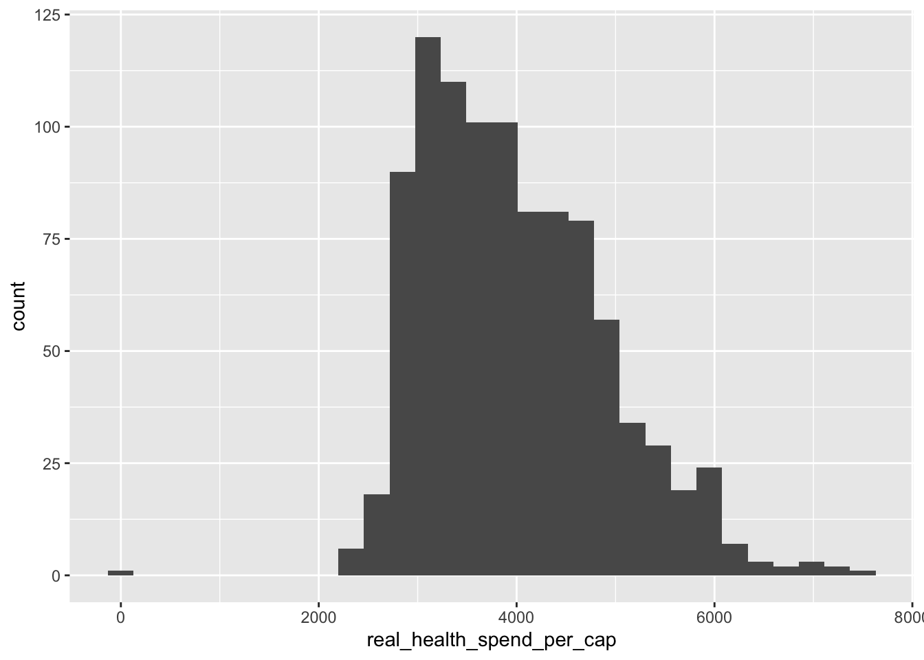
Let’s break down this code:
ggplot()sets up the container for our plot and it has two main arguments:data =which is the data that we want to plotmapping = aes()which maps our data to an aesthetic (the \(x\) and \(y\)-axes)
geom_histogram()uses all the previous inputs to make a histogram.
What if we wanted a density plot instead? Well, then we just change the geometric object to a density plot instead like this:
ggplot(data = policy_data,
       mapping = aes(x = real_health_spend_per_cap)) +
  geom_density()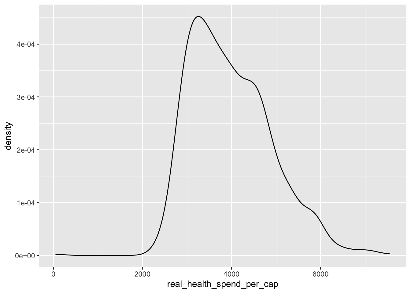
Those are the very basics of ggplot2. If you want more details (and there are a lot more details to be learned) check out Chapter 3 of R for Data Science (https://r4ds.had.co.nz/data-visualisation.html), my website post on ggplot2 (https://nicholasrjenkins.science/post/data_viz_r/data_visualization_r/), or go deep with the ggplot2 book (https://ggplot2-book.org)! For now, we get back to exploring our data visually with more of an emphasis on learning about the data than learning how to use ggplot().
Let’s make a new density plot with our logged outcome variable (log_real_health_spend_per_cap) on the \(x\)-axis of a density plot. Since we are mainly interested in how financial incentive bans effect this outcome, we’ll also set the fill = equal to fin_incentive_ban:
ggplot(data = policy_data,
       mapping = aes(x = log_real_health_spend_per_cap, fill = fin_incentive_ban)) +
  geom_density()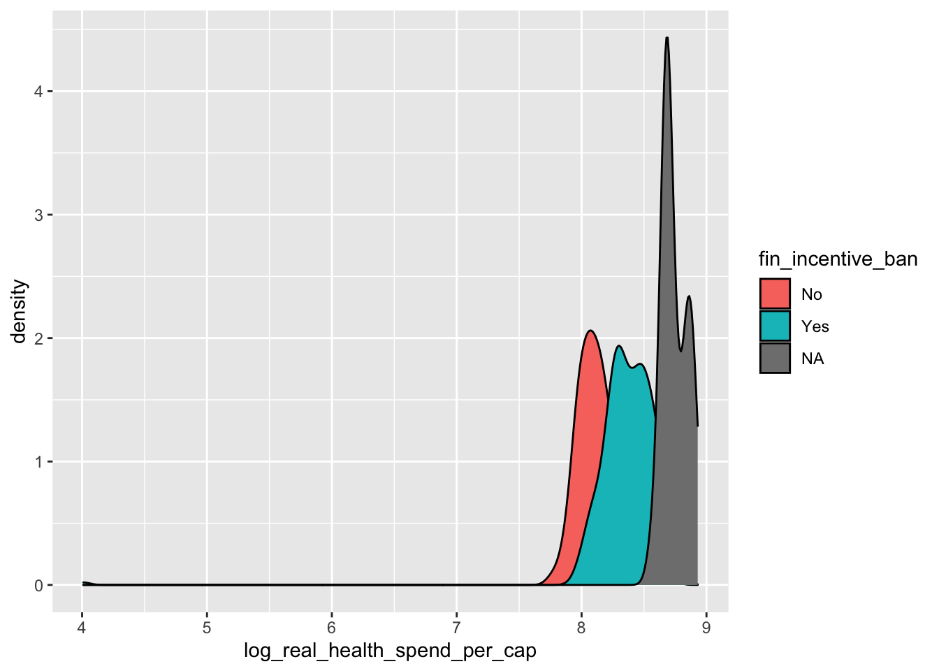
We can remove the missing values in fin_incentive_ban by wrapping our data with the remove_missing() function.
ggplot(data = remove_missing(policy_data),
       mapping = aes(x = log_real_health_spend_per_cap, fill = fin_incentive_ban)) +
  geom_density()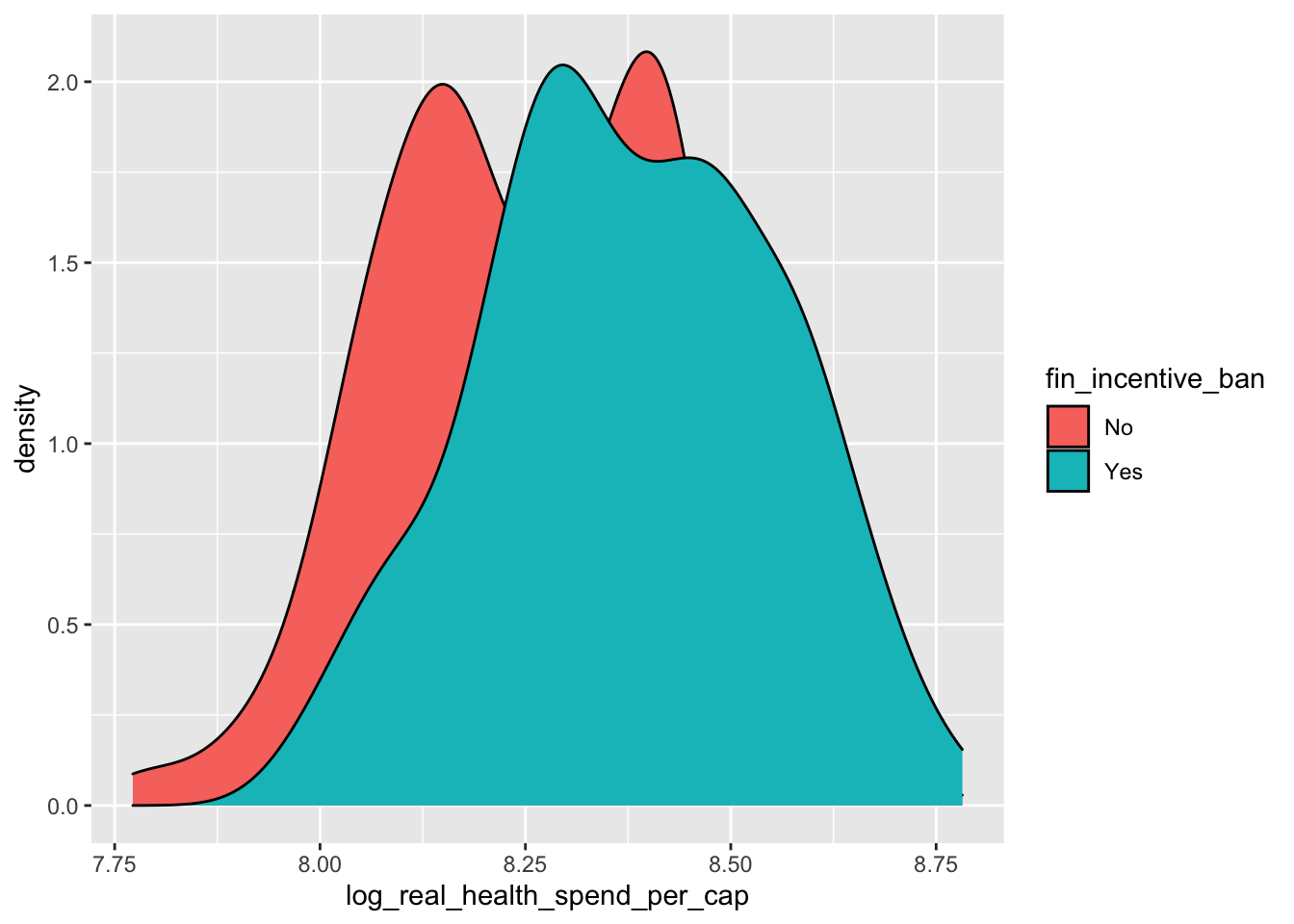
The distributions look fairly similar, and is seems that states with financial incentive bans spend a little bit more. A better way to compare these groups might be a box plot:
ggplot(data = remove_missing(policy_data),
       mapping = aes(x = fin_incentive_ban, y = log_real_health_spend_per_cap)) +
  geom_boxplot()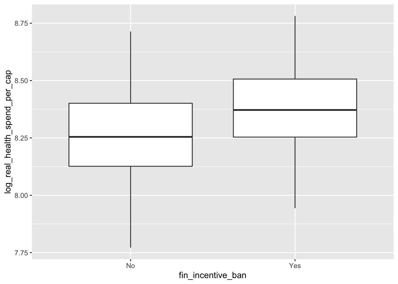
Here it definitely looks like states with financial incentive bans spend more.
What does spending look like across states?
ggplot(data = policy_data,
       mapping = aes(x = state,
                     y = log_real_health_spend_per_cap)) +
  geom_boxplot() +
  coord_flip()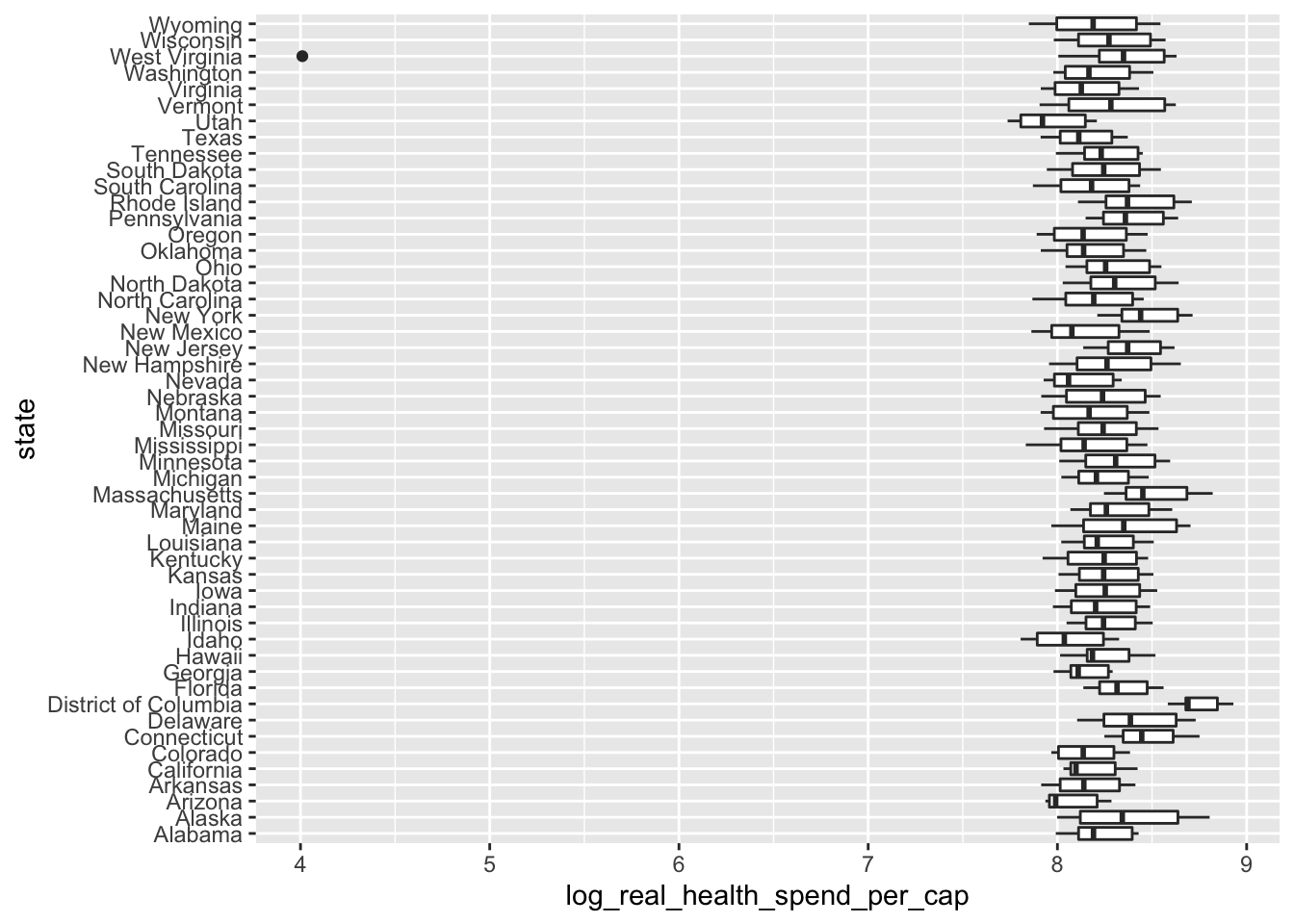
If we order this plot it will be easier to understand. We want to order the states by health spending, so we need to wrap state with the reorder() function. reorder() takes two main arguments: the variable we want to order, then the variable that we want to order them by.
ggplot(data = policy_data,
       mapping = aes(x = reorder(state, health_spend_per_cap),
                     y = log_real_health_spend_per_cap)) +
  geom_boxplot() +
  coord_flip()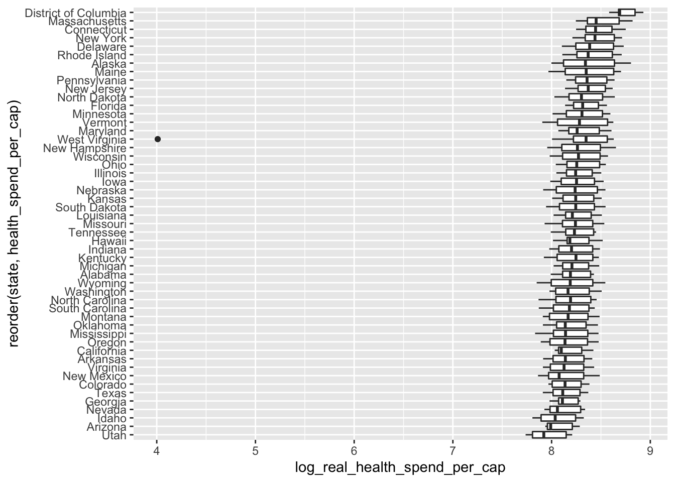
We could add in the fin_incentive_ban to see how financial incentive bans affect health spending in different states by mapping fin_incentive_ban to fill inside of the aes() mapping:
ggplot(data = policy_data,
       mapping = aes(x = reorder(state, health_spend_per_cap),
                     y = log_real_health_spend_per_cap,
                     fill = fin_incentive_ban)) +
  geom_boxplot() +
  coord_flip()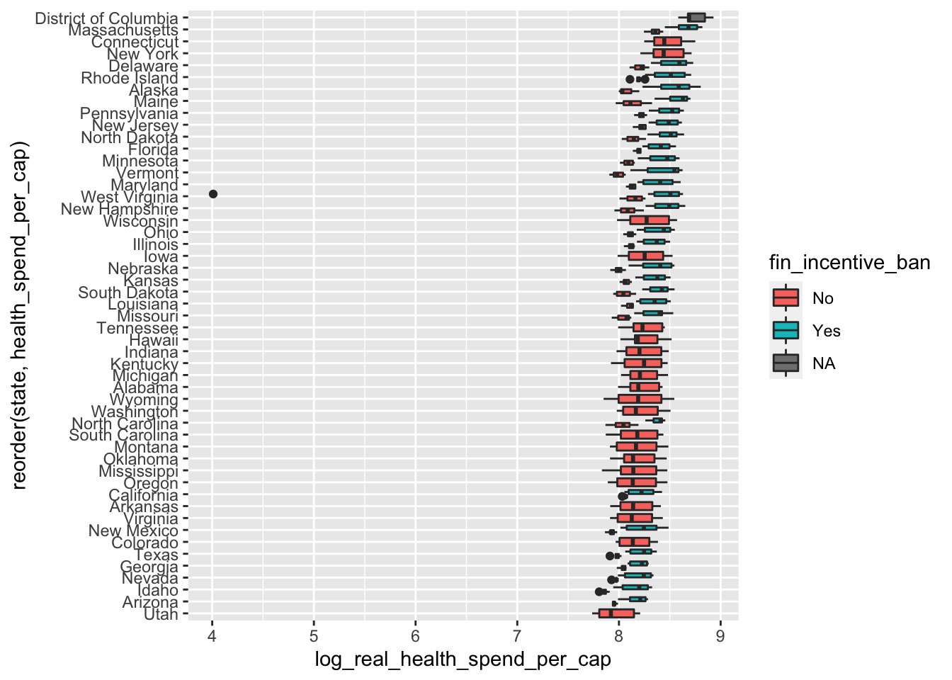
This plot is a bit busy, but it stills shows that states with a financial incentive ban spend more. This is especially apparent for the states that have data before and after financial incentive bans.
How does health spending vary by political party and state? To do that, We’ll plot log_real_health_spend_per_cap on the \(x\)-axis and house_prty_control on the \(y\)-axis, then facet by state. The facet will create subplots for each state.
ggplot(data = policy_data,
       mapping = aes(x = house_prty_control,
                     y = log_real_health_spend_per_cap)) +
  geom_boxplot() +
  facet_wrap(~ state)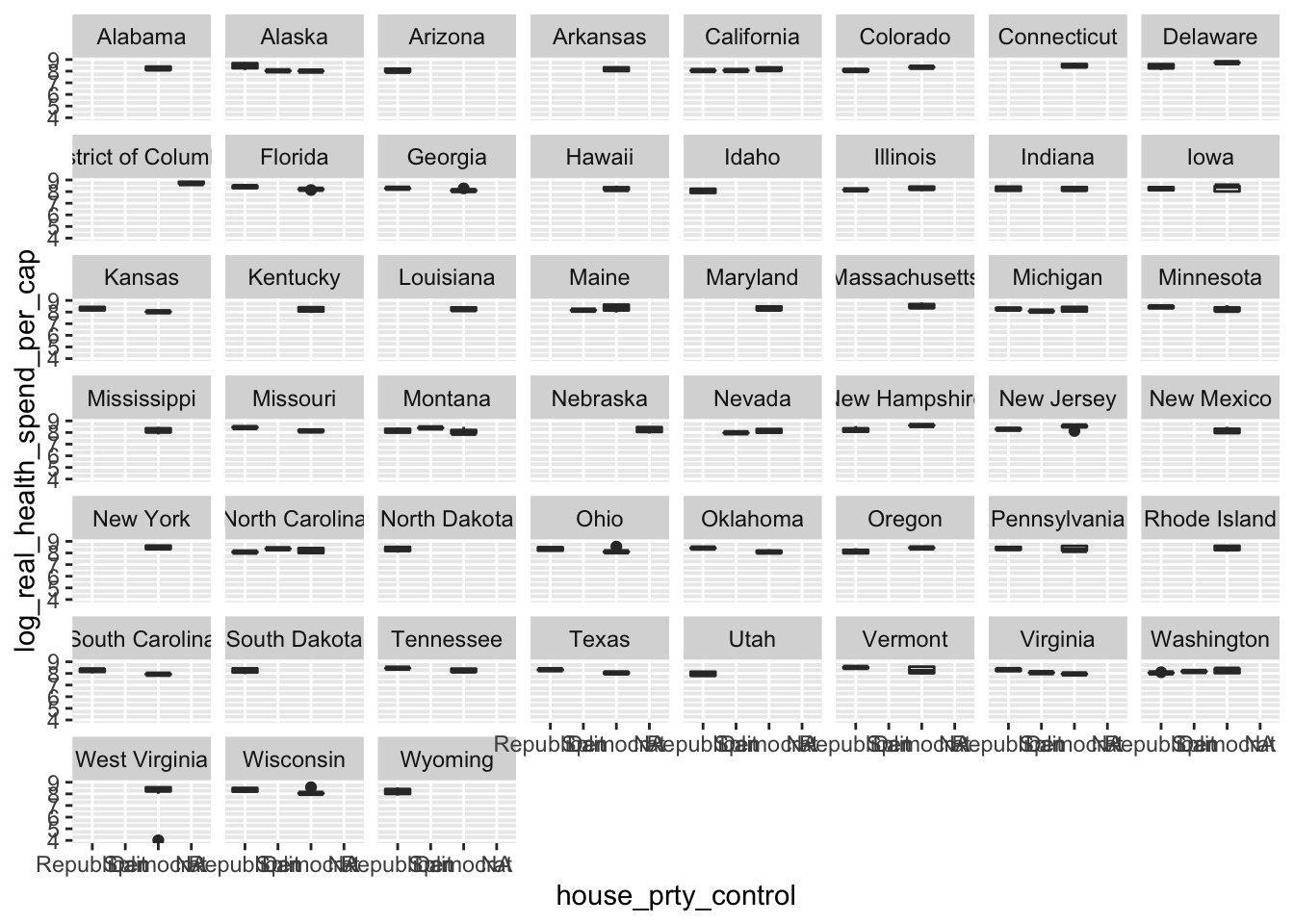
It looks like Democrats generally spend more, but that’s not the case for every state.
As a final plot, let’s see how health spending changes over time. To make the plot look like we want, we need to set group = state:
ggplot(data = remove_missing(policy_data),
       mapping = aes(x = year, y = log_real_health_spend_per_cap,
                     group = state)) +
  geom_line()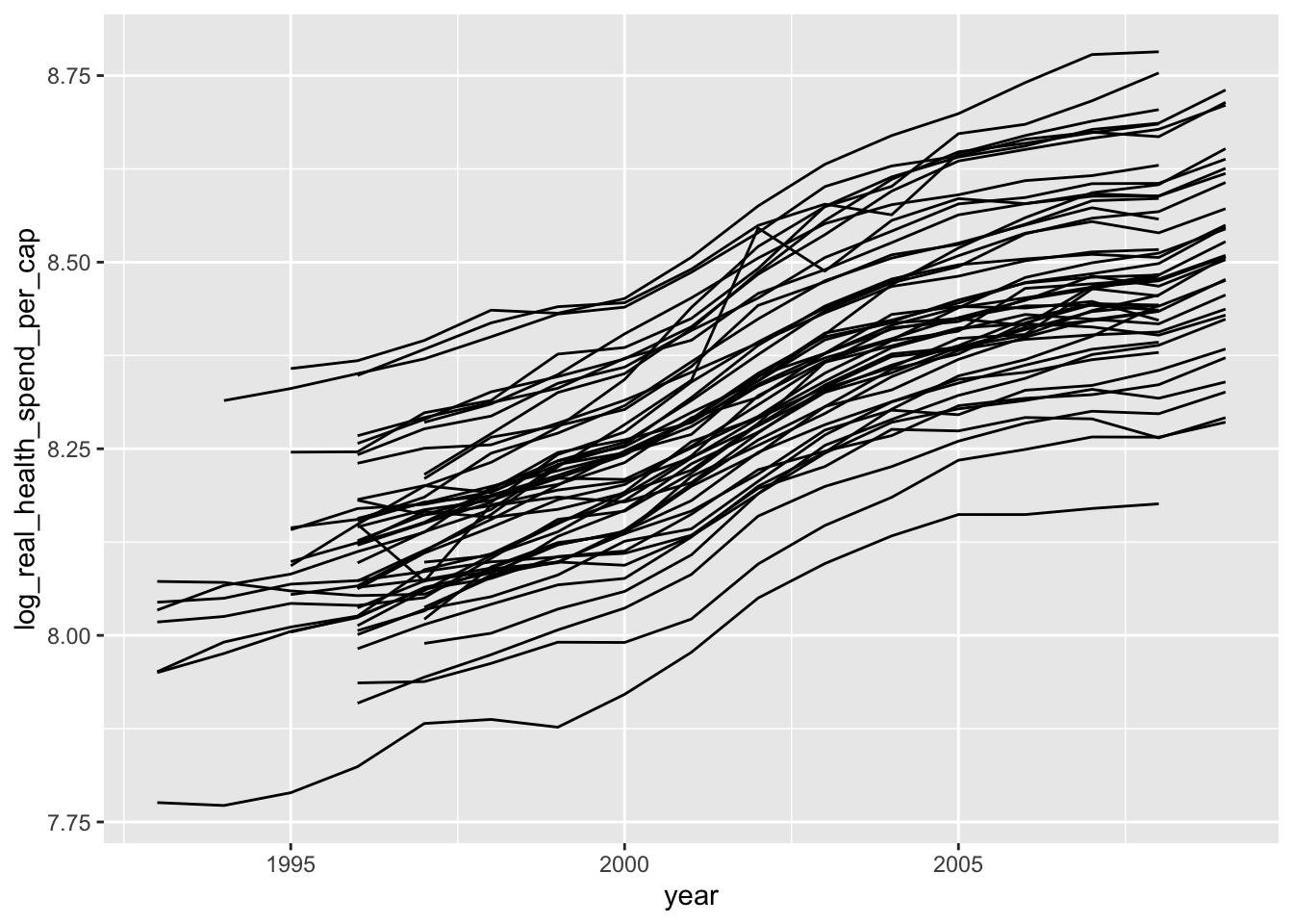
If we decided that we wanted to use this plot in a professional paper, we would need to clean it up a bit. To prevent this guide from getting longer, I’m going to quickly format the plot, but check out the resources listed above for more detailed explanations of plot customization.
ggplot(data = remove_missing(policy_data),
       mapping = aes(x = year, y = log_real_health_spend_per_cap,
                     group = state)) +
  geom_line(size = 0.1) +
  # add labels
  labs(title = "Inflation-Adjusted Health Spending Over Time by State",
       x = "Year",
       y = "Real Health Spending Per Capita (Logged)",
       caption = "This plot shows health spending over time by state.") +
  # add more ticks to the x-axis
  scale_x_continuous(breaks = seq(from = 1993, to = 2010, by = 1)) +
  # change the limits of the x-axis
  coord_cartesian(xlim = c(1993, 2010)) +
  # change the theme to look more professional with the ggpubr package
  ggpubr::theme_pubclean()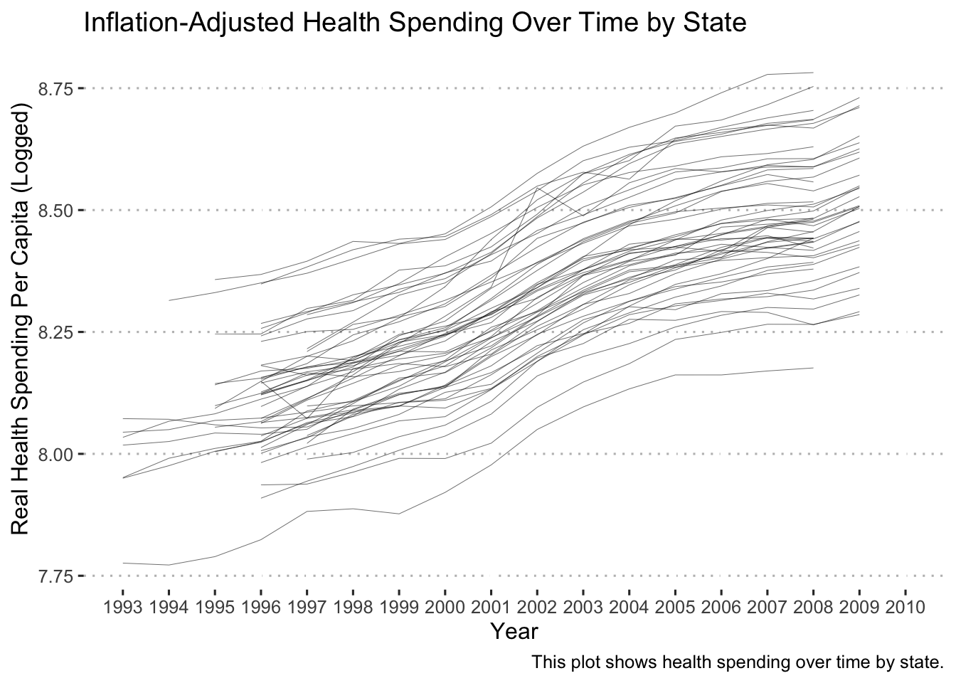
And finally, we can save this figure with ggsave():
ggsave(filename = "health_spend_time.pdf",
       # last_plot() grabs that last plot that was produced as the one to save
       plot = last_plot(),
       height = 5,
       width = 10)
Going Deeper: ggplot2 can also make maps!
There are many different packages that can be used to make maps with ggplot2, but we will use the mapproj package. The process of making maps is fairly straightforward. We need the latitude and longitude for the places that we want to map, and those data need to be joined to the values that we want shown on the map. Let’s start by getting the latitude and longitude coordinates for states. To do so we’ll use the map_data() function:
# Get US Map Coordinates
us <- map_data("state")
glimpse(us)
## Rows: 15,537
## Columns: 6
## $ long <dbl> -87.46201, -87.48493, -87.52503, -87.53076, -87.57087, -87.5…
## $ lat <dbl> 30.38968, 30.37249, 30.37249, 30.33239, 30.32665, 30.32665, …
## $ group <dbl> 1, 1, 1, 1, 1, 1, 1, 1, 1, 1, 1, 1, 1, 1, 1, 1, 1, 1, 1, 1, …
## $ order <int> 1, 2, 3, 4, 5, 6, 7, 8, 9, 10, 11, 12, 13, 14, 15, 16, 17, 1…
## $ region <chr> "alabama", "alabama", "alabama", "alabama", "alabama", "alab…
## $ subregion <chr> NA, NA, NA, NA, NA, NA, NA, NA, NA, NA, NA, NA, NA, NA, NA, …Now we need to merge this data with the policy_data. Before we merge it, however, let’s refine the policy_data to only the data that we want to plot:
# get the data we need for the map from our variables
plot_data <-
  policy_data %>%
  complete(year, state) %>%
  select(state, fin_incentive_ban, year) %>%
  mutate(state = str_to_lower(state)) %>%  # we need to lowercase the state names
  drop_na()

head(plot_data)
## # A tibble: 6 × 3
## state fin_incentive_ban year
## <chr> <fct> <dbl>
## 1 alabama No 1991
## 2 alaska No 1991
## 3 arizona No 1991
## 4 arkansas No 1991
## 5 california No 1991
## 6 colorado No 1991Now we left_join() the longitude and latitude data (us) with plot_data by state which is named region in us:
# Merge Limit Data with Map Coordinates
map_data <- left_join(
  us,
  plot_data,
  by = c("region" = "state") # merge by region (which is called state in our data)
) %>%
  # these steps will make things easier later
  drop_na(year) %>%
  mutate(year = as.integer(year))

head(map_data)
## long lat group order region subregion fin_incentive_ban year
## 1 -87.46201 30.38968 1 1 alabama <NA> No 1991
## 2 -87.46201 30.38968 1 1 alabama <NA> No 1992
## 3 -87.46201 30.38968 1 1 alabama <NA> No 1993
## 4 -87.46201 30.38968 1 1 alabama <NA> No 1994
## 5 -87.46201 30.38968 1 1 alabama <NA> No 1995
## 6 -87.46201 30.38968 1 1 alabama <NA> No 1996Finally, we plot it with geom_polygon() with the longitude mapped to the x-axis and latitude mapped to the y-axis. To color the states with financial incentive bans, we set the fill = fin_incentive_ban. We’ll also facet_wrap() by year so that we can see the change over time.
# plot the map
ggplot(data = map_data,
       mapping = aes(x = long, y = lat, group = group, fill = fin_incentive_ban)) +
  geom_polygon() +
  facet_wrap(~ year) +
  labs(title = "Financial Incentive Bans Over Time",
       fill = "Financial Incentive Ban?") +
  coord_map("albers", lat0 = 39, lat1 = 45) + # this makes the map projection look nice
  theme_void()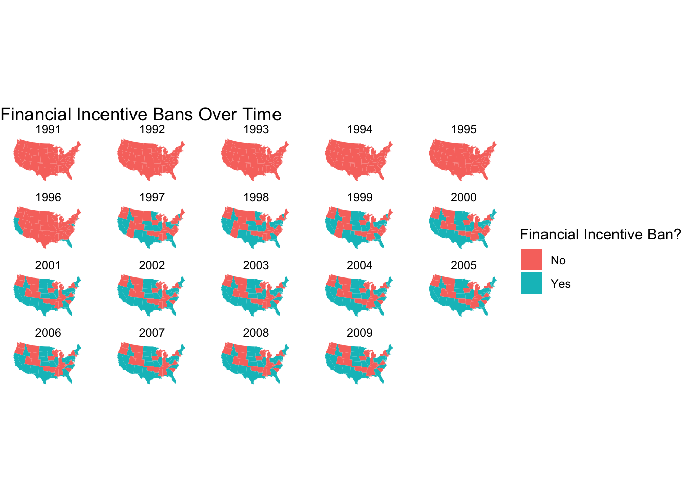
Want to make an animated map that cycles through every year of data instead of showing all the maps at the same time? You can do that with gganimate (which can be used to animate any ggplot()). Note that because we are using geom_polygon() you’ll also need to install the transformr package.
library(gganimate)

# recreate the map and save it to an object
map <-
  ggplot(data = map_data,
       mapping = aes(x = long, y = lat, group = group, fill = fin_incentive_ban)) +
  geom_polygon() +
  coord_map("albers", lat0 = 39, lat1 = 45) + # this makes the map projection look nice
  theme_void()

# set the range of years to plot
years <- max(policy_data$year) - min(policy_data$year)

# create a new map by adding transition_time() to map
animated_map <-
  map +
  transition_time(year)+
  ggtitle("Financial Incentive Bans in: {frame_time}")

# animate!
animate(animated_map, nframes = years, fps = 2)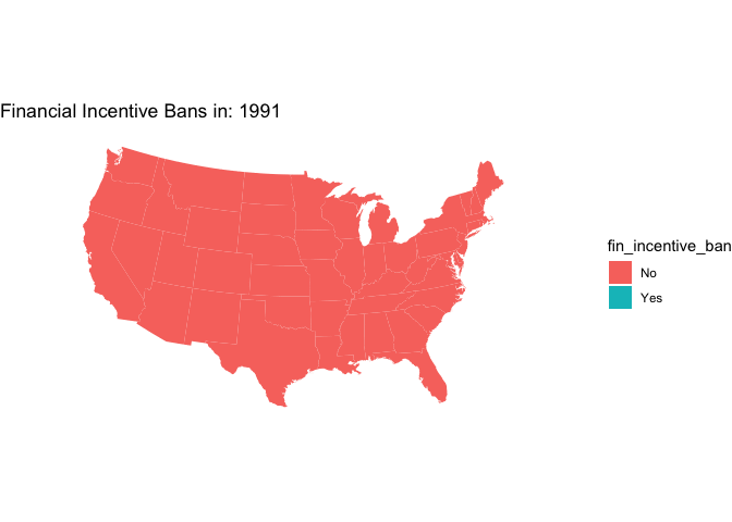
Building a Summary Statistics Table
After thoroughly exploring our data, its a good idea to build a table to summary statistics for the final report/paper. There are a number of excellent tools to do this in R (gt, gtsummary, modelsummary), but we’ll only explore how to do it with modelsummary.
First, we’ll select the data we want.
library(modelsummary)

# select the data we want in the table and convert factors to numeric (this makes things easier)
sum_table_data <-
  policy_data %>%
  select(real_health_spend_per_cap, fin_incentive_ban:senate_ideology) %>%
  mutate(senate_prty_control = as.numeric(senate_prty_control),
         house_prty_control = as.numeric(house_prty_control))
Next, we’ll build a simple table with the mean and standard deviation as the summary statistics:
datasummary(real_health_spend_per_cap + house_ideology + senate_ideology +
              house_prty_control + senate_prty_control ~ (N + Mean + SD),
data = sum_table_data)| N | Mean | SD | |
|---|---|---|---|
| real_health_spend_per_cap | 969 | 3980.88 | 915.28 |
| house_ideology | 696 | 0.02 | 0.55 |
| senate_ideology | 704 | 0.03 | 0.55 |
| house_prty_control | 931 | 2.15 | 0.98 |
| senate_prty_control | 931 | 2.07 | 0.98 |
Not bad. Now let’s separate the data by fin_incentive_ban. We do this by nesting the summary statistics with the * operator after the ~:
datasummary(real_health_spend_per_cap + house_ideology + senate_ideology +
              house_prty_control + senate_prty_control ~
              fin_incentive_ban * (N + Mean + SD),
data = policy_data)| N | Mean | SD | N | Mean | SD | ||
|---|---|---|---|---|---|---|---|
| real_health_spend_per_cap | 592 | 3635.79 | 727.81 | 358 | 4427.95 | 829.41 | |
| house_ideology | 358 | 0.05 | 0.54 | 338 | −0.02 | 0.57 | |
| senate_ideology | 354 | 0.06 | 0.53 | 350 | 0.00 | 0.57 | |
| house_prty_control | Republican | 229 | 159 | ||||
| Split | 15 | 2 | |||||
| Democrat | 342 | 184 | |||||
| senate_prty_control | Republican | 256 | 164 | ||||
| Split | 17 | 8 | |||||
| Democrat | 313 | 173 |
Ok, now let’s rename things and add titles:
datasummary((`Real Health Spending Per Capita` = real_health_spend_per_cap) +
              (`House Ideology` = house_ideology) +
              (`Senate Ideology` = senate_ideology) +
              (`House Party Control` = house_prty_control) +
              (`Senate Party Control` = senate_prty_control) ~
              fin_incentive_ban * (N + Mean + SD),
            data = policy_data,
            title = "Descriptive Statistics",
notes = "An optional note.")| N | Mean | SD | N | Mean | SD | ||
|---|---|---|---|---|---|---|---|
| Real Health Spending Per Capita | 592 | 3635.79 | 727.81 | 358 | 4427.95 | 829.41 | |
| House Ideology | 358 | 0.05 | 0.54 | 338 | −0.02 | 0.57 | |
| Senate Ideology | 354 | 0.06 | 0.53 | 350 | 0.00 | 0.57 | |
| House Party Control | Republican | 229 | 159 | ||||
| Split | 15 | 2 | |||||
| Democrat | 342 | 184 | |||||
| Senate Party Control | Republican | 256 | 164 | ||||
| Split | 17 | 8 | |||||
| Democrat | 313 | 173 | |||||
| An optional note. |
We can make the No and Yes column headers more informative by changing the factor labels:
sum_table_data <-
  policy_data %>%
  mutate(fin_incentive_ban = factor(fin_incentive_ban,
                                    labels = c("No Incentive Ban", "Incentive Ban")))

datasummary((`Real Health Spending Per Capita` = real_health_spend_per_cap) +
              (`House Ideology` = house_ideology) +
              (`Senate Ideology` = senate_ideology) +
              (`House Party Control` = house_prty_control) +
              (`Senate Party Control` = senate_prty_control) ~
              fin_incentive_ban * (N + Mean + SD),
            data = sum_table_data,
            title = "Descriptive Statistics",
notes = "An optional note.")| N | Mean | SD | N | Mean | SD | ||
|---|---|---|---|---|---|---|---|
| Real Health Spending Per Capita | 592 | 3635.79 | 727.81 | 358 | 4427.95 | 829.41 | |
| House Ideology | 358 | 0.05 | 0.54 | 338 | −0.02 | 0.57 | |
| Senate Ideology | 354 | 0.06 | 0.53 | 350 | 0.00 | 0.57 | |
| House Party Control | Republican | 229 | 159 | ||||
| Split | 15 | 2 | |||||
| Democrat | 342 | 184 | |||||
| Senate Party Control | Republican | 256 | 164 | ||||
| Split | 17 | 8 | |||||
| Democrat | 313 | 173 | |||||
| An optional note. |
We save the table to a range of different file types (https://vincentarelbundock.github.io/modelsummary/articles/datasummary.html#output), but we’ll save it as an .html file here with the output argument:
library(flextable)

datasummary((`Real Health Spending Per Capita` = real_health_spend_per_cap) +
              (`House Ideology` = house_ideology) +
              (`Senate Ideology` = senate_ideology) +
              (`House Party Control` = house_prty_control) +
              (`Senate Party Control` = senate_prty_control) ~
              fin_incentive_ban * (N + Mean + SD),
            data = sum_table_data,
            title = "Descriptive Statistics",
            notes = "An optional note.",
            output = "desc_table.html")
Step 4: Develop a Statistical Model and Analyze your Data
After thoroughly exploring our data, we’re ready to make some inferences. We’ll start with a simple linear regression to test the association between the financial incentive bans and health care spending.
Treatment Indicator Model
To test my research question, I will use the following statistical model:
\[\text{Health Spending}_{i} = \alpha + \beta_{1} \text{T}_{i} + \epsilon_{i}\]
where \(T\) is the treatment (fin_incentive_ban). However, because I only want to test my research question for one year of data, I add the following option to my data object: %>% filter(year == 1996), since 1996 is when some of my states had the treatment and some did not. I’m doing this for pedagogical reasons. The goal of this guide is to walk you through a data project, and not so much how to apply advanced regression models.
We can estimate this model in R using the lm() command. As with all other parts of R, if we want to save the model, we need to assign it to an object.
# the ~ essentially means =
fit_01 <- lm(log_real_health_spend_per_cap ~ fin_incentive_ban,
             data = policy_data %>% filter(year == 1996))

# to look at the output with confidence intervals (and without stars!) we'll
# use the broom package
library(broom)
tidy(fit_01, conf.int = TRUE)
## # A tibble: 2 × 7
## term estimate std.error statistic p.value conf.low conf.high
## <chr> <dbl> <dbl> <dbl> <dbl> <dbl> <dbl>
## 1 (Intercept) 8.10 0.0167 486. 2.70e-90 8.07 8.14
## 2 fin_incentive_banYes 0.0776 0.0589 1.32 1.94e- 1 -0.0408 0.196Our model says that adopting policies that ban financial incentives for doctors decreases a state’s per capita spending on health care by about $100 (e^{0.0776} - 1) = $ 8.07 percent. Not a massive effect, but it is statistically significant. Does that mean that we’ve found a causal effect?
Now the model with controls:
\[\text{Health Spending}_{i} = \alpha + \beta_{1} \text{T}_{i} + \beta \text{Dem House}_{i} + \beta_{3} \text{Dem Senate}_i + \beta_{4} \text{Senate Ideo}_{i} + \beta_{5} \text{House Ideo}_{i} + \epsilon_{i}\]
fit_02 <- lm(log_real_health_spend_per_cap ~ fin_incentive_ban +
                 house_prty_control + senate_prty_control + house_ideology +
                 senate_ideology,
               data = policy_data %>% filter(year == 1996))

tidy(fit_02, conf.int = TRUE)
## # A tibble: 7 × 7
## term estimate std.error statistic p.value conf.low conf.high
## <chr> <dbl> <dbl> <dbl> <dbl> <dbl> <dbl>
## 1 (Intercept) 8.15 0.0251 325. 1.62e-62 8.10 8.20
## 2 fin_incentive_banYes 0.0715 0.0489 1.46 1.52e- 1 -0.0276 0.171
## 3 house_prty_controlDe… -0.0982 0.0517 -1.90 6.57e- 2 -0.203 0.00673
## 4 senate_prty_controlS… -0.0912 0.0960 -0.950 3.49e- 1 -0.286 0.104
## 5 senate_prty_controlD… 0.0284 0.0492 0.578 5.67e- 1 -0.0714 0.128
## 6 house_ideology -0.252 0.0567 -4.45 8.34e- 5 -0.367 -0.137
## 7 senate_ideology 0.0769 0.0561 1.37 1.79e- 1 -0.0369 0.191Notice how much the point estimate slightly decreases after including controls. Now the model is telling us that a when a state adopts policies that ban financial incentives for doctors decreases a state’s per capita spending on health care by about 7.42 percent.
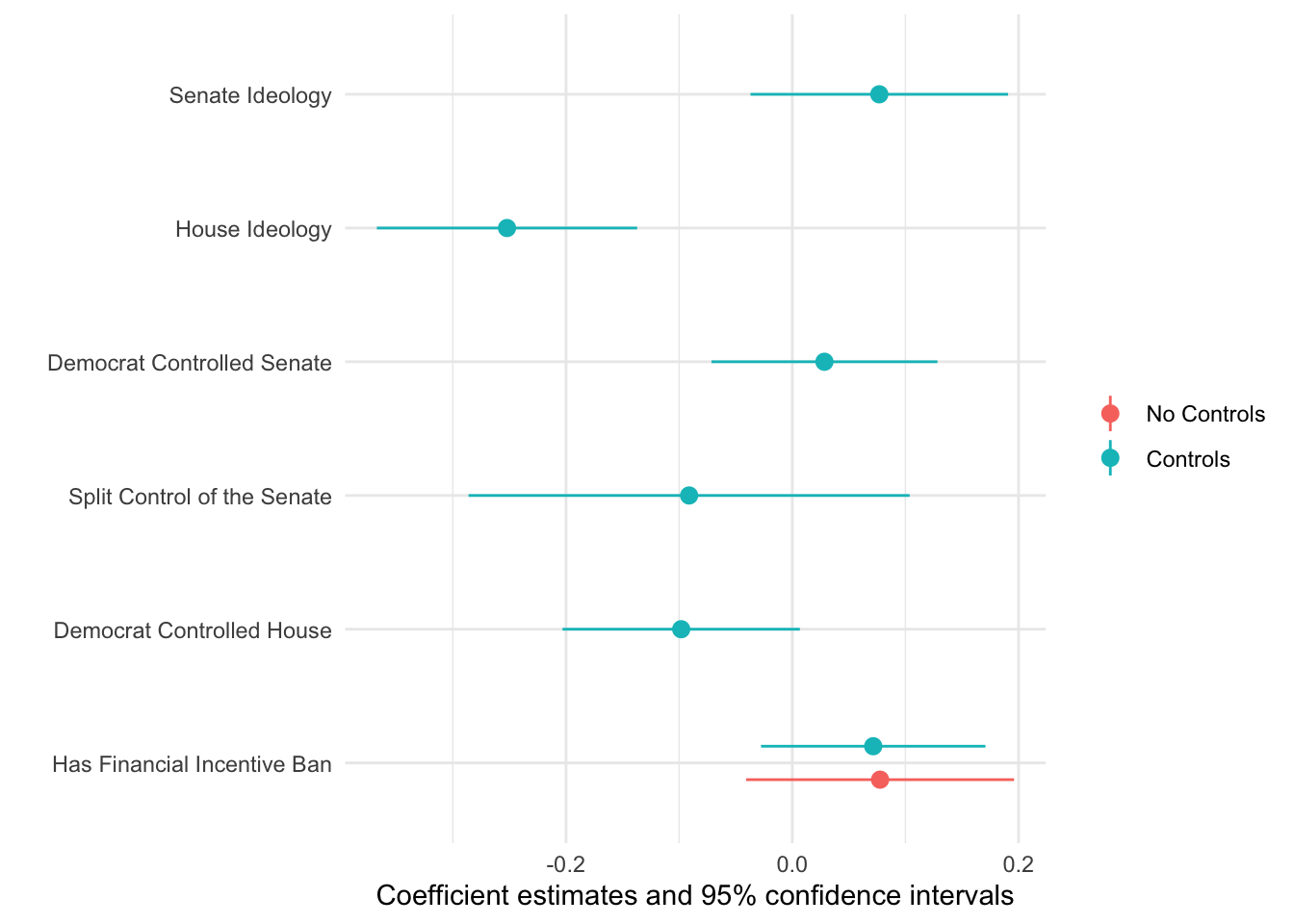
Let’s make a table for these results with modelsummary.
library(gt)

modelsummary(
  list(fit_01, fit_02),
  coef_map = c("fin_incentive_banYes" = "Has Financial Incentive Ban",
               "house_prty_controlDemocrat" = "Democrat Controlled House",
               "senate_prty_controlSplit" = "Split Control of the Senate",
               "senate_prty_controlDemocrat" = "Democrat Controlled Senate",
               "house_ideology" = "House Ideology",
               "senate_ideology" = "Senate Ideology",
               "(Intercept)" = "Intercept"),
  gof_omit = "R2|AIC",
  output = "gt"
) %>%
  tab_spanner(label = "Outcome: Real Health Spending Per Capita (logged)",
              columns = 2:3) %>%
  tab_footnote(footnote = "Models fit using OLS.",
locations = cells_column_spanners(spanners = everything()))| Outcome: Real Health Spending Per Capita (logged)1 | ||
|---|---|---|
| Model 1 | Model 2 | |
| Has Financial Incentive Ban | 0.078 | 0.072 |
| (0.059) | (0.049) | |
| Democrat Controlled House | -0.098 | |
| (0.052) | ||
| Split Control of the Senate | -0.091 | |
| (0.096) | ||
| Democrat Controlled Senate | 0.028 | |
| (0.049) | ||
| House Ideology | -0.252 | |
| (0.057) | ||
| Senate Ideology | 0.077 | |
| (0.056) | ||
| Intercept | 8.103 | 8.154 |
| (0.017) | (0.025) | |
| Num.Obs. | 50 | 42 |
| BIC | -66.5 | -64.4 |
| Log.Lik. | 39.098 | 47.149 |
| F | 1.737 | 6.429 |
| RMSE | 0.11 | 0.09 |
| 1 Models fit using OLS. | ||
Now let’s plot these coefficient estimates. Again, we’ll use the modelsummary package which has a modelplot() function:
modelplot(
  list("No Controls" = fit_01, "Controls" = fit_02),
  coef_map = c("fin_incentive_banYes" = "Has Financial Incentive Ban",
               "house_prty_controlDemocrat" = "Democrat Controlled House",
               "senate_prty_controlSplit" = "Split Control of the Senate",
               "senate_prty_controlDemocrat" = "Democrat Controlled Senate",
               "house_ideology" = "House Ideology",
               "senate_ideology" = "Senate Ideology")
)
Going Deeper: Fitting Many Models to See Trends Over Time
In some cases, we might want to see how the effect of the treatment changes over time. While we could accomplish this with a complicated multilevel model, an easier approach is to split up the data by year and estimate a separate regression for each year. To do that, we’ll make use of a new function called group_nest() that nests a data frame according to a grouping variable - year in this case. Let’s take a look:
policy_data %>%
  filter(year >= 1996) %>% # remove years before the treatment started
  group_nest(year) # split the data by year
## # A tibble: 14 × 2
## year data
## <dbl> <list<tibble[,13]>>
## 1 1996 [51 × 13]
## 2 1997 [51 × 13]
## 3 1998 [51 × 13]
## 4 1999 [51 × 13]
## 5 2000 [51 × 13]
## 6 2001 [51 × 13]
## 7 2002 [51 × 13]
## 8 2003 [51 × 13]
## 9 2004 [51 × 13]
## 10 2005 [51 × 13]
## 11 2006 [51 × 13]
## 12 2007 [51 × 13]
## 13 2008 [51 × 13]
## 14 2009 [51 × 13]So what did that do? We now have on row for each year, and the data column contains a data frame for each row of data. We created a data frame for each year of data. With this, we can easily estimate a regression on each data frame with the map() function. map() works by applying a function, or formula, to each element of an object. In this case, we want to run a linear regression on each data frame in our nested data:
many_models <-
  policy_data %>%
  filter(year >= 1996) %>% # remove years before the treatment started
  group_nest(year) %>%  # split the data by year
  mutate(model = map(data, ~ lm(log_real_health_spend_per_cap ~ fin_incentive_ban +
                                  house_prty_control + senate_prty_control + house_ideology +
                                  senate_ideology,
                                data = .x)))
many_models
## # A tibble: 14 × 3
## year data model
## <dbl> <list<tibble[,13]>> <list>
## 1 1996 [51 × 13] <lm>
## 2 1997 [51 × 13] <lm>
## 3 1998 [51 × 13] <lm>
## 4 1999 [51 × 13] <lm>
## 5 2000 [51 × 13] <lm>
## 6 2001 [51 × 13] <lm>
## 7 2002 [51 × 13] <lm>
## 8 2003 [51 × 13] <lm>
## 9 2004 [51 × 13] <lm>
## 10 2005 [51 × 13] <lm>
## 11 2006 [51 × 13] <lm>
## 12 2007 [51 × 13] <lm>
## 13 2008 [51 × 13] <lm>
## 14 2009 [51 × 13] <lm>Now we have a model column that contains a regression for each row. But how can we work with this?? We need to unnest() the column, but before that, let’s use map() again to apply the tidy() function to each regression so that we can see the coefficient estimates of each model:
many_models %>%
  mutate(coef = map(model, tidy, conf.int = TRUE))
## # A tibble: 14 × 4
## year data model coef
## <dbl> <list<tibble[,13]>> <list> <list>
## 1 1996 [51 × 13] <lm> <tibble [7 × 7]>
## 2 1997 [51 × 13] <lm> <tibble [7 × 7]>
## 3 1998 [51 × 13] <lm> <tibble [8 × 7]>
## 4 1999 [51 × 13] <lm> <tibble [8 × 7]>
## 5 2000 [51 × 13] <lm> <tibble [8 × 7]>
## 6 2001 [51 × 13] <lm> <tibble [8 × 7]>
## 7 2002 [51 × 13] <lm> <tibble [7 × 7]>
## 8 2003 [51 × 13] <lm> <tibble [8 × 7]>
## 9 2004 [51 × 13] <lm> <tibble [8 × 7]>
## 10 2005 [51 × 13] <lm> <tibble [8 × 7]>
## 11 2006 [51 × 13] <lm> <tibble [8 × 7]>
## 12 2007 [51 × 13] <lm> <tibble [7 × 7]>
## 13 2008 [51 × 13] <lm> <tibble [7 × 7]>
## 14 2009 [51 × 13] <lm> <tibble [6 × 7]>This gives us another column coef with data frames of each model’s output. FINALLY, let’s unnest() that column:
many_models %>%
  mutate(coef = map(model, tidy, conf.int = TRUE)) %>%
  unnest(cols = c(coef))
## # A tibble: 105 × 10
## year data model term estimate std.error statistic p.value conf.low
## <dbl> <list<tibbl> <lis> <chr> <dbl> <dbl> <dbl> <dbl> <dbl>
## 1 1996 [51 × 13] <lm> (Int… 8.15 0.0251 325. 1.62e-62 8.10
## 2 1996 [51 × 13] <lm> fin_… 0.0715 0.0489 1.46 1.52e- 1 -0.0276
## 3 1996 [51 × 13] <lm> hous… -0.0982 0.0517 -1.90 6.57e- 2 -0.203
## 4 1996 [51 × 13] <lm> sena… -0.0912 0.0960 -0.950 3.49e- 1 -0.286
## 5 1996 [51 × 13] <lm> sena… 0.0284 0.0492 0.578 5.67e- 1 -0.0714
## 6 1996 [51 × 13] <lm> hous… -0.252 0.0567 -4.45 8.34e- 5 -0.367
## 7 1996 [51 × 13] <lm> sena… 0.0769 0.0561 1.37 1.79e- 1 -0.0369
## 8 1997 [51 × 13] <lm> (Int… 8.18 0.0315 259. 3.88e-66 8.11
## 9 1997 [51 × 13] <lm> fin_… -0.00428 0.0326 -0.131 8.96e- 1 -0.0702
## 10 1997 [51 × 13] <lm> hous… -0.142 0.0629 -2.26 2.92e- 2 -0.269
## # … with 95 more rows, and 1 more variable: conf.high <dbl>Ta-da! Looks great, and because this is a data frame we can use ggplot() to plot it. We only care about fin_incentive_ban so we’ll filter for that variable in the term column, then we’ll feed that into ggplot():
many_models %>%
  mutate(coef = map(model, tidy, conf.int = TRUE)) %>%
  unnest(cols = c(coef)) %>%
  filter(term == "fin_incentive_banYes") %>%
  ggplot(aes(x = year, y = estimate, ymax = conf.high, ymin = conf.low)) +
  geom_pointrange() +
  scale_x_continuous(breaks = seq(from = 1996, to = 2009, by = 1)) +
  ggpubr::theme_pubclean()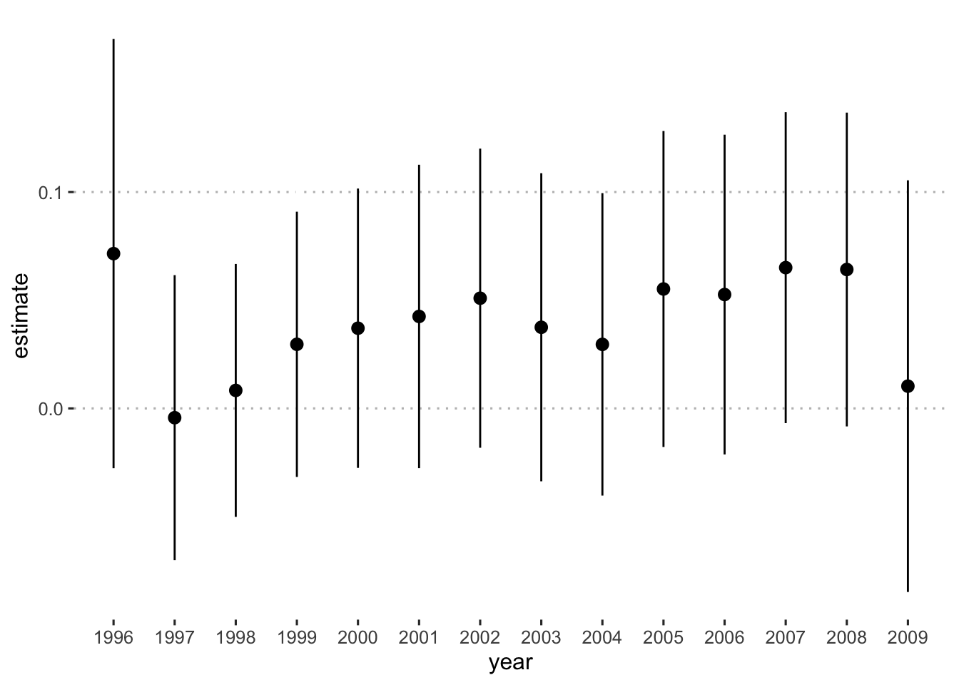
There you have it. The effect of the treatment in each year of the data.
Differences-in-differences Model
With differences-in-differences estimation, our goal is to control for differences in the treatment and control groups by looking only at how they change over time. A simple estimation of this uses this formula:
\[ \text{DiD Estimate} = \text{E}[Y^{after}_{treated} - Y^{after}_{control}] - \text{E}[Y^{before}_{treated} - Y^{before}_{control}] \]
This gives us the difference between the treatment and control groups after the intervention (\(\text{E}[Y^{after}_{treated} - Y^{after}_{control}]\)) minus the difference between the treatment and the control group before the intervention (\(\text{E}[Y^{before}_{treatment} - Y^{before}_{control}]\)). Now let’s calculate this with our data.
Before building the model, however, we are going to restrict our data to just six states. Three that adopted the policy in 1996 (California, Florida, and Maryland) and three that never adopted the policy (Virginia, Colorado, and Washington). Note that the | operator means “or.” This will make things easier, as I will explain later.
policy_data <-
  policy_data %>%
    filter(state == "California" | state == "Colorado" | state == "Florida" |
           state == "Maryland" | state == "Washington" | state == "Virginia")
Now we need to add a variable to identify which states are affected by the treatment and the first year that they received the treatment.
diff_data <-
  policy_data %>%
  mutate(treatment_group = ifelse(state == "California" | state == "Florida" |
                                    state == "Maryland", 1, 0))
Now we have a variable named treatment_group that tells us which states are in the treatment group.
Let’s review the important elements of our dataset. We have a column called fin_incentive_ban that tells us the year when states in the treatment group received the treatment and we have a column called treatment_group that tells us which states are in the treatment group and which are in the control group.
I limited my data to just three that adopt the policy in 1996 and three that never adopt the policy to simplify the analysis. We could include all states, but that introduces complexity since not every state adopts the treatment in the same year. This leads to what is called a staggered difference in difference design. There have been a plethora of papers published on staggered difference in difference designs in the last 5 years - so these methods are rapidly changing. See How much should we trust staggered difference-in-differences estimates? as a primer for how they work and their potential problems. Instead of exploring that, I’m just going to compare two states.
Before we calculate the DiD estimate, and since we have multiple pre-treatment periods, let’s check the parallel trends assumption:
ggplot(data = diff_data,
       aes(x = year, y = log_real_health_spend_per_cap,
           shape = state, color = fin_incentive_ban)) +
  geom_point() +
  geom_line() +
  geom_vline(xintercept = 1996, lty = 2) +
  annotate("label", x = 1997.5, y = 8.5, label = "Policy Adoption") +
  labs(x = "Year", y = "Health Spending per Capita", color = "Treatment State?",
       shape = "State") +
  ggpubr::theme_pubclean()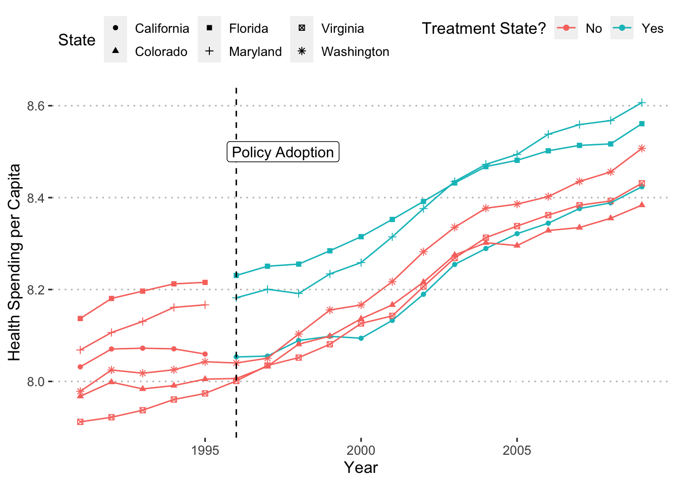
Those trends really aren’t parallel. Why does it matter? Well, if health spending in, say, California was already trending up, as compared to Colorado, before the treatment began then any differences after the treatment are probably due to whatever was causing those previous trends. In fact, this plot shows that even after the treatment states adopt the policy, all states follow similar trends. This indicates that the policy doesn’t really affect health spending.
Now we’re ready to calculate the DiD estimate:
diff_data %>%
  group_by(treatment_group, fin_incentive_ban) %>%
  summarize(mean = mean(log_real_health_spend_per_cap))
## # A tibble: 3 × 3
## # Groups: treatment_group [2]
## treatment_group fin_incentive_ban mean
## <dbl> <fct> <dbl>
## 1 0 No 8.17
## 2 1 No 8.13
## 3 1 Yes 8.34Row one shows the mean health spending for the control group before the treatment period, row two shows the mean health spending for the treatment group before the treatment period, and row three shows the mean health spending for the treatment group after the treatment takes place. But what about the mean health spending for the control group after the treatment takes place? Go back and look through data for members of the control group. What is filter(fin_incentive_ban == "Yes") for states in the control group?
There are no states in the control group that have a value of “Yes” in the fin_incentive_ban column. That means that we can’t calculate \(\text{E}[Y^{after}_{control}]\), or more technically, \(\text{E}[Y(T = 0 | D = 1)]\) where \(D\) indicates treatment period and \(T\) indicates group assignment.
How can we fix this? All we have to do is create a column that tells us when the treatment period starts (which is 1996 for our data):
diff_data <-
  diff_data %>%
  mutate(treatment_period = ifelse(year >= 1996, 1, 0))
Now let’s look at the treatment and control states to see what is going with these columns:
diff_data %>%
  select(year, state, fin_incentive_ban, treatment_group, treatment_period) %>%
  arrange(state)
## # A tibble: 114 × 5
## year state fin_incentive_ban treatment_group treatment_period
## <dbl> <chr> <fct> <dbl> <dbl>
## 1 1991 California No 1 0
## 2 1992 California No 1 0
## 3 1993 California No 1 0
## 4 1994 California No 1 0
## 5 1995 California No 1 0
## 6 1996 California Yes 1 1
## 7 1997 California Yes 1 1
## 8 1998 California Yes 1 1
## 9 1999 California Yes 1 1
## 10 2000 California Yes 1 1
## # … with 104 more rowsFor California, it doesn’t look like there is any difference between the fin_incentive_ban and treatment_period columns. But what about Colorado?
diff_data %>%
  filter(state == "Colorado") %>%
  select(year, state, fin_incentive_ban, treatment_period)
## # A tibble: 19 × 4
## year state fin_incentive_ban treatment_period
## <dbl> <chr> <fct> <dbl>
## 1 1991 Colorado No 0
## 2 1992 Colorado No 0
## 3 1993 Colorado No 0
## 4 1994 Colorado No 0
## 5 1995 Colorado No 0
## 6 1996 Colorado No 1
## 7 1997 Colorado No 1
## 8 1998 Colorado No 1
## 9 1999 Colorado No 1
## 10 2000 Colorado No 1
## 11 2001 Colorado No 1
## 12 2002 Colorado No 1
## 13 2003 Colorado No 1
## 14 2004 Colorado No 1
## 15 2005 Colorado No 1
## 16 2006 Colorado No 1
## 17 2007 Colorado No 1
## 18 2008 Colorado No 1
## 19 2009 Colorado No 1In 1996 treatment_period gets a value of 1 even though the states in the “control” group never receive the treatment.
With the treatment_group and the treatment_period columns, we have all the ingredients that we need. Now let’s finish calculating the post-treatment differences and the DiD estimate.
diff_values <-
  diff_data %>%
  group_by(treatment_group, treatment_period) %>%
  summarize(mean = mean(log_real_health_spend_per_cap)) %>%
  arrange(treatment_period)
diff_values
## # A tibble: 4 × 3
## # Groups: treatment_group [2]
## treatment_group treatment_period mean
## <dbl> <dbl> <dbl>
## 1 0 0 7.98
## 2 1 0 8.13
## 3 0 1 8.24
## 4 1 1 8.34# DiD estimate
(diff_values[4, 3] - diff_values[3, 3]) - (diff_values[2, 3] - diff_values[1, 3])## mean
## 1 -0.04649887Looks like the treatment has a negative effect on the log of health spending per capita. Specifically, when a state adopts policies that ban financial incentives for doctors decreases a state’s per capita spending on health care by about (exp(-0.03052237) - 1) * 100 = 3 percentage points.
It’s great that we have the DiD estimate, but if we want to conduct a hypothesis test we’ll need to calculate its standard errors. The easiest way to do this is to run a regression. The specification we need to use is this:
\[ \log(\text{Health Spending})_{it} = \alpha + \beta_{1} \text{T}_{it} + \beta_{2} \text{G}_{it} + \beta_{3}\text{T}_{it} \times \text{G}_{it} + \epsilon_{it} \]
where \(T\) is the treatment_period, \(G\) is treatment_group, and \(\beta_{3}\) is estimate for the interaction between treatment_period and treatment_group (this is the DiD estimate). Let’s run it!
# R is smart enough to include all three terms when we tell it to multiply
# to different variables
diff_fit <- lm(log_real_health_spend_per_cap ~ treatment_period * treatment_group,
               data = diff_data)
tidy(diff_fit, conf.int = TRUE)
## # A tibble: 4 × 7
## term estimate std.error statistic p.value conf.low conf.high
## <chr> <dbl> <dbl> <dbl> <dbl> <dbl> <dbl>
## 1 (Intercept) 7.98 0.0341 234. 3.08e-150 7.92 8.05
## 2 treatment_period 0.257 0.0397 6.46 2.92e- 9 0.178 0.336
## 3 treatment_group 0.143 0.0482 2.96 3.81e- 3 0.0470 0.238
## 4 treatment_period:tr… -0.0465 0.0562 -0.827 4.10e- 1 -0.158 0.0649Check out the estimate for our interaction treatment_period:treatment_group! Exactly what we calculated. Unfortunately, however, the treatment doesn’t seem to have any effect. This is not a great differences in difference model because the assumptions don’t hold, but hopefully it showed you how diff-in-diff estimation works. Let’s add this model to our results table.
modelsummary(
  list("No Controls" = fit_01,
       "Controls" = fit_02,
       "Diff-in-Diff" = diff_fit),
  coef_map = c("fin_incentive_banYes" = "Has Financial Incentive Ban",
               "treatment_period:treatment_group" = "Diff-in-Diff Estimate",
               "house_prty_controlDemocrat" = "Democrat Controlled House",
               "senate_prty_controlSplit" = "Split Control of the Senate",
               "senate_prty_controlDemocrat" = "Democrat Controlled Senate",
               "house_ideology" = "House Ideology",
               "senate_ideology" = "Senate Ideology",
               "treatment_period" = "Treatment Period",
               "treatment_group" = "Treatment Group",
               "(Intercept)" = "Intercept"),
  gof_omit = "R2|AIC",
  output = "gt"
) %>%
  tab_spanner(label = "Outcome: Real Health Spending Per Capita (logged)",
              columns = 2:4) %>%
  tab_footnote(footnote = "Models fit using OLS.",
locations = cells_column_spanners(spanners = everything()))| Outcome: Real Health Spending Per Capita (logged)1 | |||
|---|---|---|---|
| No Controls | Controls | Diff-in-Diff | |
| Has Financial Incentive Ban | 0.078 | 0.072 | |
| (0.059) | (0.049) | ||
| Diff-in-Diff Estimate | -0.046 | ||
| (0.056) | |||
| Democrat Controlled House | -0.098 | ||
| (0.052) | |||
| Split Control of the Senate | -0.091 | ||
| (0.096) | |||
| Democrat Controlled Senate | 0.028 | ||
| (0.049) | |||
| House Ideology | -0.252 | ||
| (0.057) | |||
| Senate Ideology | 0.077 | ||
| (0.056) | |||
| Treatment Period | 0.257 | ||
| (0.040) | |||
| Treatment Group | 0.143 | ||
| (0.048) | |||
| Intercept | 8.103 | 8.154 | 7.983 |
| (0.017) | (0.025) | (0.034) | |
| Num.Obs. | 50 | 42 | 114 |
| BIC | -66.5 | -64.4 | -118.4 |
| Log.Lik. | 39.098 | 47.149 | 71.030 |
| F | 1.737 | 6.429 | 29.638 |
| RMSE | 0.11 | 0.09 | 0.13 |
| 1 Models fit using OLS. | |||
Summary
Wow! That was a lot of information! Remember, the goal of this guide is show you how to work through all the steps of a data project so that you can complete a high-quality project of your own. If you read this straight through, well done! Chances are thought, that this will work better as a reference to help you solve problems that you encounter with your projects.