A General Guide to Generalized Linear Models
This post will walk you through how to use some of the most common generalized linear model and explain what problems they help solve and why. Before going through this code, I suggest that you take some time to review the presentation slides that I put together here.
GLM Overview
Forget generalizing it, what is the general linear model?
The general linear model is just the same basic linear regression model you know and love:
\[y_i = \alpha + \beta x_i + \epsilon_i\]
This model makes a lot of assumptions about your data, but you can’t tell that from the way that the model is written. To see what we’re hiding, let’s write this model a different way:
\[ \begin{aligned} y_i &\sim \text{Normal}(\mu_i, \sigma^2) \\ \mu_i &= \alpha + \beta \times x_i \end{aligned} \]
where \(\sim\) means “distributed”. So, \(y\) is normally distributed with a mean of \(\mu\) and a constant variance of \(\sigma^2\). Since we want to estimate the average outcome, we write the model as a model of the mean with some linear equation: \(\mu = \alpha + \beta * x\).
So,
\[ \begin{aligned} y_i &\sim \text{Normal}(\mu_i, \sigma^2) \\ \mu_i &= \alpha + \beta \times x_i \end{aligned} \]
is the more complete way to express:
\[y = \alpha + \beta x_i + \epsilon_i\]
because it tells us what likelihood and link (more on this later) functions we are using.
What are likelihood functions, again?
Likelihood functions are essentially probability models of our data. They provide a mathematical model of the process that generates our data. Remember, the goal of statistical modeling is to build models that can make accurate predictions and describe data! We do this by choosing likelihood functions that describe observed data.
Generalizing the General Linear Model
What if the normal distribution doesn’t describe our data?
As an example, we’re going to use data on flights in the US:
head(flights)## # A tibble: 6 × 23
## year month day dep_time sched_dep_time dep_delay arr_time sched_arr_time
## <int> <int> <int> <int> <int> <dbl> <int> <int>
## 1 2013 12 3 1809 1815 -6 2051 2127
## 2 2013 9 27 1516 1520 -4 1739 1740
## 3 2013 5 2 1350 1330 20 1645 1622
## 4 2013 9 21 1434 1420 14 1555 1553
## 5 2013 8 23 1939 1830 69 2238 2126
## 6 2013 10 4 1900 1900 0 2248 2235
## # … with 15 more variables: arr_delay <dbl>, carrier <chr>, flight <int>,
## # tailnum <chr>, origin <chr>, dest <chr>, air_time <dbl>, distance <dbl>,
## # hour <dbl>, minute <dbl>, time_hour <dttm>, flight_delayed <chr>,
## # delayed <dbl>, distance_c <dbl>, distance_2sd <dbl>Let’s try to see if the distance of a flight can predict whether the flight is delayed or not. What probability model would describe flight delays? The normal distribution?
ggplot(flights, aes(x = delayed)) +
  geom_density()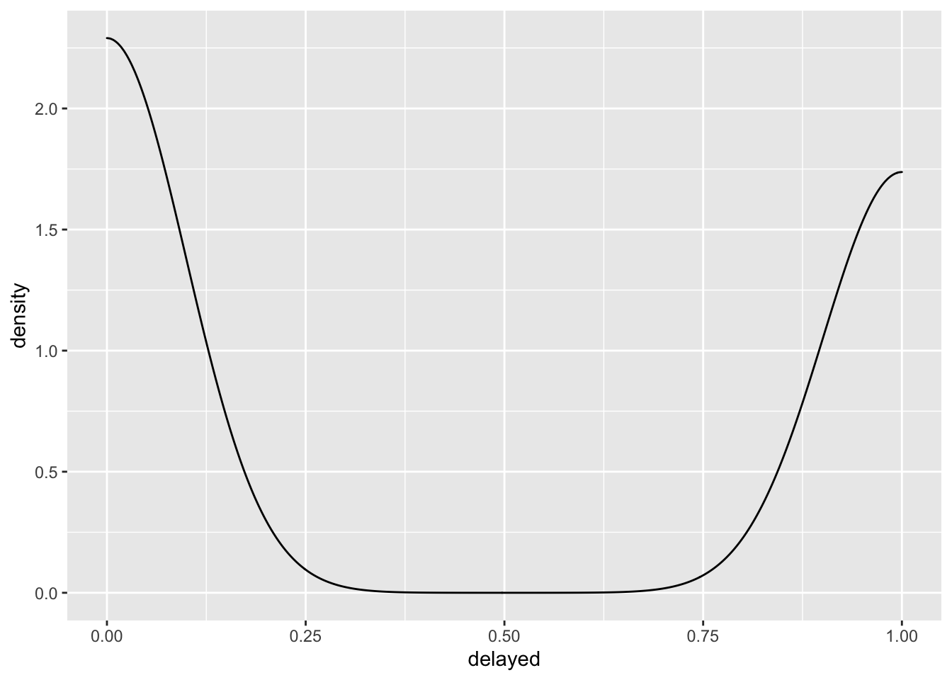
The normal distribution doesn’t look right to me, not to mention the fact that the normal distribution describes a data generating process that produces continuous values from \(-\infty\) to \(\infty\). Let’s run with it anyway
normal_fit <- glm(delayed ~ distance_2sd,
                  family = gaussian(),
                  data = flights)
library(bayesplot)
pp_check(normal_fit)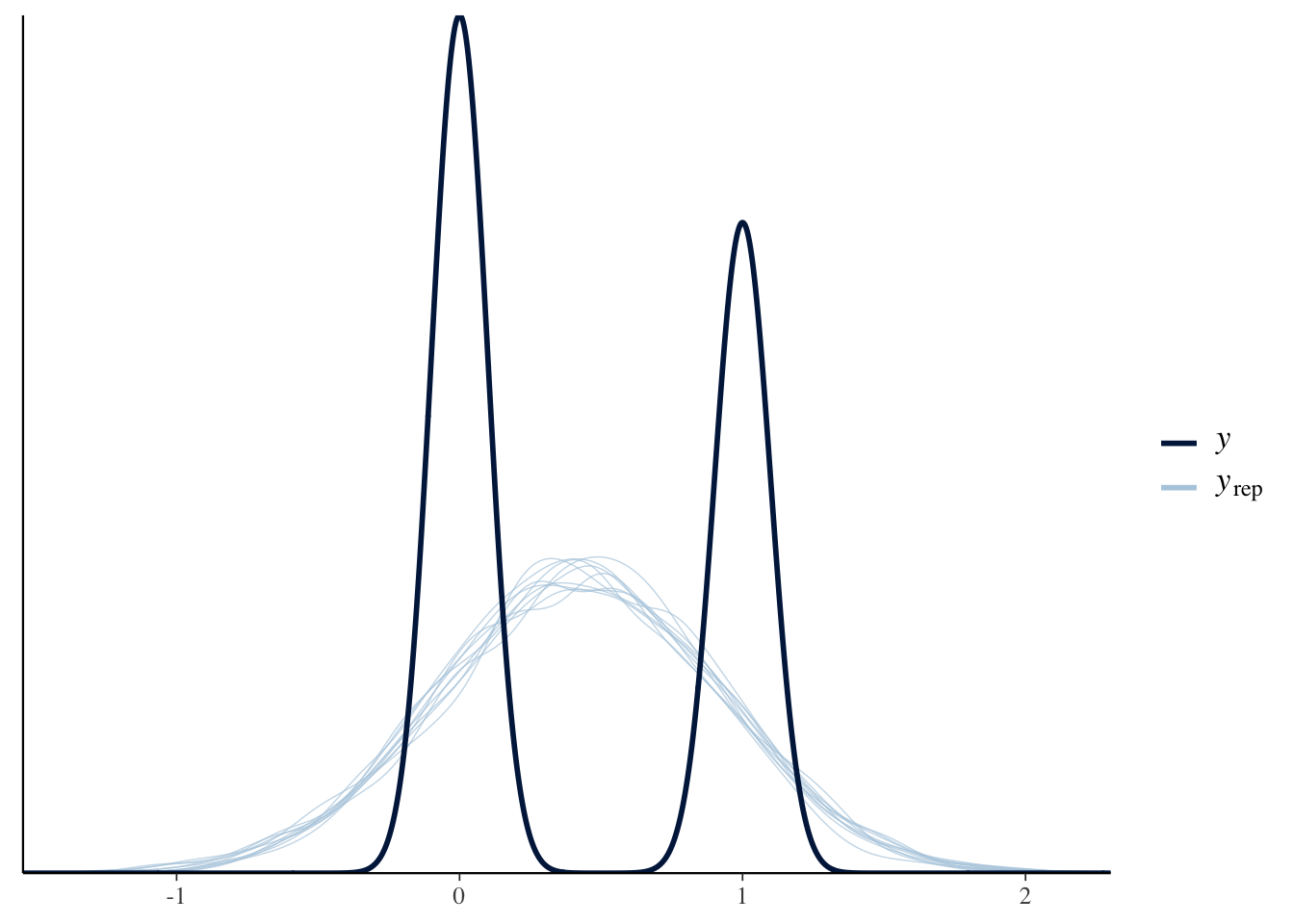
The normal distribution doesn’t model the data very well. How can we tell? Well, in the plot about we see the distribution of the outcome in the darker line labeled \(y\) and simulated draws from the model in the light blue lines labeled \(y_{rep}\). If our model was capturing the data generating process, the simulated draws \(y_{rep}\) would match the actual data \(y\).
What we need is a likelihood function that describes a data generating process that produces discrete values of either 0 or 1. That is exactly what the binomial and Bernoulli distributions describe. Let’s write out that model:
\[ \begin{aligned} y_i &\sim \text{Binomial}(1, p_i) \\ \text{logit}(p_i) &= \alpha + \beta \times x_i \end{aligned} \]
This formulation shows the likelihood and link functions.
Wait, what is a link function?
Link functions are used to map the range of a linear equation to the range of the outcome variable. That means that even if we model the outcome as a linear combination \(\mu = \alpha + \beta * x\), it result of this equation will always be restricted by the link function that we use. For example, the logit link function restricts the range of the linear equation to fall between 0 and 1 and the log link function restricts the range of the linear equation to be positive, continuous, and greater than 0.
How do we intrepret models with different likelihood and link functions?
All you have to do is “undo” the link function. So, for the logit link function:
\[\ln \left( \frac{P}{1 - P} \right)\]
the inverse is the logistic function:
\[\frac{1}{1 + \exp^{(P)}}\]
Inverse link functions put the predictions back on to the linear scale. We’ll see examples of this in the code below.
Connecting the Dots
Our models always use the same linear structure (\(\mu_i = \alpha + \beta x_i\)) but, we can use any likelihood and link function that we want. With these two pieces, we can generalize our linear equation to model any type of data. Hence, the generalized linear model. It always has a linear equation, but it doesn’t always have a normal distribution!
Let’s go back to modeling flight delays, but this time with a more realistic likelihood function - the binomial.
\[ \begin{aligned} y_i &\sim \text{Binomial}(1, p_i) \\ \text{logit}(p_i) &= \alpha + \beta \times x_i \end{aligned} \]
binomial_fit <- glm(delayed ~ distance_2sd,
                    family = binomial(link = "logit"),
                    data = flights)
pp_check(binomial_bfit)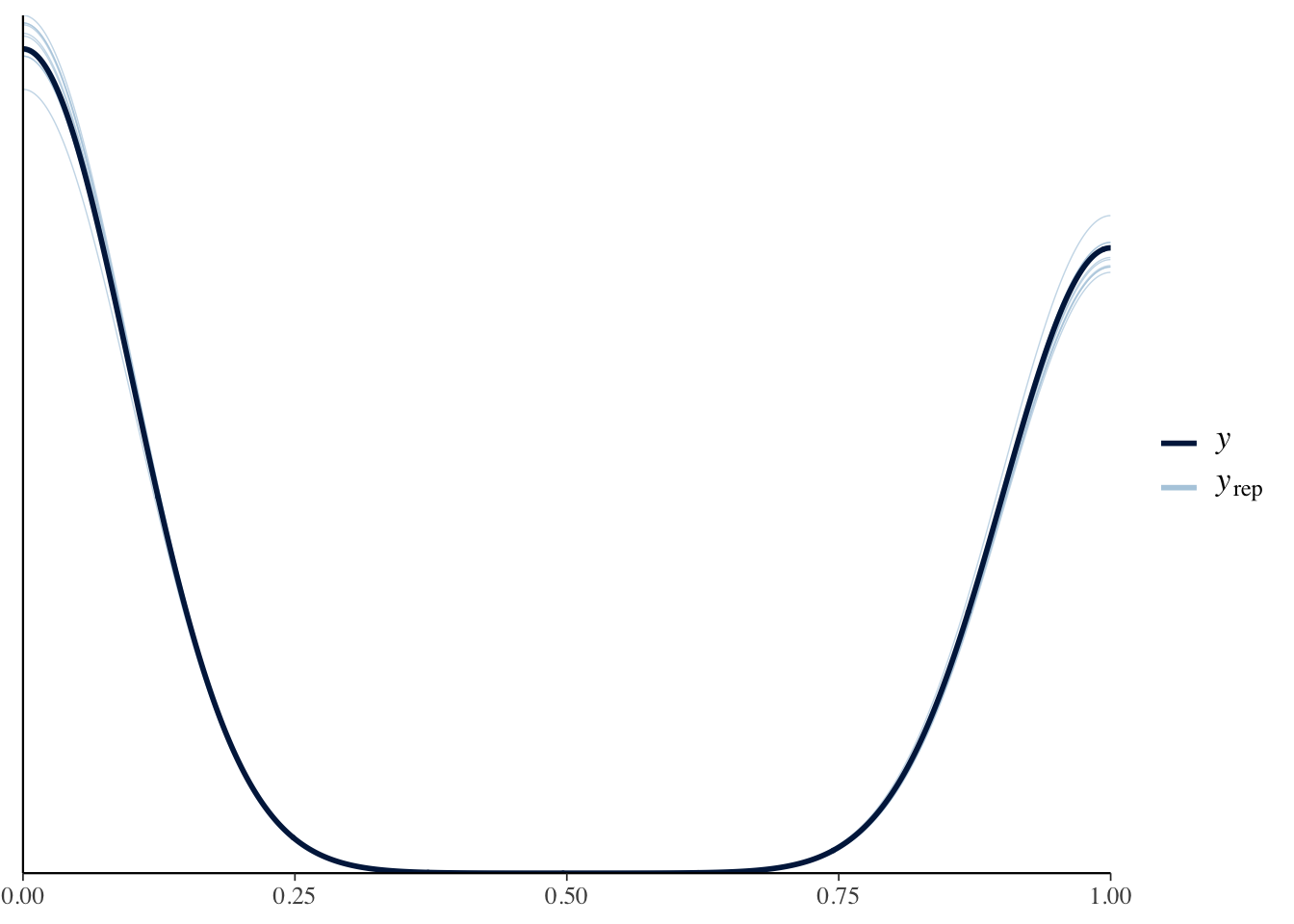
Here, the simulations from the model match the distribution of the actual data MUCH better.
Ok, let’s get into the code with some hands-on practice.
Environment Prep
Before we get started, we need to load the tidyverse package. We’ll also load broom for tidy summaries of our model results.
library(tidyverse)
library(broom)
Modeling Titanic Survival Data
Let’s start learning how to use GLMs with data on Titanic survival rates. This dataset is available in R and is called Titanic. Let’s get it loaded:
data("Titanic")This code loads the data as an array, but we can convert it to a data frame like this:
titanic_data <- as.data.frame(Titanic)We want to know if the passenger class predicts an individual’s survival rate. So, our predictor of interest is Class and the outcome is an indicator variable (0-1) for whether or not an individual survived. What kind of model should we use? We have a data generation process that produces discrete positive values that are either 0 or 1. So, we have two questions to answer:
- What likelihood should we use?
- What link function should we use?
The binomial likelihood function is a good choice in this case because the binomial distribution is a distribution of discrete values of either 0 or 1. But how do we map the linear predictor to the range of 0 and 1? For that we need a logit link function. Let’s see how to implement these.
Binomial Regression
Logit Link Function
logit_fit1 <- glm(Survived ~ Class,
                  family = binomial(link = "logit"),
                  data = titanic_data)
tidy(logit_fit1, conf.int = TRUE)
## # A tibble: 4 × 7
## term estimate std.error statistic p.value conf.low conf.high
## <chr> <dbl> <dbl> <dbl> <dbl> <dbl> <dbl>
## 1 (Intercept) 6.62e-16 0.707 9.36e-16 1.00 -1.44 1.44
## 2 Class2nd -5.80e-16 1 -5.80e-16 1 -2.00 2.00
## 3 Class3rd -8.81e-16 1 -8.81e-16 1.00 -2.00 2.00
## 4 ClassCrew -7.21e-16 1 -7.21e-16 1.00 -2.00 2.00The model ran, but the results look suspicious. Z-scores of 0? P-values of 1? Let’s inspect the data to see if we can figure out the problem.
glimpse(titanic_data)## Rows: 32
## Columns: 5
## $ Class <fct> 1st, 2nd, 3rd, Crew, 1st, 2nd, 3rd, Crew, 1st, 2nd, 3rd, Crew…
## $ Sex <fct> Male, Male, Male, Male, Female, Female, Female, Female, Male,…
## $ Age <fct> Child, Child, Child, Child, Child, Child, Child, Child, Adult…
## $ Survived <fct> No, No, No, No, No, No, No, No, No, No, No, No, No, No, No, N…
## $ Freq <dbl> 0, 0, 35, 0, 0, 0, 17, 0, 118, 154, 387, 670, 4, 13, 89, 3, 5…This data is aggregated! Remember how we wrote of the equation for the binomial regression?
\[ \begin{aligned} y_i &\sim \text{Binomial}(1, p_i) \\ \text{logit}(p_i) &= \alpha + \beta \times x \end{aligned} \]
The \(1\) governs the number of trials for each event. Usually, we just set this value equal to \(1\) because each row of our data is one event (e.g. the person voted or they didn’t). If we wanted to model binomial data where each event only has \(1\) trial it would be better to use the Bernoulli distribution which assumes that the number of trials is \(1\). It would be written like this:
\[ \begin{aligned} y_i &\sim \text{Bernoulli}(p_i) \\ \text{logit}(p_i) &= \alpha + \beta \times x \end{aligned} \]
A regression with a Bernoulli likelihood can be implemented in a package like brms. For the aggregated data, we need to set the number of trials for each event and we do this with the Freq variable. The easiest way to do this with our code is to set the weight = argument equal to Freq:
logit_fit2 <- glm(Survived ~ Class,
                  family = binomial(link = "logit"),
                  data = titanic_data,
                  weights = Freq)
tidy(logit_fit2, conf.int = TRUE)
## # A tibble: 4 × 7
## term estimate std.error statistic p.value conf.low conf.high
## <chr> <dbl> <dbl> <dbl> <dbl> <dbl> <dbl>
## 1 (Intercept) 0.509 0.115 4.44 8.79e- 6 0.287 0.736
## 2 Class2nd -0.856 0.166 -5.16 2.51e- 7 -1.18 -0.533
## 3 Class3rd -1.60 0.144 -11.1 1.07e-28 -1.88 -1.32
## 4 ClassCrew -1.66 0.139 -12.0 4.97e-33 -1.94 -1.39Now that looks a lot better.
Binomial Exercises
Now you practice. Run the code block below to disaggregate the Titanic data:
titanic_data_2 <-
  titanic_data %>%
  mutate(New_Response = map(Freq, ~ rep_len(1, .x))) %>%
  unnest(cols = c(New_Response)) %>%
  select(-Freq, -New_Response)
With the data disaggregated, try answering the following questions:
Run a standard logistic regression model with the disaggregated data (binomial likelihood function, logit link function).
Run a probit regression with the disaggregated data (binomial likelihood function, probit link function).
Modeling Airport Passenger Traffic
In this example, we are going to build a model of airport passengers to see if the COVID lock downs imposed in March of 2020 affected the number of travelers. Let’s load in the data and do some prep.
# load the data
tsa_data <- read_csv("https://raw.githubusercontent.com/mikelor/TsaThroughput/main/data/processed/tsa/throughput/TsaThroughput.LAX.csv")
## Rows: 27551 Columns: 15
## ── Column specification ────────────────────────────────────────────────────────
## Delimiter: ","
## dbl (13): LAX Suites, LAX TBIT Main Checkpoint, LAX Terminal 1 - Passenger,...
## date (1): Date
## time (1): Hour
##
## ℹ Use `spec()` to retrieve the full column specification for this data.
## ℹ Specify the column types or set `show_col_types = FALSE` to quiet this message.#
#install.packages("janitor")
#install.packages("lubridate")
tsa_data <-
tsa_data %>%
# fix the variable names
janitor::clean_names() %>%
# create an indicator for March 2020
mutate(month = lubridate::month(date),
year = lubridate::year(date),
month_year = str_c(month, year, sep = "-"),
month_year = lubridate::my(month_year),
lockdown = ifelse(month_year == "2020-03-01", 1, 0))How should we model this data? We want to know if the COVID lock down in March of 2020 had an effect on the number of air travelers. So, our data generating process will be positive between \(0\) and \(-\infty\) (theoretically) and discrete.
- What distribution describes a process like this?
- What link function should we use?
For these data, the Poisson distribution is a good choice for a likelihood since it describes a discrete process that generates a count of events taking place. This means that the Poisson distribution is defined for values greater than \(0\) all the way to \(-\infty\). In other words, it works for all positive values. Technically, the Poisson distribution is undefined for values of 0. So if we had a data generating process that produced positive values including \(0\), we would need to use a zero-inflated Poisson likelihood function.
Now that we know what likelihood to use, how do we map the linear predictor to the range of all positive values? We’ll use the log link function.
Poisson Regression
Now we’re ready to model passenger traffic. The outcome will be lax_tbit_main_checkpoint and the predictor will be lockdown. We’ll use a Poisson likelihood function and a log link function. Mathematically, we write this model as:
\[ \begin{aligned} y_i &\sim \text{Poisson}(\lambda_i) \\ \text{log}(\lambda_i) &= \alpha + \beta \times x \end{aligned} \]
poisson_fit1 <- glm(lax_tbit_main_checkpoint ~ lockdown,
                    family = poisson(link = "log"),
                    data = tsa_data)
tidy(poisson_fit1, conf.int = TRUE)
## # A tibble: 2 × 7
## term estimate std.error statistic p.value conf.low conf.high
## <chr> <dbl> <dbl> <dbl> <dbl> <dbl> <dbl>
## 1 (Intercept) 6.44 0.000260 24772. 0 6.44 6.44
## 2 lockdown -0.220 0.00181 -121. 0 -0.223 -0.216Doesn’t everyone use Negative-Binomial instead of Poisson?
Usually, where we see someone using a count model, they use a negative binomial regression instead of a Poisson regression. Well, it turns out that the negative Binomial model doesn’t involve a Binomial distribution. It’s much more accurate to call it a Gamma-Poisson model. Why Gamma-Poisson and why do we use it? One limitation of the Poisson distribution is that it assumes that the mean is equal to the variance. When this isn’t the case, we have either over, or under, dispersion. This is where the Gamma-Poisson model helps and we can write it like this:
\[ \begin{aligned} y_i &\sim \text{Gamma-Poisson}(\lambda_i, \phi) \\ \text{log}(\lambda_i) &= \alpha + \beta \times x \\ \phi &\sim \text{Gamma}(0.01, 0.01) \end{aligned} \]
Instead of assuming the mean and variance are equal, the Gamma-Poisson model has an additional parameter (\(\phi\)) that allows each observation to have its own rate (it lets the mean differ from the variance). And, the rate parameter follows a gamma distribution because the gamma distribution is a positive continuous distribution defined between (0 and \(\infty\)). Let’s run it.
#install.packages("MASS")
library(MASS)
##
## Attaching package: 'MASS'## The following object is masked from 'package:dplyr':
##
## selectgp_fit1 <- glm.nb(lax_tbit_main_checkpoint ~ lockdown,
data = tsa_data)
tidy(gp_fit1, conf.int = TRUE)## # A tibble: 2 × 7
## term estimate std.error statistic p.value conf.low conf.high
## <chr> <dbl> <dbl> <dbl> <dbl> <dbl> <dbl>
## 1 (Intercept) 6.44 0.00685 941. 0 6.43 6.45
## 2 lockdown -0.220 0.0428 -5.13 0.000000288 -0.302 -0.135Because the Gamma-Poisson model involves two likelihood functions, it is considered a mixture model. Mixture models are models that combine two likelihood functions in order to describe a data generating process.
So, how do we interpret this model?
(1 - exp(coef(gp_fit1)[[2]])) * 100## [1] 19.72062Air travel decreased by about 20 in March of 2020.
Modeling Penguin Species
For the next example, we will build a multinomial logistic regression to classify penguin species. This data comes from the palmerpenguins R package. Let’s load it in.
#install.packages("palmerpenguins")
library(palmerpenguins)

data(penguins)
Since we want to model penguin species, let’s figure out how many types of species we have in the data:
summary(penguins$species)## Adelie Chinstrap Gentoo
## 152 68 124Ok, we have three categories. Now our two standard questions:
- What distribution describes a process like this?
- What link function should we use?
We need a probability distribution that describes a data generating process that produces discrete categorical data. The multinomial distribution is a good choice for this job. But what link function? We need a link function that can classify multiple categories as either 1 or 0. For this, we need the multinomial logit, also known as the softmax, link function. Let’s get to work.
Categorical Regression
To build a multinomial logistic regression model, we need the nnet R package.
#install.packages("nnet")
library(nnet)
Now we want to classify penguin species as a function of their bill length (bill_length_mm) and flipper length (flipper_length_mm).
multinom_fit <-
  multinom(species ~ bill_length_mm + flipper_length_mm,
           data = penguins)
## # weights: 12 (6 variable)
## initial value 375.725403
## iter 10 value 50.510292
## iter 20 value 43.317383
## iter 30 value 39.708794
## iter 40 value 39.082004
## iter 50 value 39.064861
## final value 39.064292
## convergedNotice that we don’t need to specify a family (a.k.a. a likelihood function) here. That’s because it’s assumed by the multinom function. It’s also important to know that the multinom function expects the outcome variable to be a factor. Since our species variable is a factor, we’re good. Ok, let’s look at the results.
tidy(multinom_fit, conf.int = TRUE)## # A tibble: 6 × 8
## y.level term estimate std.error statistic p.value conf.low conf.high
## <chr> <chr> <dbl> <dbl> <dbl> <dbl> <dbl> <dbl>
## 1 Chinstrap (Intercept) -26.5 9.90 -2.68 7.37e- 3 -4.59e+1 -7.13
## 2 Chinstrap bill_lengt… 1.35 0.230 5.85 4.97e- 9 8.96e-1 1.80
## 3 Chinstrap flipper_le… -0.170 0.0648 -2.62 8.69e- 3 -2.97e-1 -0.0430
## 4 Gentoo (Intercept) -119. 1.60 -74.7 0 -1.23e+2 -116.
## 5 Gentoo bill_lengt… 0.482 0.212 2.28 2.28e- 2 6.69e-2 0.896
## 6 Gentoo flipper_le… 0.481 0.0496 9.69 3.17e-22 3.83e-1 0.578Hmm. What’s going on here? Multinomial regressions are complicated models, so they can be hard to interpret. Notice that we see Chinstrap and Gentoo as the row names for the Coefficients section. These rows show us the estimated coefficients for each of these categories with the Adelie species being the references group. With that said, here’s a guide to understanding the coefficients:
Chinstrap category:
- A one millimeter increase in the length of a bill is associated with an increase in the log odds of being in the
Chinstrapspecies vs theAdeliespecies of 1.3472574.
Gentoo category:
- A one millimeter increase in the length of a bill is associated with an increase in the log odds of being in the
Gentoospecies vs theAdeliespecies of 0.4815335.
We can also exponentiate the the coefficients to get the relative risk ratios:
exp(coef(multinom_fit))## (Intercept) bill_length_mm flipper_length_mm
## Chinstrap 2.981366e-12 3.846861 0.8436975
## Gentoo 1.399348e-52 1.618555 1.6168910- The relative risk ratio for a 1 millimeter increase in bill length is 3.84 times more likely to belong in to the Chinstrap species than the Adelie species. In other words, given a 1 millimeter increase in bill length, the relative risk of being in the Chinstrap species would be 3.84 times more likely than being in the Adelie species, holding all other variables constant.
The easiest way to interpret these models is probably to plot them. It takes a bit of wrangling, but here it goes. For the plot, we’ll look at how the probabilities of being in each category change across the range of bill length values, holding flipper length at the mean.
pred_data <-
  expand_grid(bill_length_mm = penguins$bill_length_mm,
              flipper_length_mm = mean(penguins$flipper_length_mm, na.rm = T)) %>%
  drop_na()


plot_data <-
  cbind(pred_data, predict(multinom_fit, newdata = pred_data, type = "probs"))

plot_data <-
  plot_data %>%
  pivot_longer(cols = c(Adelie, Chinstrap, Gentoo), names_to = "species",
               values_to = "probs")

ggplot(data = plot_data,
       aes(x = bill_length_mm, y = probs, color = species)) +
  geom_line() +
  labs(x = "Bill Length (mm)",
       y = "Predicted Probability",
       color = "Species",
       title = "Predicted Probability of Species by Bill Length") +
  theme_classic()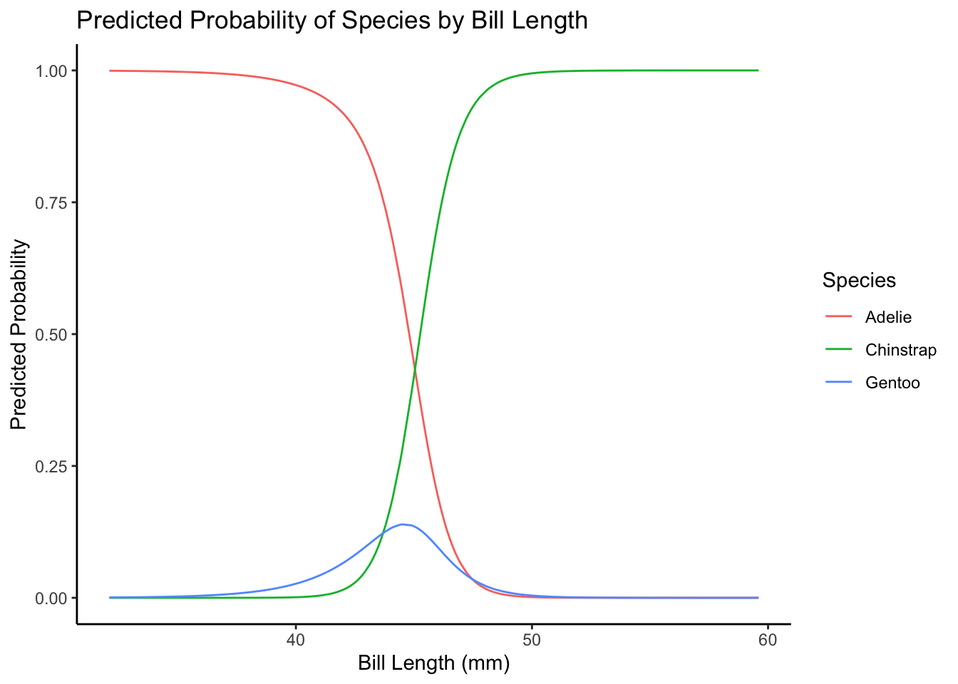
Bonus: Modeling Proportions
Sometimes we want to build a model that can make predictions about proportions. Proportions are a new type of data because they are continuous and limited between 0 and 1. As an example of this, we’ll use some data on gasoline yields from crude oil as a function of covariates.
#install.packages("betareg")
library(betareg)

data("GasolineYield")

glimpse(GasolineYield)
## Rows: 32
## Columns: 6
## $ yield <dbl> 0.122, 0.223, 0.347, 0.457, 0.080, 0.131, 0.266, 0.074, 0.182…
## $ gravity <dbl> 50.8, 50.8, 50.8, 50.8, 40.8, 40.8, 40.8, 40.0, 40.0, 40.0, 3…
## $ pressure <dbl> 8.6, 8.6, 8.6, 8.6, 3.5, 3.5, 3.5, 6.1, 6.1, 6.1, 6.1, 6.1, 6…
## $ temp10 <dbl> 190, 190, 190, 190, 210, 210, 210, 217, 217, 217, 220, 220, 2…
## $ temp <dbl> 205, 275, 345, 407, 218, 273, 347, 212, 272, 340, 235, 300, 3…
## $ batch <fct> 1, 1, 1, 1, 2, 2, 2, 3, 3, 3, 4, 4, 4, 4, 5, 5, 5, 6, 6, 6, 7…Here the yield column shows the proportion of crude oil converted to gasoline after distillation and fractionation. This will be our outcome variable. But how should we model it? We need a probability distribution that describes a data generating process that produces continuous values bounded between 0 and 1. Introducing the beta distribution!
Beta Regression
The beta distribution fits the bill exactly. It’s continuous and limited between 0 and 1. But what link function? Well, we already know of a link function that restricts a linear model to be between 0 and 1 - the logit link function. Let get to it:
beta_fit <- betareg(yield ~ gravity + pressure + temp10,
                    data = GasolineYield)

tidy(beta_fit, conf.int = TRUE)
## # A tibble: 5 × 8
## component term estimate std.error statistic p.value conf.low conf.high
## <chr> <chr> <dbl> <dbl> <dbl> <dbl> <dbl> <dbl>
## 1 mean (Intercept) -2.98 2.80 -1.06 2.87e-1 -8.47 2.51
## 2 mean gravity -0.00213 0.0265 -0.0806 9.36e-1 -0.0540 0.0497
## 3 mean pressure 0.150 0.102 1.47 1.41e-1 -0.0498 0.351
## 4 mean temp10 0.00416 0.00789 0.528 5.98e-1 -0.0113 0.0196
## 5 precision (phi) 14.8 3.65 4.05 5.10e-5 7.63 21.9Just like with logistic regression, we can interpret these coefficients on the probability scale by using the inverse logit (logistic) link function plogis(). So, the proportion of gasoline yielded from crude oil increases by plogis(0.15) about 54% for a one unit increase in pressure. Accounting for the intercept, it’s an absolute increase of only plogis(-2.98 + 0.15) - plogis(-2.98) 1%.