Visualizing Data and Statistical Models in R with ggplot2
Exploratory data analysis (EDA) is an important part of the data science process. EDA is helpful for identifying patterns in data, examining the relationship between variables, and ultimately generating testable hypotheses and producing visualizations is one of the most effective ways to accomplish these tasks. You tell me what gives YOU more information. This:
head(table1)## # A tibble: 6 × 4
## country year cases population
## <chr> <int> <int> <int>
## 1 Afghanistan 1999 745 19987071
## 2 Afghanistan 2000 2666 20595360
## 3 Brazil 1999 37737 172006362
## 4 Brazil 2000 80488 174504898
## 5 China 1999 212258 1272915272
## 6 China 2000 213766 1280428583or this?
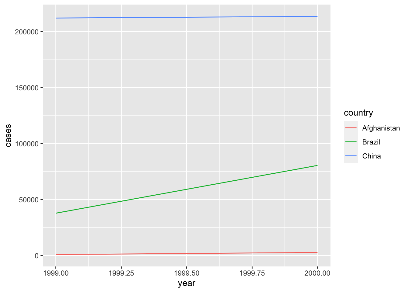
Exactly.
The workhorse package for plotting in R is ggplot2 without a doubt. ggplot2 is built around what’s called the “grammar of graphics” which is a system of building data visuals in a way that is easy to describe and understand.
Learning Objectives
Learn the fundamental components of
ggplot- Build plots with
ggplot2 - Show multiple dimensions of data in one plot
- Use facets to explore groups
- Learn how to make your visuals more effective with labels, scales, and themes
- Build plots with
Use
ggplotto explore dataUse
ggplotto visualize statistical models- Build coefficient plots
- Visualize fitted models
- Visualize interaction terms
The Fundamentals of ggplot2
Building a plot with ggplot
ggplot2 is one of the primary packages included in R’s tidyverse, so I you already loaded tidyverse then you’re good to go. Let’s load the tidyverse to get started:
library(tidyverse)With ggplot we builds plots with two basic functions: ggplot() and geom_*(), where * is a placeholder for a number of different geoms that are available. I like to learn by doing, so let’s just start plotting to see this in action, then I’ll explain things. The ggplot2 package comes with a dataset on mammal’s sleep that we’ll use to practice our plotting. Here’s what the data looks like:
head(msleep)## # A tibble: 6 × 11
## name genus vore order conservation sleep_total sleep_rem sleep_cycle awake
## <chr> <chr> <chr> <chr> <chr> <dbl> <dbl> <dbl> <dbl>
## 1 Cheetah Acin… carni Carn… lc 12.1 NA NA 11.9
## 2 Owl mo… Aotus omni Prim… <NA> 17 1.8 NA 7
## 3 Mounta… Aplo… herbi Rode… nt 14.4 2.4 NA 9.6
## 4 Greate… Blar… omni Sori… lc 14.9 2.3 0.133 9.1
## 5 Cow Bos herbi Arti… domesticated 4 0.7 0.667 20
## 6 Three-… Brad… herbi Pilo… <NA> 14.4 2.2 0.767 9.6
## # … with 2 more variables: brainwt <dbl>, bodywt <dbl>Let’s make our first plot a histogram of the total amount of sleep for mammals (sleep_total):
ggplot(data = msleep, mapping = aes(x = sleep_total)) +
  geom_histogram()
## `stat_bin()` using `bins = 30`. Pick better value with `binwidth`.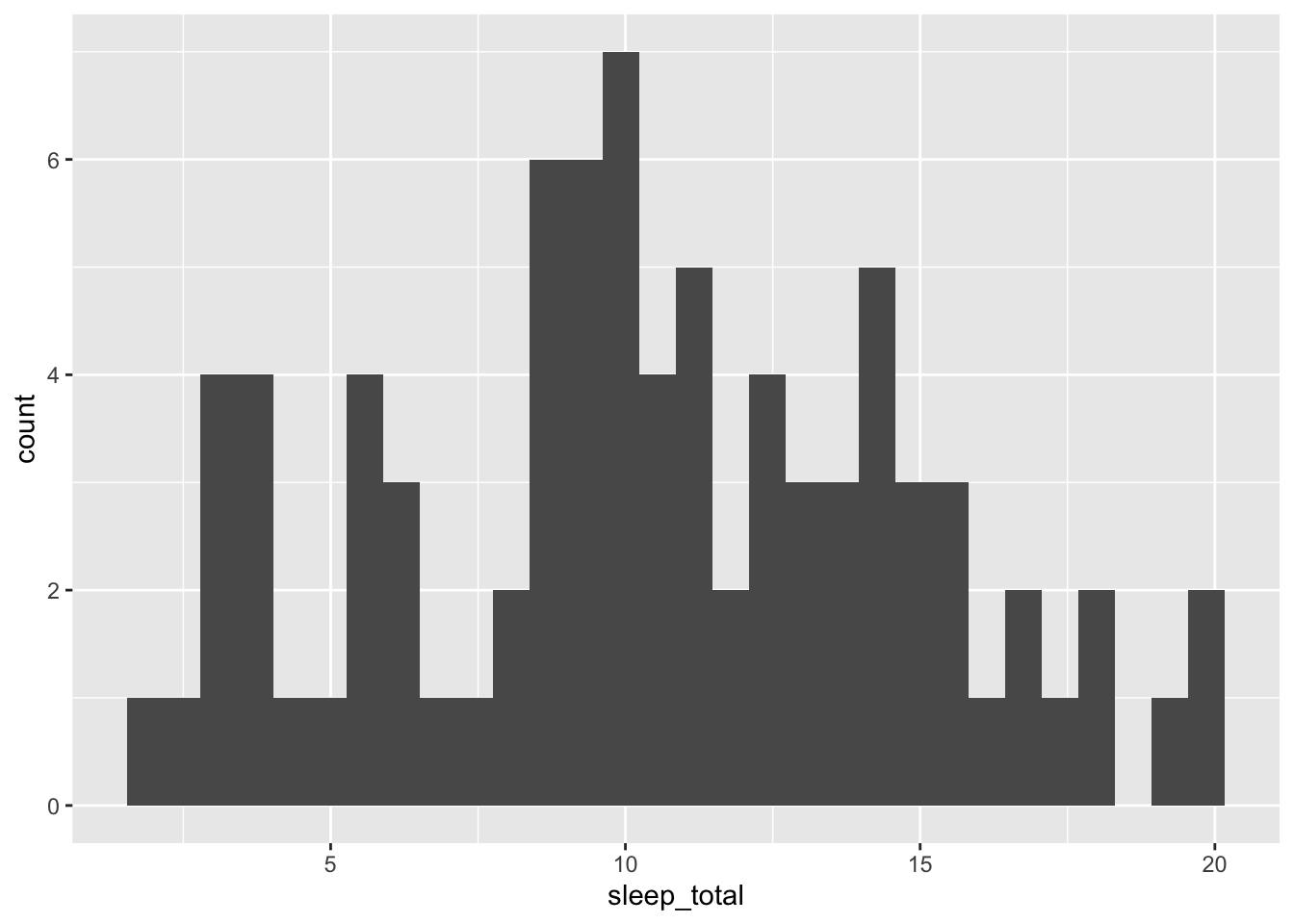
Ok, let’s break down this code:
ggplot(): the main plotting functiondata = msleep: set thedataargument equal to the data that you want to plotmapping = aes(x = sleep_total): we always map the values we want to plot to an aesthetic (aes()). In this case, we are mapping the x-axis aesthetic tosleep_totalgeom_histogram: this defines the type of plot to make
If we wanted to build a density plot instead, we could just geom_density() instead of geom_histogram():
ggplot(data = msleep, mapping = aes(x = sleep_total)) +
  geom_density()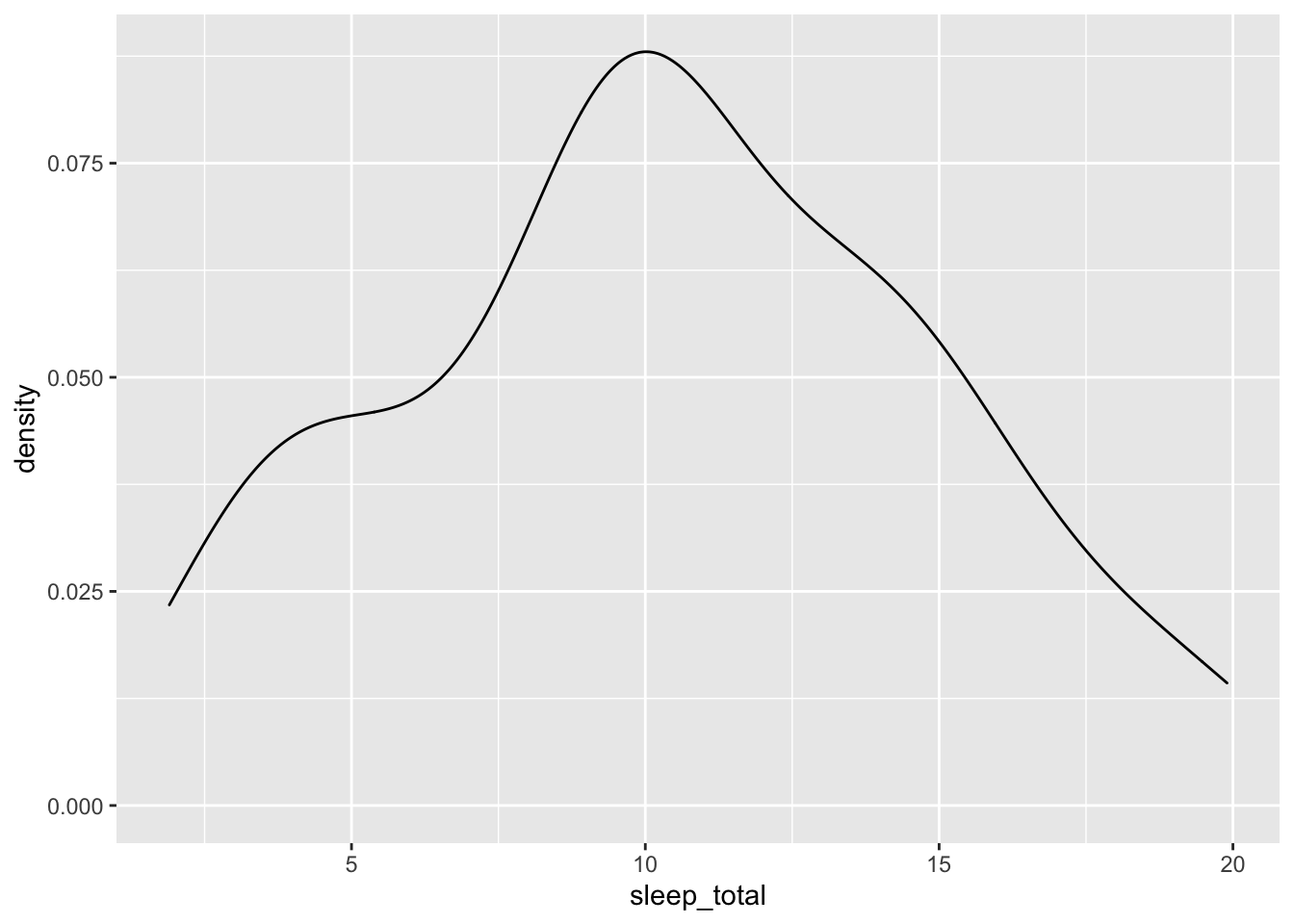
Of course, we can also make plots of two variables by adding a y-axis mapping along with a geom that works well with two variables. Let’s build a scatter plot (geom_point()) to examine the relationship between sleep_total and body weight bodywt:
ggplot(data = msleep, mapping = aes(x = bodywt, y = sleep_total)) +
  geom_point()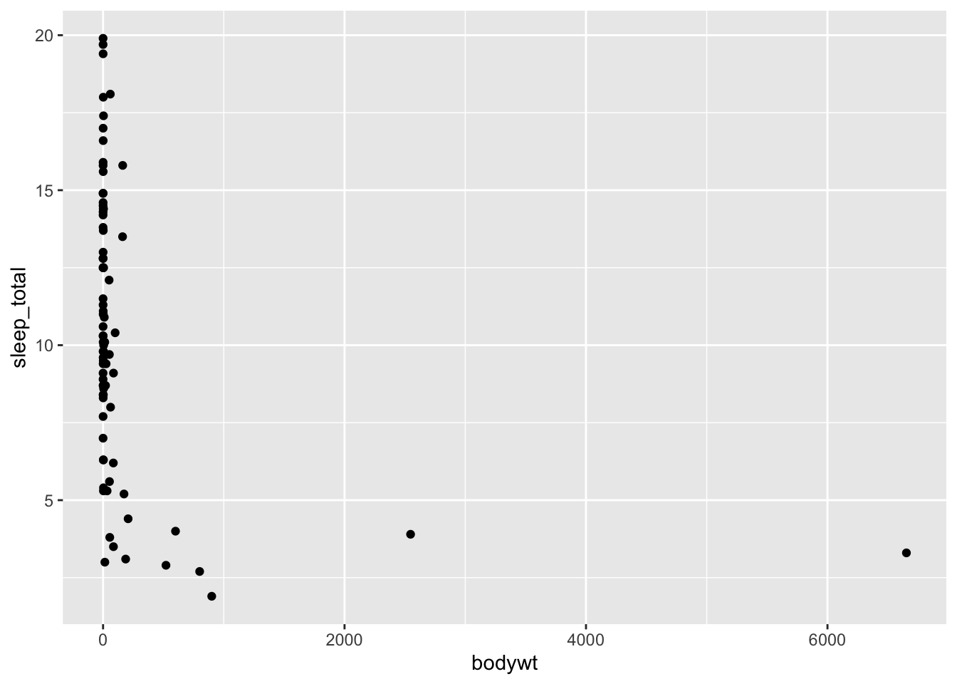
It’s a little difficult to get a sense of the variation between these variables because of the two outliers. To deal with that, we can zoom in on the x-axis by restricting its limits. We do this with coord_cartesian():
ggplot(data = msleep, mapping = aes(x = bodywt, y = sleep_total)) +
  geom_point() +
  coord_cartesian(xlim = c(0, 250))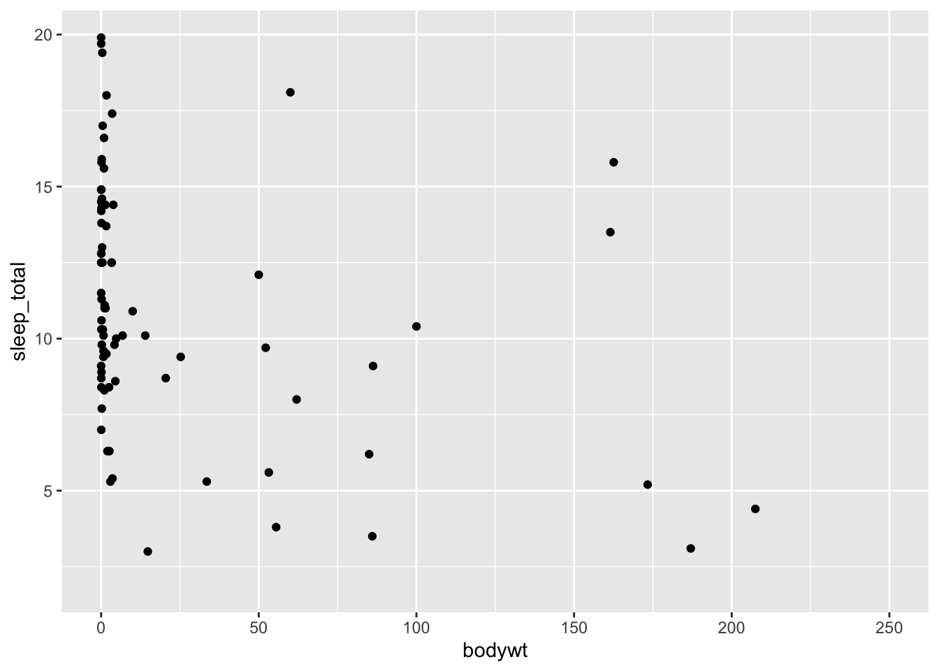
Adding Multiple Dimensions to a Plot
Now let’s look at the relationship between the length of a mammal’s sleep cycle (sleep_cycle) and their total rem sleep (sleep_rem):
ggplot(data = msleep, mapping = aes(x = sleep_cycle, y = sleep_rem)) +
  geom_point()
## Warning: Removed 51 rows containing missing values (geom_point).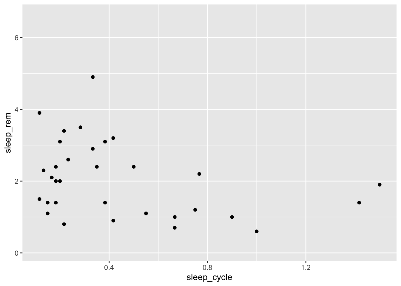
It doesn’t look like there is much of a relationship between these variables, but let’s see how it varies by a mammal’s diet type. We can do this by mapping the type of eater they are (vore) to the shape aesthetic:
ggplot(data = msleep, mapping = aes(x = sleep_cycle, y = sleep_rem,
                                    shape = vore)) +
  geom_point()
## Warning: Removed 52 rows containing missing values (geom_point).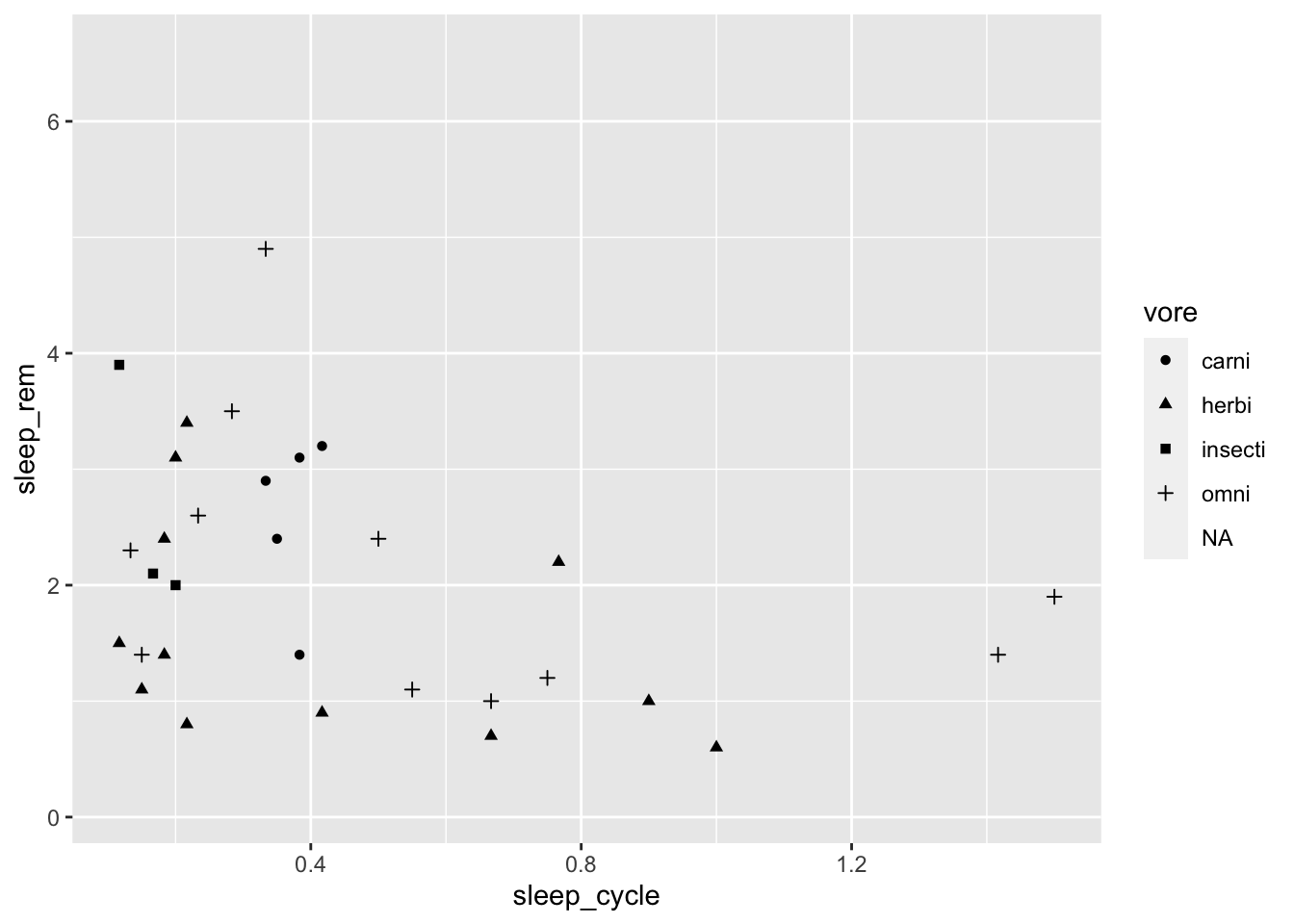
Maybe colors would be easier to see than shapes:
ggplot(data = msleep, mapping = aes(x = sleep_cycle, y = sleep_rem,
                                    color = vore)) +
  geom_point()
## Warning: Removed 51 rows containing missing values (geom_point).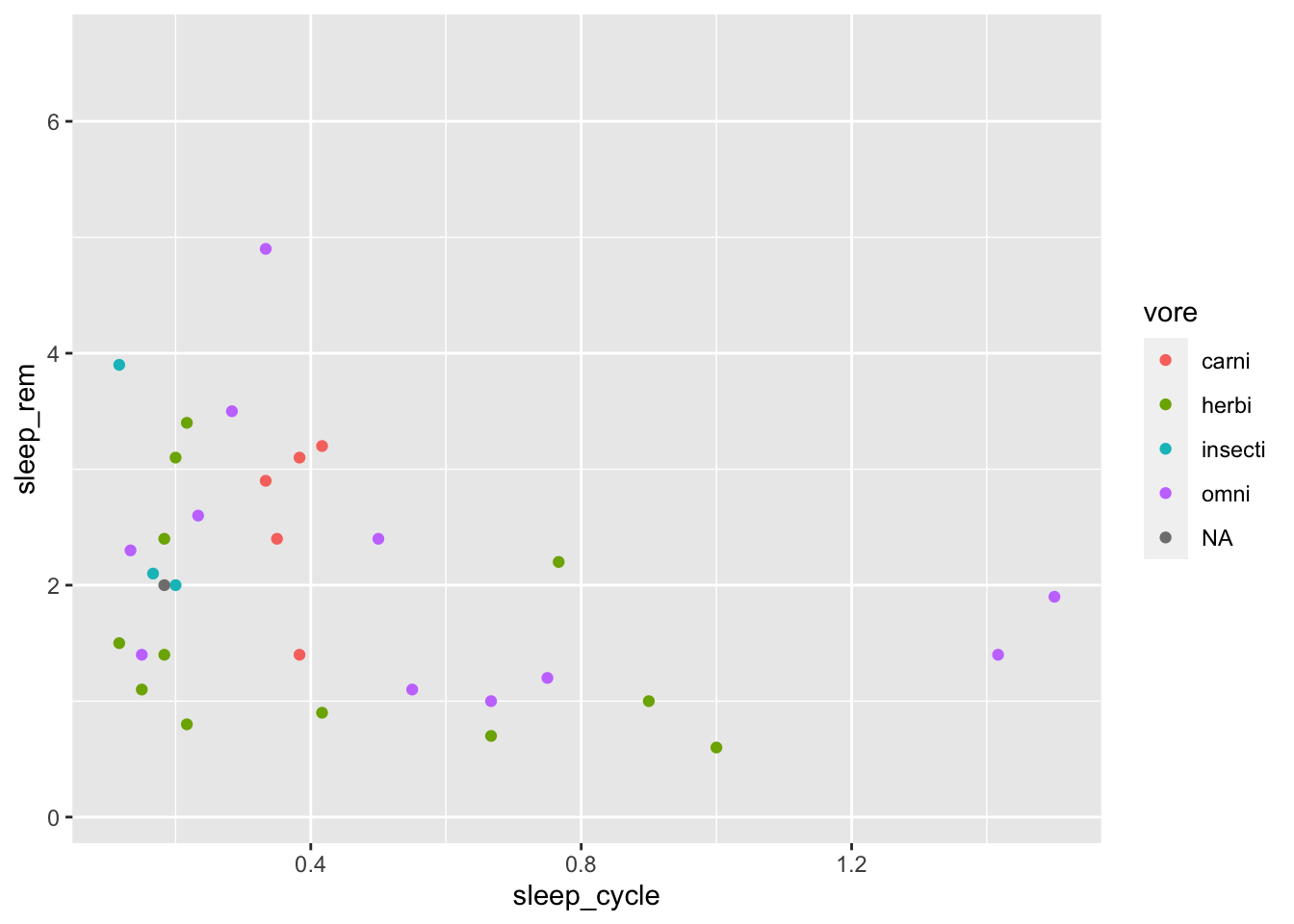
Hmm. Maybe colors and shapes?
ggplot(data = msleep, mapping = aes(x = sleep_cycle, y = sleep_rem,
                                    shape = vore, color = vore)) +
  geom_point()
## Warning: Removed 52 rows containing missing values (geom_point).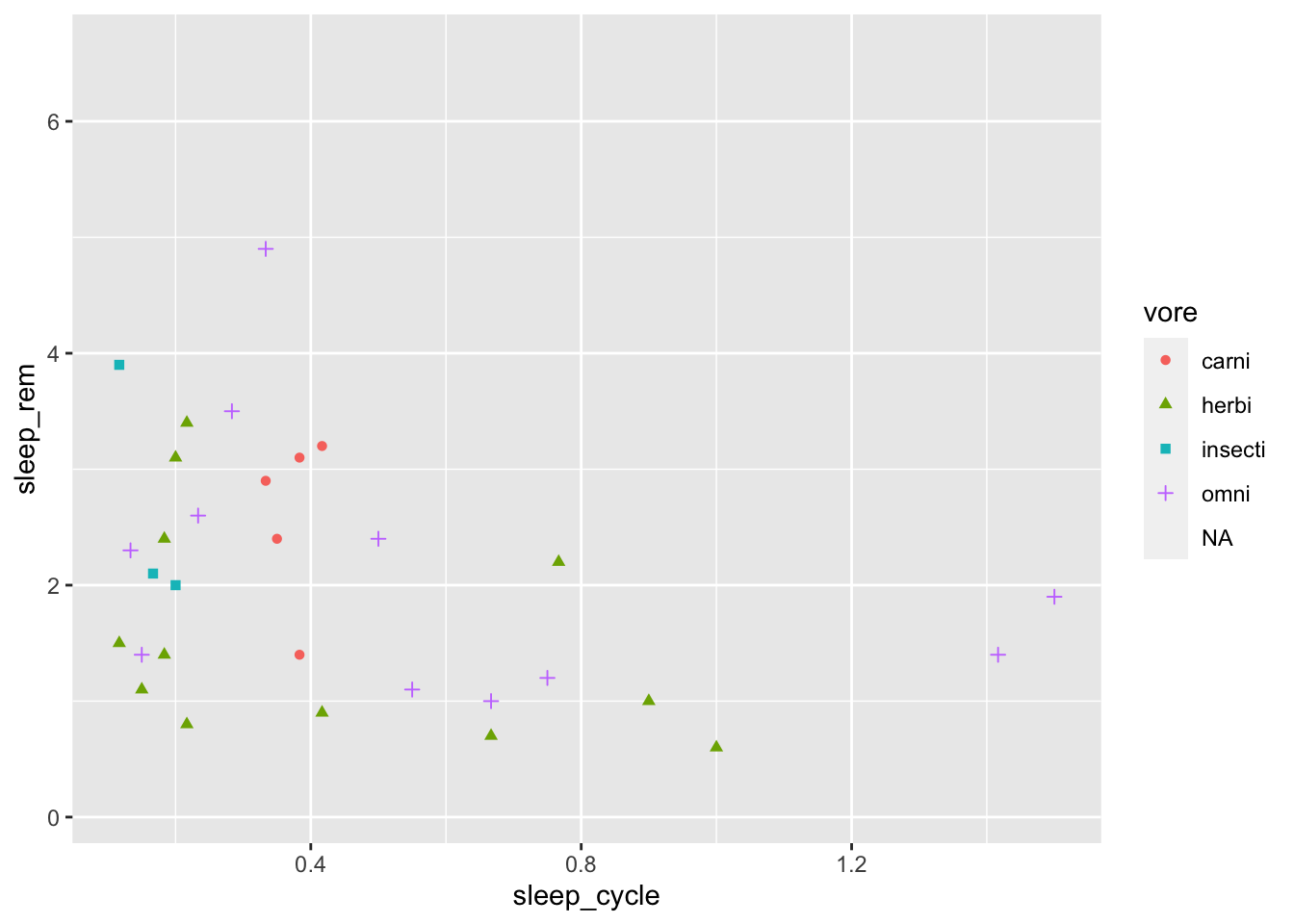
In addition to mapping the shape and color aesthetics to a variable, we can also map the size, alpha (transparency), or fill to a variable.
Using Facets to Explore Groups
Another way to visualize group differences with ggplot is to use facets. What’s a facet? It’s probably easier to look at one than try to explain it:
ggplot(data = msleep, mapping = aes(x = sleep_cycle, y = sleep_rem)) +
  geom_point() +
  facet_wrap(~ vore)
## Warning: Removed 51 rows containing missing values (geom_point).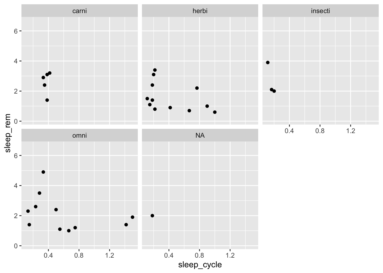
The facet_wrap() function create separate plots for each group with specify with ~ VARIABLE, which can be read aloud as “by VARIABLE.” You can also add variables to the left-hand side of the ~ to visualize plots for subgroups:
ggplot(data = msleep, mapping = aes(x = sleep_cycle, y = sleep_rem)) +
  geom_point() +
  facet_wrap(conservation ~ vore)
## Warning: Removed 51 rows containing missing values (geom_point).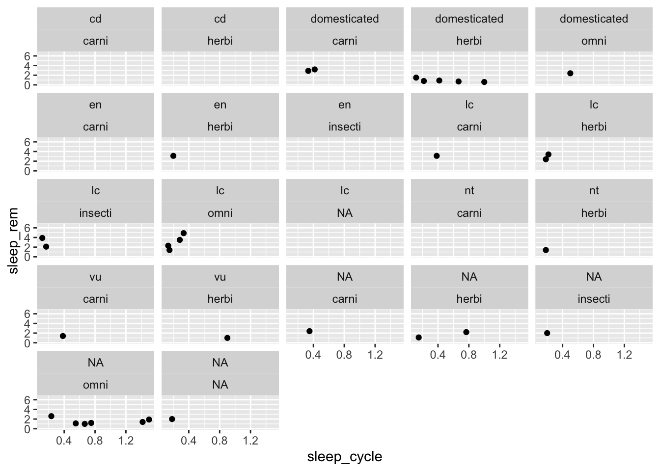
These types of plots are sometimes easier to understand if we use facet_grid() instead of facet_wrap():
ggplot(data = msleep, mapping = aes(x = sleep_cycle, y = sleep_rem)) +
  geom_point() +
  facet_grid(conservation ~ vore)
## Warning: Removed 51 rows containing missing values (geom_point).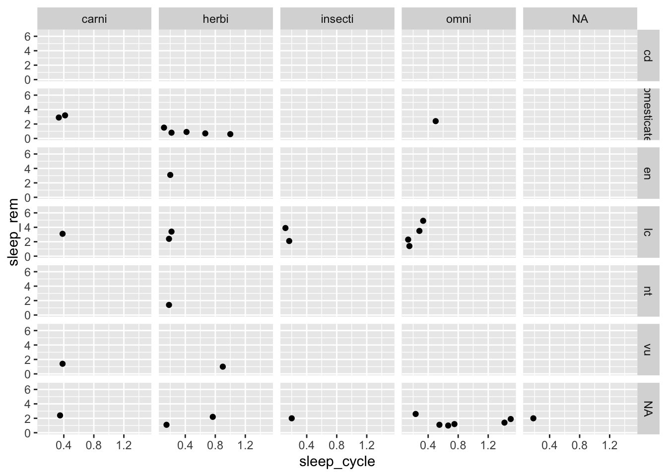
facet_wrap() also provides options to control the number of rows and columns in case we wanted to change the overall dimensions of the plot:
ggplot(data = msleep, mapping = aes(x = sleep_cycle, y = sleep_rem)) +
  geom_point() +
  facet_wrap(~ vore, ncol = 2)
## Warning: Removed 51 rows containing missing values (geom_point).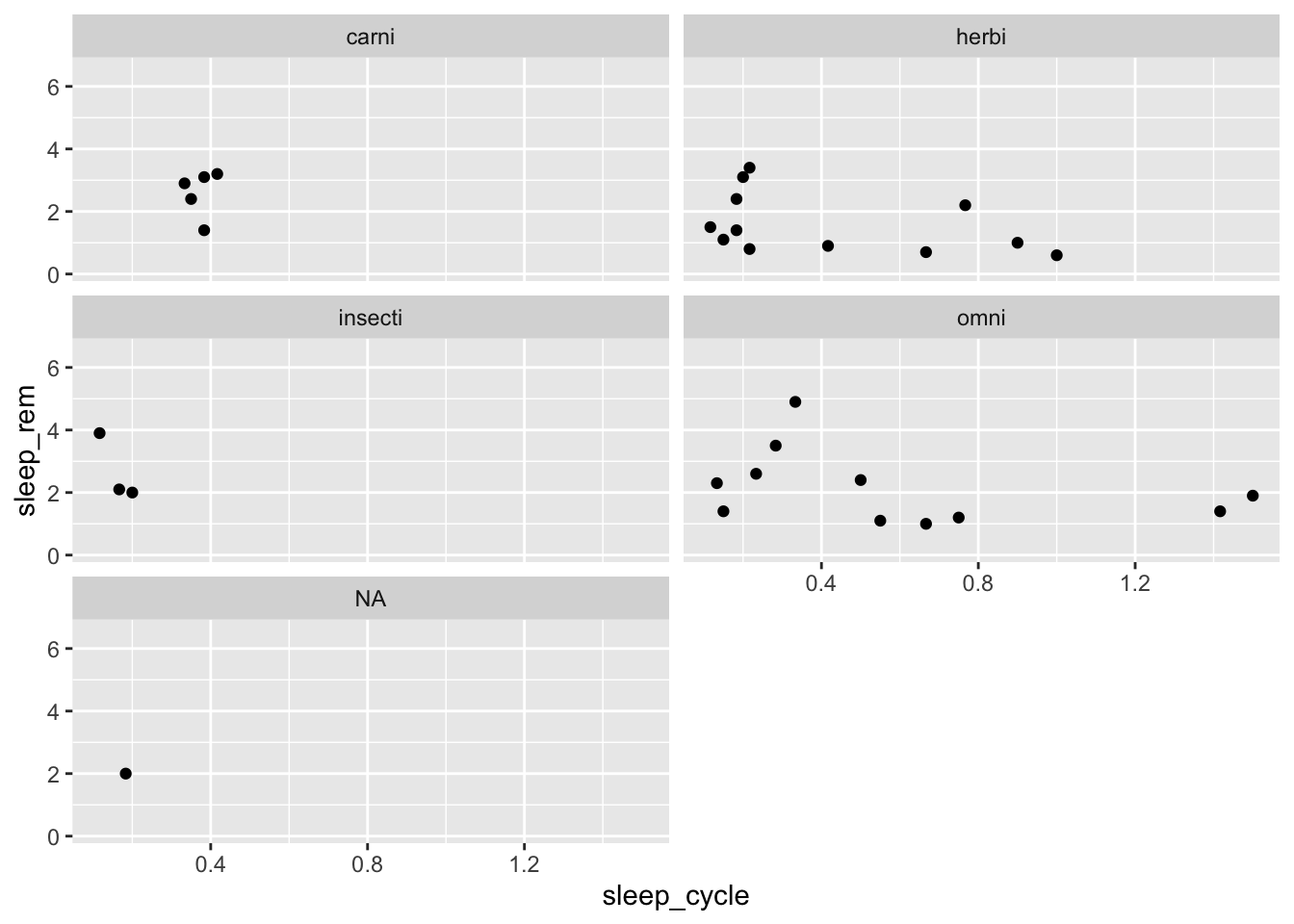
Making Plots More Effective with Labels, Scales, and Themes
Labels
Let’s return to our plot of sleep_cycle and sleep_rem to clean it up a bit:
ggplot(data = msleep, mapping = aes(x = sleep_cycle, y = sleep_rem,
                                    shape = vore, color = vore)) +
  geom_point()
## Warning: Removed 52 rows containing missing values (geom_point).
All visuals should be able to stand on their own, meaning that a reader has all the information to understand the visual with the figure alone. A typical starting point for making this happen is to add axis labels. We can do that with the labs() function:
ggplot(data = msleep, mapping = aes(x = sleep_cycle, y = sleep_rem,
                                    shape = vore, color = vore)) +
  geom_point() +
  labs(title = "The Relationship Between Sleep Cycle and REM Sleep",
       x = "Sleep Cycle (hours)",
       y = "REM Sleep (hours)")
## Warning: Removed 52 rows containing missing values (geom_point).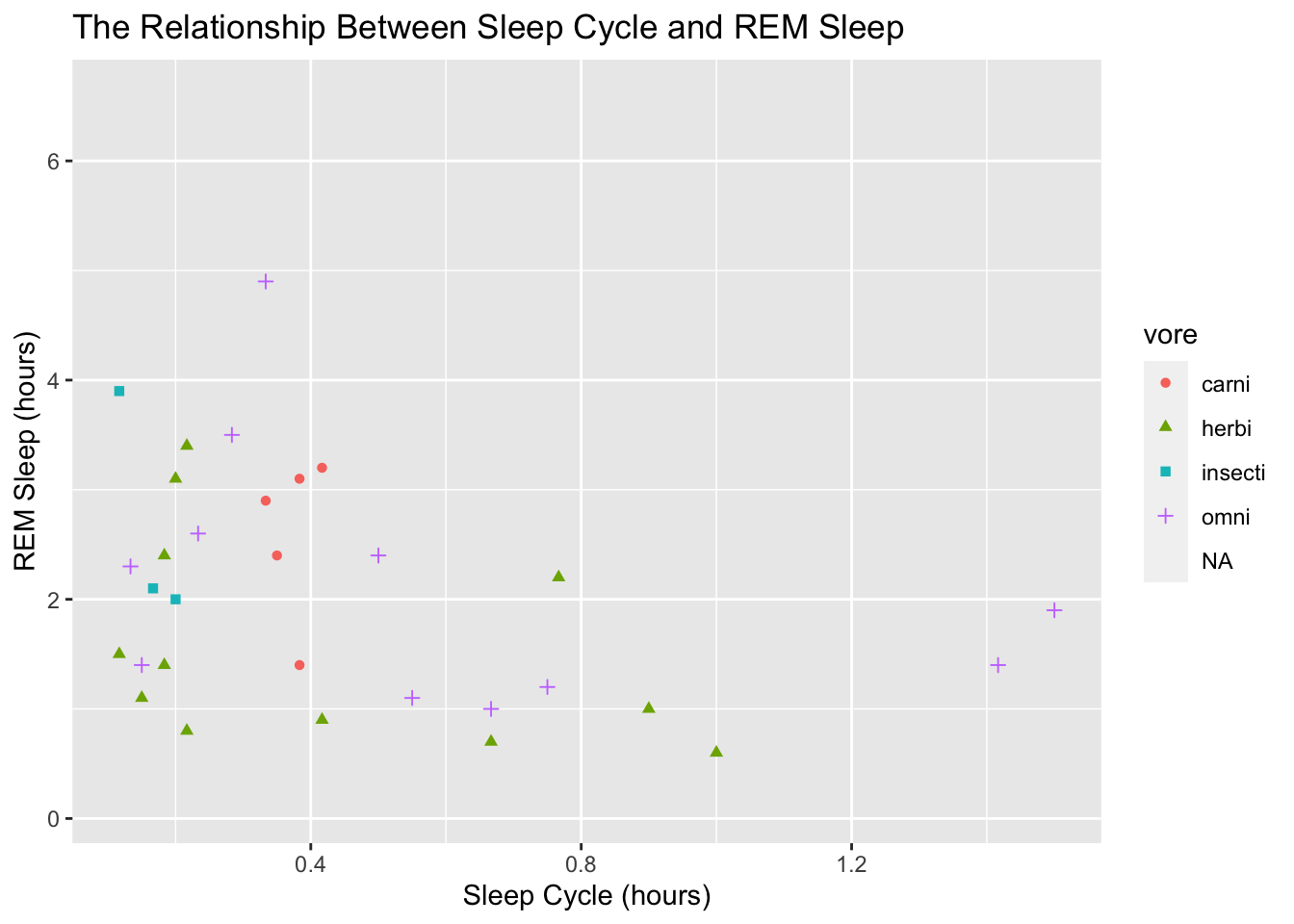
To adjust the title of the legend on the right side, we give a title to the aesthetic mapping we used, like this:
ggplot(data = msleep, mapping = aes(x = sleep_cycle, y = sleep_rem,
                                    shape = vore, color = vore)) +
  geom_point() +
  labs(title = "The Relationship Between Sleep Cycle and REM Sleep",
       x = "Sleep Cycle (hours)",
       y = "REM Sleep (hours)",
       shape = "Diet Type")
## Warning: Removed 52 rows containing missing values (geom_point).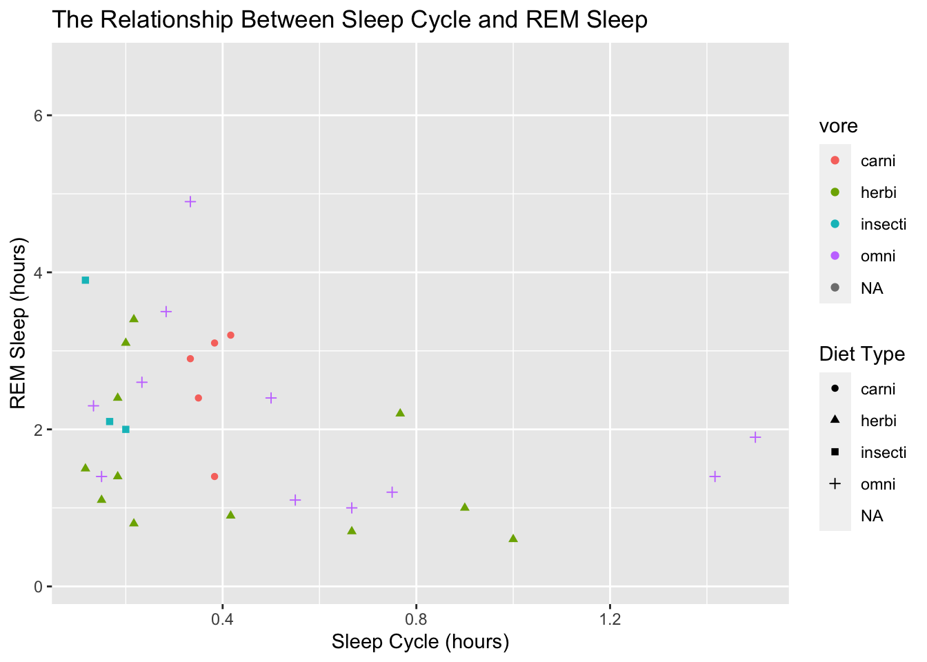
Notice how that created a second legend! Now we have one for the color and one for the shape. That’s probably not what we want. The easiest way to fix that is to assign the same title to both the shape and the color:
ggplot(data = msleep, mapping = aes(x = sleep_cycle, y = sleep_rem,
                                    shape = vore, color = vore)) +
  geom_point() +
  labs(title = "The Relationship Between Sleep Cycle and REM Sleep",
       x = "Sleep Cycle (hours)",
       y = "REM Sleep (hours)",
       shape = "Diet Type",
       color = "Diet Type")
## Warning: Removed 52 rows containing missing values (geom_point).
Scales
Now we need to clean up the labels in the legend. That can be done by modifying the raw data, but we can also change them within ggplot with one of the scales_* functions. There are many scale functions and they allow us to make changes to the values on a particular scale. For example, let’s add some more values to the x-axis with scale_x_continuous():
ggplot(data = msleep, mapping = aes(x = sleep_cycle, y = sleep_rem,
                                    shape = vore, color = vore)) +
  geom_point() +
  labs(title = "The Relationship Between Sleep Cycle and REM Sleep",
       x = "Sleep Cycle (hours)",
       y = "REM Sleep (hours)",
       shape = "Diet Type",
       color = "Diet Type") +
  scale_x_continuous(breaks = seq(0, 1.6, by = 0.2))
## Warning: Removed 52 rows containing missing values (geom_point).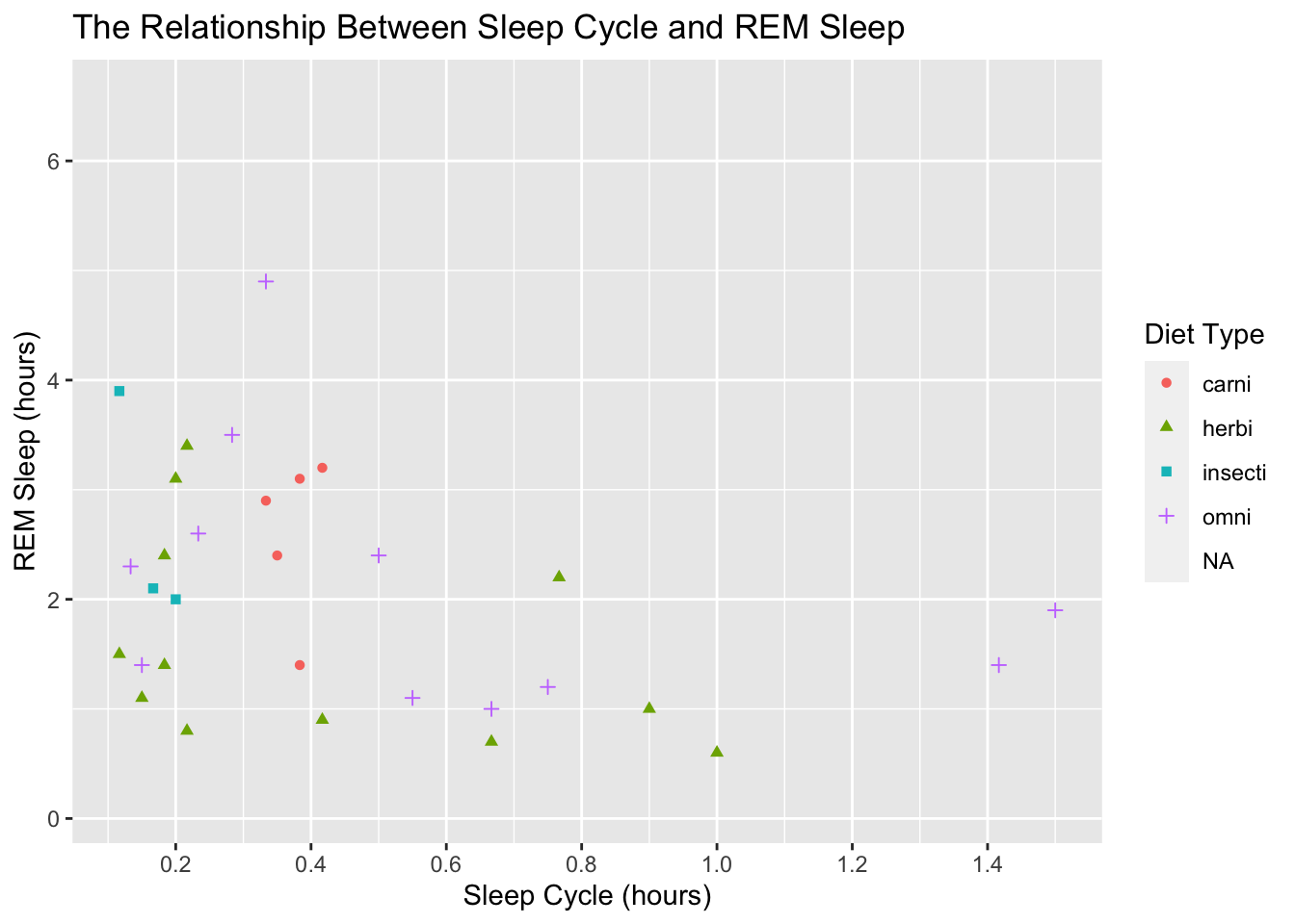
Now if you’re like me, it bugs you that the far left and right positions of the x-axis don’t have values. We can fix that by specifying the limits in scale_x_continuous():
ggplot(data = msleep, mapping = aes(x = sleep_cycle, y = sleep_rem,
                                    shape = vore, color = vore)) +
  geom_point() +
  labs(title = "The Relationship Between Sleep Cycle and REM Sleep",
       x = "Sleep Cycle (hours)",
       y = "REM Sleep (hours)",
       shape = "Diet Type",
       color = "Diet Type") +
  scale_x_continuous(breaks = seq(0, 1.6, by = 0.2),
                     limits = c(0, 1.6))
## Warning: Removed 52 rows containing missing values (geom_point).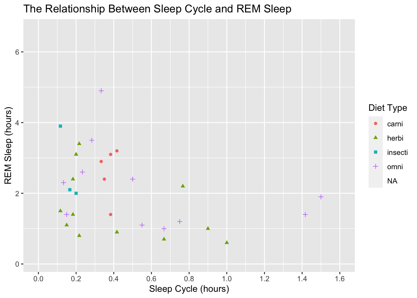
That looks better, but lets get back to the original task of modifying the legend values. To do that we use scale_color_discrete() because our color scale is discrete and not continuous:
ggplot(data = msleep, mapping = aes(x = sleep_cycle, y = sleep_rem,
                                    shape = vore, color = vore)) +
  geom_point() +
  labs(title = "The Relationship Between Sleep Cycle and REM Sleep",
       x = "Sleep Cycle (hours)",
       y = "REM Sleep (hours)",
       shape = "Diet Type",
       color = "Diet Type") +
  scale_x_continuous(breaks = seq(0, 1.6, by = 0.2),
                     limits = c(0, 1.6)) +
  scale_color_discrete(labels = c("Carnivore", "Herbivore", "?", "Omnivore"))
## Warning: Removed 52 rows containing missing values (geom_point).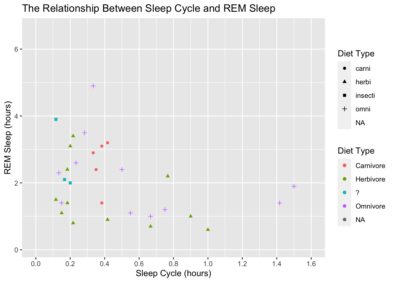
We got two legends again! Similar to before, we can fix this by assign the same labels to scale_shape():
ggplot(data = msleep, mapping = aes(x = sleep_cycle, y = sleep_rem,
                                    shape = vore, color = vore)) +
  geom_point() +
  labs(title = "The Relationship Between Sleep Cycle and REM Sleep",
       x = "Sleep Cycle (hours)",
       y = "REM Sleep (hours)",
       shape = "Diet Type",
       color = "Diet Type") +
  scale_x_continuous(breaks = seq(0, 1.6, by = 0.2),
                     limits = c(0, 1.6)) +
  scale_color_discrete(labels = c("Carnivore", "Herbivore", "?", "Omnivore")) +
  scale_shape(labels = c("Carnivore", "Herbivore", "?", "Omnivore"))
## Warning: Removed 52 rows containing missing values (geom_point).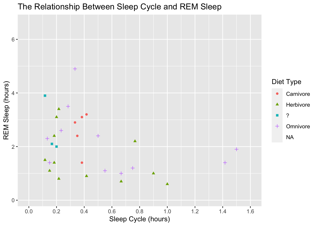
This is looking good. Before we adjust the theme of the plot, let’s make the points a little bigger. We accomplish that by adding a size argument to geom_point():
ggplot(data = msleep, mapping = aes(x = sleep_cycle, y = sleep_rem,
                                    shape = vore, color = vore)) +
  geom_point(size = 3) +
  labs(title = "The Relationship Between Sleep Cycle and REM Sleep",
       x = "Sleep Cycle (hours)",
       y = "REM Sleep (hours)",
       shape = "Diet Type",
       color = "Diet Type") +
  scale_x_continuous(breaks = seq(0, 1.6, by = 0.2),
                     limits = c(0, 1.6)) +
  scale_color_discrete(labels = c("Carnivore", "Herbivore", "?", "Omnivore")) +
  scale_shape(labels = c("Carnivore", "Herbivore", "?", "Omnivore"))
## Warning: Removed 52 rows containing missing values (geom_point).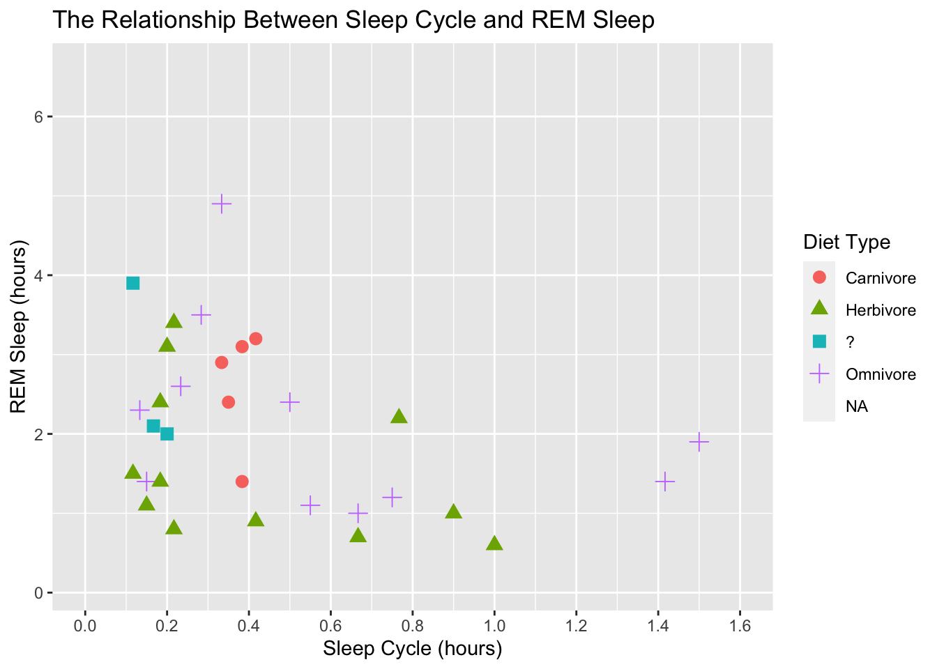
We can also adjust the units of the scales and the easiest way to do this is with the scales package. This package makes it easy to label the scales with comma formats, dollar formats, percentage, date formats, make nice axis breaks, data transformations, and much more.
Themes
On to the theme. Theme offer an easy way to change the overall look of the plot. There are several build-in options: e.g…
ggplot(data = msleep, mapping = aes(x = sleep_cycle, y = sleep_rem,
                                    shape = vore, color = vore)) +
  geom_point(size = 3) +
  labs(title = "The Relationship Between Sleep Cycle and REM Sleep",
       x = "Sleep Cycle (hours)",
       y = "REM Sleep (hours)",
       shape = "Diet Type",
       color = "Diet Type") +
  scale_x_continuous(breaks = seq(0, 1.6, by = 0.2),
                     limits = c(0, 1.6)) +
  scale_color_discrete(labels = c("Carnivore", "Herbivore", "?", "Omnivore")) +
  scale_shape(labels = c("Carnivore", "Herbivore", "?", "Omnivore")) +
  theme_classic()
## Warning: Removed 52 rows containing missing values (geom_point).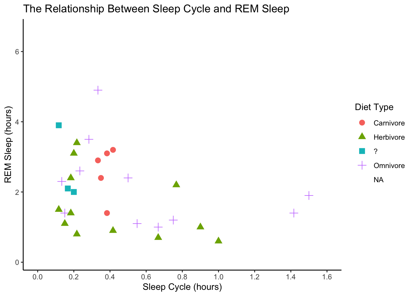
ggplot(data = msleep, mapping = aes(x = sleep_cycle, y = sleep_rem,
                                    shape = vore, color = vore)) +
  geom_point(size = 3) +
  labs(title = "The Relationship Between Sleep Cycle and REM Sleep",
       x = "Sleep Cycle (hours)",
       y = "REM Sleep (hours)",
       shape = "Diet Type",
       color = "Diet Type") +
  scale_x_continuous(breaks = seq(0, 1.6, by = 0.2),
                     limits = c(0, 1.6)) +
  scale_color_discrete(labels = c("Carnivore", "Herbivore", "?", "Omnivore")) +
  scale_shape(labels = c("Carnivore", "Herbivore", "?", "Omnivore")) +
  theme_dark()
## Warning: Removed 52 rows containing missing values (geom_point).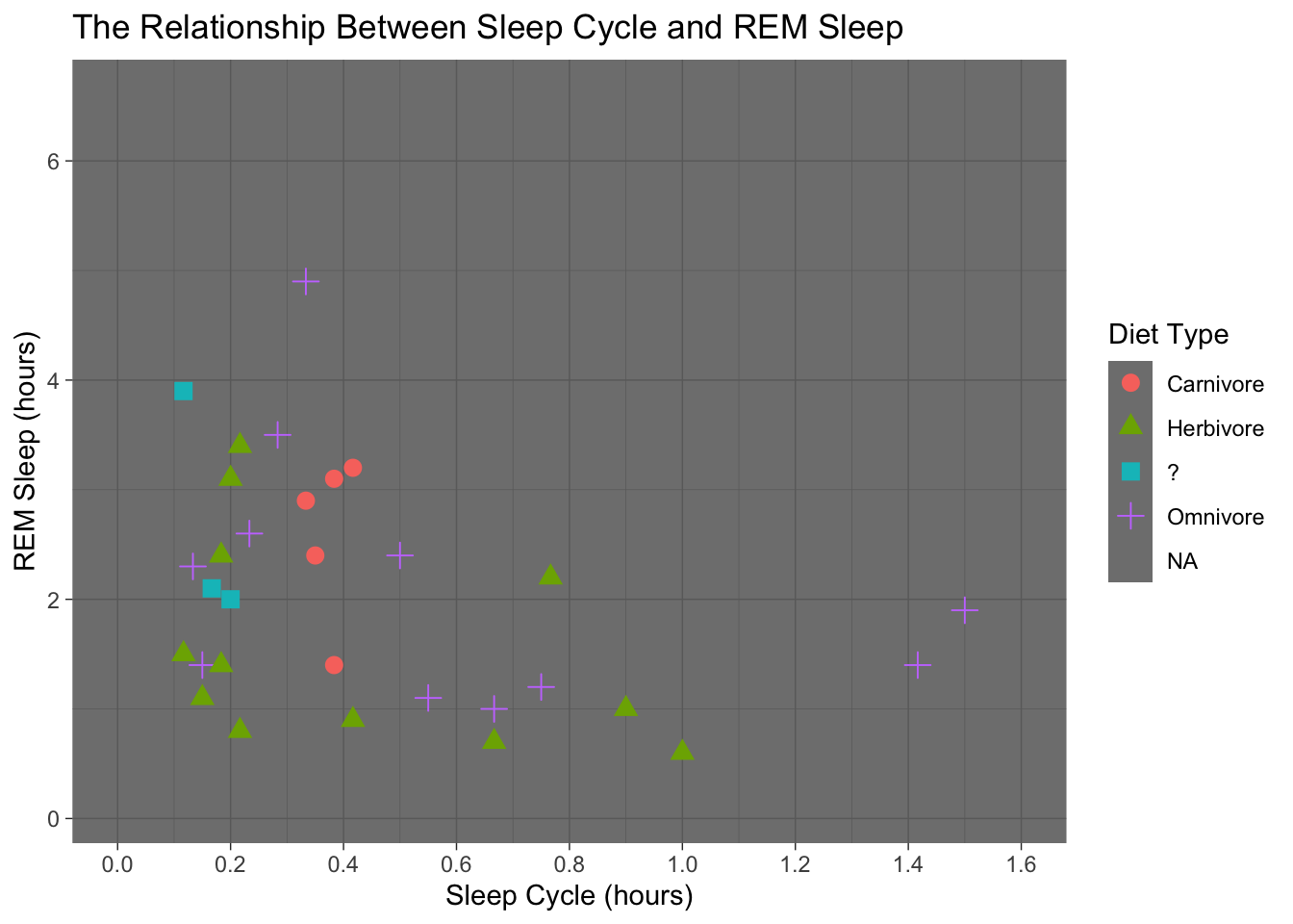
ggplot(data = msleep, mapping = aes(x = sleep_cycle, y = sleep_rem,
                                    shape = vore, color = vore)) +
  geom_point(size = 3) +
  labs(title = "The Relationship Between Sleep Cycle and REM Sleep",
       x = "Sleep Cycle (hours)",
       y = "REM Sleep (hours)",
       shape = "Diet Type",
       color = "Diet Type") +
  scale_x_continuous(breaks = seq(0, 1.6, by = 0.2),
                     limits = c(0, 1.6)) +
  scale_color_discrete(labels = c("Carnivore", "Herbivore", "?", "Omnivore")) +
  scale_shape(labels = c("Carnivore", "Herbivore", "?", "Omnivore")) +
  theme_minimal()
## Warning: Removed 52 rows containing missing values (geom_point).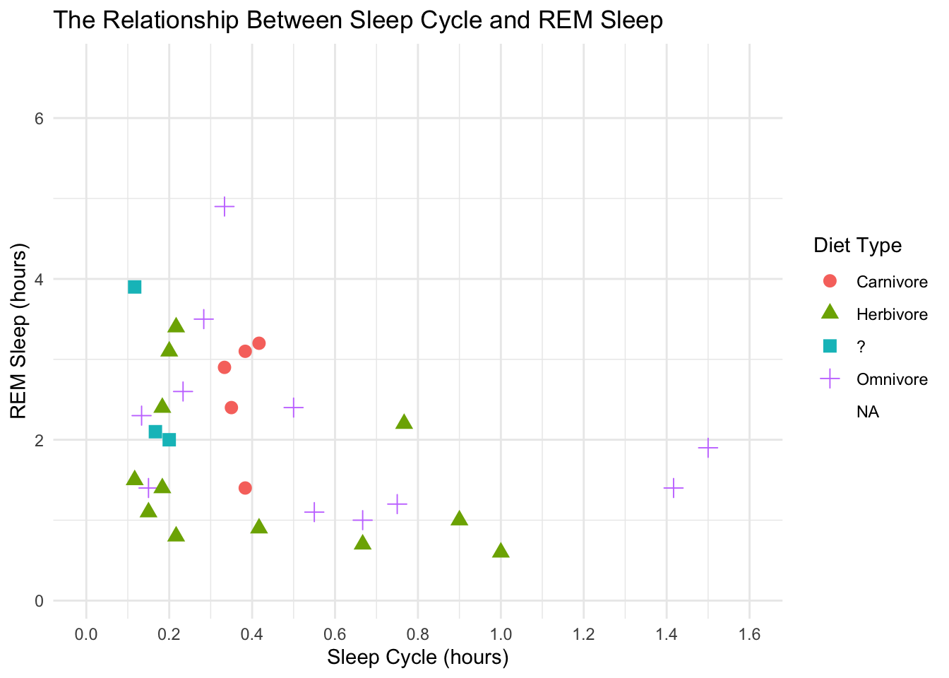
ggplot(data = msleep, mapping = aes(x = sleep_cycle, y = sleep_rem,
                                    shape = vore, color = vore)) +
  geom_point(size = 3) +
  labs(title = "The Relationship Between Sleep Cycle and REM Sleep",
       x = "Sleep Cycle (hours)",
       y = "REM Sleep (hours)",
       shape = "Diet Type",
       color = "Diet Type") +
  scale_x_continuous(breaks = seq(0, 1.6, by = 0.2),
                     limits = c(0, 1.6)) +
  scale_color_discrete(labels = c("Carnivore", "Herbivore", "?", "Omnivore")) +
  scale_shape(labels = c("Carnivore", "Herbivore", "?", "Omnivore")) +
  theme_void()
## Warning: Removed 52 rows containing missing values (geom_point).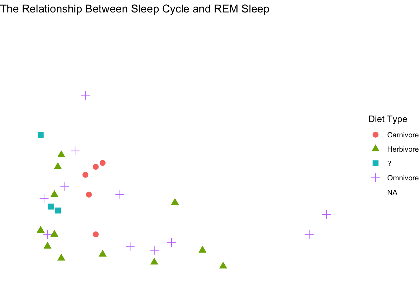
But there are also several R packages that provide great themes. Some of the ones I really like are ggthemes and ggpubr. Let’s explore some of these.
ggplot(data = msleep, mapping = aes(x = sleep_cycle, y = sleep_rem,
                                    shape = vore, color = vore)) +
  geom_point(size = 3) +
  labs(title = "The Relationship Between Sleep Cycle and REM Sleep",
       x = "Sleep Cycle (hours)",
       y = "REM Sleep (hours)",
       shape = "Diet Type",
       color = "Diet Type") +
  scale_x_continuous(breaks = seq(0, 1.6, by = 0.2),
                     limits = c(0, 1.6)) +
  scale_color_discrete(labels = c("Carnivore", "Herbivore", "?", "Omnivore")) +
  scale_shape(labels = c("Carnivore", "Herbivore", "?", "Omnivore")) +
  ggthemes::theme_economist()
## Warning: Removed 52 rows containing missing values (geom_point).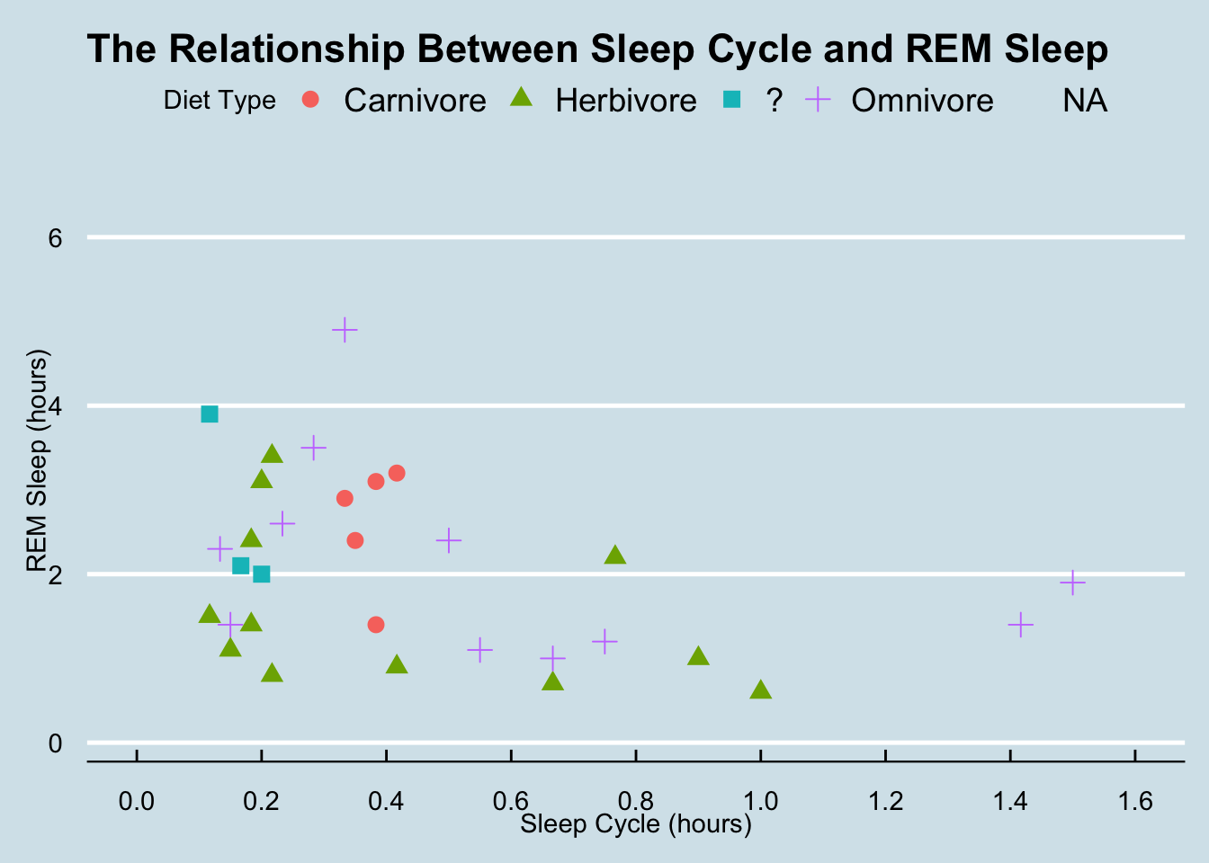
ggplot(data = msleep, mapping = aes(x = sleep_cycle, y = sleep_rem,
                                    shape = vore, color = vore)) +
  geom_point(size = 3) +
  labs(title = "The Relationship Between Sleep Cycle and REM Sleep",
       x = "Sleep Cycle (hours)",
       y = "REM Sleep (hours)",
       shape = "Diet Type",
       color = "Diet Type") +
  scale_x_continuous(breaks = seq(0, 1.6, by = 0.2),
                     limits = c(0, 1.6)) +
  scale_color_discrete(labels = c("Carnivore", "Herbivore", "?", "Omnivore")) +
  scale_shape(labels = c("Carnivore", "Herbivore", "?", "Omnivore")) +
  ggthemes::theme_fivethirtyeight()
## Warning: Removed 52 rows containing missing values (geom_point).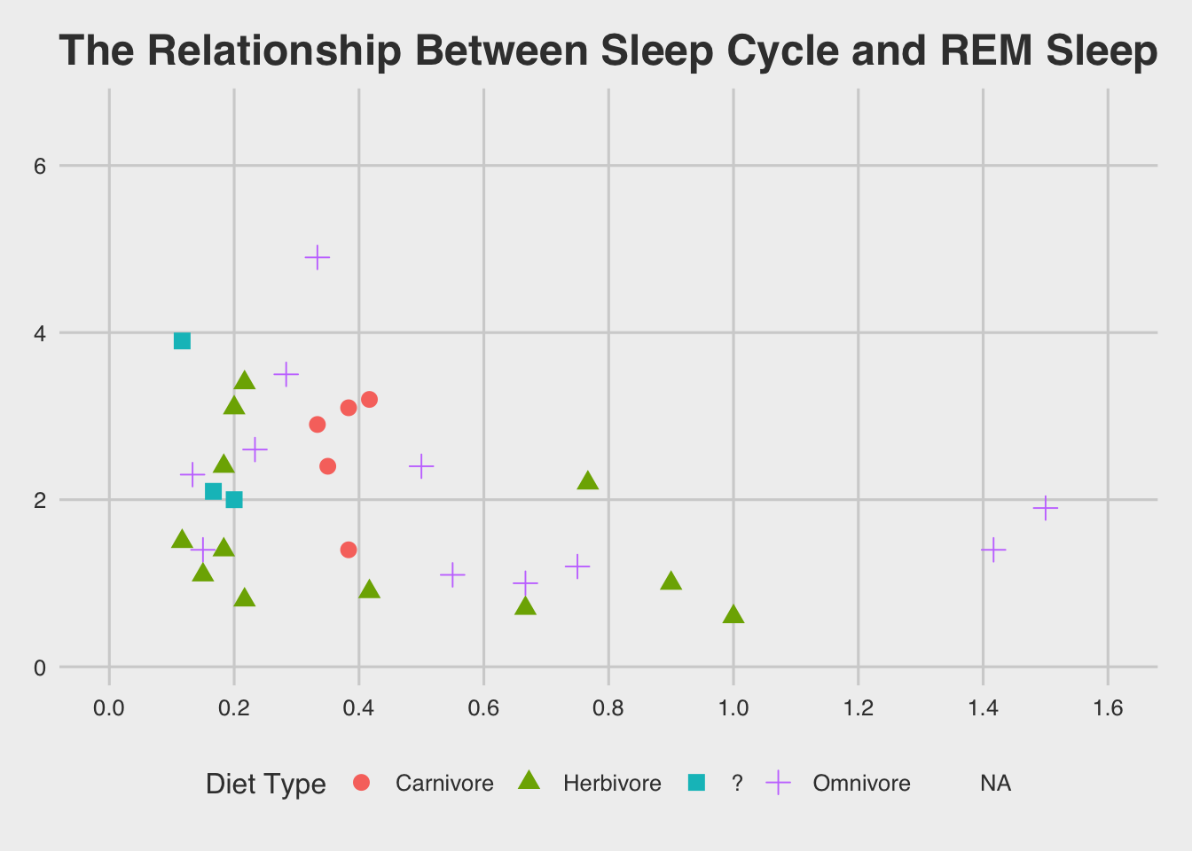
ggplot(data = msleep, mapping = aes(x = sleep_cycle, y = sleep_rem,
                                    shape = vore, color = vore)) +
  geom_point(size = 3) +
  labs(title = "The Relationship Between Sleep Cycle and REM Sleep",
       x = "Sleep Cycle (hours)",
       y = "REM Sleep (hours)",
       shape = "Diet Type",
       color = "Diet Type") +
  scale_x_continuous(breaks = seq(0, 1.6, by = 0.2),
                     limits = c(0, 1.6)) +
  scale_color_discrete(labels = c("Carnivore", "Herbivore", "?", "Omnivore")) +
  scale_shape(labels = c("Carnivore", "Herbivore", "?", "Omnivore")) +
  ggthemes::theme_gdocs()
## Warning: Removed 52 rows containing missing values (geom_point).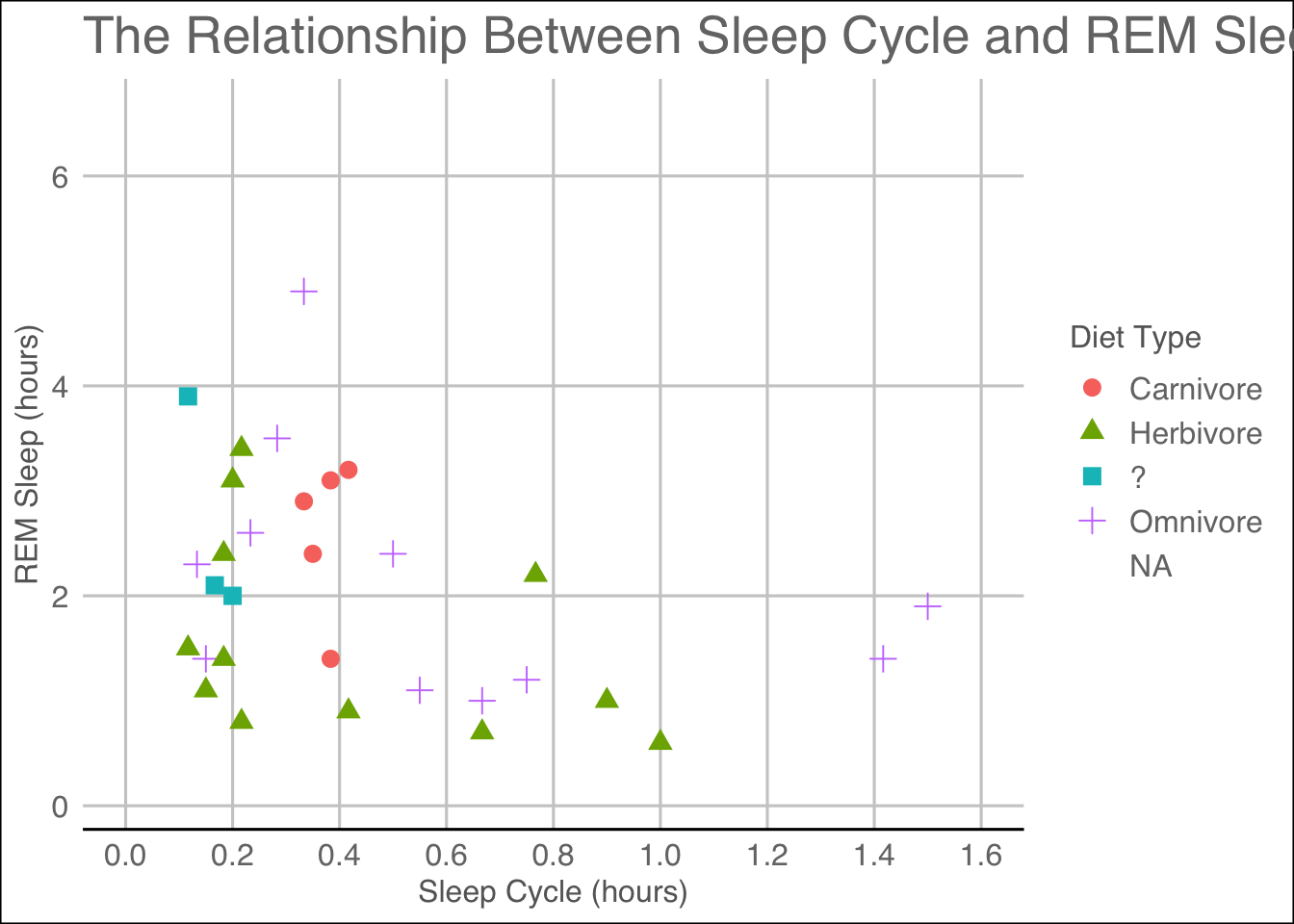
ggplot(data = msleep, mapping = aes(x = sleep_cycle, y = sleep_rem,
                                    shape = vore, color = vore)) +
  geom_point(size = 3) +
  labs(title = "The Relationship Between Sleep Cycle and REM Sleep",
       x = "Sleep Cycle (hours)",
       y = "REM Sleep (hours)",
       shape = "Diet Type",
       color = "Diet Type") +
  scale_x_continuous(breaks = seq(0, 1.6, by = 0.2),
                     limits = c(0, 1.6)) +
  scale_color_discrete(labels = c("Carnivore", "Herbivore", "?", "Omnivore")) +
  scale_shape(labels = c("Carnivore", "Herbivore", "?", "Omnivore")) +
  ggpubr::theme_pubr()
## Warning: Removed 52 rows containing missing values (geom_point).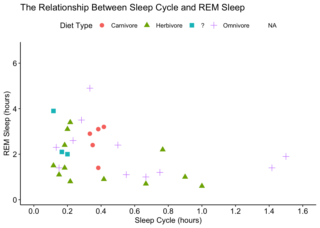
ggplot(data = msleep, mapping = aes(x = sleep_cycle, y = sleep_rem,
                                    shape = vore, color = vore)) +
  geom_point(size = 3) +
  labs(title = "The Relationship Between Sleep Cycle and REM Sleep",
       x = "Sleep Cycle (hours)",
       y = "REM Sleep (hours)",
       shape = "Diet Type",
       color = "Diet Type") +
  scale_x_continuous(breaks = seq(0, 1.6, by = 0.2),
                     limits = c(0, 1.6)) +
  scale_color_discrete(labels = c("Carnivore", "Herbivore", "?", "Omnivore")) +
  scale_shape(labels = c("Carnivore", "Herbivore", "?", "Omnivore")) +
  ggpubr::theme_pubclean()
## Warning: Removed 52 rows containing missing values (geom_point).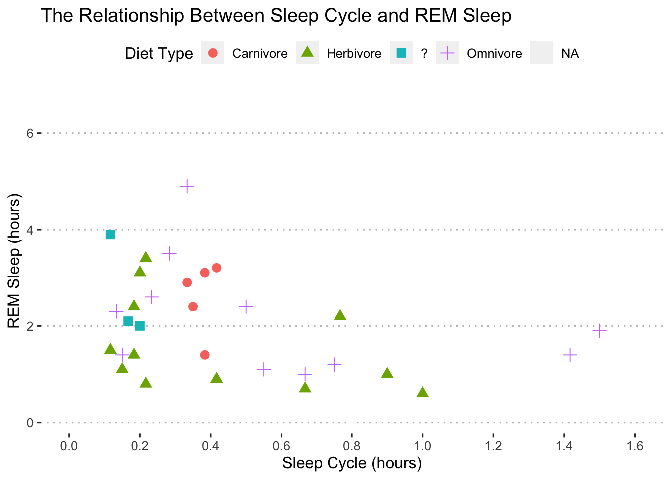
Nice! Now that we have the skills to create elegant plots, let’s use those skills to visualize the results of statistical models.
Visualizing Statistical Models
After we fit a statistical model it’s generally a good idea to visualize:
The coefficient estimates
The model’s fit to the data
Interaction terms
We can do all of these with ggplot. Let’s fit a model to get started.
I’m going to estimate a simple linear regression to see how body weight (bodywt) and brain weight (brainwt) affect total REM sleep (sleep_rem) and use the broom package to view the results:
fit1 <- lm(formula = sleep_rem ~ bodywt + brainwt,
           data = msleep)

library(broom)
tidy(fit1)
## # A tibble: 3 × 5
## term estimate std.error statistic p.value
## <chr> <dbl> <dbl> <dbl> <dbl>
## 1 (Intercept) 2.07 0.186 11.1 1.72e-14
## 2 bodywt -0.00220 0.00168 -1.30 1.99e- 1
## 3 brainwt -0.552 0.863 -0.639 5.26e- 1Coefficient Plots
The tidy function in the broom package makes it really easy to create a coefficient plot of the results:
tidy(fit1, conf.int = TRUE) ## # A tibble: 3 × 7
## term estimate std.error statistic p.value conf.low conf.high
## <chr> <dbl> <dbl> <dbl> <dbl> <dbl> <dbl>
## 1 (Intercept) 2.07 0.186 11.1 1.72e-14 1.69 2.44
## 2 bodywt -0.00220 0.00168 -1.30 1.99e- 1 -0.00558 0.00119
## 3 brainwt -0.552 0.863 -0.639 5.26e- 1 -2.29 1.19tidy(fit1, conf.int = TRUE) %>%
ggplot(data = .,
mapping = aes(x = estimate, y = term, xmin = conf.low, xmax = conf.high)) +
geom_pointrange()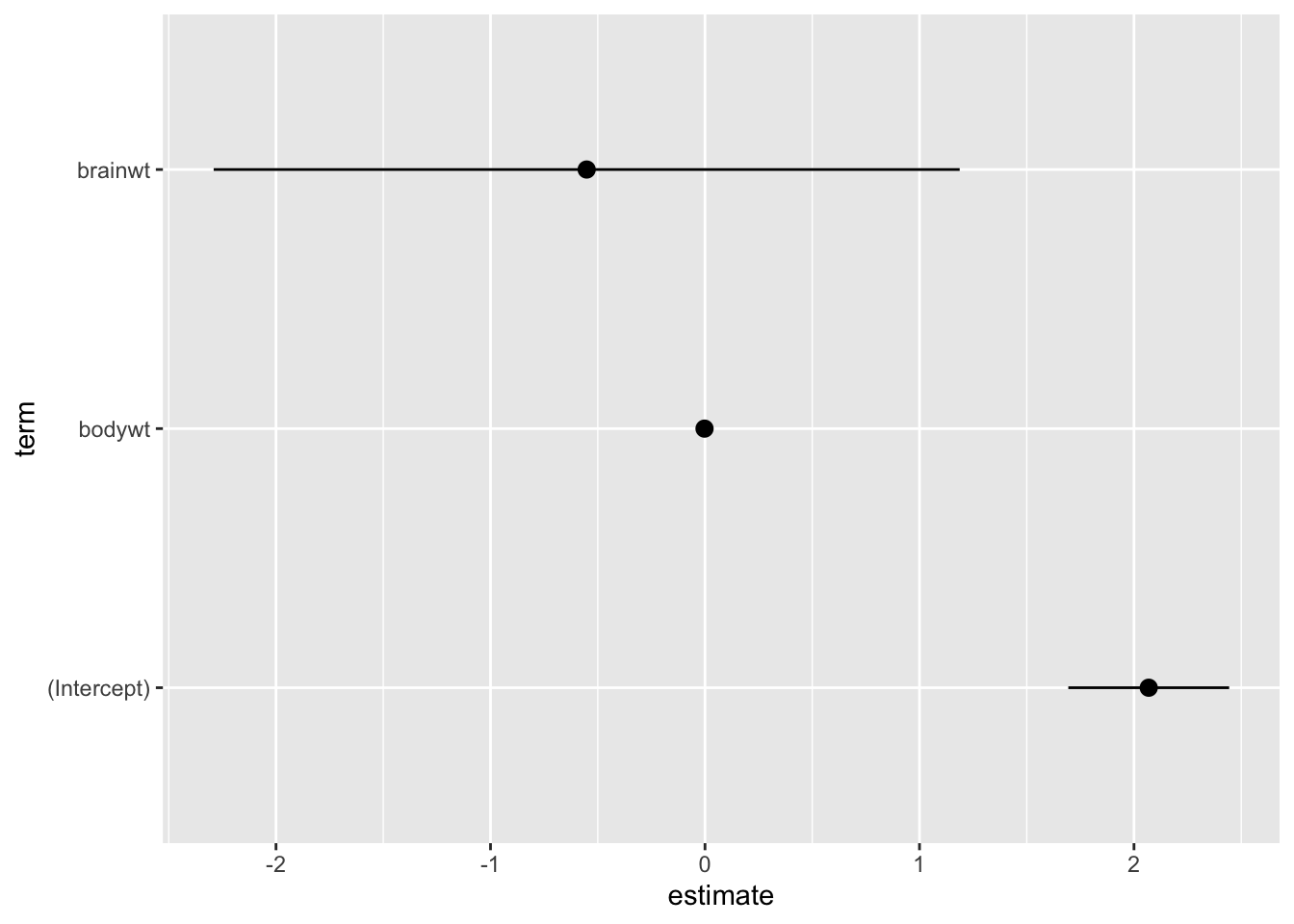
Remember, the plot should “stand on its own!” So, let’s clean it up:
tidy(fit1, conf.int = TRUE) %>%
  ggplot(data = .,
         mapping = aes(x = estimate, y = term, xmin = conf.low, xmax = conf.high)) +
geom_pointrange() +
labs(title = "Model Estimates of Brain and Body Weight on REM Sleep",
x = "Coefficient Estimate",
y = "Predictor",
caption = "Models fit with OLS. Error bars show the 95% confidence interval.") +
scale_y_discrete(labels = c("Intercept", "Body Weight", "Brain Weight")) +
ggpubr::theme_pubclean(flip = TRUE)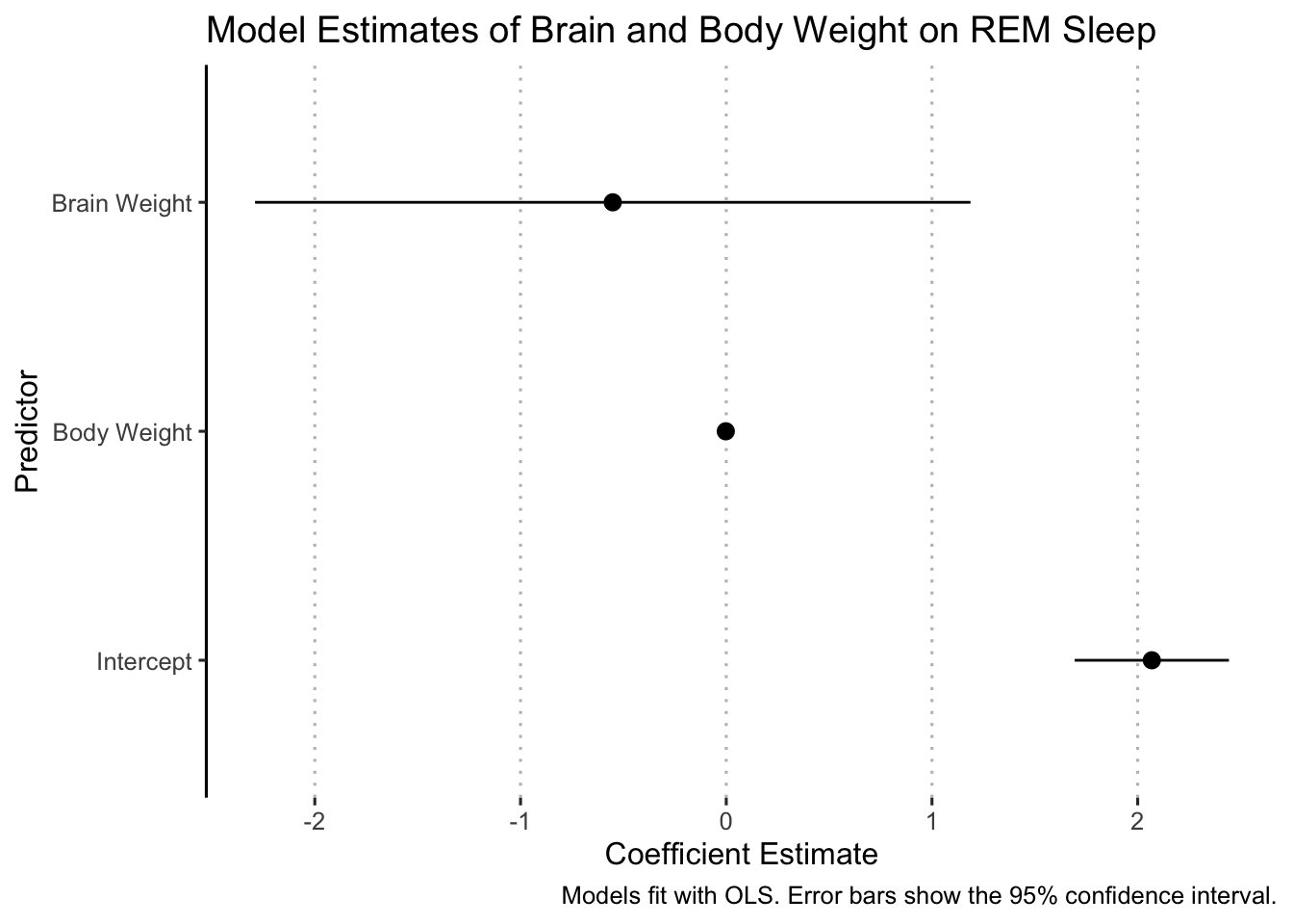
Sometimes we want to compare multiple models and coefficient plots provide a convenient way to do that. Let’s see how to add a second model to this plot. First, we fit a second model with awake as a predictor:
fit2 <- lm(formula = sleep_rem ~ bodywt + brainwt + awake,
           data = msleep)
tidy(fit2)
## # A tibble: 4 × 5
## term estimate std.error statistic p.value
## <chr> <dbl> <dbl> <dbl> <dbl>
## 1 (Intercept) 4.67 0.438 10.7 9.00e-14
## 2 bodywt 0.000535 0.00131 0.408 6.85e- 1
## 3 brainwt 0.230 0.648 0.355 7.24e- 1
## 4 awake -0.206 0.0330 -6.25 1.44e- 7There are several ways to combine the results into a single plot. We will do it by combining the results from both models into a single data frame (notice that I am also adding a new column with the name of each model):
fit1_results <- tidy(fit1, conf.int = TRUE) %>%
  mutate(model = "Model 1")

fit2_results <- tidy(fit2, conf.int = TRUE) %>%
  mutate(model = "Model 2")

model_results <- bind_rows(fit1_results, fit2_results)
Now we can plot the model_results object and map the model to a color or shape or both:
ggplot(data = model_results,
       aes(x = estimate, y = term, xmin = conf.low, xmax = conf.high,
           color = model, shape = model)) +
  geom_pointrange() +
  labs(title = "Model Estimates of Brain and Body Weight on REM Sleep",
       x = "Coefficient Estimate",
       y = "Predictor",
       caption = "Models fit with OLS. Error bars show the 95% confidence interval.") +
  scale_y_discrete(labels = c("Intercept", "Body Weight", "Brain Weight")) +
  ggpubr::theme_pubclean(flip = TRUE)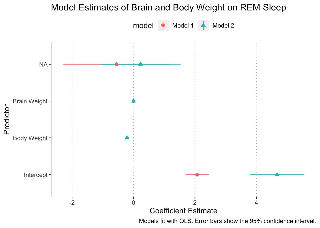
Not, bad but there are some things to clean up. We need to make sure the y-axis is labeled correctly and we also need to add some space between the coefficients for each model so that they aren’t right on top of each other. Let’s deal with the y-axis labels first.
The best way to make sure your y-axis labels are correct is to remove the old ones and write new ones. That helps ensure that we label everything correctly.
ggplot(data = model_results,
       aes(x = estimate, y = term, xmin = conf.low, xmax = conf.high,
           color = model, shape = model)) +
  geom_pointrange() +
  labs(title = "Model Estimates of Brain and Body Weight on REM Sleep",
       x = "Coefficient Estimate",
       y = "Predictor",
       caption = "Models fit with OLS. Error bars show the 95% confidence interval.") +
  ggpubr::theme_pubclean(flip = TRUE)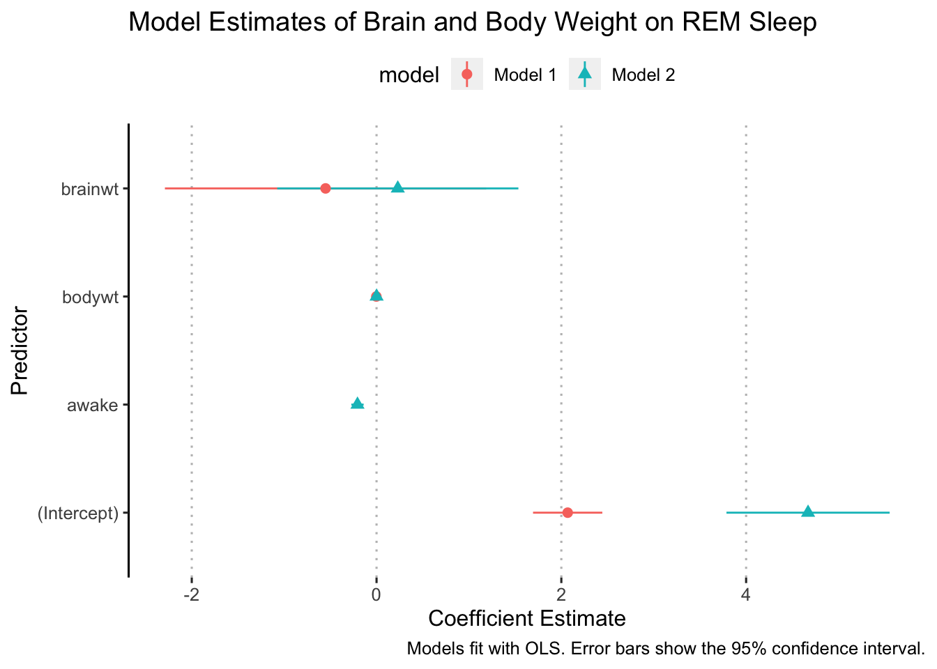
Ok, now we are ready to “dodge” the points. We do this with the position argument in geom_pointrange:
ggplot(data = model_results,
       aes(x = estimate, y = term, xmin = conf.low, xmax = conf.high,
           color = model, shape = model)) +
  geom_pointrange(position = position_dodge(width = 0.5)) +
  labs(title = "Model Estimates of Brain and Body Weight on REM Sleep",
       x = "Coefficient Estimate",
       y = "Predictor",
       caption = "Models fit with OLS. Error bars show the 95% confidence interval.") +
  scale_y_discrete(labels = c("Intercept", "Hours Awake", "Body Weight", "Brain Weight")) +
  ggpubr::theme_pubclean(flip = TRUE)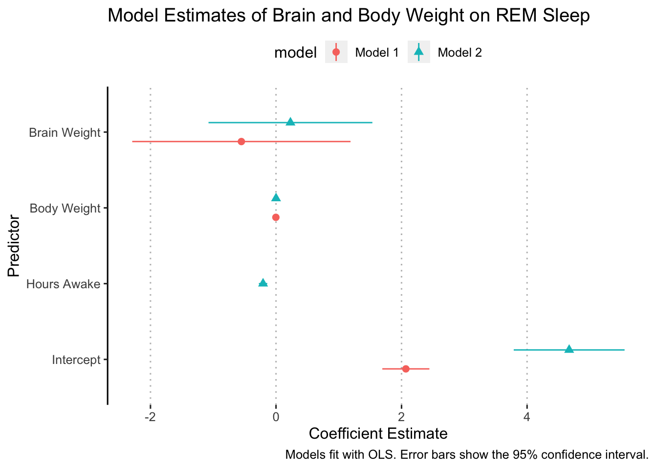
In some cases, it might make sense to flip the axes so that the error bars are vertical. We can do this simply by adding coord_flip() to our ggplot (I added it right after geom_pointrange():
ggplot(data = model_results,
       aes(x = estimate, y = term, xmin = conf.low, xmax = conf.high,
           color = model, shape = model)) +
  geom_pointrange(position = position_dodge(width = 0.5)) +
  coord_flip() +
  labs(title = "Model Estimates of Brain and Body Weight on REM Sleep",
       x = "Coefficient Estimate",
       y = "Predictor",
       caption = "Models fit with OLS. Error bars show the 95% confidence interval.") +
  scale_y_discrete(labels = c("Intercept", "Hours Awake", "Body Weight", "Brain Weight")) +
  ggpubr::theme_pubclean(flip = FALSE)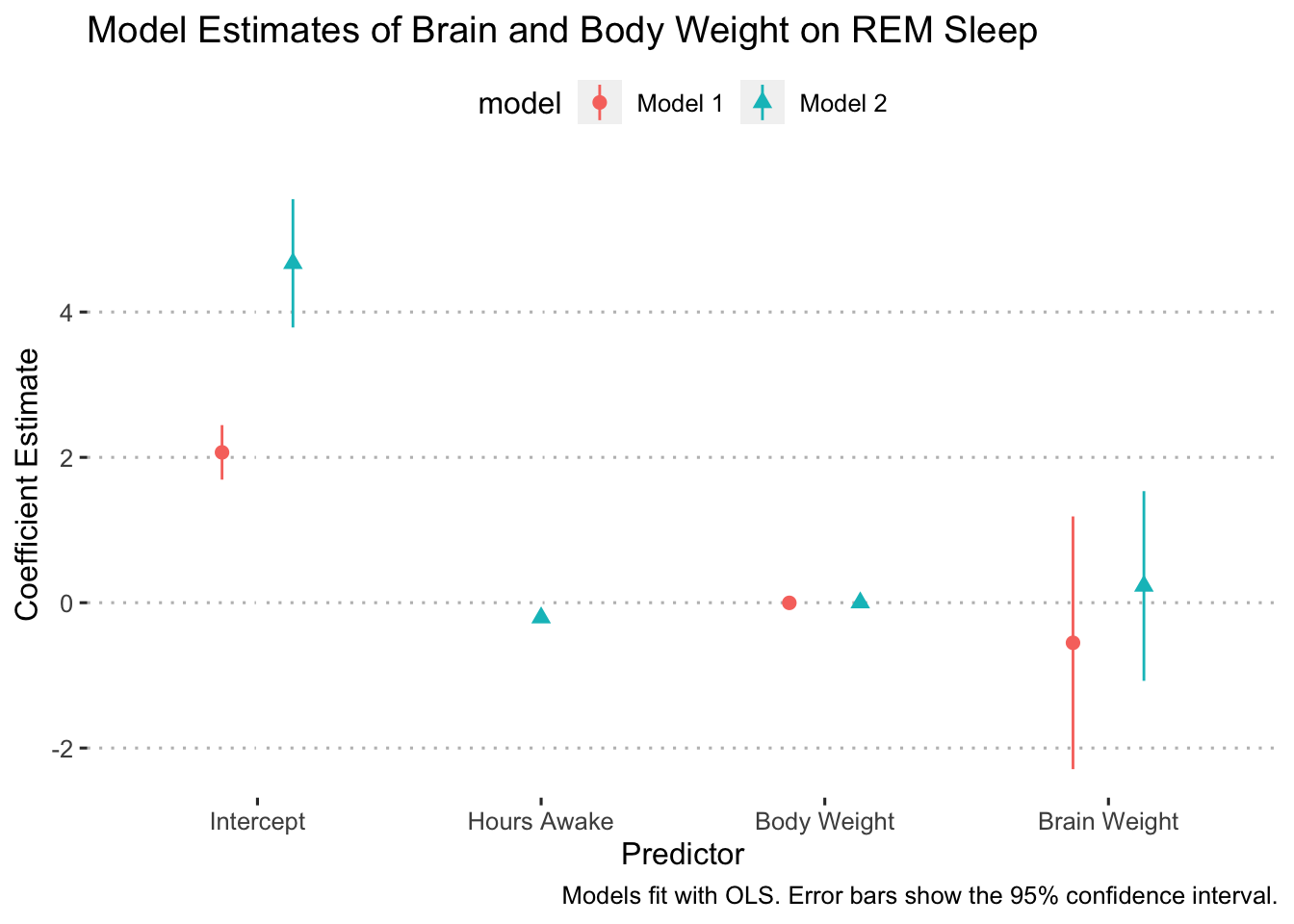
Finally, we’ll clean up the legend title:
ggplot(data = model_results,
       aes(x = estimate, y = term, xmin = conf.low, xmax = conf.high,
           color = model, shape = model)) +
  geom_pointrange(position = position_dodge(width = 0.5)) +
  coord_flip() +
  labs(title = "Model Estimates of Brain and Body Weight on REM Sleep",
       x = "Coefficient Estimate",
       y = "Predictor",
       caption = "Models fit with OLS. Error bars show the 95% confidence interval.",
       color = "Model:",
       shape = "Model:") +
  scale_y_discrete(labels = c("Intercept", "Hours Awake", "Body Weight", "Brain Weight")) +
  ggpubr::theme_pubclean(flip = FALSE)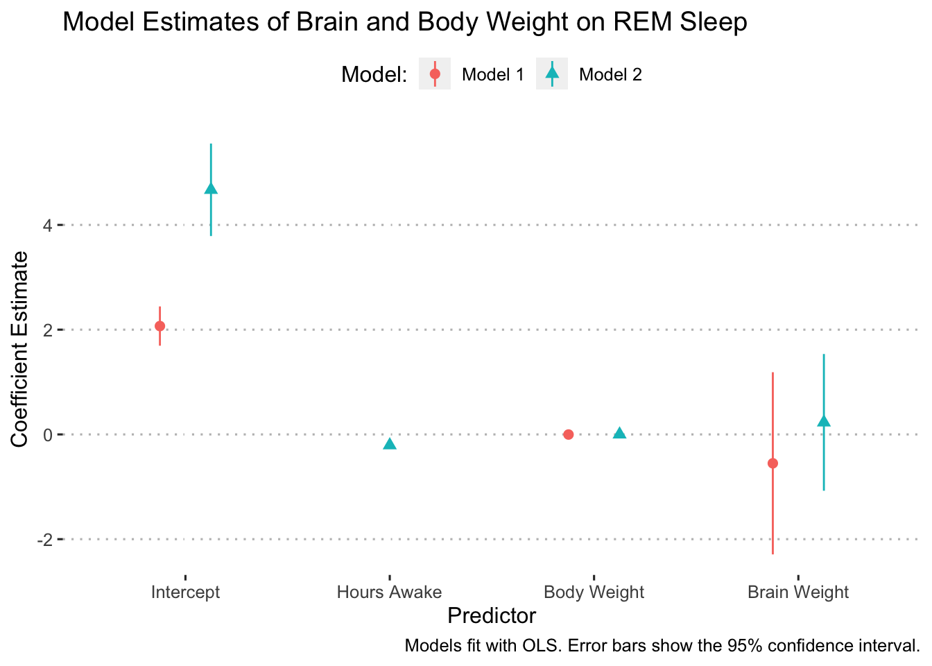
The Model’s Fit to the Data
A great way to see how well our estimated model fits the data is to plot the fitted line against the raw data. Let’s start by plotting the raw data for the variables that we want to see the model’s fit for:
library(scales)##
## Attaching package: 'scales'## The following object is masked from 'package:purrr':
##
## discard## The following object is masked from 'package:readr':
##
## col_factormsleep %>%
# drop rows with missing values for the outcome variable
drop_na(sleep_rem) %>%
ggplot(aes(x = brainwt, y = sleep_rem)) +
geom_point(size = 3, shape = 21, fill = "skyblue", alpha = 0.5) +
labs(title = "The Relationship Between Brain Weight and REM Sleep",
x = "Brain Weight (kilograms)",
y = "REM Sleep (hours)") +
scale_x_continuous(breaks = pretty_breaks(n = 8)) +
scale_y_continuous(breaks = pretty_breaks(n = 6)) +
theme_minimal()## Warning: Removed 13 rows containing missing values (geom_point).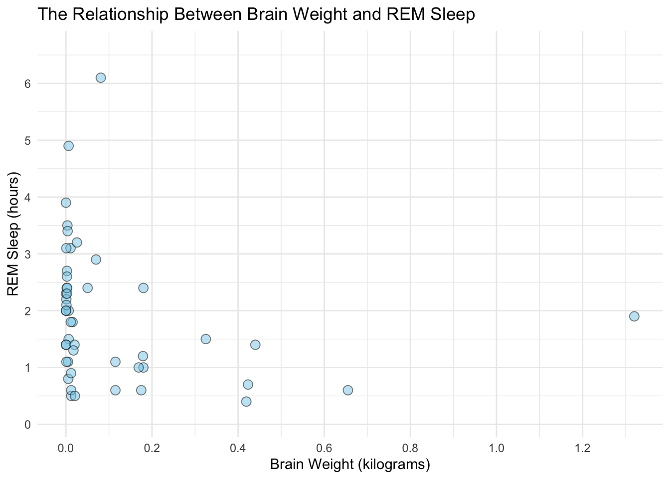
With plot of the raw data finished, we can add in our model’s fit for these points. We’ll do this by indexing the tidy model results fit1_results. Recall that indexing in R is done with brackets [] after the object and reads the input as [rows, columns]. Looking at the fit1_results content:
fit1_results## # A tibble: 3 × 8
## term estimate std.error statistic p.value conf.low conf.high model
## <chr> <dbl> <dbl> <dbl> <dbl> <dbl> <dbl> <chr>
## 1 (Intercept) 2.07 0.186 11.1 1.72e-14 1.69 2.44 Model 1
## 2 bodywt -0.00220 0.00168 -1.30 1.99e- 1 -0.00558 0.00119 Model 1
## 3 brainwt -0.552 0.863 -0.639 5.26e- 1 -2.29 1.19 Model 1We want to select row one, column one to get the intercept estimate.
# extract the data that was used to fit the model
model_data <- fit1$model

ggplot(data = model_data, aes(x = brainwt, y = sleep_rem)) +
  # plot the raw data
  geom_point(size = 3, shape = 21, fill = "skyblue", alpha = 0.5) +
  # plot the fitted line
  geom_abline(intercept = fit1_results[[1, 2]], slope = fit1_results[[3, 2]],
              color = "red") +
  labs(title = "The Relationship Between Brain Weight and REM Sleep",
       x = "Brain Weight (kilograms)",
       y = "REM Sleep (hours)",
       caption = "Fitted line estimate with OLS. The model includes a body weight as a predictor.") +
  scale_x_continuous(breaks = pretty_breaks(n = 8)) +
  scale_y_continuous(breaks = pretty_breaks(n = 6)) +
  theme_minimal()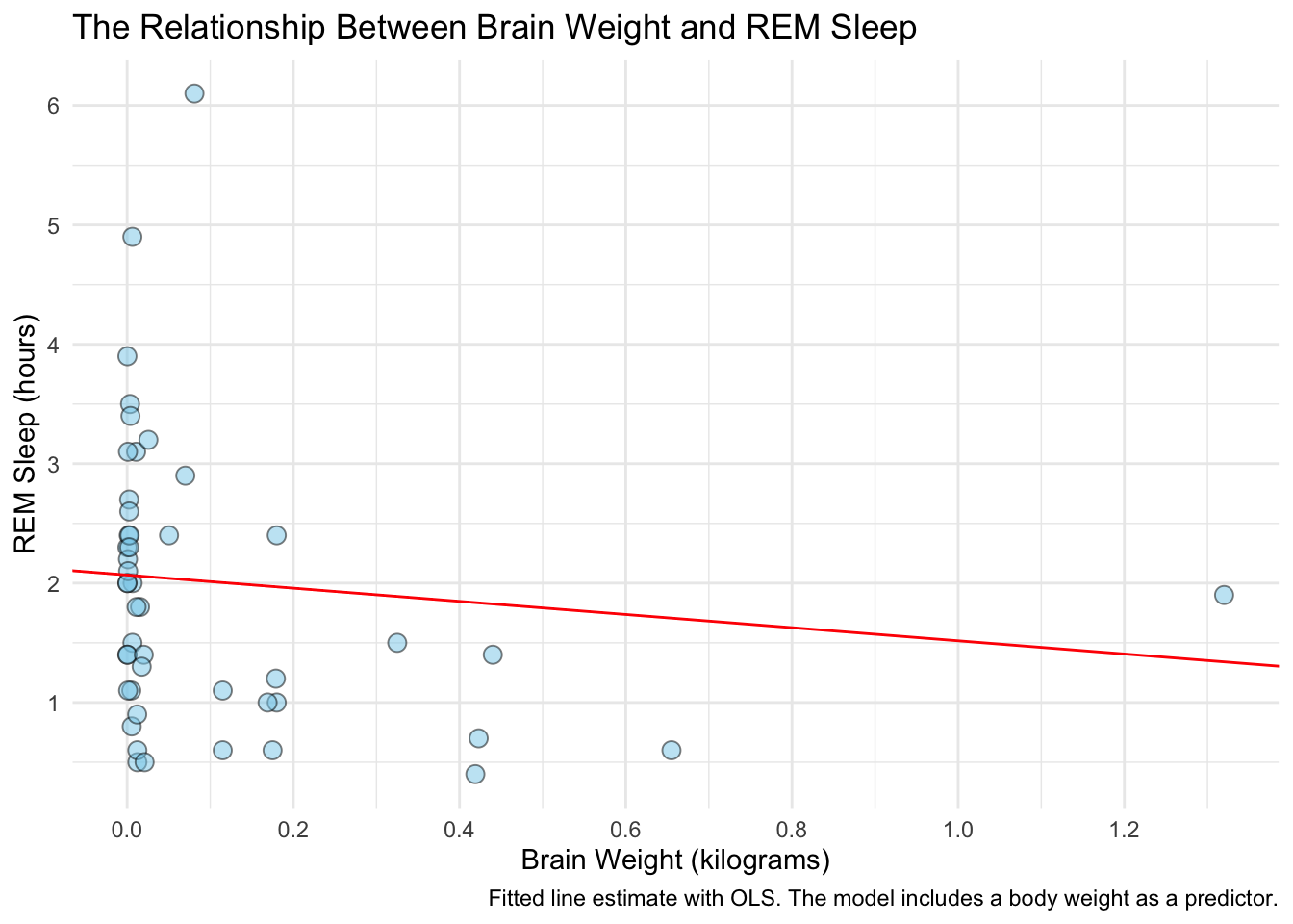
In order to add in the confidence intervals, we’ll need to do a bit more work. We need to calculate the marginal effects of brainwt at different weight levels and get the corresponding confidence intervals. This is easy to do with the ggpredict function in the ggeffects package. ggpredict produces a tidy data frame of marginal effects for the variables we specify at the levels we specify (which is optional).
After we get the marginal effects, we’ll build the plot backwards: start by plotting the fitted line with the confidence interval, then add in the raw data.
# calculate marginal effects for brainwt
library(ggeffects)
y_hat <- ggpredict(fit1, terms = "brainwt")
y_hat
## # Predicted values of sleep_rem
##
## brainwt | Predicted | 95% CI
## -----------------------------------
## 0.00 | 1.98 | [ 1.60, 2.35]
## 0.20 | 1.87 | [ 1.50, 2.23]
## 0.30 | 1.81 | [ 1.35, 2.27]
## 0.50 | 1.70 | [ 0.96, 2.44]
## 0.70 | 1.59 | [ 0.53, 2.65]
## 0.80 | 1.53 | [ 0.32, 2.75]
## 1.00 | 1.42 | [-0.12, 2.97]
## 1.30 | 1.26 | [-0.79, 3.30]
##
## Adjusted for:
## * bodywt = 42.52# plot the fit and confidence interval
ggplot(data = y_hat, aes(x = x, y = predicted)) +
# plot the fitted line
geom_line(color = "red") +
# plot the confidence intervals
geom_ribbon(aes(ymin = conf.low, ymax = conf.high), alpha = 0.3)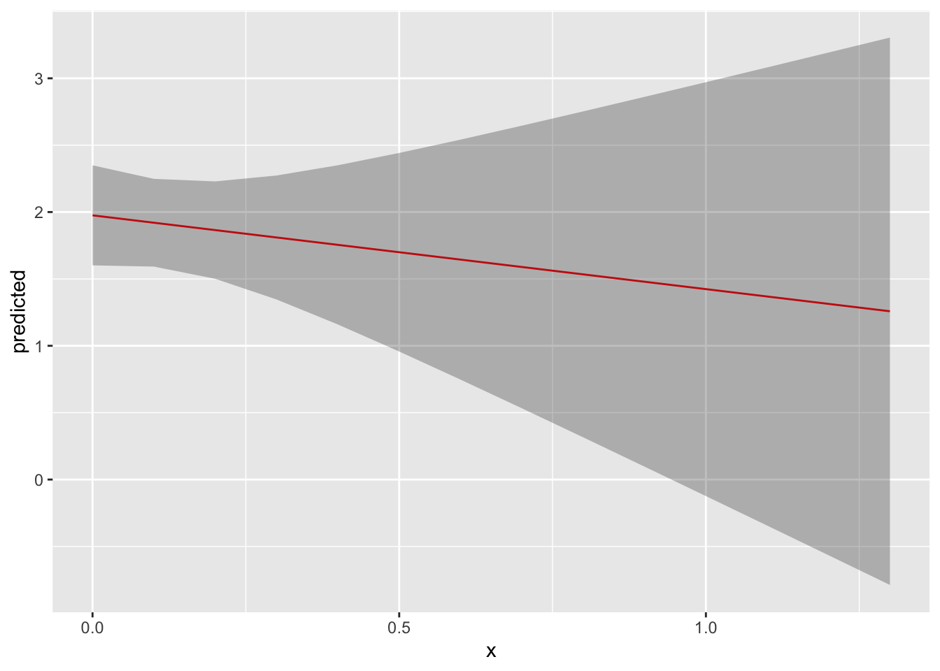
# now add in the raw data
ggplot(data = y_hat, aes(x = x, y = predicted)) +
  # plot the fitted line
  geom_line(color = "red") +
  # plot the confidence intervals
  geom_ribbon(aes(ymin = conf.low, ymax = conf.high), alpha = 0.3) +
  # plot the raw data
  geom_point(data = model_data, aes(x = brainwt, y = sleep_rem),
             size = 3, shape = 21, fill = "skyblue", alpha = 0.5) +
  labs(title = "The Relationship Between Brain Weight and REM Sleep",
       x = "Brain Weight (kilograms)",
       y = "REM Sleep (hours)",
       caption = "Fitted line estimate with OLS. \n The model includes a body weight as a predictor. \n The shaded region shows the 95% confidence interval.") +
  scale_x_continuous(breaks = pretty_breaks(n = 8)) +
  scale_y_continuous(breaks = pretty_breaks(n = 6)) +
  theme_minimal()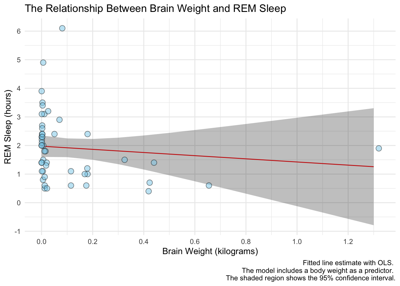
Notice the line breaks in the caption. When we have really long text in a title, axis name, caption, etc. we can use \n to specify a new line.
Interaction Terms
In some models we might be interested in the interaction between two, or more, variables. These interactions are really hard to understand with tables and coefficient plots, so it’s better to plot them. Suppose we were interested in knowing if the effect of body weight on REM sleep is attenuated by brain weight. Let’s plot out the raw data to get idea of what this effect might be.
msleep %>%
  # drop rows with missing data on the outcome variable
  drop_na(sleep_rem, vore) %>%
  ggplot(aes(x = brainwt, y = sleep_rem, color = vore)) +
  geom_point() +
  facet_wrap(~ vore)
## Warning: Removed 13 rows containing missing values (geom_point).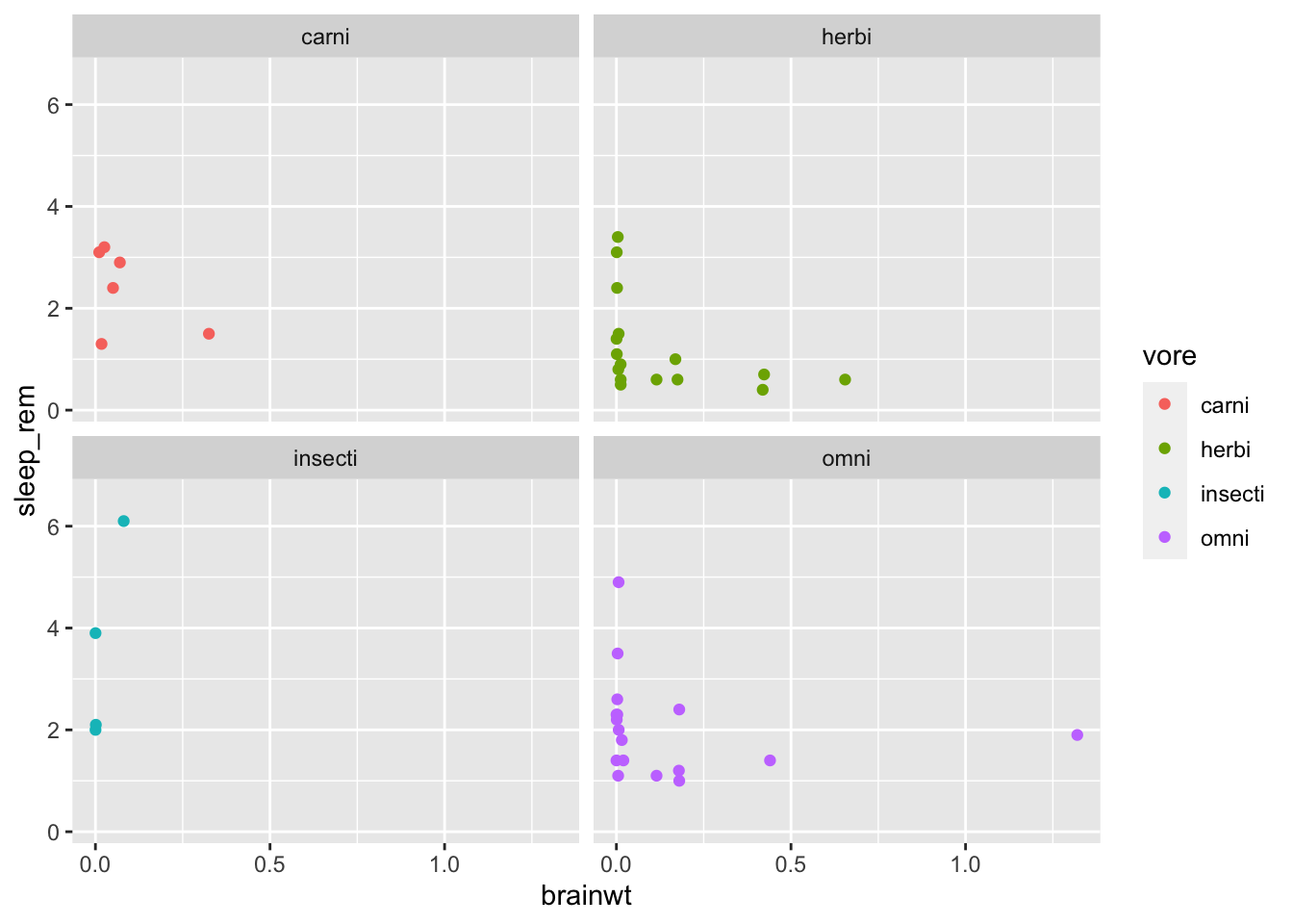
Let’s fit a model with an interaction term and see how to plot it out.
fit3 <- lm(formula = sleep_rem ~ bodywt + vore * brainwt,
           data = msleep)
tidy(fit3, conf.int = TRUE)
## # A tibble: 9 × 7
## term estimate std.error statistic p.value conf.low conf.high
## <chr> <dbl> <dbl> <dbl> <dbl> <dbl> <dbl>
## 1 (Intercept) 2.69 0.487 5.52 0.00000364 1.70e+0 3.68
## 2 bodywt 0.00123 0.00286 0.431 0.669 -4.59e-3 0.00705
## 3 voreherbi -1.20 0.564 -2.14 0.0400 -2.35e+0 -0.0585
## 4 voreinsecti -0.0455 0.738 -0.0617 0.951 -1.54e+0 1.45
## 5 voreomni -0.598 0.551 -1.09 0.285 -1.72e+0 0.521
## 6 brainwt -3.76 3.62 -1.04 0.306 -1.11e+1 3.59
## 7 voreherbi:brainwt 0.701 4.10 0.171 0.865 -7.64e+0 9.04
## 8 voreinsecti:brainwt 45.4 14.2 3.20 0.00295 1.66e+1 74.3
## 9 voreomni:brainwt 3.21 3.66 0.876 0.387 -4.23e+0 10.6Now we use ggpredict to get the marginal effects for the main effects and the interaction term:
y_hat <- ggpredict(fit3, terms = c("brainwt", "vore"))
y_hat
## # Predicted values of sleep_rem
##
## # vore = omni
##
## brainwt | Predicted | 95% CI
## -----------------------------------
## 0.00 | 2.15 | [ 1.60, 2.70]
## 0.30 | 1.98 | [ 1.46, 2.51]
## 0.50 | 1.87 | [ 1.19, 2.56]
## 0.80 | 1.71 | [ 0.67, 2.75]
## 1.30 | 1.43 | [-0.29, 3.16]
##
## # vore = herbi
##
## brainwt | Predicted | 95% CI
## -----------------------------------
## 0.00 | 1.54 | [ 0.91, 2.18]
## 0.30 | 0.63 | [-0.68, 1.93]
## 0.50 | 0.01 | [-2.32, 2.35]
## 0.80 | -0.90 | [-4.84, 3.03]
## 1.30 | -2.43 | [-9.05, 4.19]
##
## # vore = carni
##
## brainwt | Predicted | 95% CI
## ------------------------------------
## 0.00 | 2.75 | [ 1.75, 3.75]
## 0.30 | 1.62 | [ -0.07, 3.31]
## 0.50 | 0.87 | [ -2.15, 3.89]
## 0.80 | -0.26 | [ -5.37, 4.85]
## 1.30 | -2.14 | [-10.77, 6.49]
##
## # vore = insecti
##
## brainwt | Predicted | 95% CI
## ------------------------------------
## 0.00 | 2.70 | [ 1.59, 3.82]
## 0.30 | 15.20 | [ 7.60, 22.81]
## 0.50 | 23.54 | [10.54, 36.54]
## 0.80 | 36.04 | [14.92, 57.16]
## 1.30 | 56.87 | [22.20, 91.55]
##
## Adjusted for:
## * bodywt = 47.33Finally, we plot the effects just like before, but this time assigning the fill to group. We’ll also facet by group so that the lines aren’t on top of each other.
# extract the data that the model used
model_data <- fit3$model

# let's rename group to vore - that will make the plot easier
y_hat <-
  y_hat %>%
  rename(vore = group)

ggplot(data = y_hat, aes(x = x, y = predicted, fill = vore)) +
  # plot the fitted line
  geom_line() +
  # plot the confidence intervals
  geom_ribbon(aes(ymin = conf.low, ymax = conf.high), alpha = 0.3) +
  # plot the raw data
  geom_point(data = model_data, aes(x = brainwt, y = sleep_rem, fill = vore),
             size = 2, shape = 21, alpha = 0.5) +
  facet_wrap(~ vore)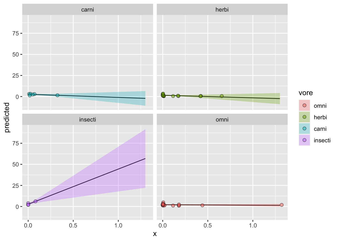
Awesome! Now let’s pretty this up a bit. We’ll start with labeling everything and picking a theme:
ggplot(data = y_hat, aes(x = x, y = predicted, fill = vore)) +
  # plot the fitted line
  geom_line() +
  # plot the confidence intervals
  geom_ribbon(aes(ymin = conf.low, ymax = conf.high), alpha = 0.3) +
  # plot the raw data
  geom_point(data = model_data, aes(x = brainwt, y = sleep_rem, fill = vore),
             size = 2, shape = 21, alpha = 0.5) +
  facet_wrap(~ vore) +
  labs(title = "The Effect of Brain Weight on REM Sleep by Diet Category",
       x = "Brain Weight (Kilograms)",
       y = "Predicted REM Sleep",
       fill = "Diet Category",
       caption = "Fitted line estimate with OLS. \n The model includes a body weight as a predictor. \n The shaded region shows the 95% confidence interval.") +
  ggpubr::theme_pubr()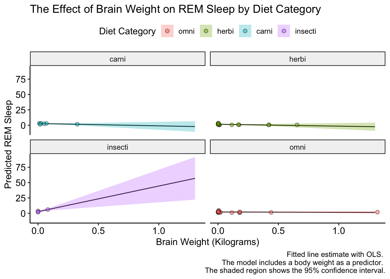
This looks good, but how to we label the facet names? Unlike scales, for facets we have to change the underlying data. Let’s do that an replot:
# change the labels in the prediction data
y_hat <-
  y_hat %>%
  mutate(vore = factor(vore,
                       levels = c("carni", "omni", "herbi", "insecti"),
                       labels = c("Carnivores", "Omnivores", "Herbivores",
                                  "?")))

# change the labels in the raw data
model_data <-
  model_data %>%
  mutate(vore = factor(vore,
                       levels = c("carni", "omni", "herbi", "insecti"),
                       labels = c("Carnivores", "Omnivores", "Herbivores",
                                  "?")))

# plot
ggplot(data = y_hat, aes(x = x, y = predicted, fill = vore)) +
  # plot the fitted line
  geom_line() +
  # plot the confidence intervals
  geom_ribbon(aes(ymin = conf.low, ymax = conf.high), alpha = 0.3) +
  # plot the raw data
  geom_point(data = model_data, aes(x = brainwt, y = sleep_rem, fill = vore),
             size = 2, shape = 21, alpha = 0.5) +
  facet_wrap(~ vore) +
  labs(title = "The Effect of Brain Weight on REM Sleep by Diet Category",
       x = "Brain Weight (Kilograms)",
       y = "Predicted REM Sleep",
       fill = "Diet Category",
       caption = "Fitted line estimate with OLS. \n The model includes a body weight as a predictor. \n The shaded region shows the 95% confidence interval.") +
  ggpubr::theme_pubr()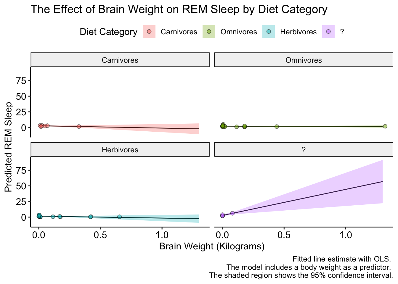
Excellent! Now, the data is a bit boring because the y-axis varies so much between diet categories. Luckily ggplot has us cover again. We can let the y-axis vary between facets by setting the scales = argument equal to "free" in facet_wrap(). Let’s check it out:
ggplot(data = y_hat, aes(x = x, y = predicted, fill = vore)) +
  # plot the fitted line
  geom_line() +
  # plot the confidence intervals
  geom_ribbon(aes(ymin = conf.low, ymax = conf.high), alpha = 0.3) +
  # plot the raw data
  geom_point(data = model_data, aes(x = brainwt, y = sleep_rem, fill = vore),
             size = 2, shape = 21, alpha = 0.5) +
  facet_wrap(~ vore, scales = "free") +
  labs(title = "The Effect of Brain Weight on REM Sleep by Diet Category",
       x = "Brain Weight (Kilograms)",
       y = "Predicted REM Sleep",
       fill = "Diet Category",
       caption = "Fitted line estimate with OLS. \n The model includes a body weight as a predictor. \n The shaded region shows the 95% confidence interval.") +
  ggpubr::theme_pubr()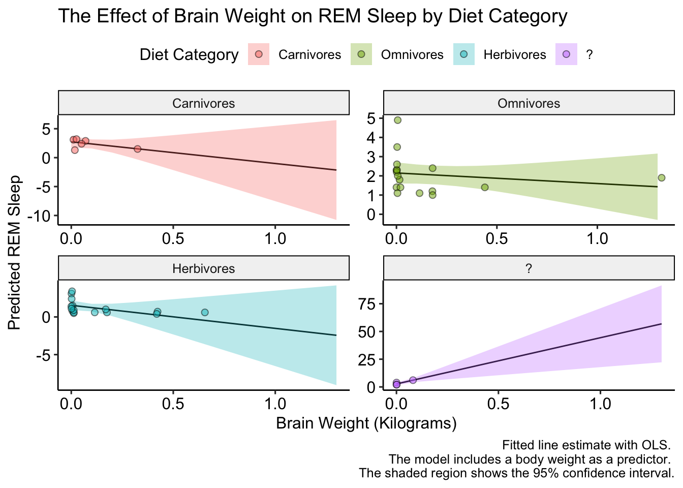
That looks better, but we could make it EVEN better if we added a few more points on the y-axis (there are only two tick marks for herbivores!). We’ll do this with the pretty_breaks() function in the scales package, which gets placed into the scale_y_continuous() function:
ggplot(data = y_hat, aes(x = x, y = predicted, fill = vore)) +
  # plot the fitted line
  geom_line() +
  # plot the confidence intervals
  geom_ribbon(aes(ymin = conf.low, ymax = conf.high), alpha = 0.3) +
  # plot the raw data
  geom_point(data = model_data, aes(x = brainwt, y = sleep_rem, fill = vore),
             size = 2, shape = 21, alpha = 0.5) +
  facet_wrap(~ vore, scales = "free") +
  labs(title = "The Effect of Brain Weight on REM Sleep by Diet Category",
       x = "Brain Weight (Kilograms)",
       y = "Predicted REM Sleep",
       fill = "Diet Category",
       caption = "Fitted line estimate with OLS. \n The model includes a body weight as a predictor. \n The shaded region shows the 95% confidence interval.") +
  scale_y_continuous(breaks = pretty_breaks(n = 6)) +
  ggpubr::theme_pubr()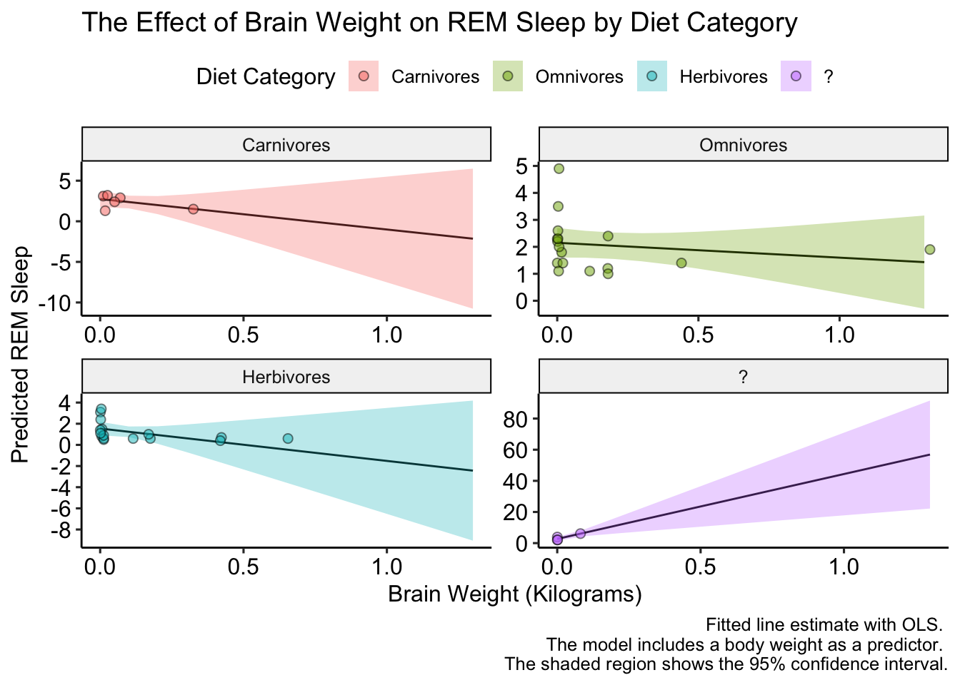
The plot looks a bit small, but we can fix that when we save it. That’s right we can save the plot too! We do that with the ggsave() function. We’ll set the plot argument equal to last_plot() which will automatically retrieve the last plot generated. We can specify the height and width with the arguments of the same names:
ggsave(filename = "interaction_plot.pdf", plot = last_plot(),
       height = 8, width = 12)
Resources for Further Study
We only touched the tip of the ggplot iceberg. For some inspiration, or maybe just to see what ggplot2 is capable of here are some amazing visuals produced with ggplot: https://awesomeopensource.com/project/z3tt/TidyTuesday.
To learn more, I recommend reading Chapter 3 of R for Data Science and ggplot2: Elegant Graphics for Data Analysis.