Tidy Time Series Analysis with R
This post will teach you the basics of working with times series data in R as well as how to build simple forecasting models and evaluate their performance.
Learning Objectives
Understand and work with date and date-time objects.
Visualize time series data.
Understand and identify the four core times series patterns: trends, cycles, seasons, and residual.
Build a forecast model and evaluate its performance.
Date and Date-time Objects
R has two primary types of date classes:
Date: This puts dates into the formatYYY-m-dand it tracks the number of days since the default of 1970-01-01.DateTime: Uses the ISO 8601 international standard format ofYYY-m-d H:M:Sto track the time since 1970-01-01 UTC. There are two options for this class:
POSIXctobject: tracks the number of seconds since the originPOSIXltobject: tracks the calendar date, time of day, and time zone
Let’s see some examples of these:
# check the current date
date <- Sys.Date()
date
## [1] "2022-04-21"class(date)## [1] "Date"# check the current time
time <- Sys.time()
time## [1] "2022-04-21 12:23:44 PDT"class(time)## [1] "POSIXct" "POSIXt"We can convert the POSIXct object to a POSIXlt object with as.POSIXlt:
time_lt <- as.POSIXlt(time)
time_lt
## [1] "2022-04-21 12:23:44 PDT"class(time_lt)## [1] "POSIXlt" "POSIXt"The differences between the POSIXct and POSIXlt objects really show if we unclass() each object type:
unclass(time)## [1] 1650569024unclass(time_lt)## $sec
## [1] 44.3334
##
## $min
## [1] 23
##
## $hour
## [1] 12
##
## $mday
## [1] 21
##
## $mon
## [1] 3
##
## $year
## [1] 122
##
## $wday
## [1] 4
##
## $yday
## [1] 110
##
## $isdst
## [1] 1
##
## $zone
## [1] "PDT"
##
## $gmtoff
## [1] -25200
##
## attr(,"tzone")
## [1] "" "PST" "PDT"These object types are important to know so that you can accurately classify date/time variables in any data set you work with. In general, it’s a good idea to use date objects POSIXct when the level of data is daily or higher. If we had hourly data, or smaller, we would want to use POSIXlt.
One challenge when working with date/time data is if the format doesn’t follow the international standard. Consider this example data frame from Hands-On Time Series Analysis with R:
library(tidyverse)

dates_df <- read_csv("https://raw.githubusercontent.com/PacktPublishing/Hands-On-Time-Series-Analysis-with-R/master/Chapter02/dates_formats.csv")

glimpse(dates_df)
## Rows: 22
## Columns: 7
## $ Japanese_format <chr> "2017/1/20", "2017/1/21", "2017/1/22", "2017/1/23…
## $ US_format <chr> "1/20/2017", "1/21/2017", "1/22/2017", "1/23/2017…
## $ US_long_format <chr> "Friday, January 20, 2017", "Saturday, January 21…
## $ CA_mix_format <chr> "January 20, 2017", "January 21, 2017", "January …
## $ SA_mix_format <chr> "20 January 2017", "21 January 2017", "22 January…
## $ NZ_format <chr> "20/01/2017", "21/01/2017", "22/01/2017", "23/01/…
## $ Excel_Numeric_Format <dbl> 42755, 42756, 42757, 42758, 42759, 42760, 42761, …Every date is stored in a different format! To read these correctly as dates, we need to specify the format of each one. That can be done with special symbols that stand in for different date/time characteristics. Here is a table of some of the possible symbols:
| Symbol | Meaning | Example |
|---|---|---|
%a |
Abbreviated weekday name in the current locale on this platform | Sun, Mon, Thu |
%A |
Full weekday name in the current locale | Sunday, Monday, Thursday |
%b |
Abbreviated month name in the current locale on this platform | Jan, Feb, Mar |
%B |
Full month name in the current locale | January, February, March |
%d |
Day of the month as a decimal number | 01, 02, 03 |
%m |
Month as a decimal number | 01, 02, 03 |
%y |
A year without a century (two-digit) | 18 |
%Y |
A year with a century (four-digit) | 2018 |
%r |
For a 12-hour clock defined by the AM/PM indicator | AM |
The Japanese format is already in the correct format (YYYY-m-d), so there isn’t any issue there, but the US_format is not. We can format it like this:
dates_df %>%
  mutate(US_format = as.POSIXct(US_format, format = "%m/%d/%Y"))
## # A tibble: 22 × 7
## Japanese_format US_format US_long_format CA_mix_format
## <chr> <dttm> <chr> <chr>
## 1 2017/1/20 2017-01-20 00:00:00 Friday, January 20, 2017 January 20, …
## 2 2017/1/21 2017-01-21 00:00:00 Saturday, January 21, 2017 January 21, …
## 3 2017/1/22 2017-01-22 00:00:00 Sunday, January 22, 2017 January 22, …
## 4 2017/1/23 2017-01-23 00:00:00 Monday, January 23, 2017 January 23, …
## 5 2017/1/24 2017-01-24 00:00:00 Tuesday, January 24, 2017 January 24, …
## 6 2017/1/25 2017-01-25 00:00:00 Wednesday, January 25, 2017 January 25, …
## 7 2017/1/26 2017-01-26 00:00:00 Thursday, January 26, 2017 January 26, …
## 8 2017/1/27 2017-01-27 00:00:00 Friday, January 27, 2017 January 27, …
## 9 2017/1/28 2017-01-28 00:00:00 Saturday, January 28, 2017 January 28, …
## 10 2017/1/29 2017-01-29 00:00:00 Sunday, January 29, 2017 January 29, …
## # … with 12 more rows, and 3 more variables: SA_mix_format <chr>,
## # NZ_format <chr>, Excel_Numeric_Format <dbl>Notice that the format must match the date format exactly - which includes the separators (/ in this case). Let’s try US_long_format:
dates_df %>%
  mutate(US_long_format = as.POSIXct(US_long_format, format = "%A, %B %d, %Y"))
## # A tibble: 22 × 7
## Japanese_format US_format US_long_format CA_mix_format SA_mix_format
## <chr> <chr> <dttm> <chr> <chr>
## 1 2017/1/20 1/20/2017 2017-01-20 00:00:00 January 20, 2017 20 January 20…
## 2 2017/1/21 1/21/2017 2017-01-21 00:00:00 January 21, 2017 21 January 20…
## 3 2017/1/22 1/22/2017 2017-01-22 00:00:00 January 22, 2017 22 January 20…
## 4 2017/1/23 1/23/2017 2017-01-23 00:00:00 January 23, 2017 23 January 20…
## 5 2017/1/24 1/24/2017 2017-01-24 00:00:00 January 24, 2017 24 January 20…
## 6 2017/1/25 1/25/2017 2017-01-25 00:00:00 January 25, 2017 25 January 20…
## 7 2017/1/26 1/26/2017 2017-01-26 00:00:00 January 26, 2017 26 January 20…
## 8 2017/1/27 1/27/2017 2017-01-27 00:00:00 January 27, 2017 27 January 20…
## 9 2017/1/28 1/28/2017 2017-01-28 00:00:00 January 28, 2017 28 January 20…
## 10 2017/1/29 1/29/2017 2017-01-29 00:00:00 January 29, 2017 29 January 20…
## # … with 12 more rows, and 2 more variables: NZ_format <chr>,
## # Excel_Numeric_Format <dbl>Practice:
Format SA_mix_format as a DateTime (POSIXct) object.
That’s pretty tedious, isn’t it! Well, there’s a better way…The lubridate package provides wrappers for the date/time symbols that make it super easy to format dates. All you need to do is use the right order of abbreviations. To see how this works, let’s reformat the two dates we just worked on with lubridate instead:
library(lubridate)

dates_df %>%
  mutate(US_format = mdy(US_format))
## # A tibble: 22 × 7
## Japanese_format US_format US_long_format CA_mix_format SA_mix_format
## <chr> <date> <chr> <chr> <chr>
## 1 2017/1/20 2017-01-20 Friday, January 20, 2… January 20, … 20 January 2…
## 2 2017/1/21 2017-01-21 Saturday, January 21,… January 21, … 21 January 2…
## 3 2017/1/22 2017-01-22 Sunday, January 22, 2… January 22, … 22 January 2…
## 4 2017/1/23 2017-01-23 Monday, January 23, 2… January 23, … 23 January 2…
## 5 2017/1/24 2017-01-24 Tuesday, January 24, … January 24, … 24 January 2…
## 6 2017/1/25 2017-01-25 Wednesday, January 25… January 25, … 25 January 2…
## 7 2017/1/26 2017-01-26 Thursday, January 26,… January 26, … 26 January 2…
## 8 2017/1/27 2017-01-27 Friday, January 27, 2… January 27, … 27 January 2…
## 9 2017/1/28 2017-01-28 Saturday, January 28,… January 28, … 28 January 2…
## 10 2017/1/29 2017-01-29 Sunday, January 29, 2… January 29, … 29 January 2…
## # … with 12 more rows, and 2 more variables: NZ_format <chr>,
## # Excel_Numeric_Format <dbl>dates_df %>%
mutate(US_long_format = mdy(US_long_format))## # A tibble: 22 × 7
## Japanese_format US_format US_long_format CA_mix_format SA_mix_format
## <chr> <chr> <date> <chr> <chr>
## 1 2017/1/20 1/20/2017 2017-01-20 January 20, 2017 20 January 2017
## 2 2017/1/21 1/21/2017 2017-01-21 January 21, 2017 21 January 2017
## 3 2017/1/22 1/22/2017 2017-01-22 January 22, 2017 22 January 2017
## 4 2017/1/23 1/23/2017 2017-01-23 January 23, 2017 23 January 2017
## 5 2017/1/24 1/24/2017 2017-01-24 January 24, 2017 24 January 2017
## 6 2017/1/25 1/25/2017 2017-01-25 January 25, 2017 25 January 2017
## 7 2017/1/26 1/26/2017 2017-01-26 January 26, 2017 26 January 2017
## 8 2017/1/27 1/27/2017 2017-01-27 January 27, 2017 27 January 2017
## 9 2017/1/28 1/28/2017 2017-01-28 January 28, 2017 28 January 2017
## 10 2017/1/29 1/29/2017 2017-01-29 January 29, 2017 29 January 2017
## # … with 12 more rows, and 2 more variables: NZ_format <chr>,
## # Excel_Numeric_Format <dbl>For the US_long_format notice that lubridate ignores the full day name that precedes the month.
What if we had a really complicated date-time object like this:
time_US_str <- "Monday, December 31, 2018 11:59:59 PM"Without lubridate we format it like this:
as.POSIXct(time_US_str, format = "%A, %B %d, %Y %I:%M:%S %p")## [1] "2018-12-31 23:59:59 PST"But, with lubridate:
mdy_hms(time_US_str, tz = "US/Pacific")## [1] "2018-12-31 23:59:59 PST"Hint: you can see a list of all timezone options in R with OlsonNames()
Ok, I’m sure I’ve won you over with lubridate. Now, let’s load the UKgrid data set made available through the UKgrid package. This dataset tracks electricity usage in the UK between April 2005 and October 2019. We’re going to focus on the national demand for electricity (ND).
library(UKgrid)
library(janitor)

uk_data <-
  UKgrid %>%
  # lowercase all column names
  clean_names() %>%
  select(timestamp, nd)

glimpse(uk_data)
## Rows: 254,592
## Columns: 2
## $ timestamp <dttm> 2005-04-01 00:00:00, 2005-04-01 00:30:00, 2005-04-01 01:00:…
## $ nd <int> 32926, 32154, 33633, 34574, 34720, 34452, 33818, 32951, 3244…Notice that timestamp is already a DateTime object so we don’t need to convert it. These data are measured every 30 minutes - which we might call half-hourly data. This is the frequency of the data. Other possible frequencies could be monthly, quarterly, yearly, weekly, etc.
Dealing with data this granular can be challenging for computational reasons. To make it easier to work with, let’s aggregate it to a monthly frequency. There are a couple ways we can do this. This first is with lubridate. lubridate provides functions to extract different time components from a DateTime object. So, we can extract the year and month like this:
year(uk_data$timestamp)[1:5]## [1] 2005 2005 2005 2005 2005month(uk_data$timestamp, label = TRUE)[1:5]## [1] Apr Apr Apr Apr Apr
## 12 Levels: Jan < Feb < Mar < Apr < May < Jun < Jul < Aug < Sep < ... < DecWith those functions, we can group_by() the year and month to aggregate to a monthly frequency.
uk_data %>%
  group_by(year(timestamp), month(timestamp, label = TRUE)) %>%
  summarize(nd = sum(nd))
## # A tibble: 175 × 3
## # Groups: year(timestamp) [15]
## `year(timestamp)` `month(timestamp, label = TRUE)` nd
## <dbl> <ord> <int>
## 1 2005 Apr 55860950
## 2 2005 May 53290225
## 3 2005 Jun 50384699
## 4 2005 Jul 50821971
## 5 2005 Aug 50932241
## 6 2005 Sep 51640229
## 7 2005 Oct 56185094
## 8 2005 Nov 62108220
## 9 2005 Dec 65248152
## 10 2006 Jan 66849497
## # … with 165 more rowsThat does what we want, but it also separates the year and month into separate columns and converts them non-DateTime objects. There’s a better way! The timetk package provides a summarize_by_time() function that does exactly what we want. Let’s load the package and try it out:
library(timetk)

uk_monthly_data <-
  uk_data %>%
  summarize_by_time(.date_var = timestamp,
                    .by = "month",
                    nd = sum(nd, na.rm = TRUE))

head(uk_monthly_data, 12)
## # A tibble: 12 × 2
## timestamp nd
## <dttm> <int>
## 1 2005-04-01 00:00:00 55860950
## 2 2005-05-01 00:00:00 53290225
## 3 2005-06-01 00:00:00 50384699
## 4 2005-07-01 00:00:00 50821971
## 5 2005-08-01 00:00:00 50932241
## 6 2005-09-01 00:00:00 51640229
## 7 2005-10-01 00:00:00 56185094
## 8 2005-11-01 00:00:00 62108220
## 9 2005-12-01 00:00:00 65248152
## 10 2006-01-01 00:00:00 66849497
## 11 2006-02-01 00:00:00 60579739
## 12 2006-03-01 00:00:00 65731906Nice!
As a final step, let’s also restrict our data to fall between 2006 and 2018. Again, we could do this with filter(year(timestamp) >= 2006 & year(timestamp) <= 2018) but then we would run into the same problems as with the summarize() function. Instead, we’ll use filter_by_time():
uk_monthly_data <-
  uk_monthly_data %>%
  filter_by_time(.date_var = timestamp,
                 .start_date = "2006",
                 .end_date = "2018")

head(uk_monthly_data)
## # A tibble: 6 × 2
## timestamp nd
## <dttm> <int>
## 1 2006-01-01 00:00:00 66849497
## 2 2006-02-01 00:00:00 60579739
## 3 2006-03-01 00:00:00 65731906
## 4 2006-04-01 00:00:00 54663527
## 5 2006-05-01 00:00:00 53186630
## 6 2006-06-01 00:00:00 49795953With the data in-hand, let’s move on to plotting it out.
Visualize Time Series Data
Visualizing time series data is important because it will help you identify patterns - which is very important with time series! As you might expect if you have experience with the tidyverse, you can visualize it with ggplot2. And now that our data is on a monthly frequency we don’t have to worry about our computer blowing up when we try to plot it!
ggplot(data = uk_monthly_data, aes(x = timestamp, y = nd)) +
  geom_line() +
  geom_smooth(se = FALSE) +
  labs(x = "Monthly Data", y = "Electricity Demand") +
  scale_x_datetime(date_breaks = "year", date_labels = "%b-%Y")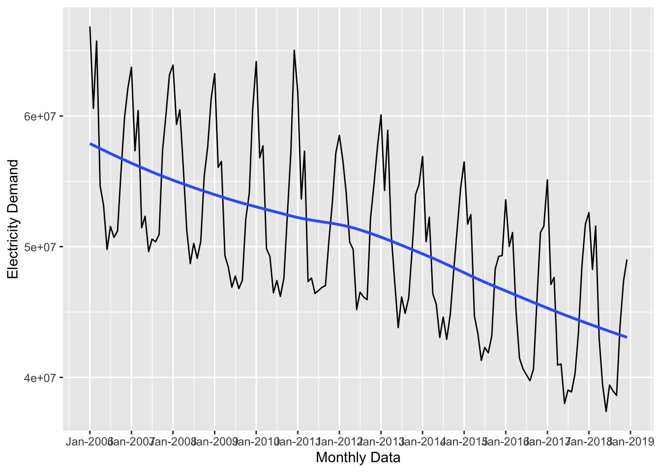
ggplot2 works great, but the timetk package offers some attractive plotting tools as well. The plot_time_series() produces the same plot as above, but it gives us the option to plot a ggplot object by setting .interactive = FALSE or an INTERACTIVE (!) plot by setting .interactive = TRUE:
plot_time_series(uk_monthly_data,
                 .date_var = timestamp,
                 .value = nd,
                 .interactive = TRUE,
                 .x_lab = "Monthy Data",
                 .y_lab = "Electricity Demand")
Time Series Patterns
Time series data tend to contain four core patterns:
Trends: Trends are the general up and down patterns over the whole series. In the previous plots, the blue line displayed the series trend. Overall the series above is trending downward.
Cycles: Cycles are repeatable events over time where it starts with a local minimum and ends at the next local minimum. The data above don’t have much of a cycle, but look at this plot of US unemployment:
library(TSstudio)

tk_tbl(USUnRate) %>%
  filter_by_time(.start_date = "1990", .end_date = "2016") %>%
  ggplot(aes(x = index, y = value)) +
  geom_line()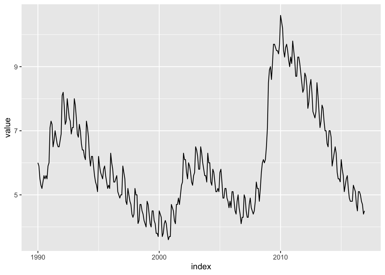
There is a clear cycle from 1990 to 2000. Another one from 2000 to about 2008 and finally from 2008 to 2016.
Seasons: Seasonal patterns are related to the frequency of the data and are patterns that repeat over that frequency. Looking at the
uk_monthly_data, it seems like there is a seasonal pattern throughout the months, which makes sense.Residual or Random: Residual patterns are variations in the data that occur as a result of random chance. We’ll see an example of this below.
These patterns are important because a good forecast model must account for all patterns in the data. Luckily there are some tools to help us identify patterns.
First, we’ll use the plot_stl_diagnostics() function from the timetk package to visualize the trend and seasonal components.
plot_stl_diagnostics(uk_monthly_data, .date_var = timestamp, .value = nd)In the top panel of the plot we see observed. This is just the plot of the raw data. The season panel shows the plot seasonal component of the data, trend shows the trend of the data, and remainder shows the remaining variation in the data after the seasonal and trend components have been removed. Finally, seasadj shows the plot of the data after it has been seasonally adjusted. This makes it clear that we have seasonal variation and a downward trend.
To get more insight on the seasonal aspect, we can use plot_seasonal_diagnostics():
plot_seasonal_diagnostics(uk_monthly_data, .date_var = timestamp, .value = nd)This shows a very clear monthly seasonal trend, and thus quarterly trend as well, but not much of an annual seasonal trend. What does all this mean for our forecast model? It means that we definitely need to account for a trend and seasonal variation.
Building a Forecast Model
There are tons of different forecasting models, but because this is an introduction, we’ll focus on one of the simplest: forecasting with linear regression.
The linear regression model you know and love is a decent way to forecast a series, so let’s see how it’s done. Before we start, we need to do some data prep. We need to add a trend variable and a season variable. To add a time trend variable to the data, all we need to do is create a number for each row of data:
uk_monthly_data <-
  uk_monthly_data %>%
  mutate(time_trend = row_number())

glimpse(uk_monthly_data)
## Rows: 156
## Columns: 3
## $ timestamp <dttm> 2006-01-01, 2006-02-01, 2006-03-01, 2006-04-01, 2006-05-01…
## $ nd <int> 66849497, 60579739, 65731906, 54663527, 53186630, 49795953,…
## $ time_trend <int> 1, 2, 3, 4, 5, 6, 7, 8, 9, 10, 11, 12, 13, 14, 15, 16, 17, …Recall that the seasonal patterns are related to the frequency of the data because they are patterns that repeat over the frequency of the data. In this case, the data’s frequency is monthly so that is what our seasonal trend will be. This means that we need to create indicator variables for each month in the data.
To extract the month from timestamp, we’ll use the month() function from lubridate. It works like this:
month(uk_monthly_data$timestamp)## [1] 1 2 3 4 5 6 7 8 9 10 11 12 1 2 3 4 5 6 7 8 9 10 11 12 1
## [26] 2 3 4 5 6 7 8 9 10 11 12 1 2 3 4 5 6 7 8 9 10 11 12 1 2
## [51] 3 4 5 6 7 8 9 10 11 12 1 2 3 4 5 6 7 8 9 10 11 12 1 2 3
## [76] 4 5 6 7 8 9 10 11 12 1 2 3 4 5 6 7 8 9 10 11 12 1 2 3 4
## [101] 5 6 7 8 9 10 11 12 1 2 3 4 5 6 7 8 9 10 11 12 1 2 3 4 5
## [126] 6 7 8 9 10 11 12 1 2 3 4 5 6 7 8 9 10 11 12 1 2 3 4 5 6
## [151] 7 8 9 10 11 12If we wanted the month names instead of their numeric values, we could add label = TRUE:
month(uk_monthly_data$timestamp, label = TRUE)## [1] Jan Feb Mar Apr May Jun Jul Aug Sep Oct Nov Dec Jan Feb Mar Apr May Jun
## [19] Jul Aug Sep Oct Nov Dec Jan Feb Mar Apr May Jun Jul Aug Sep Oct Nov Dec
## [37] Jan Feb Mar Apr May Jun Jul Aug Sep Oct Nov Dec Jan Feb Mar Apr May Jun
## [55] Jul Aug Sep Oct Nov Dec Jan Feb Mar Apr May Jun Jul Aug Sep Oct Nov Dec
## [73] Jan Feb Mar Apr May Jun Jul Aug Sep Oct Nov Dec Jan Feb Mar Apr May Jun
## [91] Jul Aug Sep Oct Nov Dec Jan Feb Mar Apr May Jun Jul Aug Sep Oct Nov Dec
## [109] Jan Feb Mar Apr May Jun Jul Aug Sep Oct Nov Dec Jan Feb Mar Apr May Jun
## [127] Jul Aug Sep Oct Nov Dec Jan Feb Mar Apr May Jun Jul Aug Sep Oct Nov Dec
## [145] Jan Feb Mar Apr May Jun Jul Aug Sep Oct Nov Dec
## 12 Levels: Jan < Feb < Mar < Apr < May < Jun < Jul < Aug < Sep < ... < DecOk, now let’s use that to create a seasonal_trend indicator for each month:
uk_monthly_data <-
  uk_monthly_data %>%
  mutate(seasonal_trend = factor(month(timestamp, label = TRUE), ordered = FALSE))

glimpse(uk_monthly_data)
## Rows: 156
## Columns: 4
## $ timestamp <dttm> 2006-01-01, 2006-02-01, 2006-03-01, 2006-04-01, 2006-0…
## $ nd <int> 66849497, 60579739, 65731906, 54663527, 53186630, 49795…
## $ time_trend <int> 1, 2, 3, 4, 5, 6, 7, 8, 9, 10, 11, 12, 13, 14, 15, 16, …
## $ seasonal_trend <fct> Jan, Feb, Mar, Apr, May, Jun, Jul, Aug, Sep, Oct, Nov, …Now we have the variables (features) we need, but before we can fit a model, we need to split the data into a training and test set. The idea is that we want to build the best model we can with a subset of the data and then use that model to on new data to see how well it performed. Unlike training and testing splits used with other types of data (where the observations are put into each group randomly), with time series data, we want to reserve the latest data for the testing set. As a rule of thumb, we should make the testing partition the length of the forecasting horizon. If we wanted to forecast out 4 months of data, we would put the most recent 4 months in the testing set.
To split the data, we’ll use the initial_time_split() function from the rsample package, and let’s say we want to forecast the next 6 months of electricity demand:
library(rsample)

uk_monthly_split <- initial_time_split(uk_monthly_data, prop = 150/156)
Then we extract the training and testing sets with training() and testing():
uk_training <- training(uk_monthly_split)
uk_testing <- testing(uk_monthly_split)
Ok, now we can fit the forecast on uk_training with the standard lm() function:
forecast_1 <- lm(nd ~ time_trend, data = uk_training)
broom::tidy(forecast_1)
## # A tibble: 2 × 5
## term estimate std.error statistic p.value
## <chr> <dbl> <dbl> <dbl> <dbl>
## 1 (Intercept) 57664673. 864433. 66.7 2.47e-112
## 2 time_trend -90305. 9932. -9.09 5.91e- 16Let’s plot it out to see the forecast. This is as simple as overlaying the predicted values with the raw data. To add the predicted values to the dataset, we’ll use the augment() function from the broom package. It works like this:
library(broom)

augment(forecast_1, newdata = uk_training)
## # A tibble: 150 × 6
## timestamp nd time_trend seasonal_trend .fitted .resid
## <dttm> <int> <int> <fct> <dbl> <dbl>
## 1 2006-01-01 00:00:00 66849497 1 Jan 57574368. 9275129.
## 2 2006-02-01 00:00:00 60579739 2 Feb 57484063. 3095676.
## 3 2006-03-01 00:00:00 65731906 3 Mar 57393758. 8338148.
## 4 2006-04-01 00:00:00 54663527 4 Apr 57303453. -2639926.
## 5 2006-05-01 00:00:00 53186630 5 May 57213149. -4026519.
## 6 2006-06-01 00:00:00 49795953 6 Jun 57122844. -7326891.
## 7 2006-07-01 00:00:00 51547742 7 Jul 57032539. -5484797.
## 8 2006-08-01 00:00:00 50713472 8 Aug 56942234. -6228762.
## 9 2006-09-01 00:00:00 51215300 9 Sep 56851929. -5636629.
## 10 2006-10-01 00:00:00 55663834 10 Oct 56761624. -1097790.
## # … with 140 more rowsWe can use that as the data argument for the forecast line:
ggplot(data = uk_monthly_data, aes(x = timestamp, y = nd)) +
  # plot the raw data
  geom_line() +
  # add the forecast
  geom_line(data = augment(forecast_1, newdata = uk_training),
            aes(x = timestamp, y = .fitted),
            color = "red") +
  labs(x = "Monthly Data", y = "Electricity Demand") +
  scale_x_datetime(date_breaks = "year", date_labels = "%b-%Y")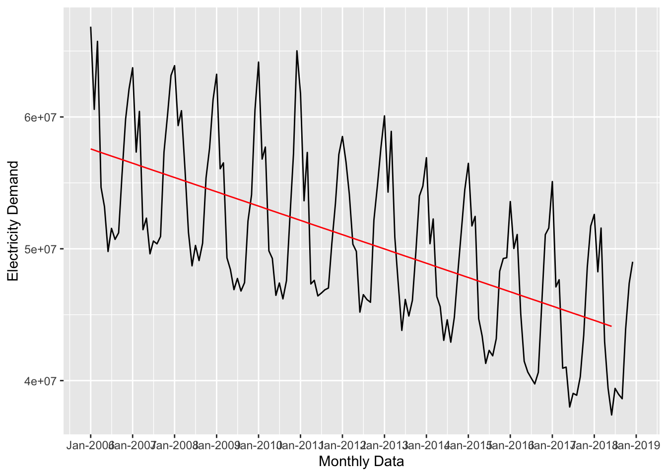
The time_trend captured the downward movement of the series, but we also need to account for the seasonal pattern if we want a decent forecast. So, let’s add that to the model:
forecast_2 <- lm(nd ~ time_trend + seasonal_trend, data = uk_training)
tidy(forecast_2)
## # A tibble: 13 × 5
## term estimate std.error statistic p.value
## <chr> <dbl> <dbl> <dbl> <dbl>
## 1 (Intercept) 66326848. 449352. 148. 7.01e-153
## 2 time_trend -89884. 2738. -32.8 8.77e- 67
## 3 seasonal_trendFeb -5660973. 569146. -9.95 7.03e- 18
## 4 seasonal_trendMar -3720680. 569165. -6.54 1.14e- 9
## 5 seasonal_trendApr -11047867. 569198. -19.4 3.79e- 41
## 6 seasonal_trendMay -12474974. 569244. -21.9 1.27e- 46
## 7 seasonal_trendJun -14904991. 569304. -26.2 3.57e- 55
## 8 seasonal_trendJul -13682436. 580875. -23.6 5.07e- 50
## 9 seasonal_trendAug -14294080. 580881. -24.6 3.96e- 52
## 10 seasonal_trendSep -13289534. 580901. -22.9 1.24e- 48
## 11 seasonal_trendOct -8588485. 580933. -14.8 3.66e- 30
## 12 seasonal_trendNov -5115717. 580978. -8.81 5.08e- 15
## 13 seasonal_trendDec -1910424. 581036. -3.29 1.28e- 3And replot:
ggplot(data = uk_monthly_data, aes(x = timestamp, y = nd)) +
  # plot the raw data
  geom_line() +
  # add the first forecast (time trend)
  geom_line(data = augment(forecast_1, newdata = uk_training),
            aes(x = timestamp, y = .fitted),
            color = "red") +
  # add the second forecast (time + seasonal trends)
  geom_line(data = augment(forecast_2, newdata = uk_training),
            aes(x = timestamp, y = .fitted),
            color = "skyblue") +
  labs(x = "Monthly Data", y = "Electricity Demand") +
  scale_x_datetime(date_breaks = "year", date_labels = "%b-%Y")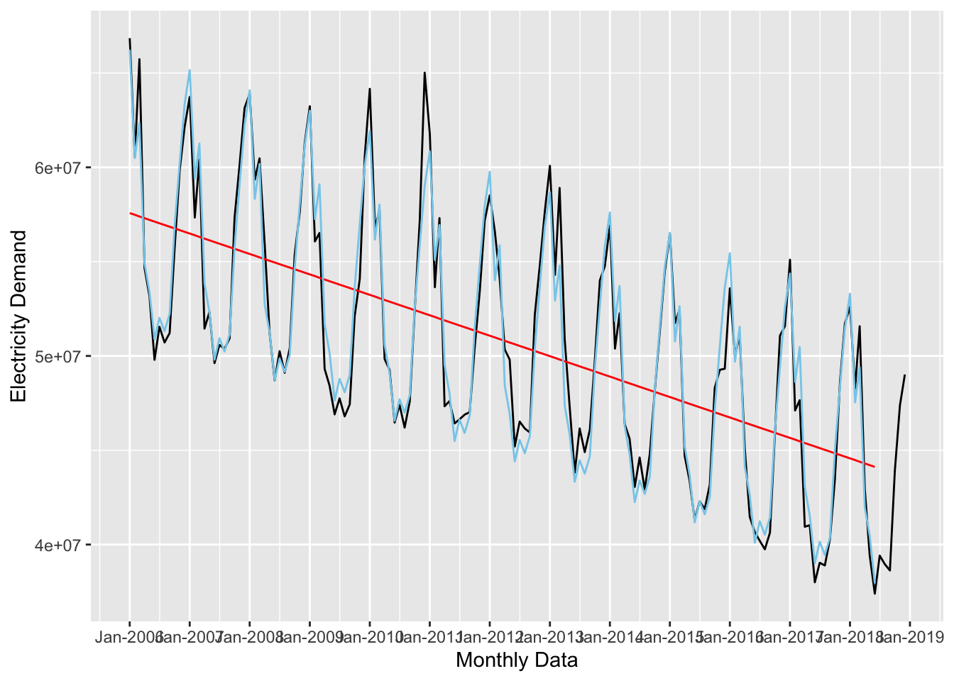
Adding a polynomial term might improve the forecast:
forecast_3 <- lm(nd ~ time_trend + I(time_trend^2) + seasonal_trend,
                 data = uk_training)
tidy(forecast_2)
## # A tibble: 13 × 5
## term estimate std.error statistic p.value
## <chr> <dbl> <dbl> <dbl> <dbl>
## 1 (Intercept) 66326848. 449352. 148. 7.01e-153
## 2 time_trend -89884. 2738. -32.8 8.77e- 67
## 3 seasonal_trendFeb -5660973. 569146. -9.95 7.03e- 18
## 4 seasonal_trendMar -3720680. 569165. -6.54 1.14e- 9
## 5 seasonal_trendApr -11047867. 569198. -19.4 3.79e- 41
## 6 seasonal_trendMay -12474974. 569244. -21.9 1.27e- 46
## 7 seasonal_trendJun -14904991. 569304. -26.2 3.57e- 55
## 8 seasonal_trendJul -13682436. 580875. -23.6 5.07e- 50
## 9 seasonal_trendAug -14294080. 580881. -24.6 3.96e- 52
## 10 seasonal_trendSep -13289534. 580901. -22.9 1.24e- 48
## 11 seasonal_trendOct -8588485. 580933. -14.8 3.66e- 30
## 12 seasonal_trendNov -5115717. 580978. -8.81 5.08e- 15
## 13 seasonal_trendDec -1910424. 581036. -3.29 1.28e- 3ggplot(data = uk_monthly_data, aes(x = timestamp, y = nd)) +
# plot the raw data
geom_line() +
# add the first forecast (time trend)
geom_line(data = augment(forecast_1, newdata = uk_training),
aes(x = timestamp, y = .fitted),
color = "red") +
# add the second forecast (time + seasonal trends)
geom_line(data = augment(forecast_2, newdata = uk_training),
aes(x = timestamp, y = .fitted),
color = "skyblue") +
# add the third forecast (time + seasonal trends + polynomial)
geom_line(data = augment(forecast_3, newdata = uk_training),
aes(x = timestamp, y = .fitted),
color = "darkgreen") +
labs(x = "Monthly Data", y = "Electricity Demand") +
scale_x_datetime(date_breaks = "year", date_labels = "%b-%Y")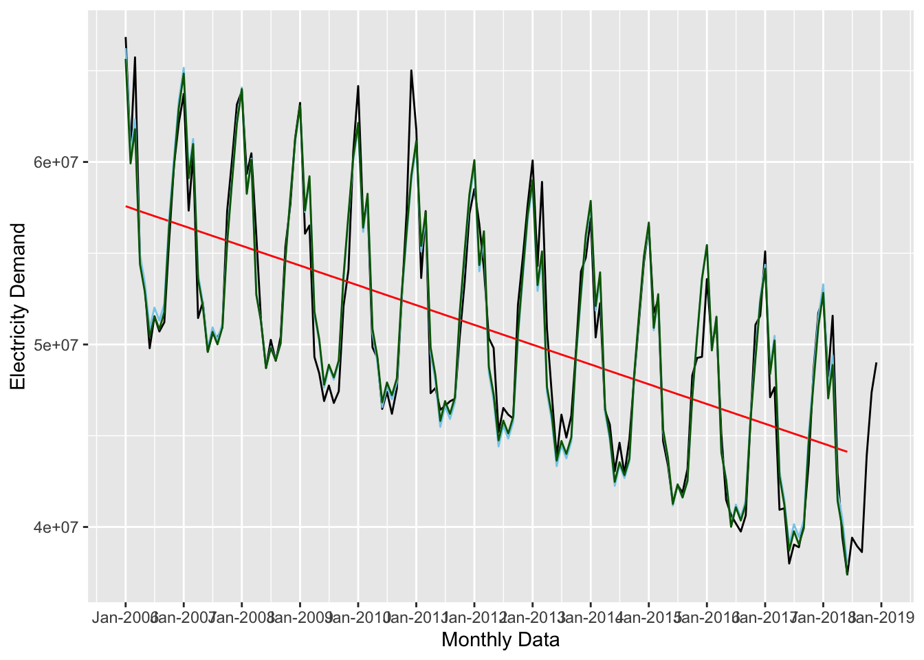
Now let’s see how well this model fits the test data. This time, we’ll pass uk_testing to the augment() function.
ggplot(data = uk_monthly_data, aes(x = timestamp, y = nd)) +
  # plot the raw data
  geom_line() +
  # add the second forecast (time + seasonal trends)
  geom_line(data = augment(forecast_2, newdata = uk_training),
            aes(x = timestamp, y = .fitted),
            color = "skyblue") +
  # add the test data
  geom_line(data = augment(forecast_2, newdata = uk_testing),
            aes(x = timestamp, y = .fitted),
            color = "red", lty = 2) +
  labs(x = "Monthly Data", y = "Electricity Demand") +
  scale_x_datetime(date_breaks = "year", date_labels = "%b-%Y")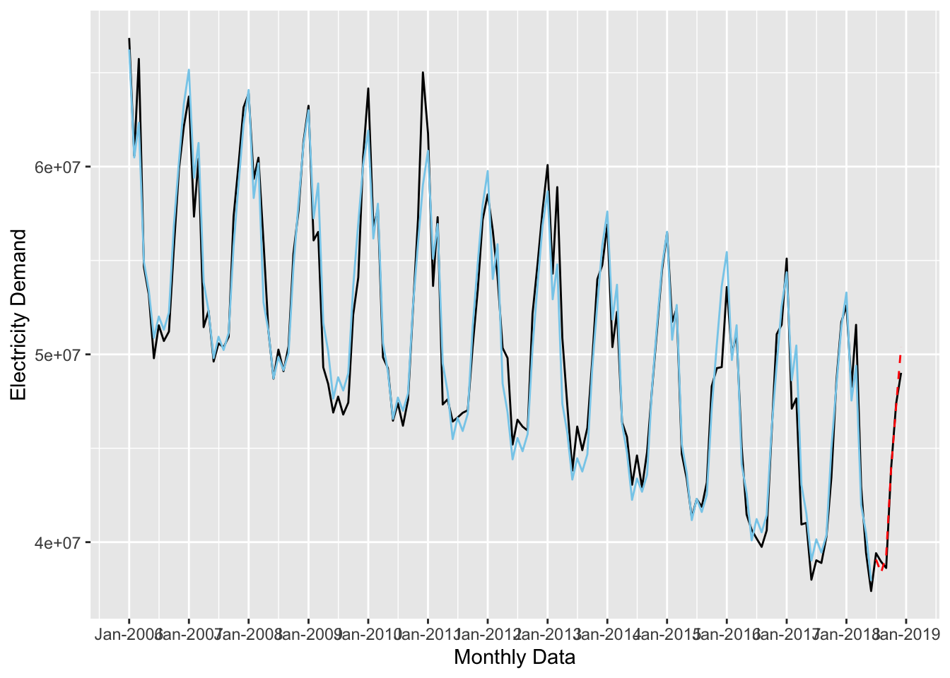
It’s hard to tell visually which forecast is performing the best. Instead, we could look at the standard model diagnostics with the glance() function:
bind_rows(
  glance(forecast_1),
  glance(forecast_2),
  glance(forecast_3)
)
## # A tibble: 3 × 12
## r.squared adj.r.squared sigma statistic p.value df logLik AIC BIC
## <dbl> <dbl> <dbl> <dbl> <dbl> <dbl> <dbl> <dbl> <dbl>
## 1 0.358 0.354 5267102. 82.7 5.91e-16 1 -2533. 5073. 5082.
## 2 0.955 0.951 1451025. 242. 7.72e-86 12 -2334. 4696. 4739.
## 3 0.957 0.953 1426540. 231. 7.46e-86 13 -2331. 4692. 4737.
## # … with 3 more variables: deviance <dbl>, df.residual <int>, nobs <int>This shows that forecast_3 is the best, but it only slightly outperforms forecast_2.
The fable Package
Forecasting with lm() works just fine, but if we use R packages designed for forecasting, we will get more tools to use. There are a lot of these packages, but here we will use fable which provides tools to fit a number of different time series models, evaluate their performance, and make out-of-sample predictions. Let’s use fable to fit the three models we fit above.
Before we can use the TSLM() function to fit the model, we need to convert the data frame into a tsibble. To do that we set the index equal to the time variable.
As a side note, I really don’t like using packages that force you to use data formats other than a data frame (or tibble) because that interrupts your workflow. Unfortunately, that is the case with most time series packages in R. Most either require a time series object (which I intentionally did not cover in this guide), or some kind of time series data frame (like a
tsibble). The only package I am aware of that lets you use standard data frames for time series analysis is modeltime but that requires you to use the tidymodels framework for modeling (which is excellent) and is outside the scope of this tutorial.
library(fable)
library(tsibble)

ts_uk_training <-
  uk_training %>%
  mutate(timestamp = yearmonth(timestamp)) %>%
  as_tsibble(index = timestamp)

ts_uk_testing <-
  uk_testing %>%
  mutate(timestamp = yearmonth(timestamp)) %>%
  as_tsibble(index = timestamp)

ts_uk_monthly <-
  uk_monthly_data %>%
  mutate(timestamp = yearmonth(timestamp)) %>%
  as_tsibble(index = timestamp)

glimpse(ts_uk_training)
## Rows: 150
## Columns: 4
## $ timestamp <mth> 2006 Jan, 2006 Feb, 2006 Mar, 2006 Apr, 2006 May, 2006 …
## $ nd <int> 66849497, 60579739, 65731906, 54663527, 53186630, 49795…
## $ time_trend <int> 1, 2, 3, 4, 5, 6, 7, 8, 9, 10, 11, 12, 13, 14, 15, 16, …
## $ seasonal_trend <fct> Jan, Feb, Mar, Apr, May, Jun, Jul, Aug, Sep, Oct, Nov, …Now we build the models:
tslm_fit <-
  ts_uk_training %>%
  model(trend_fit = TSLM(nd ~ trend()),
        ts_fit = TSLM(nd ~ trend() + season()),
        ts_2_fit = TSLM(nd ~ trend() + season() + I(trend()^2)))
We can look at the model results and diagnostics with tidy():
tidy(tslm_fit)## # A tibble: 29 × 6
## .model term estimate std.error statistic p.value
## <chr> <chr> <dbl> <dbl> <dbl> <dbl>
## 1 trend_fit (Intercept) 57664673. 864433. 66.7 2.47e-112
## 2 trend_fit trend() -90305. 9932. -9.09 5.91e- 16
## 3 ts_fit (Intercept) 66326848. 449352. 148. 7.01e-153
## 4 ts_fit trend() -89884. 2738. -32.8 8.77e- 67
## 5 ts_fit season()year2 -5660973. 569146. -9.95 7.03e- 18
## 6 ts_fit season()year3 -3720680. 569165. -6.54 1.14e- 9
## 7 ts_fit season()year4 -11047867. 569198. -19.4 3.79e- 41
## 8 ts_fit season()year5 -12474974. 569244. -21.9 1.27e- 46
## 9 ts_fit season()year6 -14904991. 569304. -26.2 3.57e- 55
## 10 ts_fit season()year7 -13682436. 580875. -23.6 5.07e- 50
## # … with 19 more rowsWe can use the accuracy() function to evaluate the models on common accuracy metrics:
tslm_fit %>%
  accuracy() %>%
  arrange(MAPE)
## # A tibble: 3 × 10
## .model .type ME RMSE MAE MPE MAPE MASE RMSSE ACF1
## <chr> <chr> <dbl> <dbl> <dbl> <dbl> <dbl> <dbl> <dbl> <dbl>
## 1 ts_2_fit Training 9.86e-11 1358337. 987990. -0.0625 1.92 0.524 0.570 0.391
## 2 ts_fit Training -1.94e-10 1386723. 1027282. -0.0693 2.01 0.544 0.582 0.417
## 3 trend_fit Training 8.69e-10 5231870. 4662586. -1.05 9.21 2.47 2.20 0.715The next thing to to is check how well these models fit the test data. To do that we’ll use the forecast() function to forecast the next 6 months of data (which is our test set), along with autoplot() to plot them:
tslm_fit %>%
  forecast(h = "6 months") %>%
  autoplot(ts_uk_monthly)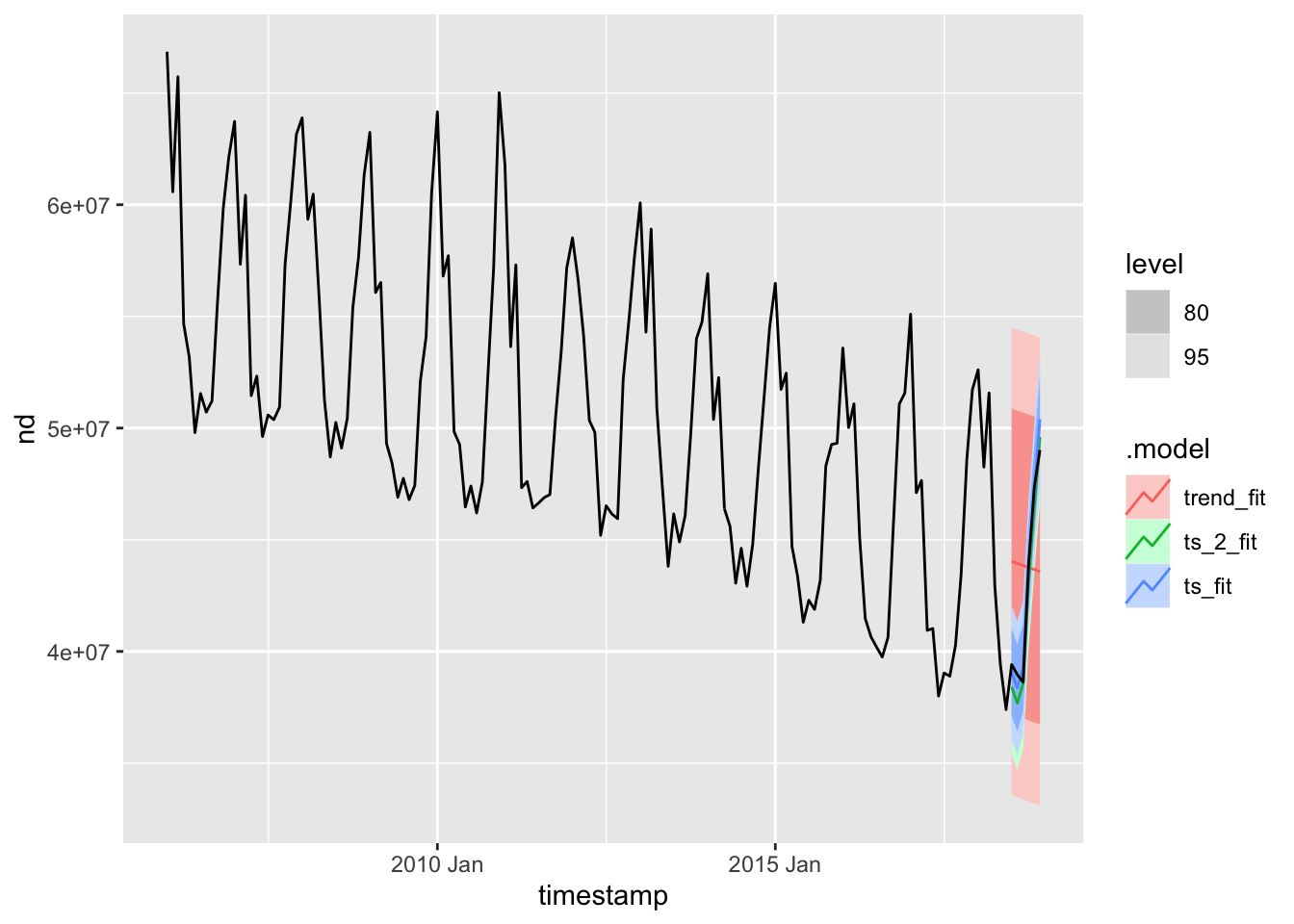
From this plot, and the previous diagnostics, I’m going to pick the last forecast model as the final model. After selecting a model, the next step is to fit it on the full data set and make out-of-sample predictions:
tslm_final_fit <-
  ts_uk_monthly %>%
  model(ts_2_fit = TSLM(nd ~ trend() + season() + I(trend()^2)))

tslm_final_fit %>%
  forecast(h = "12 months") %>%
  autoplot(ts_uk_monthly) +
  labs(x = "Monthly Data", y = "Electricity Demand") +
  scale_x_yearmonth(date_breaks = "1 year", date_labels = "%b-%Y") +
  ggpubr::theme_pubr()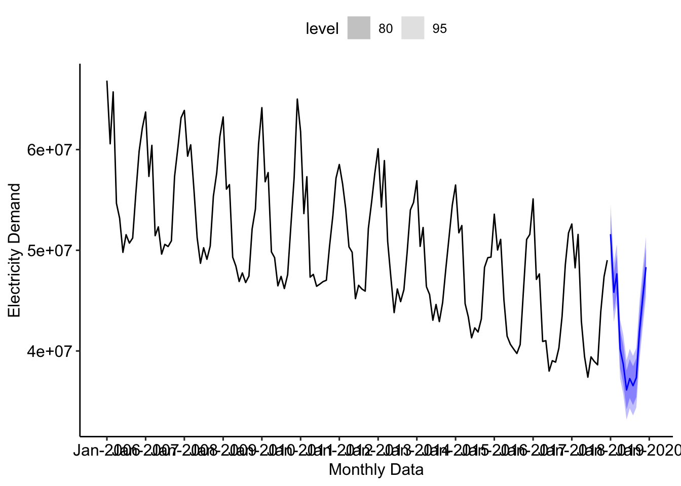
Resources For Futrher Study
If you want to learn more about forecasting (and there is much, MUCH, more to learn) here are some resources that you might want to check out: