Data Analysis and Reporting Results
With a cleaned (tidy) dataset ready to go and with some detailed exploratory data analysis out of the way, we’re ready to test hypotheses. Rather than focus on the details of a specific programming language, this session will help you build your statistical modeling skills. We’ll talk about how to build models for different types of data and show how each model can be implemented in R or Python.
To get started, let’s load the clean data. You can do this with R or Python. I’m going to load it in R and call it up in Python when I need to (there’s no need to load it with both languages).
library(tidyverse)
flight_data <- read_csv("Documents/my_project/flights_cleaned.csv")
The General Linear Model
During our data exploration we investigated several interesting questions, but when we move on to modeling our data we want to investigate the relationship between variables in a more precise fashion. That’s where statistics comes in. Statistics allows us to talk about relationships between multiple variables in terms of probability which helps to quantify our uncertainty of any specific answer we might provide.
In the flight data, we investigated patterns in the data with visual methods but now we want to build statistical models to test these patterns. Let’s start simple. Are planes that depart late more likely to arrive late? let’s reproduce the plot we made between these variables last time, using Matplotlib this time instead of ggplot2:
import matplotlib.pyplot as plt
plt.scatter(r.flight_data["dep_delay"], r.flight_data["arr_delay"])
plt.xlabel("Departure Delays")
plt.ylabel("Arrival Delays")
plt.show()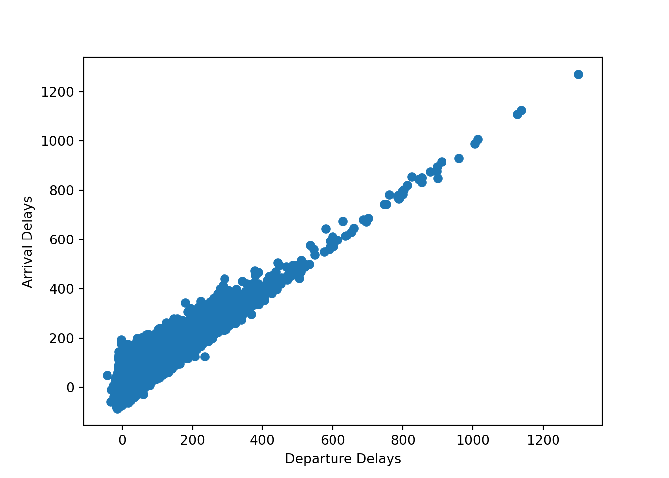
plt.clf()To quantify this relationship, we can use a regression model. Let’s start with linear regression. Linear regression is the first model most students learn and they learn to write it like this:
\[ y_i = \alpha + \beta x_i + \epsilon_i \]
where \(y_i\) is the outcome variable, \(\alpha\) is the estimated intercept, \(\beta\) is the estimated slope, \(x_i\) is a column of data, and \(\epsilon_i\) is the error term which measures the difference between the observed and predicted data for each row of data.
It’s not wrong to write your model like this, but it hides a lot of assumptions that you are making about your model. For example, this model assumes that your data is normally distributed. One way of writing this is like this:
\[ \begin{aligned} y_i &= \alpha + \beta x_i + \epsilon \\ \epsilon_i &\sim N(0, \sigma^2) \end{aligned} \]
This is better because we can see that we are assuming that the errors are normally distributed with a mean of 0 and a constant variance (homoscedastic). However, writing our models this way really only works when we’re working with normally distributed data. The even better, more general way to write this model is like this:
\[ \begin{aligned} y_i &\sim \text{Normal}(\mu_i, \sigma^2) \\ \mu_i &= \alpha + \beta x_i \end{aligned} \]
This tells us that our model assumes that the data are normally distributed, has a constant variance, and we see the predictors that we are using to predict the mean. Cool, but how to do implement this in software? Let’s see how starting with R:
fit_r <- glm(formula = arr_delay ~ dep_delay,
             family = gaussian(link = "identity"),
             data = flight_data)
Let’s break this down. We’re using the glm function, which stands for generalized linear model, and a Gaussian family, which is the normal distribution, and an “identity” link function, which we’ll talk more about later. Finally, we just feed in the data with data =.
Now let’s see this in Python:
import statsmodels.formula.api as smf
import statsmodels.api as sm

fit_py = smf.glm(formula = "arr_delay ~ dep_delay",
                 family = sm.families.Gaussian(sm.families.links.identity()),
                 data = r.flight_data)

fit_py_fit = fit_py.fit()
We can view the results in R like this:
summary(fit_r)##
## Call:
## glm(formula = arr_delay ~ dep_delay, family = gaussian(link = "identity"),
## data = flight_data)
##
## Deviance Residuals:
## Min 1Q Median 3Q Max
## -107.587 -11.005 -1.883 8.938 201.938
##
## Coefficients:
## Estimate Std. Error t value Pr(>|t|)
## (Intercept) -5.8994935 0.0330195 -178.7 <2e-16 ***
## dep_delay 1.0190929 0.0007864 1295.8 <2e-16 ***
## ---
## Signif. codes: 0 '***' 0.001 '**' 0.01 '*' 0.05 '.' 0.1 ' ' 1
##
## (Dispersion parameter for gaussian family taken to be 324.9891)
##
## Null deviance: 652114033 on 327345 degrees of freedom
## Residual deviance: 106383218 on 327344 degrees of freedom
## AIC: 2822273
##
## Number of Fisher Scoring iterations: 2and in Python like this:
print(fit_py_fit.summary())## Generalized Linear Model Regression Results
## ==============================================================================
## Dep. Variable: arr_delay No. Observations: 327346
## Model: GLM Df Residuals: 327344
## Model Family: Gaussian Df Model: 1
## Link Function: identity Scale: 324.99
## Method: IRLS Log-Likelihood: -1.4111e+06
## Date: Wed, 02 Feb 2022 Deviance: 1.0638e+08
## Time: 11:59:04 Pearson chi2: 1.06e+08
## No. Iterations: 3 Pseudo R-squ. (CS): 0.9941
## Covariance Type: nonrobust
## ==============================================================================
## coef std err z P>|z| [0.025 0.975]
## ------------------------------------------------------------------------------
## Intercept -5.8995 0.033 -178.667 0.000 -5.964 -5.835
## dep_delay 1.0191 0.001 1295.850 0.000 1.018 1.021
## ==============================================================================The normal distribution is a good choice when we’re modeling data that is continuous and can theoretically range from \(-\infty\) to \(\infty\). That fits a lot of scenarios but not all scenarios.1 One of the most common cases where the normal distribution isn’t great is if we are trying to model a binary outcome.
Generalizing the Linear Model
In order to generalize our linear model to model any type of data, we need two components: a likelihood function and a link function.
What is a likelihood function?
Likelihood functions are essentially probability models of our data. They describe the data generating process. Technically, they show what the parameter values need to be in our model to maximize the chances of observing the data that we have. That’s technical, but just remember that one of the main goals of statistics is to build models that can be make accurate predictions and describe data. We do this by choosing likelihood functions that describe the observed data.
What is a link function?
The link function restricts the range of the linear equation to the range of the outcome variable. This makes it so that our model will produce predictions that make sense. It wouldn’t be good if we were trying to model the probability of someone winning an election and the model predicted a negative value! Or, if it gave a value greater than 1! Link functions prevent this from happening.
Putting it All Together
Our models almost always use the same linear structure (\(\mu_i = \alpha + \beta x_i\)), but we can choose any likelihood and link functions that we need to best match the data we are modeling. With these pieces we can generalize our linear equation to model any type of data we want, hence the generalized linear model.
Binomial Regression
For example, let’s suppose that we wanted to build a model to understand why delays happen. Maybe planes that preparing to travel shorter distances are more likely to get delayed since shorter travel times mean faster turn around times. Let’s generate a binary indicator for whether a flight was delayed that will serve as the outcome variable:
flight_data <- flight_data %>%
  mutate(delay_dum = ifelse(dep_delay > 0, yes = 1, no = 0))
Which probability distribution would best match this data generating process? Here we have a 0-1 outcome so our data generating process is limited to either 0 or 1. This means that we need a discrete distribution that produces values that are either 0 or 1. So, we have two questions to answer:
- What likelihood function (probability distribution) should we use?
- What link function should we use?
The binomial distribution is a good choice for a likelihood in this case because it is a distribution of discrete values of either 0 or 1. So far, this means that our equation looks like this:
\[ \begin{aligned} y_i &\sim \text{Binomial}(1, p_i) \\ p_i &= \alpha + \beta x_i \end{aligned} \]
Let’s plot a binomial distribution to get an idea of what it looks like. Suppose we flipped a coin 3 times. Here is a visual (using the binomial distribution) of the probability of getting 0, 1, 2, and 3 heads:
library(tidyverse)

binomial_data <- tibble(
  # number of trials
  n = 3,

  # probability of success on a given trial
  p = 0.5,

  # range of successes (heads)
  s = 0:3,

  # probability density
  prob = dbinom(x = s, size = n, prob = p)
)

ggplot(data = binomial_data, aes(x = s, y = prob)) +
  geom_col() +
  labs(x = "# of Successes", y = "Probability",
       title = "The Binomial Distribution")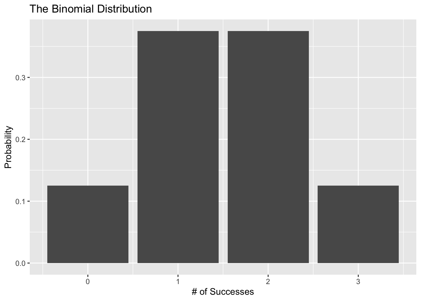
Now, what if we try this 100 times?
binomial_data <- tibble(
  # number of trials
  n = 100,

  # probability of success on a given trial
  p = 0.5,

  # range of successes (heads)
  s = 0:100,

  # probability density
  prob = dbinom(x = s, size = n, prob = p)
)

ggplot(data = binomial_data, aes(x = s, y = prob)) +
  geom_col() +
  labs(x = "# of Successes", y = "Probability",
       title = "The Binomial Distribution")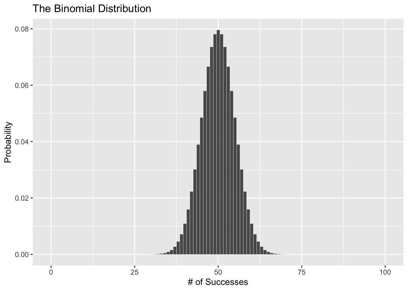
Ok awesome, the binomial distribution seems like a good choice. Here’s the problem though. The linear equation (\(p_i = \alpha + \beta x_i\)) can give us just about any value we want even though we only want values between 0 and 1. In other words, we’re using a probability distribution that produces 0’s and 1’s but there’s nothing stopping our model’s predictions for \(p_i\) from staying between 0 and 1. That’s where the link function comes in.
Remember how we entered family = gaussian(link = identity) for the linear regression? When you estimate a linear regression, you’re technically using the identity link function, which basically means that you aren’t using a link function. When our data is discrete, one type of link function we could use is the logit link function. The logit link function restricts \(p_i\) to fall between 0 and 1. Mathematically, the logit link function is defined as:
\[ \ln \big(\frac{p_i}{1 - p_i}\big) \]
This simple equation ensures that we always get a prediction between 0 and 1.
Let’s see the link function in action:
ggplot(data = tibble(x = c(0, 1)), aes(x = x)) +
  stat_function(fun = function(x) log(x / (1 - x)),
                geom = "line") +
  coord_flip() +
  labs(y = "x", x = "logistic(x)", title = "Plotting the Logit Link Function")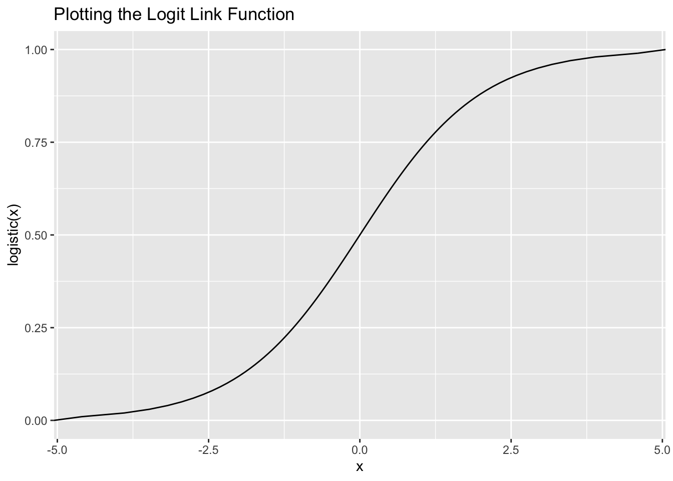
Alright, let’s fit the model already!
In R:
binom_fit_r <- glm(formula = delay_dum ~ distance,
                   family = binomial(link = "logit"),
                   data = flight_data)
summary(binom_fit_r)
##
## Call:
## glm(formula = delay_dum ~ distance, family = binomial(link = "logit"),
## data = flight_data)
##
## Deviance Residuals:
## Min 1Q Median 3Q Max
## -1.1526 -0.9930 -0.9697 1.3709 1.4147
##
## Coefficients:
## Estimate Std. Error z value Pr(>|z|)
## (Intercept) -5.503e-01 6.255e-03 -87.98 <2e-16 ***
## distance 9.865e-05 4.839e-06 20.39 <2e-16 ***
## ---
## Signif. codes: 0 '***' 0.001 '**' 0.01 '*' 0.05 '.' 0.1 ' ' 1
##
## (Dispersion parameter for binomial family taken to be 1)
##
## Null deviance: 437896 on 327345 degrees of freedom
## Residual deviance: 437481 on 327344 degrees of freedom
## AIC: 437485
##
## Number of Fisher Scoring iterations: 4In Python:
binom_py = smf.glm(formula = "delay_dum ~ distance",
                   family = sm.families.Binomial(sm.families.links.logit()),
                   data = r.flight_data)

binom_fit_py = binom_py.fit()
print(binom_fit_py.summary())
## Generalized Linear Model Regression Results
## ==============================================================================
## Dep. Variable: delay_dum No. Observations: 327346
## Model: GLM Df Residuals: 327344
## Model Family: Binomial Df Model: 1
## Link Function: logit Scale: 1.0000
## Method: IRLS Log-Likelihood: -2.1874e+05
## Date: Wed, 02 Feb 2022 Deviance: 4.3748e+05
## Time: 11:59:06 Pearson chi2: 3.27e+05
## No. Iterations: 4 Pseudo R-squ. (CS): 0.001265
## Covariance Type: nonrobust
## ==============================================================================
## coef std err z P>|z| [0.025 0.975]
## ------------------------------------------------------------------------------
## Intercept -0.5503 0.006 -87.977 0.000 -0.563 -0.538
## distance 9.865e-05 4.84e-06 20.388 0.000 8.92e-05 0.000
## ==============================================================================Great! Now how do we interpret the estimates? The easiest way to interpret them is to convert them to the probability scale (instead of talking about log-odds, or odds ratios). We do this by “undoing” the link function. The inverse logit link function is the logistic function and we can call it up in R with plogis() or in Python by defining the inverse logit function manually.
So, a one unit increase in distance is associated with a:
plogis(9.865e-05)## [1] 0.5000247increase in the relative probability of being delayed. Or with Python:
import numpy as np

def inv_logit(p):
    return np.exp(p) / (1 + np.exp(p))

inv_logit(9.865e-05)
## 0.50002466249998Considering that a 50% probability is basically a coin flip, distance doesn’t really have any predictive power.
Exercise
What is the likelihood function and the link function for this model:
\[ \begin{aligned} y_i &\sim \text{Binomial}(1, p_i) \\ \text{probit}(p_i) &= \alpha + \beta x_i \end{aligned} \]
Use Python or R to fit the model above and print the results.
Poisson Regression
What if our research question asked how if the number of delays depended on the month of the year? We would need a different model for this. Let’s prepare the data first. To do that, we’ll use our tidyverse skills to calculate the number of delays each month.
flight_data_agg <- flight_data %>%
  group_by(year, month) %>%
  summarize(num_delays = sum(delay_dum))
## `summarise()` has grouped output by 'year'. You can override using the `.groups` argument.head(flight_data_agg)## # A tibble: 6 × 3
## # Groups: year [1]
## year month num_delays
## <dbl> <dbl> <dbl>
## 1 2013 1 9620
## 2 2013 2 9088
## 3 2013 3 11166
## 4 2013 4 10484
## 5 2013 5 11227
## 6 2013 6 12558Now we have a data generating process that produces discrete positive values from 0 to \(\infty\).
- What distribution (likelihood function) describes a process like this?
- What link function should we use?
For this situation, the Poisson distribution is a good choice for a likelihood since it describes a discrete process that generates a count of events taking place. This means that the Poisson distribution is defined for values greater than all the way to \(\infty\). In other words, it works for all positive values. Technically, the Poisson distribution is undefined for values of 0. So if we had a data generating process that produced positive values including 0, we would need to use a zero-inflated Poisson likelihood function.
Let’s see what the Poisson distribution looks like:
poisson_data <- tibble(
  # range of events
  s = 0:20,

  # lambda (mean number of event occurances)
  rate = 2,

  # probability density
  prob = dpois(x = s, lambda = rate)
)

ggplot(data = poisson_data, aes(x = s, y = prob)) +
  geom_col() +
  labs(x = "# of Events", y = "Probability",
       title = "The Poisson Distribution")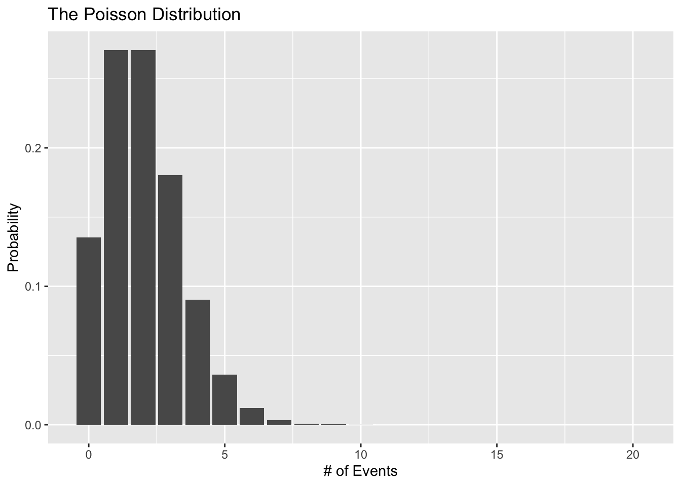
But how do we map the linear predictor to the range of all possible values? We’ll use the log link function since the log function is only defined for positive values greater than 0.
Let’s visualize this link function:
ggplot(data = tibble(x = c(0, 8)), aes(x = x)) +
  stat_function(fun = function(x) log(x),
                geom = "line") +
  coord_flip() +
  labs(y = "x", x = "exp(x)", title = "Plotting the Log Link Function")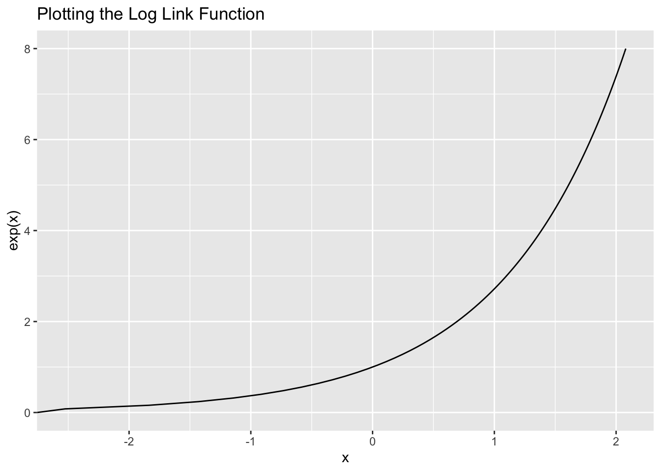
It’s always positive!
Mathematically, the Poisson model looks like this:
\[ \begin{aligned} y_i &\sim \text{Poisson}(\lambda_i) \\ \log(\lambda_i) &= \alpha + \beta x_i \end{aligned} \]
Here is the fitted model in R:
poisson_fit_r <- glm(formula = num_delays ~ month,
                     family = poisson(link = "log"),
                     data = flight_data_agg)
summary(poisson_fit_r)
##
## Call:
## glm(formula = num_delays ~ month, family = poisson(link = "log"),
## data = flight_data_agg)
##
## Deviance Residuals:
## Min 1Q Median 3Q Max
## -29.995 -15.946 2.371 11.586 28.875
##
## Coefficients:
## Estimate Std. Error z value Pr(>|z|)
## (Intercept) 9.2592482 0.0059830 1547.585 < 2e-16 ***
## month 0.0020939 0.0008105 2.583 0.00978 **
## ---
## Signif. codes: 0 '***' 0.001 '**' 0.01 '*' 0.05 '.' 0.1 ' ' 1
##
## (Dispersion parameter for poisson family taken to be 1)
##
## Null deviance: 4208.7 on 11 degrees of freedom
## Residual deviance: 4202.0 on 10 degrees of freedom
## AIC: 4339.1
##
## Number of Fisher Scoring iterations: 4And in Python:
poisson_py = smf.glm(formula = "num_delays ~ month",
                     family = sm.families.Poisson(sm.families.links.log()),
                     data = r.flight_data_agg)

poisson_fit_py = poisson_py.fit()

print(poisson_fit_py.summary())
## Generalized Linear Model Regression Results
## ==============================================================================
## Dep. Variable: num_delays No. Observations: 12
## Model: GLM Df Residuals: 10
## Model Family: Poisson Df Model: 1
## Link Function: log Scale: 1.0000
## Method: IRLS Log-Likelihood: -2167.6
## Date: Wed, 02 Feb 2022 Deviance: 4202.0
## Time: 11:59:07 Pearson chi2: 4.18e+03
## No. Iterations: 4 Pseudo R-squ. (CS): 0.4266
## Covariance Type: nonrobust
## ==============================================================================
## coef std err z P>|z| [0.025 0.975]
## ------------------------------------------------------------------------------
## Intercept 9.2592 0.006 1547.585 0.000 9.248 9.271
## month 0.0021 0.001 2.583 0.010 0.001 0.004
## ==============================================================================This isn’t the best model because it doesn’t really make sense to treat month as a continuous variable, but we’re not worried about that here.
Now, how do I interpret THIS model? Just like before, we need to “undo” the link function. In this case, the exponential \(\exp()\) is the opposite of the log link function.
So, a one-unit increase in month (which doesn’t really make sense) is associated with a
(1 - exp(0.0020939)) * 100## [1] -0.2096094percent decreased in the number of delayed flights.
In Python it’s:
import numpy as np
(1 - np.exp(0.0020939)) * 100
## -0.20960937394949308Modeling with Other Distributions
We talked about Poisson and Binomial, but there are plenty of other likelihood functions you can use. For example, need to model a proportion? Something like, say, the percentage of a city that gets stopped by the police? For that you would want to use the beta distribution.
The beta distribution is for continuous data that can only be between 0 and 1. What link function would we use? Well, you already know of a link function that will limit the linear predictor to be between 0 and 1 - the logit link function. You can fit a beta regression in R with the betareg package.
What if your outcome consists of different unordered categories? For that you’d need the categorical distribution which you can do with the nnet R package.
Reporting Results
What’s the best way to report the results of your research project? Markdown! You can write your entire paper in markdown and include all your code for plots and models so that your document updates dynamically. Check out this blog post on using RMarkdown for writing scientific papers: https://libscie.github.io/rmarkdown-workshop/handout.html. What should you report? It’s generally helpful to report 3 things:
- A table of your model’s results
- A plot of your model’s results
- A plot of your model’s fit to the data
Building a Table of Regression Results
There are so many ways to create a table for you model’s results, but maybe the easiest way is with a package called Stargazer which is available for R and Python. Let’s use stargazer to build a table for the binomial model results. By default, stargazer produces a table in , but we can change that with the type = argument.
#install.packages("stargazer")
library(stargazer)
##
## Please cite as:## Hlavac, Marek (2018). stargazer: Well-Formatted Regression and Summary Statistics Tables.## R package version 5.2.2. https://CRAN.R-project.org/package=stargazerstargazer(binom_fit_r, type = "text")##
## =============================================
## Dependent variable:
## ---------------------------
## delay_dum
## ---------------------------------------------
## distance 0.0001***
## (0.00000)
##
## Constant -0.550***
## (0.006)
##
## ---------------------------------------------
## Observations 327,346
## Log Likelihood -218,740.600
## Akaike Inf. Crit. 437,485.200
## =============================================
## Note: *p<0.1; **p<0.05; ***p<0.01You can fully customize this table within the stargazer function so that you don’t need to do any manual edits. Avoiding manual editing is good because it reduces errors and makes it so that your tables a produced programmatically which helps with reproducability.
#install.packages("stargazer")
library(stargazer)

stargazer(binom_fit_r, type = "html",
          title = "Regression Results of Departure Delays and Travel Distance",
          covariate.labels = c("Distance"),
          dep.var.labels = c("Departure Delay"),
notes = c("Model fit using a binomial likelihood function with a logit link."))| Dependent variable: | |
| Departure Delay | |
| Distance | 0.0001*** |
| (0.00000) | |
| Constant | -0.550*** |
| (0.006) | |
| Observations | 327,346 |
| Log Likelihood | -218,740.600 |
| Akaike Inf. Crit. | 437,485.200 |
| Note: | p<0.1; p<0.05; p<0.01 |
| Model fit using a binomial likelihood function with a logit link. | |
Let’s build a table for the Poisson model using stargazer in Python (you’ll need to install it first by typing pip install stargazer in the terminal):
pip install stargazer## Requirement already satisfied: stargazer in /Users/nickjenkins/Library/r-miniconda-arm64/envs/r-reticulate/lib/python3.8/site-packages (0.0.5)Now we can build the table:
from stargazer.stargazer import Stargazer

results_table = Stargazer([poisson_fit_py])
results_table.title("Regression Results of the Number of Departure Delays and Months")
results_table.rename_covariates({"month": "Month"})
results_table.add_custom_notes(["Model fit using a Poisson likelihood function with a log link."])
results_table.dependent_variable_name("Number of Delays")
results_table.render_html()| Number of Delaysnum_delays | |
| (1) | |
| Intercept | 9.259*** |
| (0.006) | |
| Month | 0.002*** |
| (0.001) | |
| Observations | 12 |
| R2 | |
| Adjusted R2 | |
| Residual Std. Error | 1.000 (df=10) |
| F Statistic | (df=1; 10) |
| Note: | p<0.1;p<0.05;p<0.01 |
| Model fit using a Poisson likelihood function with a log link. | |
’
We can’t render the table as a .txt with the Python version, unfortunately.
Plotting Your Model’s Results
The next thing to create is a plot of your model’s coefficients, known as a coefficient plot. In R, we can do this pretty easily with the broom package and ggplot2.
library(broom)

tidy(binom_fit_r, conf.int = TRUE) %>%
  ggplot(aes(x = estimate, y = term, xmin = conf.low, xmax = conf.high)) +
  geom_pointrange()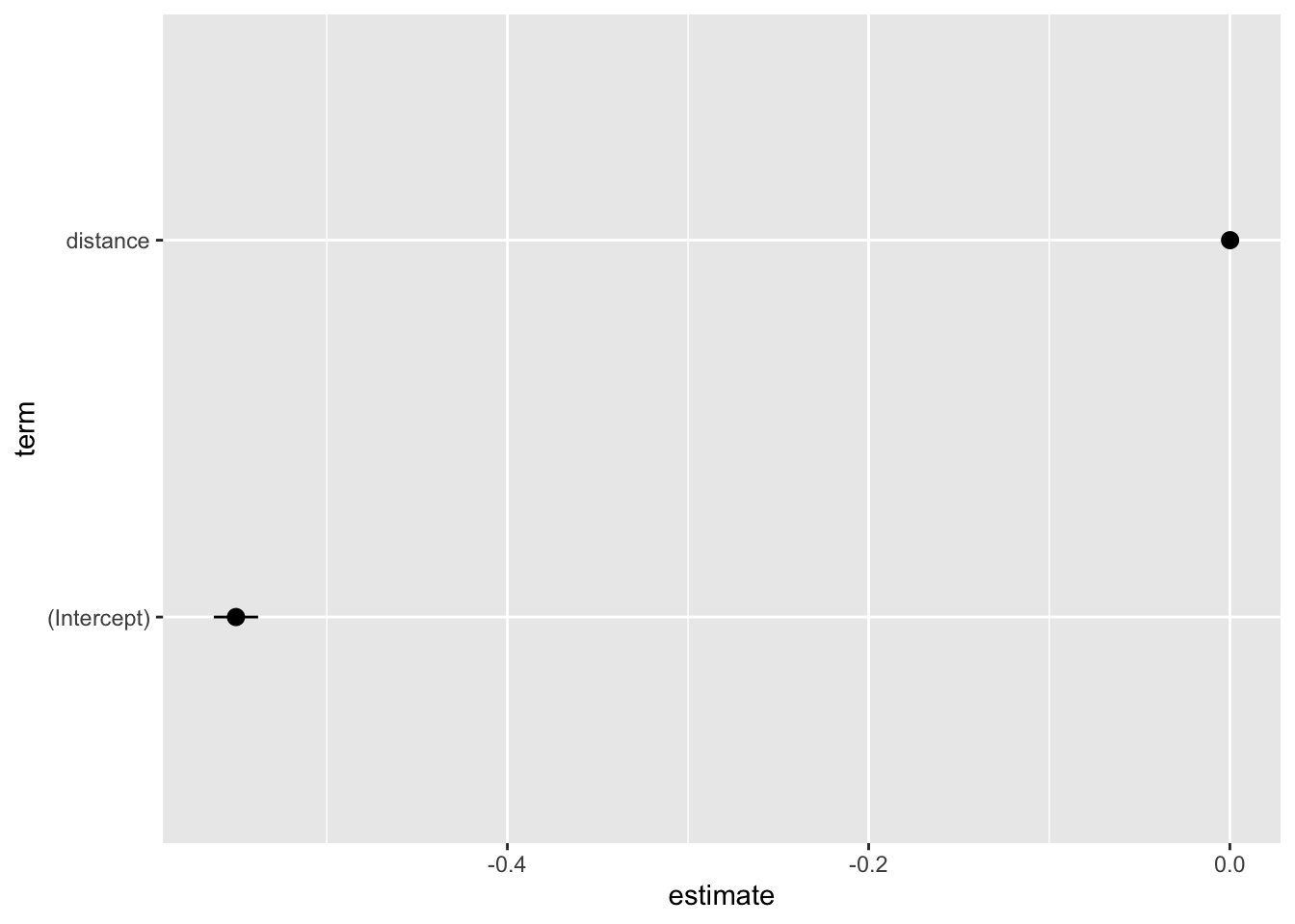
Again, a plot like this should be fully customized to “speak for itself.”
tidy(binom_fit_r, conf.int = TRUE) %>%
  ggplot(aes(x = estimate, y = term, xmin = conf.low, xmax = conf.high)) +
  geom_pointrange() +
  labs(x = "Point Estimate (log odds)",
       y = "Coefficient",
       title = "Regression Results of Departure Delays and Distance",
       caption = "Model fit with binomial likelihood and logit link function.") +
  scale_y_discrete(labels = c("Intercept", "Distance"))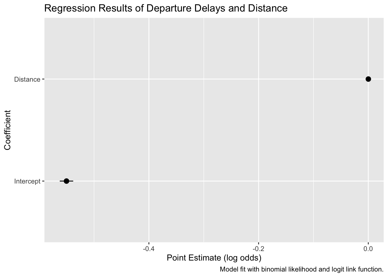
We can make a similar plot for the Poisson model as well. I’m sure this is possible in Python, but I couldn’t find a quick way to do it.
Plotting Your Model’s Fit to the Data
The last plot we’ll cover is how to show your fitted model against your data. These plots are good because they give you a sense of how well you model fits and can help you identify problems. Let’s plot the binomial model fit in R:
# calculate predicted values
binom_preds <- tidy(binom_fit_r, conf.int = TRUE)

pred_data <- tibble(
  distance = seq(from = min(flight_data$distance),
                 to = max(flight_data$distance),
                 length.out = 100)
)

binom_preds <-
  # calculate predicted values
  predict(binom_fit_r,
          newdata = pred_data,
          type = "link",
          se.fit = TRUE) %>%
  # convert to a data frame
  data.frame() %>%
  # calculate upper and lower confidence bands
  mutate(ll = plogis(fit - 1.96 * se.fit),
         ul = plogis(fit + 1.96 * se.fit),
         fit = plogis(fit)) %>%
  # add predictions to the prediction data
  bind_cols(pred_data)

ggplot(data = binom_preds, aes(x = distance, y = fit)) +
  #geom_point(alpha = 0.1, color = "skyblue") +
  # add fitted line
  geom_line() +
  # add error bars
  geom_ribbon(aes(ymin = ll, ymax = ul), alpha = 0.5) +
  # add data
  geom_point(data = flight_data, aes(y = delay_dum),
             alpha = 0.1, color = "skyblue") +
  labs(x = "Distance", y = "Predicted Probability")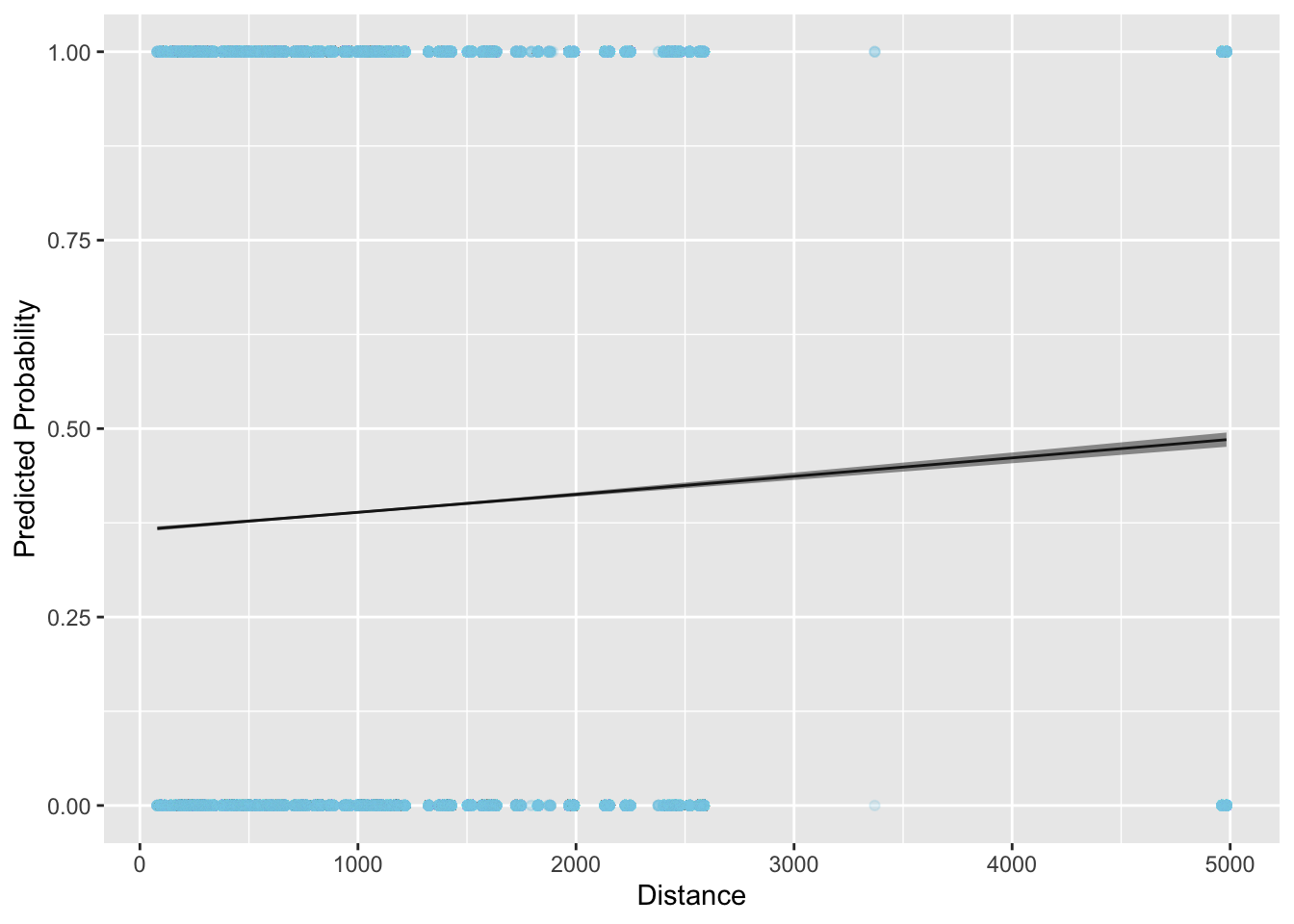
Resources for Further Study
To learn more about generalized linear models, I’d recommend these resources:
Check this article on why the normal distribution is so common: https://towardsdatascience.com/why-is-the-normal-distribution-so-normal-e644b0a50587↩︎