Data Exploration and Hypothesis Generation
The exploratory data analysis (EDA) process is important because it helps with us learn more about what the data measures, what typical values are, and also identify errors. But EDA is also very helpful for identifying patterns in the data, relationships between variables, and ultimately generate testable hypotheses.
In this lesson, we will learn the basics of summarizing, filtering, and arranging data to learn more about it, and we’ll also learn how to visualize data. Data visualization is an extremely good way to learn about your data. You tell me what give YOU more information. This:
head(table1)## # A tibble: 6 × 4
## country year cases population
## <chr> <int> <int> <int>
## 1 Afghanistan 1999 745 19987071
## 2 Afghanistan 2000 2666 20595360
## 3 Brazil 1999 37737 172006362
## 4 Brazil 2000 80488 174504898
## 5 China 1999 212258 1272915272
## 6 China 2000 213766 1280428583or this?
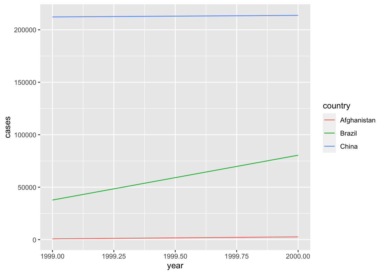
Exactly.
Python and R both have good plotting libraries, and because we can use both languages in R Studio, we can visualize our data using both. Our focus in this lesson, however, will be on learning the extremely powerful visualization package in R called ggplot2. ggplot2 is built around what’s called the “grammar of graphics” which is a system of building data visuals in a way that is easy to describe and understand. Data visualization with ggplot is one of the best aspects of using R.
In general in conducting EDA, we want to explore two questions. As Hadley Wickham explains in Chapter 7 of R for Data Science:
… two types of questions will always be useful for making discoveries within your data. You can loosely word these questions as:
- What type of variation occurs within my variables?
- What type of covariation occurs between my variables?
Session Learning Objectives
Use descriptive methods to explore data
- Summarize and aggregate data
- Filter data
- Arrange data
Use visual methods to explore data
- Build plots with
ggplot2 - Show multiple dimensions of data in one plot
- Use facets to explore groups
- Learn how to make your visuals more effective
- Build plots with
Practice developing hypotheses from EDA methods
Import the Cleaned Data
Before we jump into things, we need to load the packages we need and import the data we cleaned last time:
library(tidyverse)
flight.data <- read_csv("Documents/my_project/flights_cleaned.csv")
Alright, looks good. Let’s get into it.
Exploring Data with Descriptive Methods
Once we have our data in a tidy format, the next step is to start exploring it to learn more about what information our data has. One of the best ways to do this is with data visualizations, but there are important non-visual ways to explore it as well. In this section we’ll explore how to:
- Summarize and aggregate data
- Filter data
- Arrange data
Summarizing and Aggregating Data
Summarizing and aggregation are useful because they allow us to answer questions like: “how long is the average flight?”, “which carriers have the longest delays on average?” and “which origin has the most number of carriers?” These questions can easily be answered with the combination of the group_by() and summarize() functions in R.
group_by() puts the data into groups so that we can then perform calculations for each group instead of the entire column of data. summarize() collapses our data down to the level of our groups so that we can answer questions at the group-level. For example, which carriers have the longest delays on average? Note that we probably don’t want an assignment here.
flight.data %>%
  # lets group the data by carrier
  group_by(carrier) %>%
  # then find the mean delay for each carrier
  summarize(mean_delay = mean(dep_delay))
## # A tibble: 16 × 2
## carrier mean_delay
## <chr> <dbl>
## 1 9E 16.4
## 2 AA 8.57
## 3 AS 5.83
## 4 B6 13.0
## 5 DL 9.22
## 6 EV 19.8
## 7 F9 20.2
## 8 FL 18.6
## 9 HA 4.90
## 10 MQ 10.4
## 11 OO 12.6
## 12 UA 12.0
## 13 US 3.74
## 14 VX 12.8
## 15 WN 17.7
## 16 YV 18.9Which origin has the most number of carriers? To answer this, we’ll use the n_distinct() function which calculates the number of distinct values.
flight.data %>%
  group_by(origin) %>%
  summarize(n_carriers = n_distinct(carrier))
## # A tibble: 3 × 2
## origin n_carriers
## <chr> <int>
## 1 EWR 12
## 2 JFK 10
## 3 LGA 13It’s also possible to group by multiple groups to get narrower calculations.
Exercise
- Find the average departure delay (
dep_delay) for eachcarrierat eachorigin. - What are some other reasons that could contribute to delays? Could you test those reasons with this dataset?
Filtering Data
Your answer to the last exercise gives some good info, but it’s natural to look at data like that and wonder what the longest average delay was. This is where filter() comes in. Let’s filter the data from the last exercise to find the longest delay:
flight.data %>%
  group_by(origin, carrier) %>%
  summarize(avg_delay = mean(dep_delay)) %>%
  # filter the data where avg_delay equals the maximum avg_delay
  filter(avg_delay == max(avg_delay))
## `summarise()` has grouped output by 'origin'. You can override using the `.groups` argument.## # A tibble: 3 × 3
## # Groups: origin [3]
## origin carrier avg_delay
## <chr> <chr> <dbl>
## 1 EWR OO 20.8
## 2 JFK 9E 18.7
## 3 LGA F9 20.2Notice that R returned the max delay by each airport. That’s because our data is still grouped. We can get the overall maximum by ungrouping the data after we summarize it:
flight.data %>%
  group_by(origin, carrier) %>%
  summarize(avg_delay = mean(dep_delay)) %>%
  # now ungroup the data
  ungroup() %>%
  # filter the data where avg_delay equals the maximum avg_delay
  filter(avg_delay == max(avg_delay))
## `summarise()` has grouped output by 'origin'. You can override using the `.groups` argument.## # A tibble: 1 × 3
## origin carrier avg_delay
## <chr> <chr> <dbl>
## 1 EWR OO 20.8We can figure out what airline OO is by looking at the airlines data included in the nycflights13 R package:
filter(nycflights13::airlines, carrier == "OO")## # A tibble: 1 × 2
## carrier name
## <chr> <chr>
## 1 OO SkyWest Airlines Inc.Exercise
- Use
filter()to find the longest distance (distance) any flight traveled.
Arranging Data
Instead of returning only one specific value, like the maximum, you might instead want to arrange the data. This is what arrange() is for. Let’s calculate the average delays by origin and carrier and arrange the data so that we can see all the the delays in order:
flight.data %>%
  group_by(origin, carrier) %>%
  summarize(avg_delay = mean(dep_delay)) %>%
  arrange(avg_delay)
## `summarise()` has grouped output by 'origin'. You can override using the `.groups` argument.## # A tibble: 35 × 3
## # Groups: origin [3]
## origin carrier avg_delay
## <chr> <chr> <dbl>
## 1 LGA US 3.26
## 2 EWR US 3.70
## 3 JFK HA 4.90
## 4 EWR 9E 5.66
## 5 EWR AS 5.83
## 6 JFK US 5.87
## 7 LGA AA 6.70
## 8 JFK UA 7.81
## 9 JFK DL 8.29
## 10 LGA MQ 8.44
## # … with 25 more rowsBy default, arrange() puts the values in acceding order but we can change that to descending order by wrapping our variable with desc() like so:
flight.data %>%
  group_by(origin, carrier) %>%
  summarize(avg_delay = mean(dep_delay)) %>%
  arrange(desc(avg_delay))
## `summarise()` has grouped output by 'origin'. You can override using the `.groups` argument.## # A tibble: 35 × 3
## # Groups: origin [3]
## origin carrier avg_delay
## <chr> <chr> <dbl>
## 1 EWR OO 20.8
## 2 LGA F9 20.2
## 3 EWR EV 20.0
## 4 LGA EV 19.0
## 5 LGA YV 18.9
## 6 JFK 9E 18.7
## 7 LGA FL 18.6
## 8 JFK EV 18.5
## 9 EWR WN 17.8
## 10 LGA WN 17.5
## # … with 25 more rowsExercise
- Use
arrange()to investigate the shortest distances traveled.
Exploring Data with Visual Methods
Building Plots with ggplot2
ggplot2 is one of the primary packages included in R’s tidyverse, so I you already loaded tidyverse then you’re good to go.
ggplot2 builds plots with two basic functions: ggplot() and geom_*(), where * is a placeholder for a number of different geoms that are available.
I like to learn by doing, so let’s just start plotting, then I’ll explain things. Let’s build a histogram of flight departure delays dep_delay:
ggplot(data = flight.data, mapping = aes(x = dep_delay)) +
  geom_histogram()
## `stat_bin()` using `bins = 30`. Pick better value with `binwidth`.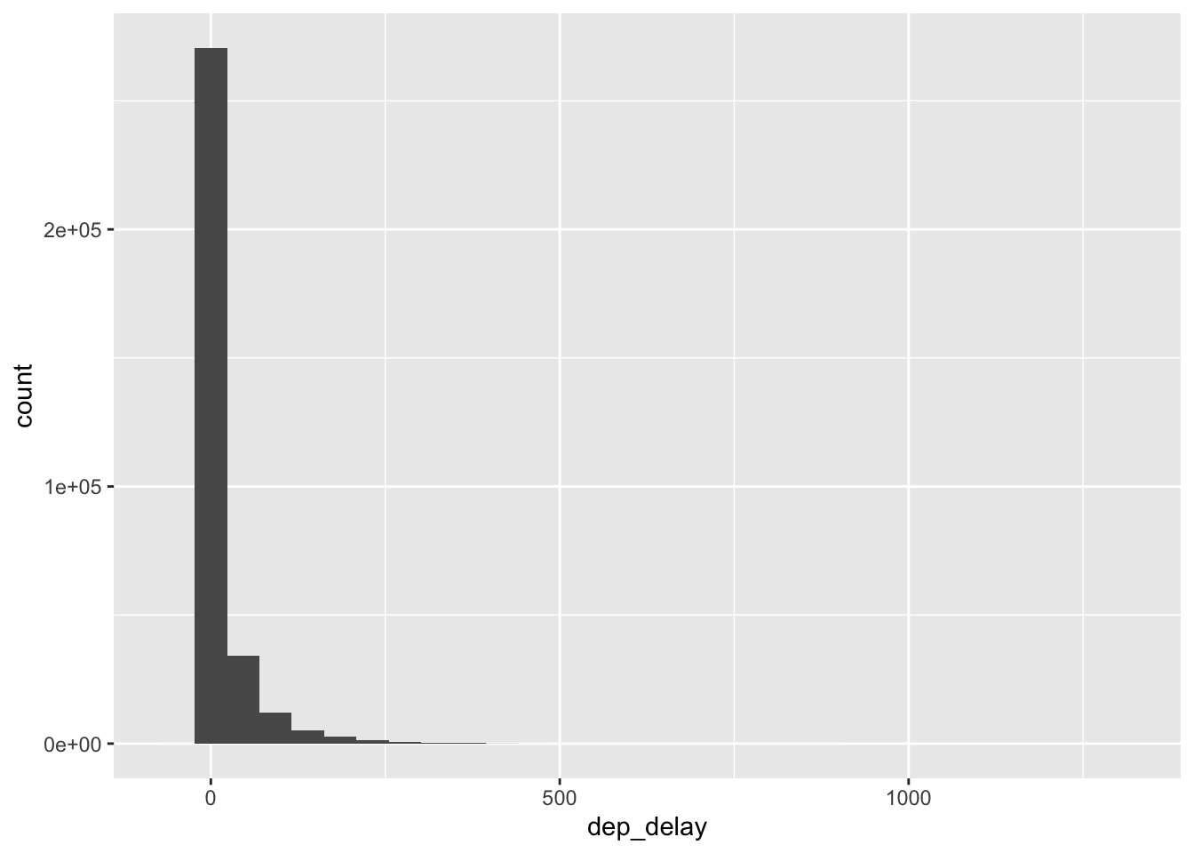
Let’s break down this code:
ggplot(): the main plotting functiondata = flight.data: set thedataargument equal to the data that I want to plotmapping = aes(x = dep_delay): we always map the values we want to plot to an aesthetic (aes()). In this case, we are mapping the x-axis aesthetic todep_delaygeom_histogram: this defines the type of plot to make
It looks like most of the values are close to zero, but this plot already looks suspicious given the how wide the x-axis is. The long x-axis means that extreme values exist, but there aren’t enough to make a bar tall enough we can see. Let’s zoom in to get a better sense of what these values are. We can zoom by limiting the y-axis to a narrower width with coord_cartesian():
ggplot(data = flight.data, mapping = aes(x = dep_delay)) +
  geom_histogram() +
  coord_cartesian(ylim = c(0, 50))
## `stat_bin()` using `bins = 30`. Pick better value with `binwidth`.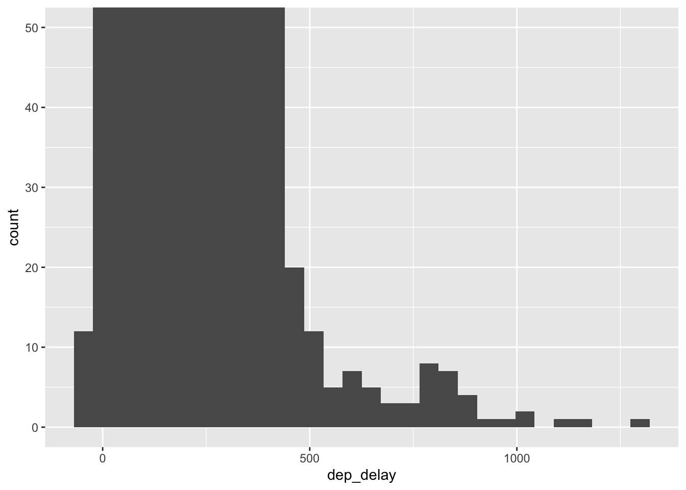
It looks like there are some extreme values and we can see that there are more that just a couple. Let’s use our arrange() and filter() skills to see what these values are:
flight.data %>%
  filter(dep_delay > 750) %>%
  arrange(desc(dep_delay))
## # A tibble: 28 × 17
## year month day dep_time dep_delay arr_time arr_delay carrier tail_num
## <dbl> <dbl> <dbl> <dbl> <dbl> <dbl> <dbl> <chr> <chr>
## 1 2013 1 9 641 1301 1242 1272 HA N384HA
## 2 2013 6 15 1432 1137 1607 1127 MQ N504MQ
## 3 2013 1 10 1121 1126 1239 1109 MQ N517MQ
## 4 2013 9 20 1139 1014 1457 1007 AA N338AA
## 5 2013 7 22 845 1005 1044 989 MQ N665MQ
## 6 2013 4 10 1100 960 1342 931 DL N959DL
## 7 2013 3 17 2321 911 135 915 DL N927DA
## 8 2013 6 27 959 899 1236 850 DL N3762Y
## 9 2013 7 22 2257 898 121 895 DL N6716C
## 10 2013 12 5 756 896 1058 878 AA N5DMAA
## # … with 18 more rows, and 8 more variables: flight <dbl>, origin <chr>,
## # dest <chr>, air_time <dbl>, distance <dbl>, hour <dbl>, minute <dbl>,
## # tot_delay <dbl>There are 28 flights that had delays of longer than 750 minutes and 5 with over 1000 minutes.
A better way to get a sense of the range of values might be to use a box plot. Let’s also include airline information to see how the delays vary by airline:
ggplot(data = flight.data, mapping = aes(x = carrier, y = dep_delay)) +
  geom_boxplot()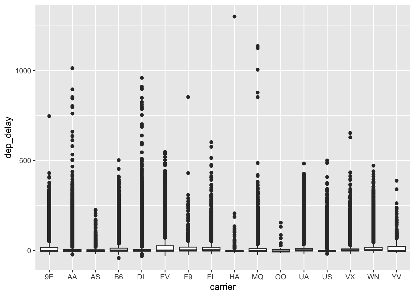
No super helpful, but better. Another option is what’s called a violin plot:
ggplot(data = flight.data, mapping = aes(x = carrier, y = dep_delay)) +
  geom_violin()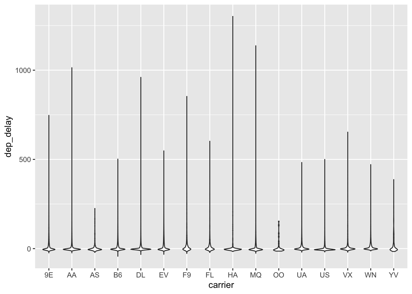
Are arrival delays any different? Let’s investigate.
ggplot(data = flight.data, mapping = aes(x = arr_delay)) +
  geom_histogram()
## `stat_bin()` using `bins = 30`. Pick better value with `binwidth`.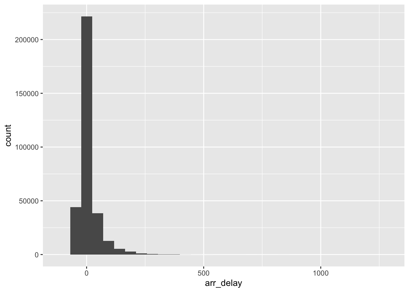
Looks like a similar story here.
Instead of using histograms we could also plot the densities. Density plots standardize the count across categories so that the area under the curve equals 1.
ggplot(data = flight.data, mapping = aes(x = arr_delay)) +
  geom_density()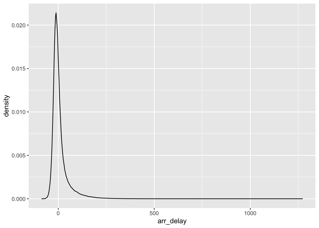
We’ve looked at departure delays and arrival delays independently, but is there a relationship between them? It seems reasonable that if a plane leaves late it will also arrive late, right? Let’s use a scatter plot to look at this relationship. In the scatter plot, we’ll put dep_delay on the x-axis and arr_delay on the y-axis because we typically think of the x variable as explaining the y variable:
ggplot(data = flight.data, mapping = aes(x = dep_delay, y = arr_delay)) +
  geom_point()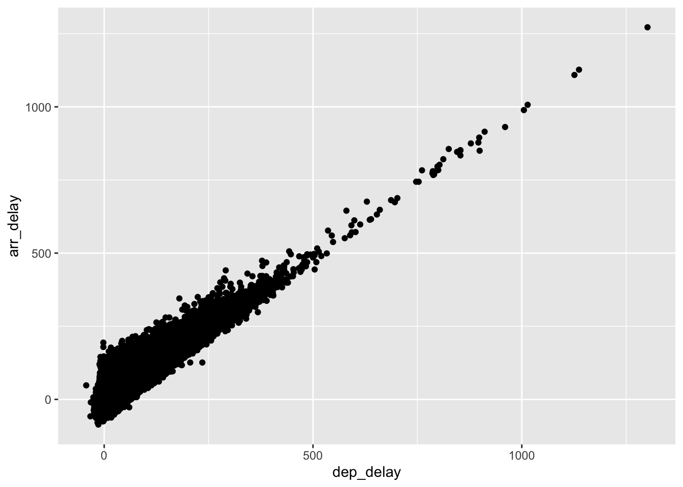
That’s a pretty strong relationship.
Exercises
- Visualize departure delays
dep_delayusing a frequency polygongeom_freqpoly. How does this differ from a density plot? - Plot the relationship between
monthanddep_delay. Which month has the most delays?
Visualizing Multiple Dimensions
So far we’ve seen plots of one and two variables, but what if we wanted even more information? For example, what if we wanted to look at the relationship between departure delays and arrival delays by airline? We can do this by mapping the carrier to a color like this:
ggplot(data = flight.data,
       mapping = aes(x = dep_delay, y = arr_delay, color = carrier)) +
  geom_point()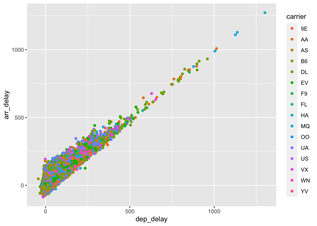
The color helps a little, but we can make this better. First, let’s try using a hex plot and map carrier to the fill instead of the color:
ggplot(data = flight.data,
       mapping = aes(x = dep_delay, y = arr_delay, fill = carrier)) +
  geom_hex()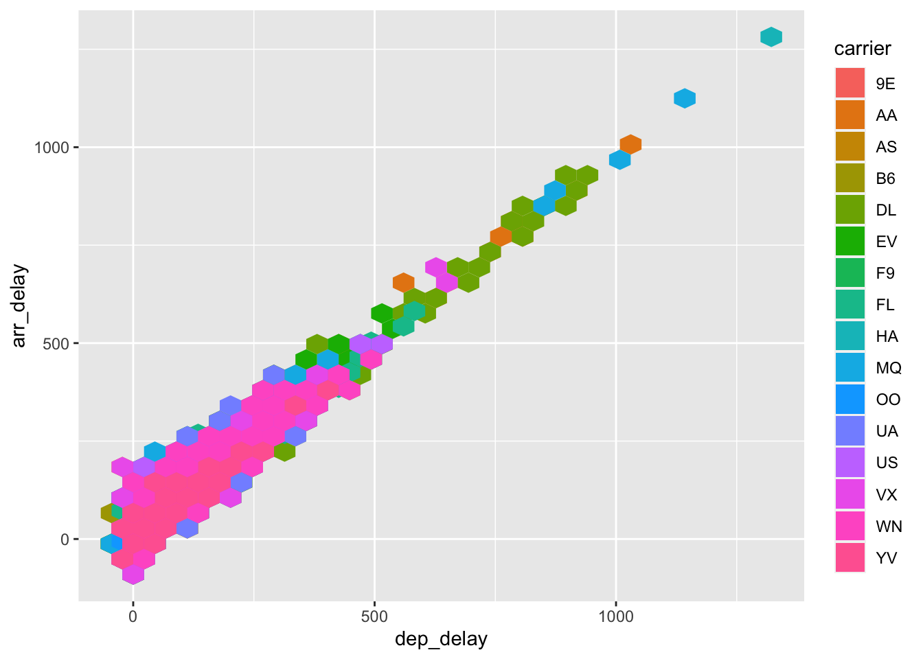
That’s definitely better. Maybe it’s not the airline that matters, though, but where the flight leaves from instead. To check this, we’ll make another hex plot mapping origin to the fill:
ggplot(data = flight.data,
       mapping = aes(x = dep_delay, y = arr_delay, fill = origin)) +
  geom_hex()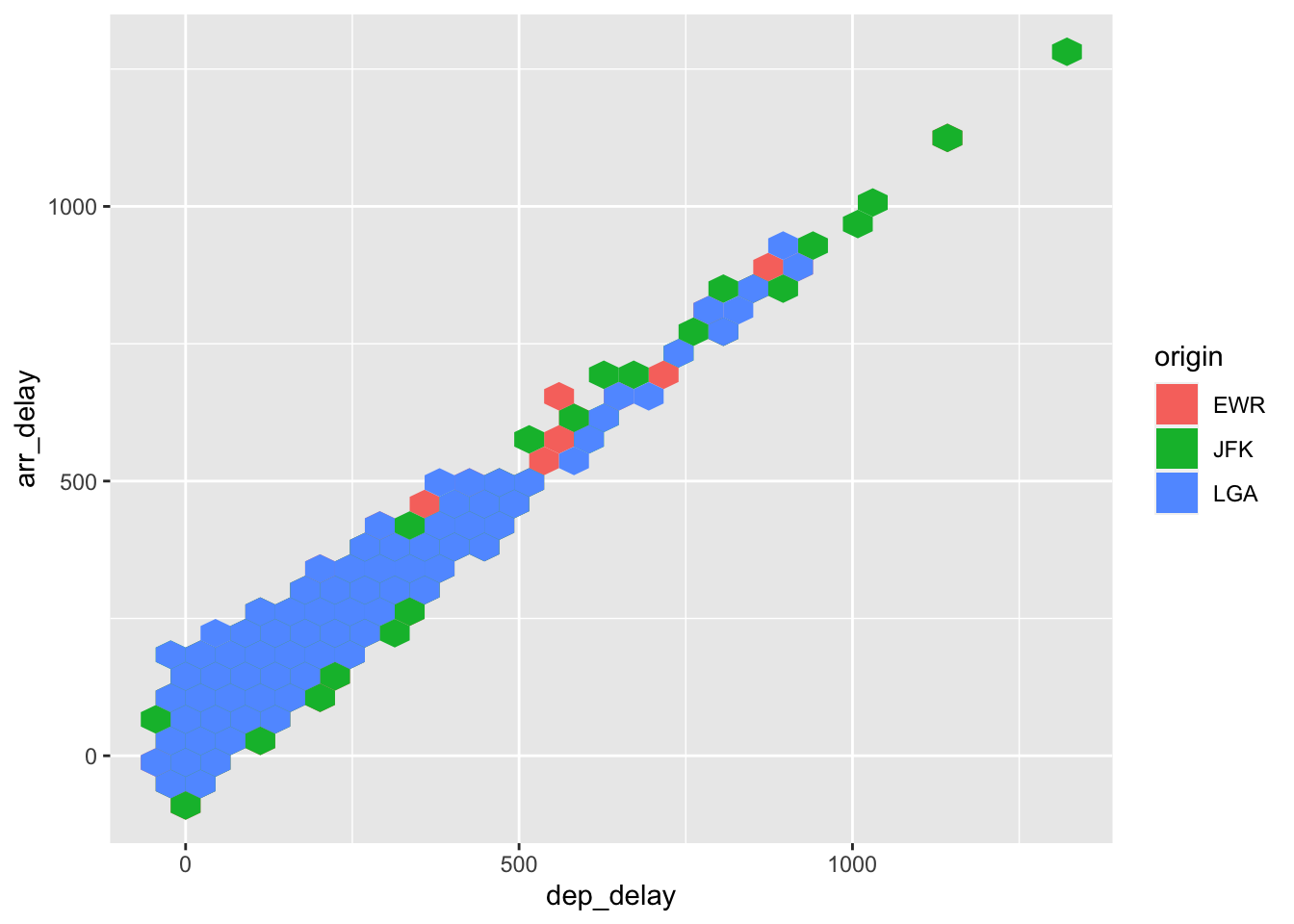
How much to average departure delays for each carrier vary by their point of origin? This is a more complicated plot because it requires us to complete a couple steps:
Compute the average delays by carrier and origin
Create a plot of average delays by carrier and point of origin
We’ll build this by using group_by() and summarize() to calculate the average delays then build a bar plot with carrier on the x-axis, mean delays on the y-axis and assign origin to a color:
flight.data %>%
  group_by(carrier, origin) %>%
  summarize(mean_dep_delay = mean(dep_delay)) %>%
  ggplot(mapping = aes(x = carrier, y = mean_dep_delay, fill = origin)) +
  geom_col()
## `summarise()` has grouped output by 'carrier'. You can override using the `.groups` argument.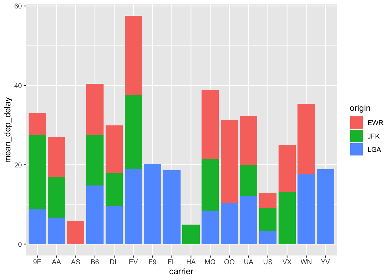
Usually bar plots are easier to interpret when the bars are positioned next to each other instead of on top of each other. Let’s do that by setting the position = argument equal to dodge.
flight.data %>%
  group_by(carrier, origin) %>%
  summarize(mean_dep_delay = mean(dep_delay)) %>%
  ggplot(mapping = aes(x = carrier, y = mean_dep_delay, fill = origin)) +
  geom_col(position = "dodge")
## `summarise()` has grouped output by 'carrier'. You can override using the `.groups` argument.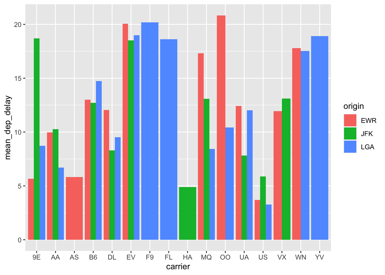
That’s better, but we can improve it. Making all the bars the same width would help and we can do that with position_dodge2() like this:
flight.data %>%
  group_by(carrier, origin) %>%
  summarize(mean_dep_delay = mean(dep_delay)) %>%
  ggplot(mapping = aes(x = carrier, y = mean_dep_delay, fill = origin)) +
  geom_col(position = position_dodge2(preserve = "single"))
## `summarise()` has grouped output by 'carrier'. You can override using the `.groups` argument.
Exercises
Plot the relationship between
dep_timeanddep_delay. What does this plot tell us? What might explain the odd pattern?Does this pattern depend on the origin of the flight? (Hint: make a plot to check.)
What happens if we plot this bar graph:
flight.data %>%
  group_by(carrier, origin) %>%
  summarize(mean_dep_delay = mean(dep_delay)) %>%
  ggplot(mapping = aes(x = carrier, y = mean_dep_delay, fill = origin)) +
  geom_col(position = position_dodge2(preserve = "single"))
## `summarise()` has grouped output by 'carrier'. You can override using the `.groups` argument.
but map
originto color instead of fill?
Exploring Groups with Facets
Given the results of these last exercises, we might wonder about when planes take off from each airport. One easy to way to look into this question would be to use a facet. A good plot for this question would be a histogram and we could look at the differences by mapping origin to fill:
ggplot(flight.data, aes(x = dep_time, fill = origin)) +
  geom_histogram()
## `stat_bin()` using `bins = 30`. Pick better value with `binwidth`.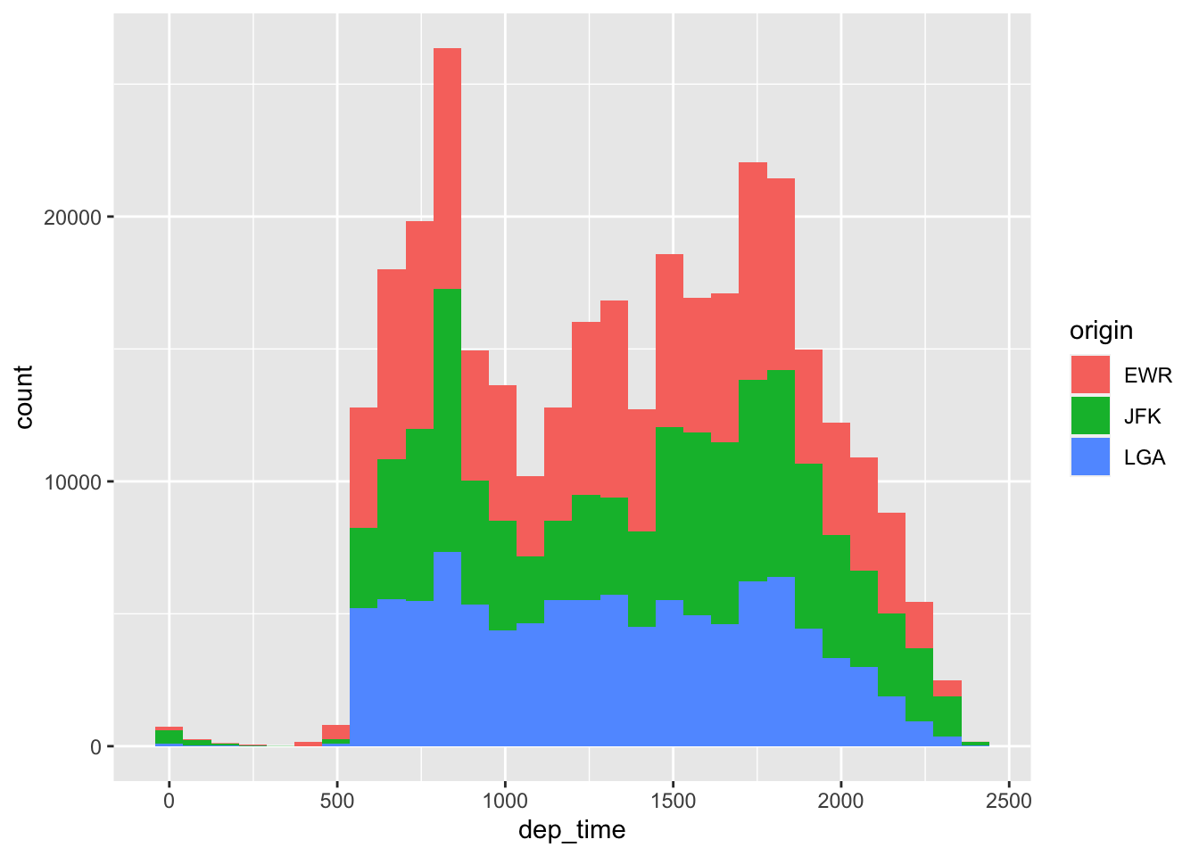
That’s actually pretty informative. But we could also use a facet like this:
ggplot(flight.data, aes(x = dep_time, fill = origin)) +
  geom_histogram() +
  facet_wrap(~ origin)
## `stat_bin()` using `bins = 30`. Pick better value with `binwidth`.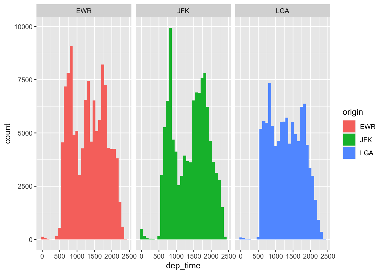
All we added to our plot was facet_wrap(~ origin). In English, this means “split the plot by (~) origin. Because these plots are really tall, it might be better to split them into rows instead of columns with the nrow = argument:
ggplot(flight.data, aes(x = dep_time, fill = origin)) +
  geom_histogram() +
  facet_wrap(~ origin, nrow = 3)
## `stat_bin()` using `bins = 30`. Pick better value with `binwidth`.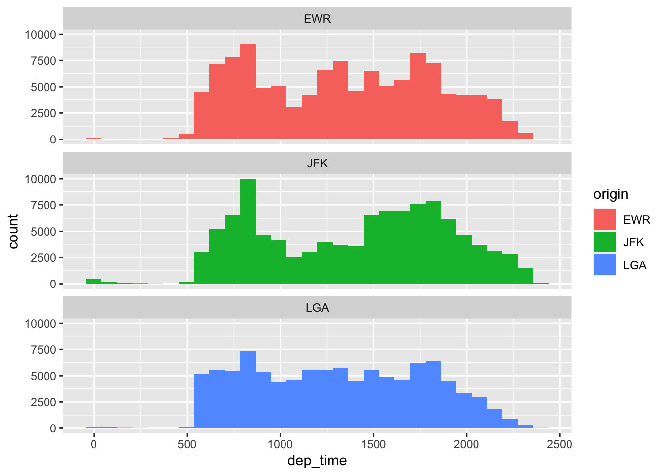
Exercises
- Use a facet to visualize the relationship between
distanceandarr_delayby carrier. - Is there a relationship between these variables? Does it vary depending on
carrier?
How to Make your Visuals More Effective
ggplot2 offers a number of different ways to make your visuals more effective. An effective visual is one that “stands on its own.” In other words, If you showed someone an effective visual, they would be able to understand what they are looking at. Some of the primary things we want to do to make our visuals more effective are:
Use good labels for axes, legends, colors, etc.
Modify the colors of the plot
Adjust the axis scales
There are many more ways to modify plots, but we’ll focus on these three main aspects.
Using Good Labels
This is a pretty good plot:
flight.data %>%
  group_by(carrier, origin) %>%
  summarize(mean_dep_delay = mean(dep_delay)) %>%
  ggplot(mapping = aes(x = carrier, y = mean_dep_delay, fill = origin)) +
  geom_col(position = position_dodge2(preserve = "single"))
## `summarise()` has grouped output by 'carrier'. You can override using the `.groups` argument.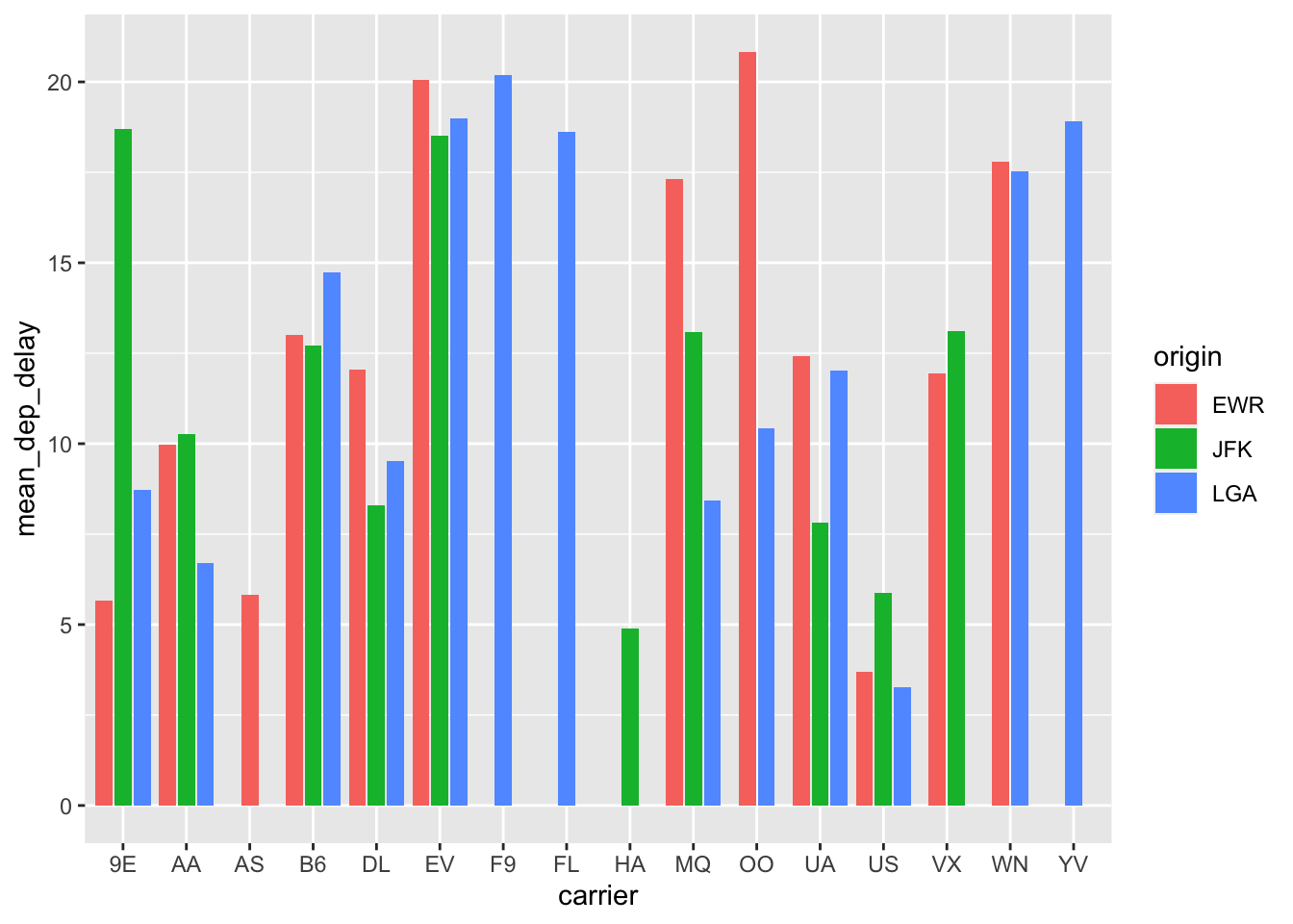
but we can make it better. Let’s start by using better axis titles. We can do that with the labs() function:
flight.data %>%
  group_by(carrier, origin) %>%
  summarize(mean_dep_delay = mean(dep_delay)) %>%
  ggplot(mapping = aes(x = carrier, y = mean_dep_delay, fill = origin)) +
  geom_col(position = position_dodge2(preserve = "single")) +
  # add labels
  labs(x = "Airline",
       y = "Average Departure Delay")
## `summarise()` has grouped output by 'carrier'. You can override using the `.groups` argument.
Better. Now let’s add a title and change the name of the legend:
flight.data %>%
  group_by(carrier, origin) %>%
  summarize(mean_dep_delay = mean(dep_delay)) %>%
  ggplot(mapping = aes(x = carrier, y = mean_dep_delay, fill = origin)) +
  geom_col(position = position_dodge2(preserve = "single")) +
  # add labels
  labs(x = "Airline",
       y = "Average Departure Delay",
       title = "Average Departure Delays Across Airlines and Originating Airport",
       fill = "Originating Airport:")
## `summarise()` has grouped output by 'carrier'. You can override using the `.groups` argument.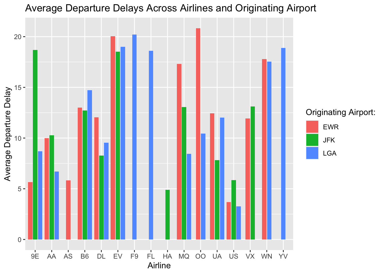
It might make it easier to approximate the y-axis values if we add some horizontal lines. We can do that be adding theme_linedraw():
flight.data %>%
  group_by(carrier, origin) %>%
  summarize(mean_dep_delay = mean(dep_delay)) %>%
  ggplot(mapping = aes(x = carrier, y = mean_dep_delay, fill = origin)) +
  geom_col(position = position_dodge2(preserve = "single")) +
  # add labels
  labs(x = "Airline",
       y = "Average Departure Delay",
       title = "Average Departure Delays Across Airlines and Originating Airport",
       fill = "Originating Airport:") +
  theme_linedraw()
## `summarise()` has grouped output by 'carrier'. You can override using the `.groups` argument.
Now let’s move the legend to the top of the plot:
flight.data %>%
  group_by(carrier, origin) %>%
  summarize(mean_dep_delay = mean(dep_delay)) %>%
  ggplot(mapping = aes(x = carrier, y = mean_dep_delay, fill = origin)) +
  geom_col(position = position_dodge2(preserve = "single")) +
  # add labels
  labs(x = "Airline",
       y = "Average Departure Delay",
       title = "Average Departure Delays Across Airlines and Originating Airport",
       fill = "Originating Airport:") +
  theme_linedraw() +
  # reposition the legend location
  theme(legend.position = "top")
## `summarise()` has grouped output by 'carrier'. You can override using the `.groups` argument.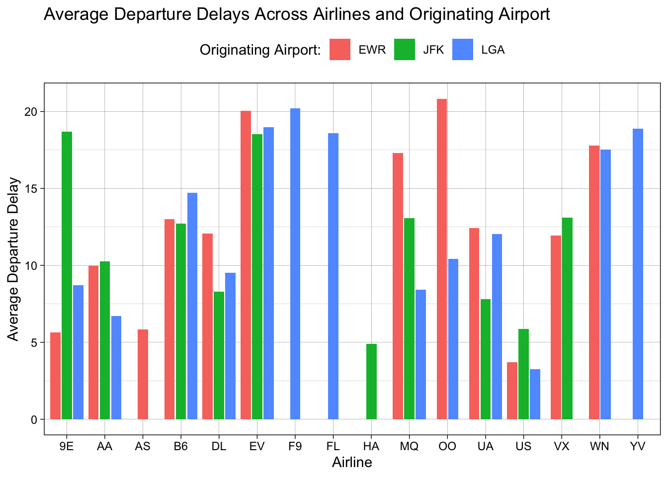
We might want to change the colors of the bars themselves. For example, we might want to make the colors more friendly to colorblind viewers. The ggthemes package offers a great option for this. You’ll need to install the package if you haven’t already. Because we want to adjust the fill colors, we use scale_fill_* then the name of the fill we want. To use the colorblind fill from ggthemes, we’ll use scale_fill_colorblind():
#install.packages("ggthemes")
library(ggthemes)

flight.data %>%
  group_by(carrier, origin) %>%
  summarize(mean_dep_delay = mean(dep_delay)) %>%
  ggplot(mapping = aes(x = carrier, y = mean_dep_delay, fill = origin)) +
  geom_col(position = position_dodge2(preserve = "single")) +
  # add labels
  labs(x = "Airline",
       y = "Average Departure Delay",
       title = "Average Departure Delays Across Airlines and Originating Airport",
       fill = "Originating Airport:") +
  theme_linedraw() +
  # reposition the legend location
  theme(legend.position = "top") +
  ggthemes::scale_fill_colorblind()
## `summarise()` has grouped output by 'carrier'. You can override using the `.groups` argument.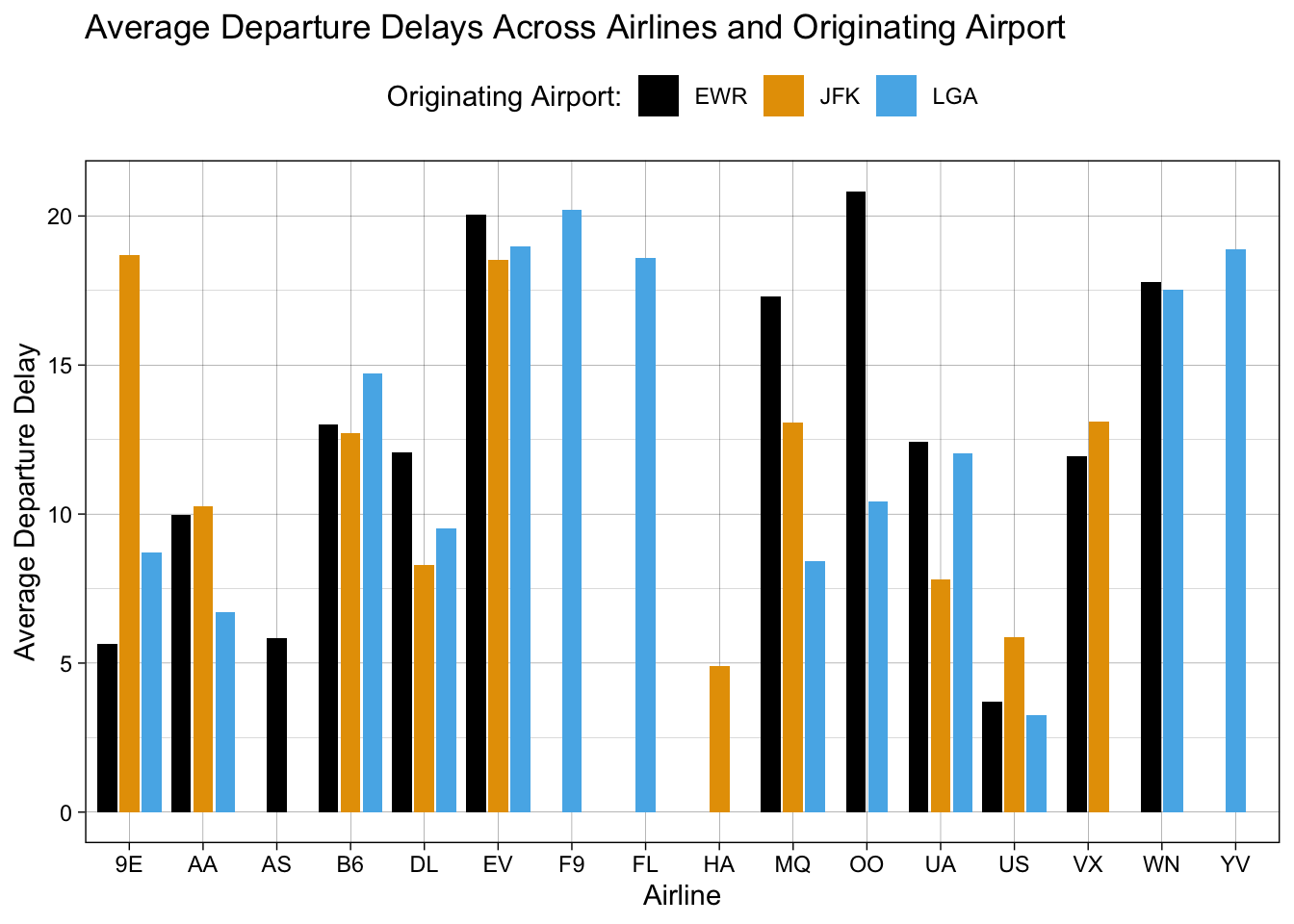
We might, instead, want to pick custom colors. Maybe UCR colors? We can do that with scale_fill_manual(). To set the colors we want, we can supply HTML color codes to the values =argument. (You can find UCR’s official HTML color codes here: UCR Colors.)
flight.data %>%
  group_by(carrier, origin) %>%
  summarize(mean_dep_delay = mean(dep_delay)) %>%
  ggplot(mapping = aes(x = carrier, y = mean_dep_delay, fill = origin)) +
  geom_col(position = position_dodge2(preserve = "single")) +
  # add labels
  labs(x = "Airline",
       y = "Average Departure Delay",
       title = "Average Departure Delays Across Airlines and Originating Airport",
       fill = "Originating Airport:") +
  theme_linedraw() +
  # reposition the legend location
  theme(legend.position = "top") +
  scale_fill_manual(values = c("black", "#FFB81C", "#003DA5"))
## `summarise()` has grouped output by 'carrier'. You can override using the `.groups` argument.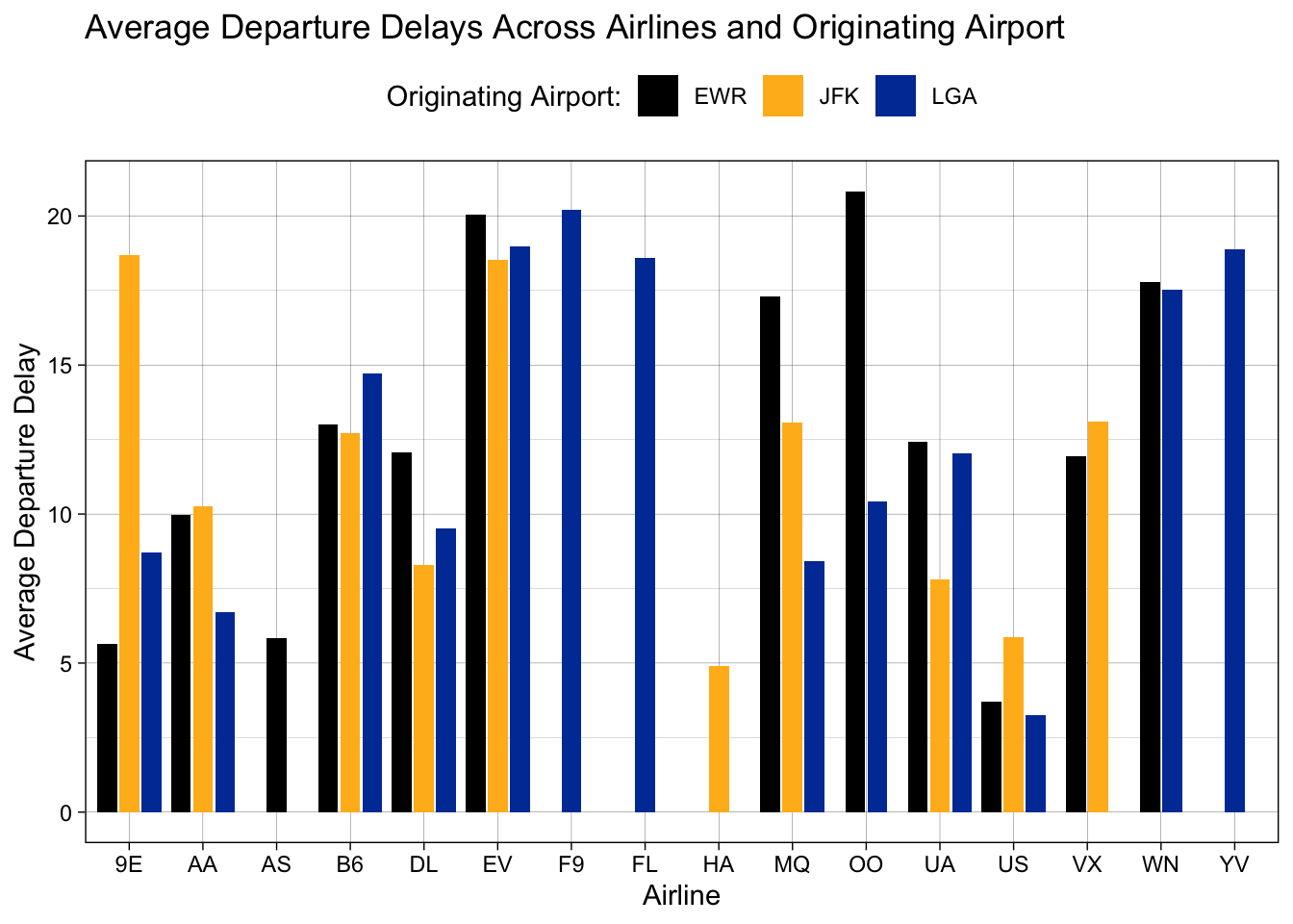
This is good, but we can still do better. What airports are EWR, JFK, and LGA? You might know, but not everyone will. Let’s give those better names. To do so, we return to the scale_fill_manual() function but this time to add a labels = argument:
flight.data %>%
  group_by(carrier, origin) %>%
  summarize(mean_dep_delay = mean(dep_delay)) %>%
  ggplot(mapping = aes(x = carrier, y = mean_dep_delay, fill = origin)) +
  geom_col(position = position_dodge2(preserve = "single")) +
  # add labels
  labs(x = "Airline",
       y = "Average Departure Delay",
       title = "Average Departure Delays Across Airlines and Originating Airport",
       fill = "Originating Airport:") +
  theme_linedraw() +
  # reposition the legend location
  theme(legend.position = "top") +
  scale_fill_manual(values = c("black", "#FFB81C", "#003DA5"),
                    labels = c("Newark (NJ)", "John F. Kennedy (NY)",
                               "LaGuardia (NY)"))
## `summarise()` has grouped output by 'carrier'. You can override using the `.groups` argument.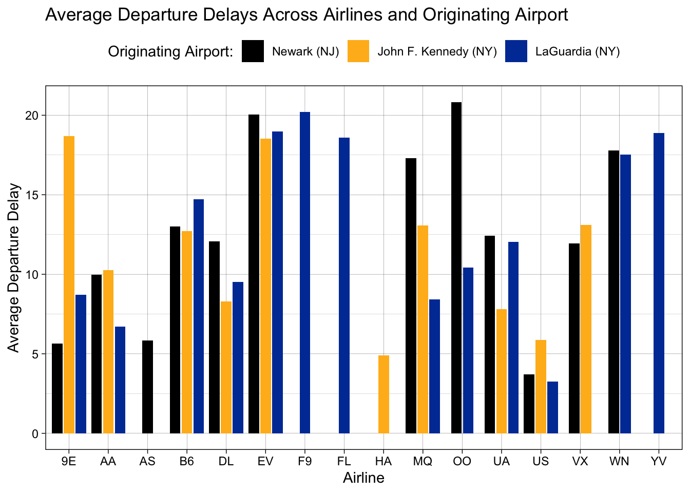
We could still do better, but this looks pretty good. Let’s use the patchwork package to put the old and new plots next to each other:
#install.packages("patchwork")
library(patchwork)

old.plot <- flight.data %>%
  group_by(carrier, origin) %>%
  summarize(mean_dep_delay = mean(dep_delay)) %>%
  ggplot(mapping = aes(x = carrier, y = mean_dep_delay, fill = origin)) +
  geom_col(position = position_dodge2(preserve = "single"))
## `summarise()` has grouped output by 'carrier'. You can override using the `.groups` argument.new.plot <- flight.data %>%
group_by(carrier, origin) %>%
summarize(mean_dep_delay = mean(dep_delay)) %>%
ggplot(mapping = aes(x = carrier, y = mean_dep_delay, fill = origin)) +
geom_col(position = position_dodge2(preserve = "single")) +
# add labels
labs(x = "Airline",
y = "Average Departure Delay",
title = "Average Departure Delays Across Airlines and Originating Airport",
fill = "Originating Airport:") +
theme_linedraw() +
# reposition the legend location
theme(legend.position = "top") +
scale_fill_manual(values = c("black", "#FFB81C", "#003DA5"),
labels = c("Newark (NJ)", "John F. Kennedy (NY)",
"LaGuardia (NY)"))## `summarise()` has grouped output by 'carrier'. You can override using the `.groups` argument.old.plot + new.plot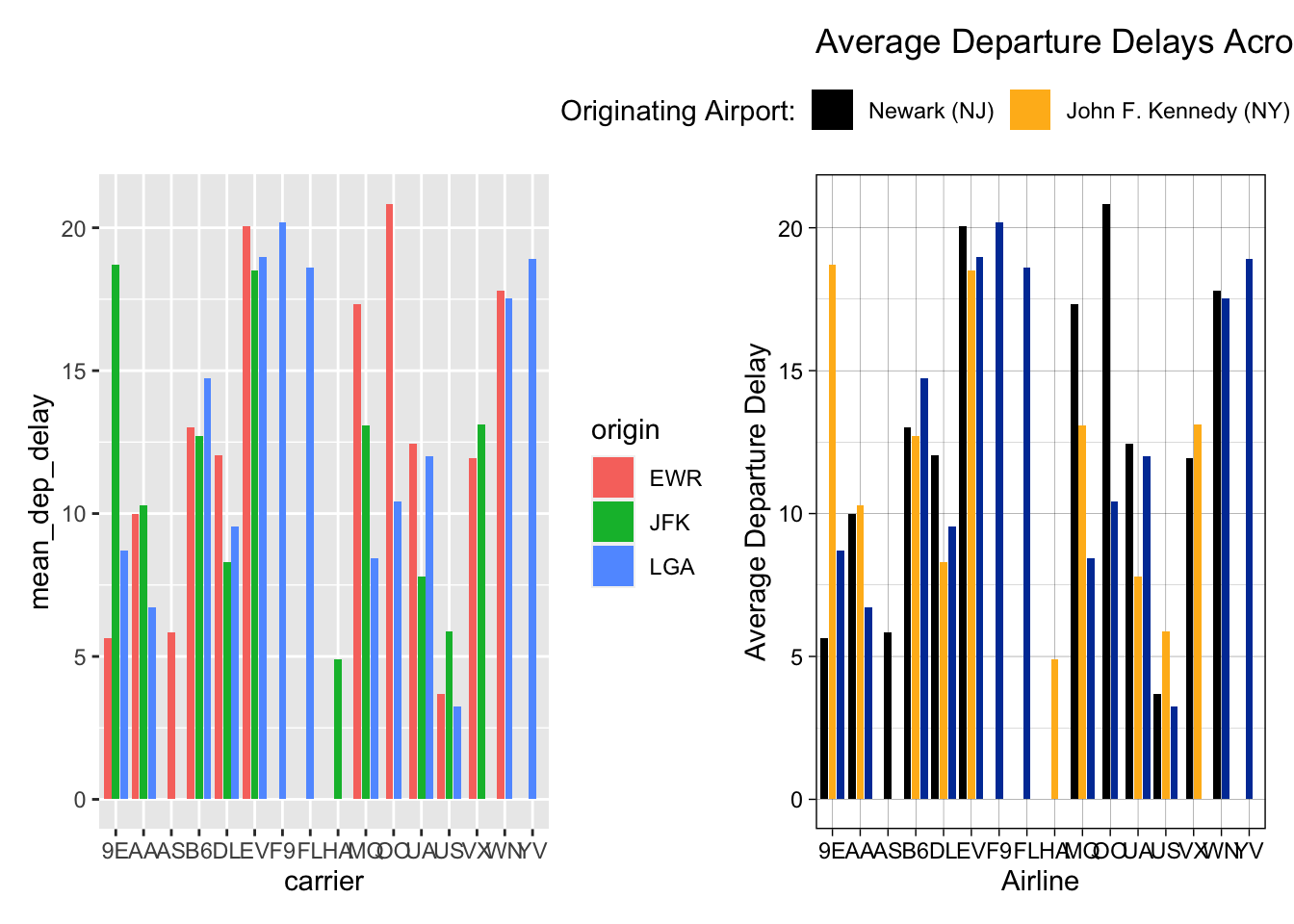
Exercises
- Use your new skills to make one of the plots we made earlier in class more effective and presentation ready.
Resources for Further Study
We only touched the tip of the ggplot iceberg. For some inspiration, or maybe just to see what ggplot2 is capable of here are some amazing visuals produced with ggplot: https://awesomeopensource.com/project/z3tt/TidyTuesday.
To learn more, I recommend reading Chapter 3 of R for Data Science and ggplot2: Elegant Graphics for Data Analysis.