Basic Data Visualization R
Import the Data
mpg.data <- read.csv("mpg.csv")Basic Plots
R offers several packages that make it relatively easy to create advanced plots. Anything from basic line graphs to maps. We’ll learn more about that another time. For now, we are just going to focus on the basic functionality that R offers.
plot
The plot function is used to make scatterplots.
plot(x = mpg.data$cty, y = mpg.data$displ)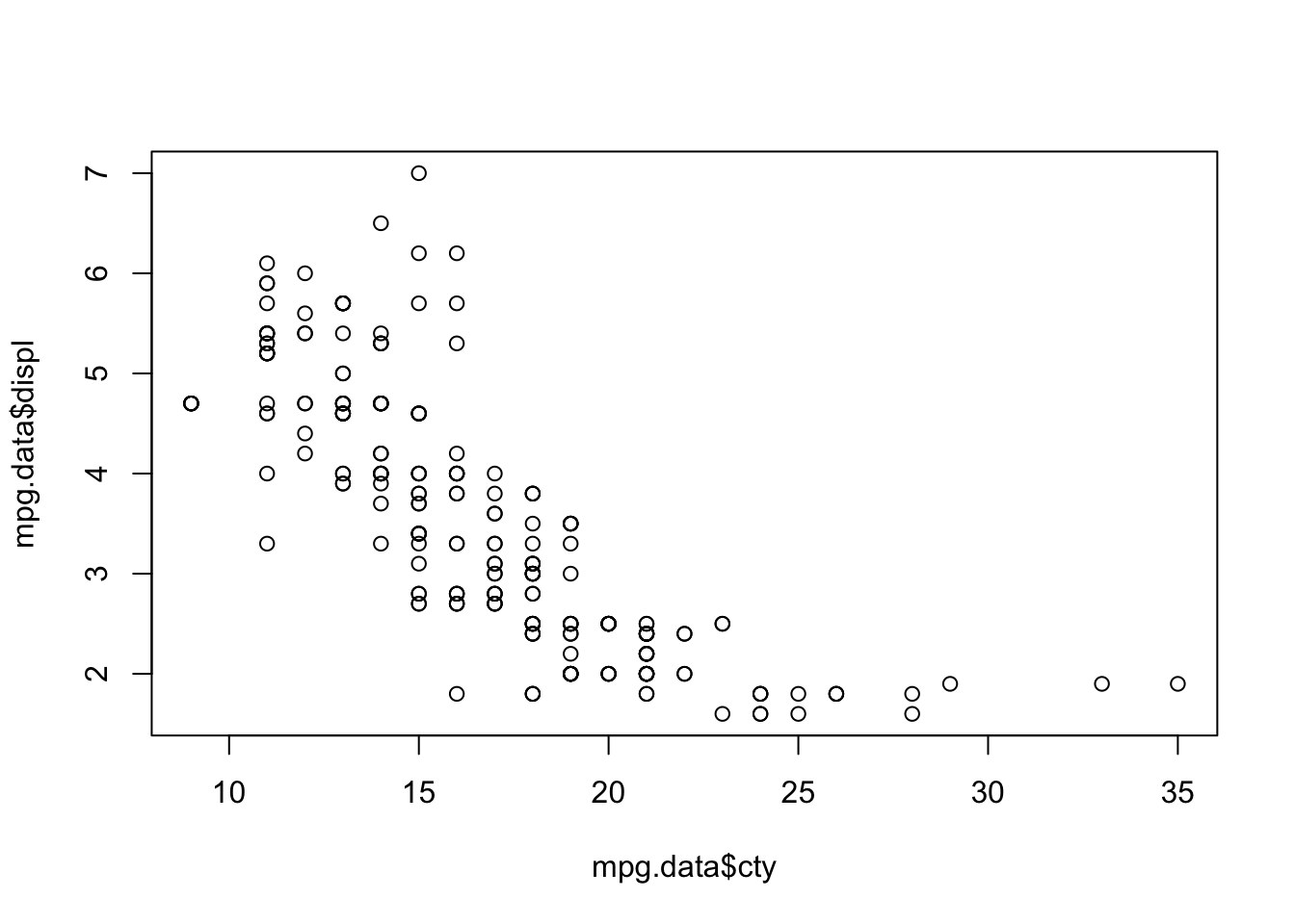
To avoid having to use the $ operator twice, we could use the with() function.
with(mpg.data, plot(cty, displ))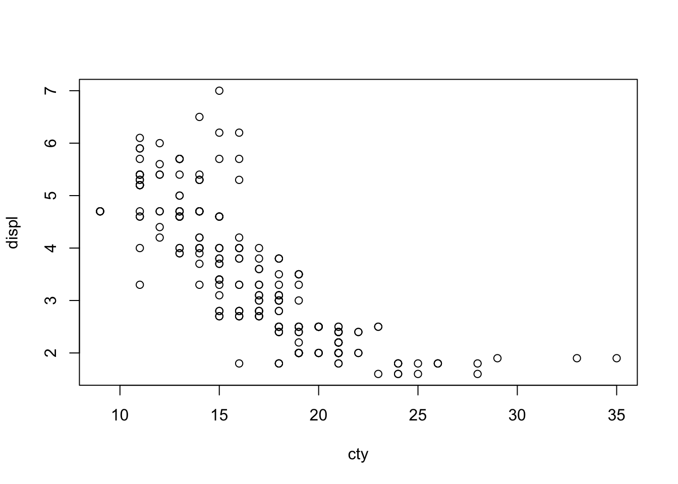
Looks like city MPG is higher for cars with smaller engines.
If we wanted to we could change the axis labels using the label arguments like this:
with(mpg.data, plot(cty, displ,
                    xlab = "City MPG",
                    ylab = "Engine Size",
                    main = "Engine Size and City MPG",
                    sub = "This is only a test."))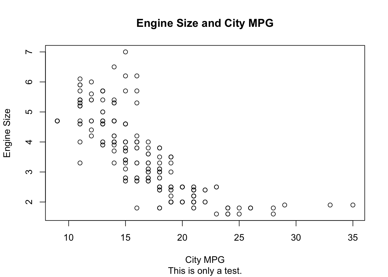
hist
Histograms are a great way to summarize all of the values of a single variable.
with(mpg.data, hist(cty))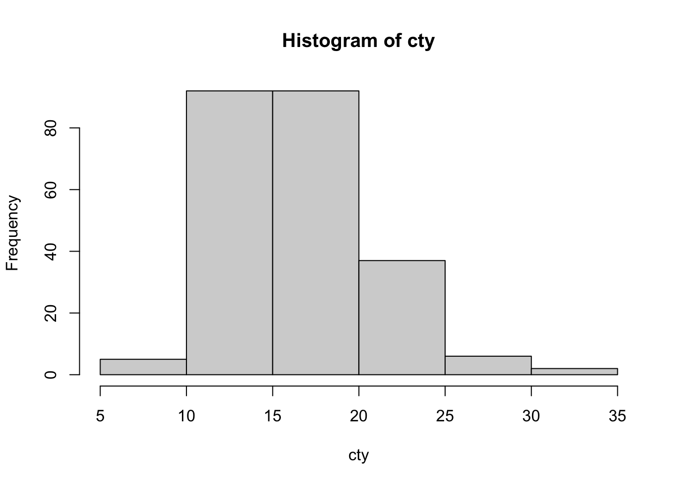
The values range from between 5 and 10 to between 30 and 35. Let’s find out what kind of car gets only 5 MPG in the city.
mpg.data$model[which.min(mpg.data$cty)]## [1] "dakota pickup 4wd"boxplot
Boxplots provide easier summaries of data than a histogram does. They show the minimum values, the 25 percentile, the median, the 75 percentile, and the maximum value. Let’s summarize the city MPG for our vehicles by vehicle type.
boxplot(cty ~ class, data = mpg.data)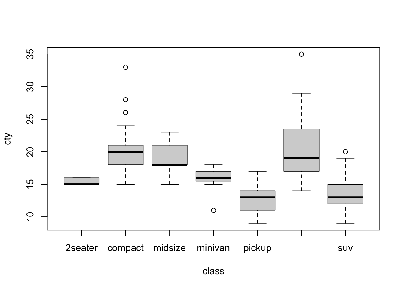
Practice Problems
Create a histogram of cylinders (
cyl). Why are there only three main spikes?Create a scatter plot of highway (
hwy) mpg and engine displacement (displ).Create a scatter plot of highway mpg and engine displacement and add labels to all of the axes.
ADVANCED: Create a boxplot of highway mpg and vehicle class (
class) with informative labels for each value on the x-axis and with labels for all the axes.